- AppSheet
- Release Notes & Announcements
- Announcements
- Re: Coming Soon: AppSheet's Fresh New Look
- Subscribe to RSS Feed
- Mark Topic as New
- Mark Topic as Read
- Float this Topic for Current User
- Bookmark
- Subscribe
- Mute
- Printer Friendly Page
- Mark as New
- Bookmark
- Subscribe
- Mute
- Subscribe to RSS Feed
- Permalink
- Report Inappropriate Content
- Mark as New
- Bookmark
- Subscribe
- Mute
- Subscribe to RSS Feed
- Permalink
- Report Inappropriate Content
Hello everyone!
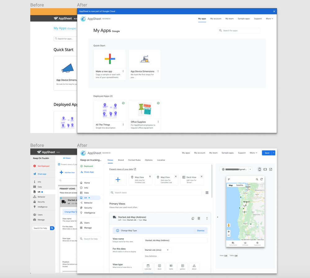
Just a heads up, now that AppSheet is a part of Google Cloud we’re freshening up our UI to better fit with the Google family of products
This new “Material” look will only affect colors, fonts, and icons. It’s still the same AppSheet under the hood! Here’s a sneak peak of what’s coming:

- Mark as New
- Bookmark
- Subscribe
- Mute
- Subscribe to RSS Feed
- Permalink
- Report Inappropriate Content
- Mark as New
- Bookmark
- Subscribe
- Mute
- Subscribe to RSS Feed
- Permalink
- Report Inappropriate Content
Probably within the next week or so, but thats just a guess… ![]()
- Mark as New
- Bookmark
- Subscribe
- Mute
- Subscribe to RSS Feed
- Permalink
- Report Inappropriate Content
- Mark as New
- Bookmark
- Subscribe
- Mute
- Subscribe to RSS Feed
- Permalink
- Report Inappropriate Content
Waiting in anticipation ![]()
- Mark as New
- Bookmark
- Subscribe
- Mute
- Subscribe to RSS Feed
- Permalink
- Report Inappropriate Content
- Mark as New
- Bookmark
- Subscribe
- Mute
- Subscribe to RSS Feed
- Permalink
- Report Inappropriate Content
@everyone that cares. Whoever came up with the idea to start going serious beta tester user group style. Bravo, it’s honestly engaging.
- Mark as New
- Bookmark
- Subscribe
- Mute
- Subscribe to RSS Feed
- Permalink
- Report Inappropriate Content
- Mark as New
- Bookmark
- Subscribe
- Mute
- Subscribe to RSS Feed
- Permalink
- Report Inappropriate Content
![]() I do! That’s great to hear! Shout out to @JCadence for helping us organize all of this!
I do! That’s great to hear! Shout out to @JCadence for helping us organize all of this!
- Mark as New
- Bookmark
- Subscribe
- Mute
- Subscribe to RSS Feed
- Permalink
- Report Inappropriate Content
- Mark as New
- Bookmark
- Subscribe
- Mute
- Subscribe to RSS Feed
- Permalink
- Report Inappropriate Content
Right! @JCadence seems to be everywhere at all times! I don’t know how she does it!
- Mark as New
- Bookmark
- Subscribe
- Mute
- Subscribe to RSS Feed
- Permalink
- Report Inappropriate Content
- Mark as New
- Bookmark
- Subscribe
- Mute
- Subscribe to RSS Feed
- Permalink
- Report Inappropriate Content
ME too please
- Mark as New
- Bookmark
- Subscribe
- Mute
- Subscribe to RSS Feed
- Permalink
- Report Inappropriate Content
- Mark as New
- Bookmark
- Subscribe
- Mute
- Subscribe to RSS Feed
- Permalink
- Report Inappropriate Content
![]()
- Mark as New
- Bookmark
- Subscribe
- Mute
- Subscribe to RSS Feed
- Permalink
- Report Inappropriate Content
- Mark as New
- Bookmark
- Subscribe
- Mute
- Subscribe to RSS Feed
- Permalink
- Report Inappropriate Content
I hope it gets faster without animations and shadows all over the place
- Mark as New
- Bookmark
- Subscribe
- Mute
- Subscribe to RSS Feed
- Permalink
- Report Inappropriate Content
- Mark as New
- Bookmark
- Subscribe
- Mute
- Subscribe to RSS Feed
- Permalink
- Report Inappropriate Content
Count me in
- Mark as New
- Bookmark
- Subscribe
- Mute
- Subscribe to RSS Feed
- Permalink
- Report Inappropriate Content
- Mark as New
- Bookmark
- Subscribe
- Mute
- Subscribe to RSS Feed
- Permalink
- Report Inappropriate Content
It’s arrived…!!! Woohoo…!!! Cheers… ![]()
![]()
- Mark as New
- Bookmark
- Subscribe
- Mute
- Subscribe to RSS Feed
- Permalink
- Report Inappropriate Content
- Mark as New
- Bookmark
- Subscribe
- Mute
- Subscribe to RSS Feed
- Permalink
- Report Inappropriate Content
I love it, so far everything seems to be functioning fine.
@Stefan_Quartemont your might need to slip your expansion arrow down a bit.
- Mark as New
- Bookmark
- Subscribe
- Mute
- Subscribe to RSS Feed
- Permalink
- Report Inappropriate Content
- Mark as New
- Bookmark
- Subscribe
- Mute
- Subscribe to RSS Feed
- Permalink
- Report Inappropriate Content
We are pushing the updated QREW tools to Chrome later this week ![]()
- Mark as New
- Bookmark
- Subscribe
- Mute
- Subscribe to RSS Feed
- Permalink
- Report Inappropriate Content
- Mark as New
- Bookmark
- Subscribe
- Mute
- Subscribe to RSS Feed
- Permalink
- Report Inappropriate Content
Loving this. Looks Super Sleek,
Haven’t used enough to say much more ![]()
- Mark as New
- Bookmark
- Subscribe
- Mute
- Subscribe to RSS Feed
- Permalink
- Report Inappropriate Content
- Mark as New
- Bookmark
- Subscribe
- Mute
- Subscribe to RSS Feed
- Permalink
- Report Inappropriate Content
I’d love to try this out!! Ben@limitlesstrainingco.com is my email! Thanks for everything you do!
- Mark as New
- Bookmark
- Subscribe
- Mute
- Subscribe to RSS Feed
- Permalink
- Report Inappropriate Content
- Mark as New
- Bookmark
- Subscribe
- Mute
- Subscribe to RSS Feed
- Permalink
- Report Inappropriate Content
![]() love the look well done appsheet team
love the look well done appsheet team
- Mark as New
- Bookmark
- Subscribe
- Mute
- Subscribe to RSS Feed
- Permalink
- Report Inappropriate Content
- Mark as New
- Bookmark
- Subscribe
- Mute
- Subscribe to RSS Feed
- Permalink
- Report Inappropriate Content
Looks fantastic, great work ![]()
![]()
- Mark as New
- Bookmark
- Subscribe
- Mute
- Subscribe to RSS Feed
- Permalink
- Report Inappropriate Content
- Mark as New
- Bookmark
- Subscribe
- Mute
- Subscribe to RSS Feed
- Permalink
- Report Inappropriate Content
Working extremely well so far. Loving the new look.
Only thing is it would be nice to have an option to enable tabbed dashboard view on tablet mode. Currently does not tab the views, only on mobile mode.
- Mark as New
- Bookmark
- Subscribe
- Mute
- Subscribe to RSS Feed
- Permalink
- Report Inappropriate Content
- Mark as New
- Bookmark
- Subscribe
- Mute
- Subscribe to RSS Feed
- Permalink
- Report Inappropriate Content
Hello everyone!
Exciting update: Today, we’ve started publicly rolling out our new Google UI to app creators. The rollout will be incremental and if everything goes as planned, it may take a week or so for everyone to start seeing the changes in the editor. Special thanks to our early beta-testers for helping us get to this point!
For those of you who are part of this early rollout, please share any feedback and/or report any potential issues you encounter in this thread.
If you experience significant issues following this rollout, please contact:
support@appsheet.com and include subject line “UI Refresh”
Thanks again,
Carie
- Mark as New
- Bookmark
- Subscribe
- Mute
- Subscribe to RSS Feed
- Permalink
- Report Inappropriate Content
- Mark as New
- Bookmark
- Subscribe
- Mute
- Subscribe to RSS Feed
- Permalink
- Report Inappropriate Content
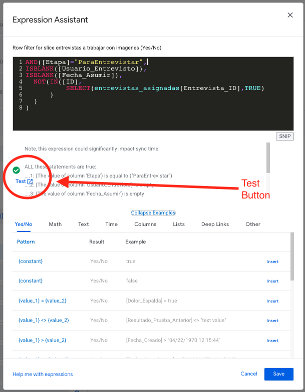
So little of a change but Thank you! Thank you! for moving the Test field function to the top
- Mark as New
- Bookmark
- Subscribe
- Mute
- Subscribe to RSS Feed
- Permalink
- Report Inappropriate Content
- Mark as New
- Bookmark
- Subscribe
- Mute
- Subscribe to RSS Feed
- Permalink
- Report Inappropriate Content
Hi @carie,
In the expression builder the Test button is out of place.

Using: Google Chrome is up to date
Version 85.0.4183.102 (Official Build) (64-bit)
- Mark as New
- Bookmark
- Subscribe
- Mute
- Subscribe to RSS Feed
- Permalink
- Report Inappropriate Content
- Mark as New
- Bookmark
- Subscribe
- Mute
- Subscribe to RSS Feed
- Permalink
- Report Inappropriate Content
I believe that particular problem is because of QREW Tools. @Stefan_Quartemont?
- Mark as New
- Bookmark
- Subscribe
- Mute
- Subscribe to RSS Feed
- Permalink
- Report Inappropriate Content
- Mark as New
- Bookmark
- Subscribe
- Mute
- Subscribe to RSS Feed
- Permalink
- Report Inappropriate Content
Updated Extension is currently in review by the Chrome store and should roll out in a week or so.
- Mark as New
- Bookmark
- Subscribe
- Mute
- Subscribe to RSS Feed
- Permalink
- Report Inappropriate Content
- Mark as New
- Bookmark
- Subscribe
- Mute
- Subscribe to RSS Feed
- Permalink
- Report Inappropriate Content
@James_McFarlane and anyone else waiting, I have noticed QREW Tools is now updated for the new UI. So if you disabled it, it’s good to go now.
@Stefan_Quartemont Props to you and the team for the handy little moving pull arrow, so it stays out of the way of the Save button. The only thing I haven’t figured out is that Data Recovery Tool. The “What’s This?” link goes to your training website, but doesn’t mention this piece. Or, at least, I can’t find it.
- Mark as New
- Bookmark
- Subscribe
- Mute
- Subscribe to RSS Feed
- Permalink
- Report Inappropriate Content
- Mark as New
- Bookmark
- Subscribe
- Mute
- Subscribe to RSS Feed
- Permalink
- Report Inappropriate Content
Thanks for the props! I’m glad you’re enjoying the update.
TBH, the “What’s This” link is supposed go to an explainer page that I haven’t made yet ![]()
I didn’t have time to put it all together before we needed to push the updated code live.
Essentially, you can use that tool to select multiple Recovery.txt files (the kind the get created when a sync fails) and it will collate the files and return a .csv file for you that will allow you to more easily re-enter it into your data source.
- Mark as New
- Bookmark
- Subscribe
- Mute
- Subscribe to RSS Feed
- Permalink
- Report Inappropriate Content
- Mark as New
- Bookmark
- Subscribe
- Mute
- Subscribe to RSS Feed
- Permalink
- Report Inappropriate Content
Neat!
- Mark as New
- Bookmark
- Subscribe
- Mute
- Subscribe to RSS Feed
- Permalink
- Report Inappropriate Content
- Mark as New
- Bookmark
- Subscribe
- Mute
- Subscribe to RSS Feed
- Permalink
- Report Inappropriate Content
Daaaang! Noice!
- Mark as New
- Bookmark
- Subscribe
- Mute
- Subscribe to RSS Feed
- Permalink
- Report Inappropriate Content
- Mark as New
- Bookmark
- Subscribe
- Mute
- Subscribe to RSS Feed
- Permalink
- Report Inappropriate Content
Open up my app, working along, everything is fine. Lemme just do a quick save & verify…*POP!* here’s the new look. I blinked and it changed. Lmao, I stared for a second, and then remembered I was expecting this. Just not like this.
- Mark as New
- Bookmark
- Subscribe
- Mute
- Subscribe to RSS Feed
- Permalink
- Report Inappropriate Content
- Mark as New
- Bookmark
- Subscribe
- Mute
- Subscribe to RSS Feed
- Permalink
- Report Inappropriate Content
Haha, same. It’s a bit blinding at first. Getting used to it now and I’m liking it. Feels…“clean”, almost too clean.
- Mark as New
- Bookmark
- Subscribe
- Mute
- Subscribe to RSS Feed
- Permalink
- Report Inappropriate Content
- Mark as New
- Bookmark
- Subscribe
- Mute
- Subscribe to RSS Feed
- Permalink
- Report Inappropriate Content
Lmao, right? I like it. But I want to invert the whole color scheme. So ![]() to the UI team, but please also do a dark mode. (I dislike the “dark mode” extensions)
to the UI team, but please also do a dark mode. (I dislike the “dark mode” extensions)
- Mark as New
- Bookmark
- Subscribe
- Mute
- Subscribe to RSS Feed
- Permalink
- Report Inappropriate Content
- Mark as New
- Bookmark
- Subscribe
- Mute
- Subscribe to RSS Feed
- Permalink
- Report Inappropriate Content
Same! I was in the middle of a training session/screen share with a client. Saved the app and BOOM!- new editor!
The client got to watch me stumble around and learn the new layout lol! ![]()
- Mark as New
- Bookmark
- Subscribe
- Mute
- Subscribe to RSS Feed
- Permalink
- Report Inappropriate Content
- Mark as New
- Bookmark
- Subscribe
- Mute
- Subscribe to RSS Feed
- Permalink
- Report Inappropriate Content
![]() Same here!
Same here!
As a noob, I actually discovered a few new places to go after the update. So well done to the Appsheet team!
- Mark as New
- Bookmark
- Subscribe
- Mute
- Subscribe to RSS Feed
- Permalink
- Report Inappropriate Content
- Mark as New
- Bookmark
- Subscribe
- Mute
- Subscribe to RSS Feed
- Permalink
- Report Inappropriate Content
But yes, compared to the old editor, there’s a lot less clutter which is disorienting in the beginning. It took me a few days to get used to it.
Most everything should still be in the same spot — we tried not to move things around.
- Mark as New
- Bookmark
- Subscribe
- Mute
- Subscribe to RSS Feed
- Permalink
- Report Inappropriate Content
- Mark as New
- Bookmark
- Subscribe
- Mute
- Subscribe to RSS Feed
- Permalink
- Report Inappropriate Content
Your baby has been googled ![]()
![]()
![]()
![]()
- Mark as New
- Bookmark
- Subscribe
- Mute
- Subscribe to RSS Feed
- Permalink
- Report Inappropriate Content
- Mark as New
- Bookmark
- Subscribe
- Mute
- Subscribe to RSS Feed
- Permalink
- Report Inappropriate Content
Thanks to everyone at AppSheet involved in this improvement in the editor. My editor is looking very nice now. And thanks to @carie for telling us about it. One minor request that I would like to make is that the #editor tag be added to the post that started this thread. The “editor experience” (as opposed to the app user’s experience) is a very important aspect of the AppSheet platform and has been the subject of considerable discussion. For this reason, the #editor tag was added last year by @Peter last year:
Thanks again!
- Mark as New
- Bookmark
- Subscribe
- Mute
- Subscribe to RSS Feed
- Permalink
- Report Inappropriate Content
- Mark as New
- Bookmark
- Subscribe
- Mute
- Subscribe to RSS Feed
- Permalink
- Report Inappropriate Content
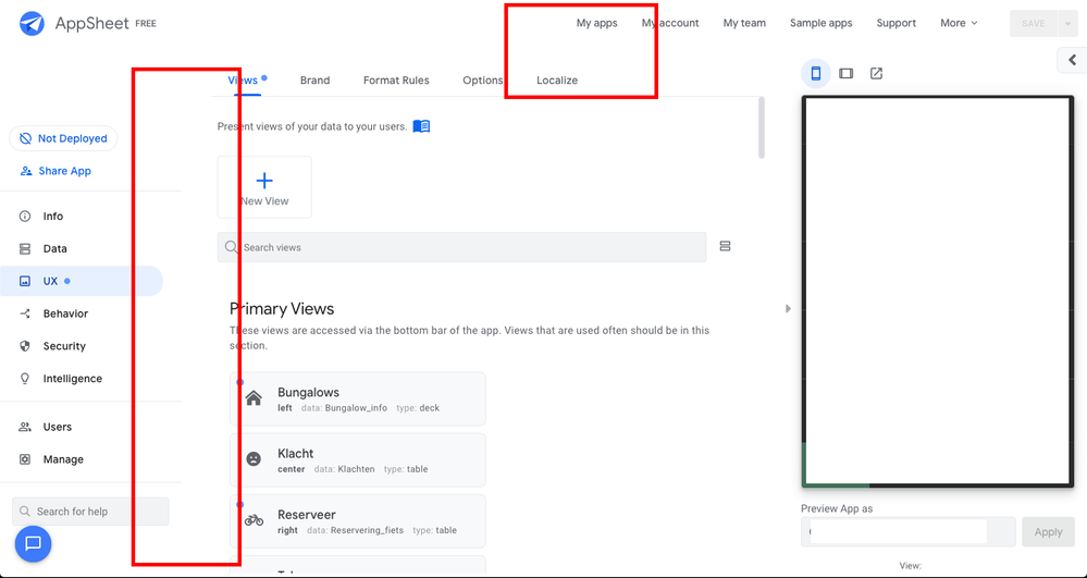
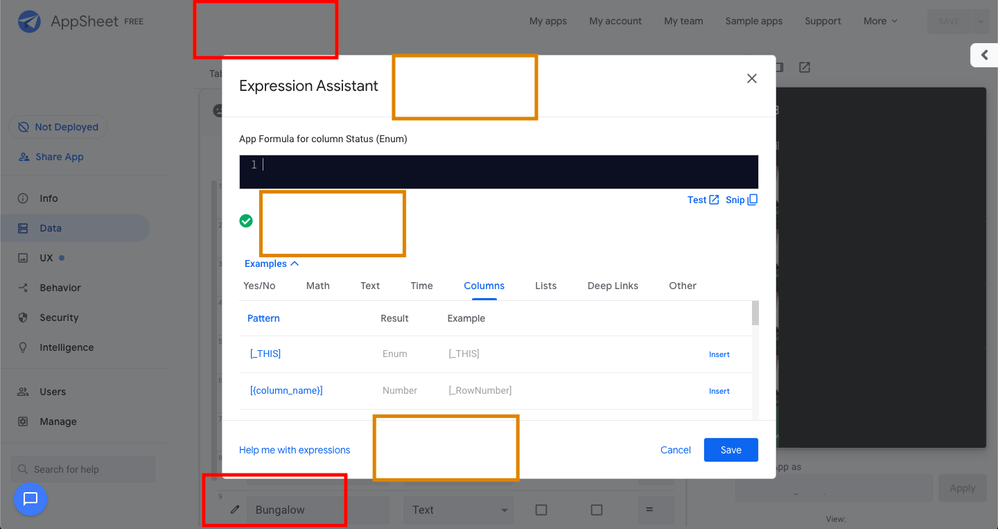
I like the design part but i really don’t like the spacing. I know it is part of the new look but in my opinion the editor is a editor and this should be in service of the maker of the app. And i like overview, ofcource you can’t see everything in one, but it saves a lot of time and mistakes if you don’t have to scroll a lot.
In the screenshots you see where i think there is way to much spacing and not helping the user of the editor.
EDIT

Als the formula editor is like a 4 instead of a 9 it was before…

- Mark as New
- Bookmark
- Subscribe
- Mute
- Subscribe to RSS Feed
- Permalink
- Report Inappropriate Content
- Mark as New
- Bookmark
- Subscribe
- Mute
- Subscribe to RSS Feed
- Permalink
- Report Inappropriate Content
![]()
Have you seen this?
- Mark as New
- Bookmark
- Subscribe
- Mute
- Subscribe to RSS Feed
- Permalink
- Report Inappropriate Content
- Mark as New
- Bookmark
- Subscribe
- Mute
- Subscribe to RSS Feed
- Permalink
- Report Inappropriate Content
Yes, as you can see i have the extention, but i think it needs to be reprogrammed after the design update. I edit the post as well. These are some examples, i saw a comment form other guys about the big plus sign as well.
I love the design but i hope there will be some improvements about oversight and spacing.
- Mark as New
- Bookmark
- Subscribe
- Mute
- Subscribe to RSS Feed
- Permalink
- Report Inappropriate Content
- Mark as New
- Bookmark
- Subscribe
- Mute
- Subscribe to RSS Feed
- Permalink
- Report Inappropriate Content
Hi @Remco_Edelenbos
first thanks for the feedback. It is valuable!
This is not a one-and-done change for us. We will absolutely hear the feedback and keep refining the interface. At the moment, we just need to let it sit for a few days and fix bugs while we hear the feedback. Then we can take stock and make adjustments.
- Mark as New
- Bookmark
- Subscribe
- Mute
- Subscribe to RSS Feed
- Permalink
- Report Inappropriate Content
- Mark as New
- Bookmark
- Subscribe
- Mute
- Subscribe to RSS Feed
- Permalink
- Report Inappropriate Content
Use your browser’s zoom settings to zoom out to 70 or 80%. It seems you have a very small screen resolution.
@carie An option to think about (if not planned already): Editor Text Size. That way people don’t have to use zoom to change it if they are hard of seeing, or if their screen size is small.
- Mark as New
- Bookmark
- Subscribe
- Mute
- Subscribe to RSS Feed
- Permalink
- Report Inappropriate Content
- Mark as New
- Bookmark
- Subscribe
- Mute
- Subscribe to RSS Feed
- Permalink
- Report Inappropriate Content
True about the zoom,
On my Macbook pro 13" the tablet viewing mode is completely square. If I zoom to about 60% , 70% wont do it, everything seems to look normal again.
-
Account
3 -
Announcements
30 -
App Management
8 -
Automation
31 -
Data
32 -
Errors
17 -
Expressions
21 -
Integrations
25 -
Intelligence
5 -
Other
15 -
Resources
15 -
Security
5 -
Templates
13 -
Users
7 -
UX
34

 Twitter