- AppSheet
- Release Notes & Announcements
- Announcements
- Re: Desktop changes coming to Preview Program
- Subscribe to RSS Feed
- Mark Topic as New
- Mark Topic as Read
- Float this Topic for Current User
- Bookmark
- Subscribe
- Mute
- Printer Friendly Page
- Mark as New
- Bookmark
- Subscribe
- Mute
- Subscribe to RSS Feed
- Permalink
- Report Inappropriate Content
- Mark as New
- Bookmark
- Subscribe
- Mute
- Subscribe to RSS Feed
- Permalink
- Report Inappropriate Content
Not a brief post, but there’s a lot to touch upon. There will be further posts, as we develop, release and get feedback, but we wanted to let you know some things we’re up to. Still a lot in the works, and iteration…
TL:DR;
We’ve been researching and working on some patterns for desktop apps; these will start being released in the Preview Program, giving us some extensive use across variety of apps, and iterating along the way. We asked the community for some desktop use cases earlier this year as well.
The major desktop elements are discussed below:
- Navigation rail (aka sidebar) and top appbar changes
- Detail view developments:
- Using the expanded real estate for laying out dense content
- App bar patterns, such as breadcrumbs, action buttons, and sibling navigation controls
- Splitting and grouping content
- Collection views
- Open search
- Split view options
What’s not in motion at this time:
- Dashboards
- Forms
Here’s a high level overview and concept sketches of what we’re working on, and will be coming to the preview program:
1. New desktop element: Navigation rail (aka sidenav)
When AppSheet is being used on a desktop, we’re exposing the app views as a visible navigation rail on the left side of the viewport.
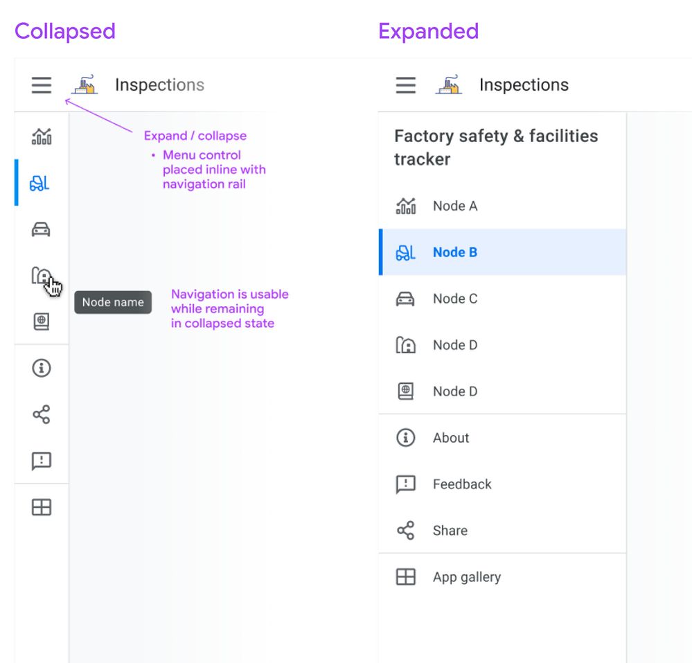
Besides being present at all times, we’d like you to be able to work with this in two modes: Collapsed or Expanded. Here’s a sketch:
Collapsed mode
When collapsed, you’ll see the icon associated with the view, and on hover you’ll see the view name in a tooltip. Collapsed means you can have more space dedicated to the content pane. Either mode is scrollable for apps with lots of views.
If you don’t show an app icon in your app bar, you’ll see the app icon (and the app name) when you expand the drawer, similar to what you see today on mobile.
Expanded mode
When expanded, it resembles the mobile navigation drawer you see today, except it occupies persistent space, i.e. the menu links are visible.
Moving the bottom app bar nodes into the navigation rail
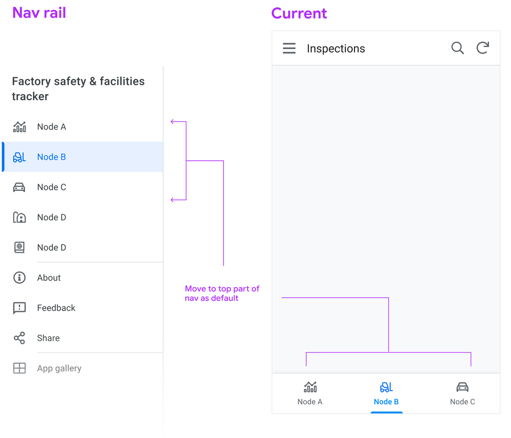
Following a more standard desktop web app pattern, you won’t see the bottom app bar on desktop.
Tab nodes ⇒ Top of nav rail
This means we map the visible tabs on mobile to the top of the view list in the sidebar, putting them in the top position in the list:
Swapping menu and icon position
Another change we’re making is switching the position of the menu bars and the app logo (if you use one), so the menu control is directly aligned above the navigation links. Pressing the menu control toggles between Collapsed and Expanded states.
2. Detail view changes
We’re starting with detail views, as it’s one of the most important and potentially information dense, and currently it’s designed primarily for mobile.
We’re looking to use the available real estate afforded by desktop to break out the content into sections. These sections can be laid out across columns.
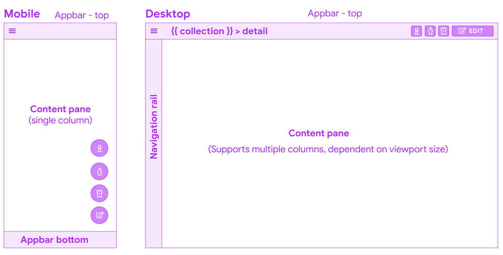
Let’s look at the basic structure:
Appbar top - breadcrumbs
Starting from the top, you’ll see a a common pattern when you drill down into a detail from a collection: a (hierarchical) breadcrumb bar:

This means there’s one click up to the collection, and if a user lands in this view from a link, it’s clear what collection this instance belongs to.
Overlay buttons placement
The use of Overlay buttons (aka FAB: Material Floating Action Buttons) is a fairly standard mobile pattern. The core idea is that it’s for the ONE most important action, but AppSheet lets you add multiple.
Translated to the desktop, Material originally kept the floating overlays in the bottom right of the viewport, but after testing and research, transitioned to the top app bar, because of discoverability issues and content overlay. App creators we’ve interviewed have brought this issue to our attention.
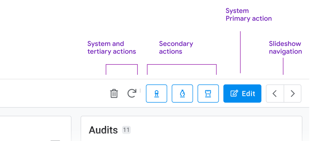
System action primary buttons will have a label
Right now, we’re starting with having the primary system action button, Edit appearing as a contained button with a label.
How to handle multiple overlay buttons?
The remaining overlay buttons take are displayed as secondary action buttons, and other system actions (delete, sync) remain as icon buttons, and all buttons will have tooltips as well:
Here’s a sketch of how we are structuring the top right of the app bar for Detail views:
Slideshow controls
For these, we’re moving to dedicated buttons for navigating sibling records. If you have to skim back and forth between records, the buttons are in a stable place, and close together. We’re also exploring (future) keyboard shortcuts to aid in sibling navigation: This can aid in quickly traversing records, and is effective for power users.
You may have seen this pattern before: We’re currently using it for detail views in dashboards:

Consolidating interaction patterns when possible is part of a larger push.
Content: Sections, columns, and flow
Right now, detail views form one long strip of mostly undifferentiated content.
We’re working on a way of grouping these into the following types of sections.
- Primary
- Secondary: Properties (columns and their values)
- Inline lists
These sections can be ordered, and sections can be arranged into columns.
So a layout on a browser can form up to 3 columns, containing multiple sections.
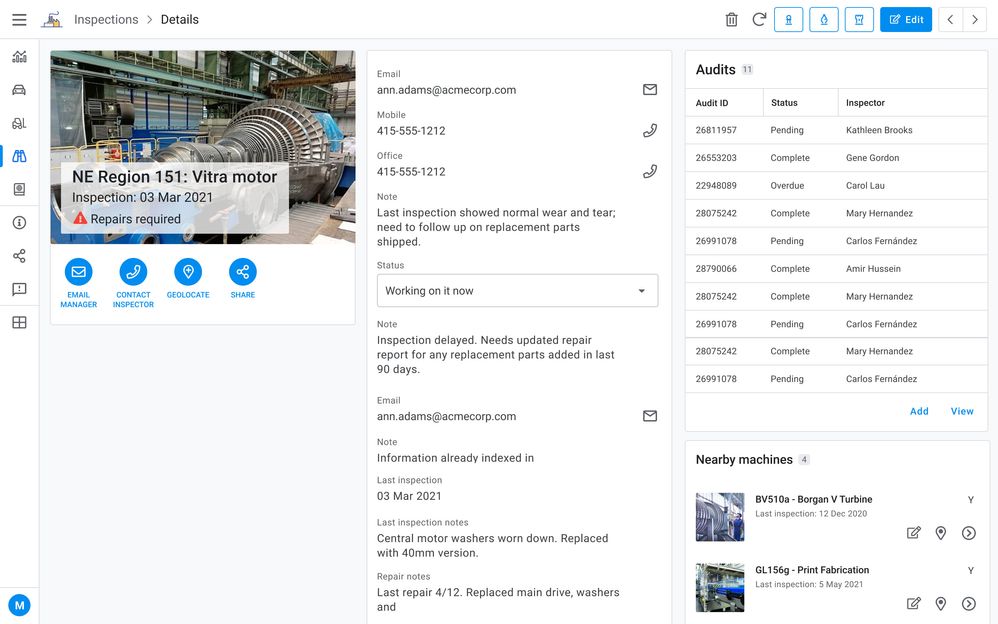
Here’s an sketch of a detail view with 1. a primary section with an image and some overlay text, a medium amount of secondary properties, and 2 inline lists:
Primary section
Consider a ‘primary’ section (name may change for clarity) as including some of the following:
- Title (often the instance name from the label column)
- Any other headers
- An image
- Actions (Prominent Display actions as currently seen in mobile)
There are many permutations of headers, images, and both combined, currently in apps. There are combination of headers and images, just headers (up to 6), or the card layout.
Right now we’re giving any and all of these prominent placements in the upper left of the content pane when multicolumn layouts are in effect.
Together a primary section of content allows you to:
- See the instance and most important details (expressed as headers)
- Take relevant actions (Prominent display actions)
- View the image (when there is one)
Properties
Next are the remaining properties (columns) of the record. These can have tremendous variance: we have customer apps with anywhere from 5 - 70 plus properties represented in their detail views.
Tradeoffs: There will be some potentially large height differences in sections, simply due to how many properties a section contains.
Grouping properties
To start with these will default to a single section, and we want to empower you to break these into more groupings, and we’d like to allow you to use the SHOW type header as one means of doing so:
Ref lists
The third section type is inline views, such as ref lists. These form other individual sections.
3. Collection views
Next we have our collection views. Starting from the top:
Top app bar: Open search

Another common pattern is a visible search field. With large lists, a persistent field with a visible label provides a quick way to find items.
The other aspect is that the filter icon is visible, and can be accessed with a single click.
Split pane patterns: collection detail views
We notice that app creators are configuring interactive dashboards, setting up a table or similar collection, and adding a detail view. This is recreating the common collection - detail pattern (aka split pane or two-panel selector).
We’d like to allow app creators to configure a collection view to accommodate a split pane, no dashboard creation required. This will facilitate working in context, and avoiding jumping from collection to detail and back to collection. Here’s a concept sketch:
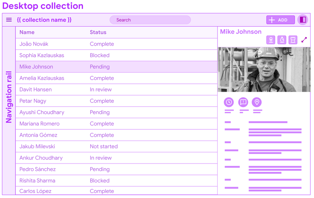
You’ll see this pattern in Gmail: users can invoke the split pane from an icon control, and a single click allows for viewing details.
I’m displaying a data table for the concept mock, but this pattern can apply to other forms of collections (cards).
In conclusion
It’s a long post, but we wanted to bundle this together to give you a heads up, and break down some of the core concepts and patterns. There’s a bunch of details we’ll dive into more in other posts.
We put out a call for desktop views and use cases earlier this year, and have gotten some excellent examples of dense data displays. We look forward to receiving more as we go forward.
Stay tuned for more specific details…There’s a lot of tuning to do, big and small.
- Labels:
-
UX
- Mark as New
- Bookmark
- Subscribe
- Mute
- Subscribe to RSS Feed
- Permalink
- Report Inappropriate Content
- Mark as New
- Bookmark
- Subscribe
- Mute
- Subscribe to RSS Feed
- Permalink
- Report Inappropriate Content
Yes, when can we try it?
I have been waiting for decent Desktop UX support for, forever.
- Mark as New
- Bookmark
- Subscribe
- Mute
- Subscribe to RSS Feed
- Permalink
- Report Inappropriate Content
- Mark as New
- Bookmark
- Subscribe
- Mute
- Subscribe to RSS Feed
- Permalink
- Report Inappropriate Content
- Mark as New
- Bookmark
- Subscribe
- Mute
- Subscribe to RSS Feed
- Permalink
- Report Inappropriate Content
- Mark as New
- Bookmark
- Subscribe
- Mute
- Subscribe to RSS Feed
- Permalink
- Report Inappropriate Content
This is a great idea. Any thoughts on when beta will be out or any further direction on this?
Thanks
- Mark as New
- Bookmark
- Subscribe
- Mute
- Subscribe to RSS Feed
- Permalink
- Report Inappropriate Content
- Mark as New
- Bookmark
- Subscribe
- Mute
- Subscribe to RSS Feed
- Permalink
- Report Inappropriate Content
That's absolutely great!! It is a must-have for our APPs
Do you have any ETA for beta?
- Mark as New
- Bookmark
- Subscribe
- Mute
- Subscribe to RSS Feed
- Permalink
- Report Inappropriate Content
- Mark as New
- Bookmark
- Subscribe
- Mute
- Subscribe to RSS Feed
- Permalink
- Report Inappropriate Content
We really need a good desktop UI overhaul with some theme options for coloration and such. Would love to get this in the preview program asap! 🙂
- Mark as New
- Bookmark
- Subscribe
- Mute
- Subscribe to RSS Feed
- Permalink
- Report Inappropriate Content
- Mark as New
- Bookmark
- Subscribe
- Mute
- Subscribe to RSS Feed
- Permalink
- Report Inappropriate Content
Overlaid actions in dashboards look awful and cramped on mobile but are basically necessary on desktop view or else people need to click the little full screen arrows. Can we please have two separate options for overlay actions or maybe scale them proportionately to a mobile phone screen?
- Mark as New
- Bookmark
- Subscribe
- Mute
- Subscribe to RSS Feed
- Permalink
- Report Inappropriate Content
- Mark as New
- Bookmark
- Subscribe
- Mute
- Subscribe to RSS Feed
- Permalink
- Report Inappropriate Content
This is an excellent feature! Looking forward to using this feature!
Are there any updates when this feature is gonna be available?
- Mark as New
- Bookmark
- Subscribe
- Mute
- Subscribe to RSS Feed
- Permalink
- Report Inappropriate Content
- Mark as New
- Bookmark
- Subscribe
- Mute
- Subscribe to RSS Feed
- Permalink
- Report Inappropriate Content
Any updates coming soon? Most of my use cases will use desktop apps and this looks great.
- Mark as New
- Bookmark
- Subscribe
- Mute
- Subscribe to RSS Feed
- Permalink
- Report Inappropriate Content
- Mark as New
- Bookmark
- Subscribe
- Mute
- Subscribe to RSS Feed
- Permalink
- Report Inappropriate Content
I feel like once this migrated over to Google, which I'm very happy about long term, everything with this came to a screeching halt. Rolling out new features in general have tapered off in the last 4-6 months I feel.
- Mark as New
- Bookmark
- Subscribe
- Mute
- Subscribe to RSS Feed
- Permalink
- Report Inappropriate Content
- Mark as New
- Bookmark
- Subscribe
- Mute
- Subscribe to RSS Feed
- Permalink
- Report Inappropriate Content
I'll get excited if/when any of it actually makes it out. Too many undelivered promises.
- Mark as New
- Bookmark
- Subscribe
- Mute
- Subscribe to RSS Feed
- Permalink
- Report Inappropriate Content
- Mark as New
- Bookmark
- Subscribe
- Mute
- Subscribe to RSS Feed
- Permalink
- Report Inappropriate Content
Not happening list
iframe
video recordings
GAS integration
new charts
enhanced input expressions
other preview features
probably more.
- Mark as New
- Bookmark
- Subscribe
- Mute
- Subscribe to RSS Feed
- Permalink
- Report Inappropriate Content
- Mark as New
- Bookmark
- Subscribe
- Mute
- Subscribe to RSS Feed
- Permalink
- Report Inappropriate Content
Six months and there is no explanation or comment about this.
Believe us AppSheet team, we don't care if the ETA is on Dec-2022, but give us a clear idea of what to expect.
At this point, we feel ignored. I would prefer a less feature rich app with more passionate developers than the other way around.
I'm not saying that AppSheet developers are not working hard on the backend, I'm saying that this is not the individual company AppSheet was once anymore, it's a subset of a company that don't care about users, just their quantity and their data
- Mark as New
- Bookmark
- Subscribe
- Mute
- Subscribe to RSS Feed
- Permalink
- Report Inappropriate Content
- Mark as New
- Bookmark
- Subscribe
- Mute
- Subscribe to RSS Feed
- Permalink
- Report Inappropriate Content
Agreed - any update would be greatly appreciated. Google, you have a passionate community, please recognize and reciprocate. As @SkrOYC mentioned, we'll wait, just don't keep us in the dark as we are out here on the front lines fielding questions from customers.
- Mark as New
- Bookmark
- Subscribe
- Mute
- Subscribe to RSS Feed
- Permalink
- Report Inappropriate Content
- Mark as New
- Bookmark
- Subscribe
- Mute
- Subscribe to RSS Feed
- Permalink
- Report Inappropriate Content
APPSHEET HAS FORGOT THIS?
- Mark as New
- Bookmark
- Subscribe
- Mute
- Subscribe to RSS Feed
- Permalink
- Report Inappropriate Content
- Mark as New
- Bookmark
- Subscribe
- Mute
- Subscribe to RSS Feed
- Permalink
- Report Inappropriate Content
Please consider, Rich Text in LongText data type display on desktop, it rather shows the codes without the display....
- Mark as New
- Bookmark
- Subscribe
- Mute
- Subscribe to RSS Feed
- Permalink
- Report Inappropriate Content
- Mark as New
- Bookmark
- Subscribe
- Mute
- Subscribe to RSS Feed
- Permalink
- Report Inappropriate Content
@pravse - are you tuned into this thread? I just read the summary from the recent Office Hours session (which I was unfortunately unable to attend) and there was a question about menu customization which I hoped would be answered with an update on these long-promised UX enhancements. Instead, the response was the tired and generic "build your own custom menus" suggestion. It seems as if this post - which got many of your most passionate and advanced users/developers really excited about major advances in the UX - has been totally abandoned or seriously deprioritized. What is up with this? As @SkrOYC said, we are patient and understand these things take time, but please don't leave us all hanging and posting into the void! An update, any update, would be much appreciated. Thanks!
- Mark as New
- Bookmark
- Subscribe
- Mute
- Subscribe to RSS Feed
- Permalink
- Report Inappropriate Content
- Mark as New
- Bookmark
- Subscribe
- Mute
- Subscribe to RSS Feed
- Permalink
- Report Inappropriate Content
Hi @Jamie , thank you for pinging me. The work isn't abandoned. It is ongoing but definitely much slower than promised and anticipated :[.
I am adding @zito (Matt Zito) to this thread. He is the Director of Product Management for AppSheet --- his team coordinates the work and the priorities. Also adding @harsh (Harsh Chevuru) who is Director of Engineering for AppSheet. His team does the dev work. Between the two of them, they should be able to share the status and anticipated timeline. I will also follow up with them offline.
- Mark as New
- Bookmark
- Subscribe
- Mute
- Subscribe to RSS Feed
- Permalink
- Report Inappropriate Content
- Mark as New
- Bookmark
- Subscribe
- Mute
- Subscribe to RSS Feed
- Permalink
- Report Inappropriate Content
Thank you very much for the reply, Praveen. Very glad to hear this is still in the works and I understand firsthand that major changes often take longer than anticipated. I'm sure this one is huge and complex. Looking forward to an update from the team and I will happily contribute to testing once you all have something ready for preview. 🙏
- Mark as New
- Bookmark
- Subscribe
- Mute
- Subscribe to RSS Feed
- Permalink
- Report Inappropriate Content
- Mark as New
- Bookmark
- Subscribe
- Mute
- Subscribe to RSS Feed
- Permalink
- Report Inappropriate Content
Seems like this is a good time to introduce myself 😎 I am Frank Weigel and I am the VP for the part of Google where AppSheet sits. I am actually newer to Google than AppSheet, I joined last October. I happen to have a fair bit of background in Citizen app dev, as I was Director of PM for Power App and Power Automate from their initial release and for the first few years of their growth. It was fun to help Citizen app building become a serious Enterprise category and I am super excited to apply all my learnings here at Google. So I can promise I'll do my darnedest to make sure AppSheet will thrive here at Google.
We are actually just expanding the UX team to make sure we have even more intuitive app building experiences and even better looking apps (including the Desktop view a per above). I am also working with the team on how we can get better at engaging with all of you, our AppSheet user community.
For now, if there are other threads where I can help to get the right folks to engage, please don't hesitate to add me to the thread!
- Mark as New
- Bookmark
- Subscribe
- Mute
- Subscribe to RSS Feed
- Permalink
- Report Inappropriate Content
- Mark as New
- Bookmark
- Subscribe
- Mute
- Subscribe to RSS Feed
- Permalink
- Report Inappropriate Content
Hi @FrankW!
I believe in you😉
- Mark as New
- Bookmark
- Subscribe
- Mute
- Subscribe to RSS Feed
- Permalink
- Report Inappropriate Content
- Mark as New
- Bookmark
- Subscribe
- Mute
- Subscribe to RSS Feed
- Permalink
- Report Inappropriate Content
Thanks for introducing yourself @FrankW and for offering yourself up as a resource. I look forward to your future engagement in this space! One of the major deciding factors when I chose to go all in with AppSheet was the talent, generosity, and passion of this community - on both sides of the fence. I think you will find a dedicated group of willing and able customers / collaborators who contribute significant value to the AppSheet platform and really only ask for a reasonably responsive channel of communication in return.
Welcome and best of luck in your role!
- Mark as New
- Bookmark
- Subscribe
- Mute
- Subscribe to RSS Feed
- Permalink
- Report Inappropriate Content
- Mark as New
- Bookmark
- Subscribe
- Mute
- Subscribe to RSS Feed
- Permalink
- Report Inappropriate Content
Thanks all for the warm welcome! PM team will also provide an update on the Desktop view; I believe the work was put on hold after the announcement above to focus on some reliability work, but it is back on deck. And yes, we should have just shared that when it happened 😎
- Mark as New
- Bookmark
- Subscribe
- Mute
- Subscribe to RSS Feed
- Permalink
- Report Inappropriate Content
- Mark as New
- Bookmark
- Subscribe
- Mute
- Subscribe to RSS Feed
- Permalink
- Report Inappropriate Content
Hi folks,
Some of you may have "met" me during the last office hours, but my name is Matthew (Matt) Zito, and I'm the product lead for AppSheet. I joined AppSheet relatively recently (about six months ago), but I spent the prior three years at Google working on Workspace with a team of PMs working on a variety of products. In a previous life, I was head of product for Squarespace's website builder, where I spent a lot of time engaging with the community, and I'm happy to have the opportunity to do that again here.
But back to the important part - the Desktop UI. The gaps around the Desktop UI are something that we've felt acutely for quite a while, and we were excited to make progress on improving that experience. Mike and the team here put together a series of designs based on the feedback here and other customer feedback, and work began last August.
As the work progressed, though, the team realized that they needed to make some architectural improvements to how the front-end code runs and is structured, along with some of the reliability work Frank alluded to above, and that consumed most of November-January. Since then, they've refocused back on the end UX work itself, and the scope remains effectively the same as what Mike outlined above.
Our current target is for a public preview at the end of Q2 - but I want to caution that we treat changes that can affect the UI of existing apps very seriously, because it can be extremely disruptive for the users of AppSheet apps. Given that, if we discover unintended interactions in testing or in limited preview, we may need to delay it further.
I'll plan to have myself or someone on the team provide an update in the next month or two - perhaps we can get a demo video or two up to at least show the progress, and we'll keep everyone apprised as to the timing.
More broadly, I'm also going to work with the team to plan out the best way to make sure we stay in contact with the community here, engaging, but also making sure we don't let long-dormant open topics get lost, and we keep people up to date as plans evolve and change.
Thanks for being such strong advocates of AppSheet, and taking the time to make the platform as a whole better.
- Mark as New
- Bookmark
- Subscribe
- Mute
- Subscribe to RSS Feed
- Permalink
- Report Inappropriate Content
- Mark as New
- Bookmark
- Subscribe
- Mute
- Subscribe to RSS Feed
- Permalink
- Report Inappropriate Content
Welcome Matt! Thanks for the comprehensive update and explanation. I'm glad to hear the scope and substance of these enhancements has not significantly changed! I fully understand the need for diligence and caution for such a major feature release and appreciate that your timelines will ultimately have to reflect the realities that emerge during your development and testing. Looking forward to hearing (and seeing) more as this progresses!
- Mark as New
- Bookmark
- Subscribe
- Mute
- Subscribe to RSS Feed
- Permalink
- Report Inappropriate Content
- Mark as New
- Bookmark
- Subscribe
- Mute
- Subscribe to RSS Feed
- Permalink
- Report Inappropriate Content
I am looking forward waiting these new feature. When will it be released?
- Mark as New
- Bookmark
- Subscribe
- Mute
- Subscribe to RSS Feed
- Permalink
- Report Inappropriate Content
- Mark as New
- Bookmark
- Subscribe
- Mute
- Subscribe to RSS Feed
- Permalink
- Report Inappropriate Content
We're shooting for a public preview in the June timeframe, with a warning that the date may slip as we get into testing. We will keep everyone posted here, I'm planning to have myself or someone on the team check back in with some content and an update in ~1 month or so.
- Mark as New
- Bookmark
- Subscribe
- Mute
- Subscribe to RSS Feed
- Permalink
- Report Inappropriate Content
- Mark as New
- Bookmark
- Subscribe
- Mute
- Subscribe to RSS Feed
- Permalink
- Report Inappropriate Content
Hi Team Dev please update more!
- Mark as New
- Bookmark
- Subscribe
- Mute
- Subscribe to RSS Feed
- Permalink
- Report Inappropriate Content
- Mark as New
- Bookmark
- Subscribe
- Mute
- Subscribe to RSS Feed
- Permalink
- Report Inappropriate Content
Hello everyone,
A quick update on what’s happening.
As Matt said in a previous post above, in late 2021 the engineering team had to pivot work on some foundational infrastructure. While we will be continuing to invest in infrastructure for the foreseeable future, we made enough progress that we were able to shift much of the relevant team members back to the new desktop experience and move that forward.
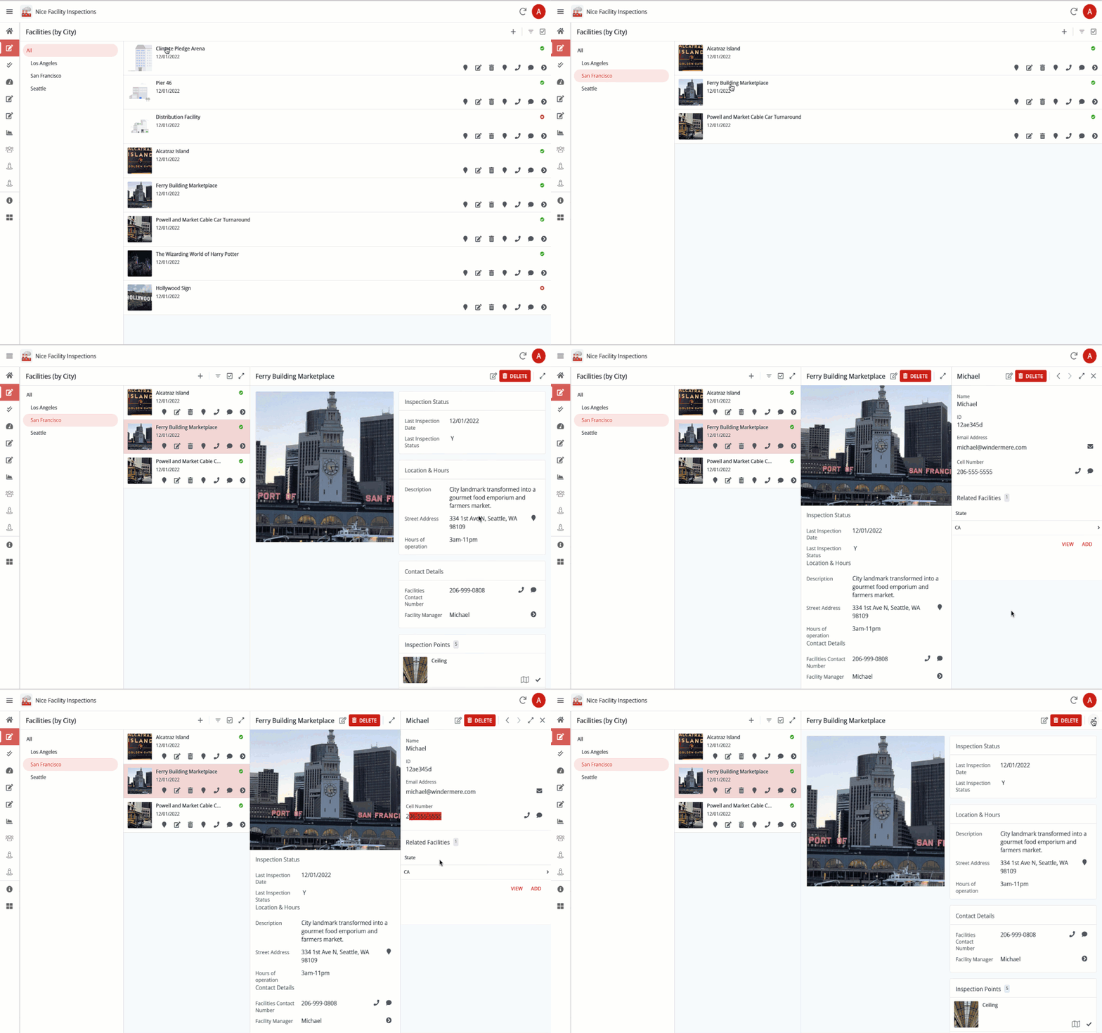
There’s more work needed, but here’s a gif of what it looks like right now:
We’re working with some of our design partners and collecting their feedback, which we’ll be addressing starting next week.
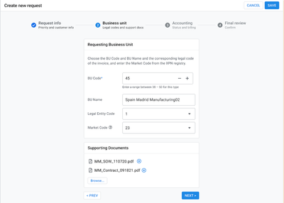
Additionally, we’re working on improving how users can create new records
and update existing ones with an in-place editing of column values:
Fig: Starting from a full screen Detail View, the user edits a record.
Fig: Starting from a split configuration, the user edits a record .
In addition to enabling a navigation side bar more appropriate on desktop, these improvements should address some of the feedback we got here, here and here (around a wider and more organized Detail View). They are also related to some of the needs expressed in this post as well (Form available in context).
We’re still tracking for a public preview at the end of June/beginning of July. We’ll give you an update in about a month as we get closer to the Public Preview and can provide a more specific date.
Thank you for your patience all!
The AppSheet Team
- Mark as New
- Bookmark
- Subscribe
- Mute
- Subscribe to RSS Feed
- Permalink
- Report Inappropriate Content
- Mark as New
- Bookmark
- Subscribe
- Mute
- Subscribe to RSS Feed
- Permalink
- Report Inappropriate Content
I'd say that it looks a litle bit different from what we expected from the OP
- Mark as New
- Bookmark
- Subscribe
- Mute
- Subscribe to RSS Feed
- Permalink
- Report Inappropriate Content
- Mark as New
- Bookmark
- Subscribe
- Mute
- Subscribe to RSS Feed
- Permalink
- Report Inappropriate Content
Some screenshots did not go through in my original post. I updated it to show the missing ones.
- Mark as New
- Bookmark
- Subscribe
- Mute
- Subscribe to RSS Feed
- Permalink
- Report Inappropriate Content
- Mark as New
- Bookmark
- Subscribe
- Mute
- Subscribe to RSS Feed
- Permalink
- Report Inappropriate Content
In a good way
- Mark as New
- Bookmark
- Subscribe
- Mute
- Subscribe to RSS Feed
- Permalink
- Report Inappropriate Content
- Mark as New
- Bookmark
- Subscribe
- Mute
- Subscribe to RSS Feed
- Permalink
- Report Inappropriate Content
I can say that this looks great but its really hard to get excited about without clear timelines.
- Mark as New
- Bookmark
- Subscribe
- Mute
- Subscribe to RSS Feed
- Permalink
- Report Inappropriate Content
- Mark as New
- Bookmark
- Subscribe
- Mute
- Subscribe to RSS Feed
- Permalink
- Report Inappropriate Content
"Looks for update and public preview" 😬
- Mark as New
- Bookmark
- Subscribe
- Mute
- Subscribe to RSS Feed
- Permalink
- Report Inappropriate Content
- Mark as New
- Bookmark
- Subscribe
- Mute
- Subscribe to RSS Feed
- Permalink
- Report Inappropriate Content
Hey @marquis_robert - @Arthur_Rallu will be able to give an update next week with more specifics, but we've been making progress towards a public preview, though the timeframe for that preview has slipped by a few weeks, closer to the end of July. Some of that timing is dependent on internal Google processes that we have less control over, but we're doing our best to get to public preview ASAP.
- Mark as New
- Bookmark
- Subscribe
- Mute
- Subscribe to RSS Feed
- Permalink
- Report Inappropriate Content
- Mark as New
- Bookmark
- Subscribe
- Mute
- Subscribe to RSS Feed
- Permalink
- Report Inappropriate Content
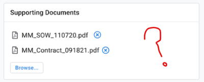
That seems to be great, we are waiting since a long time for the possibility of having multiple files uploaded into the same field.
- Mark as New
- Bookmark
- Subscribe
- Mute
- Subscribe to RSS Feed
- Permalink
- Report Inappropriate Content
- Mark as New
- Bookmark
- Subscribe
- Mute
- Subscribe to RSS Feed
- Permalink
- Report Inappropriate Content
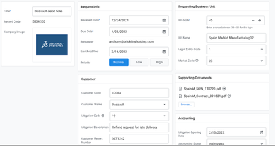
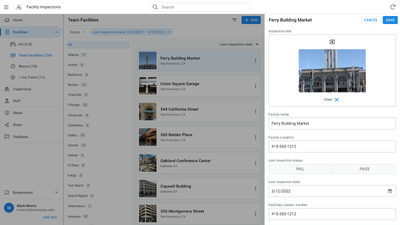
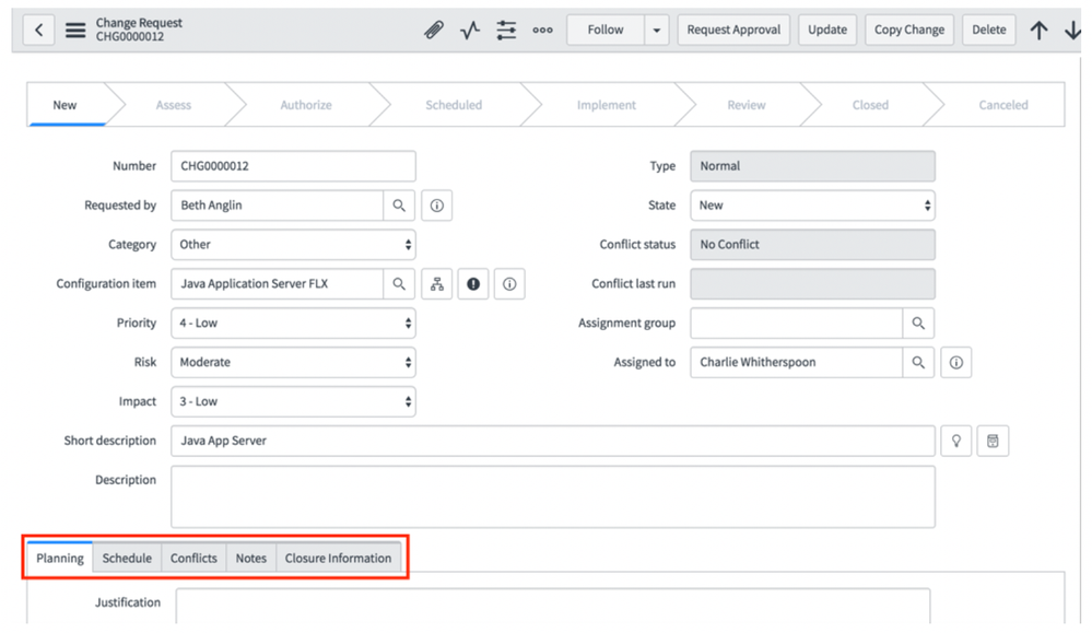
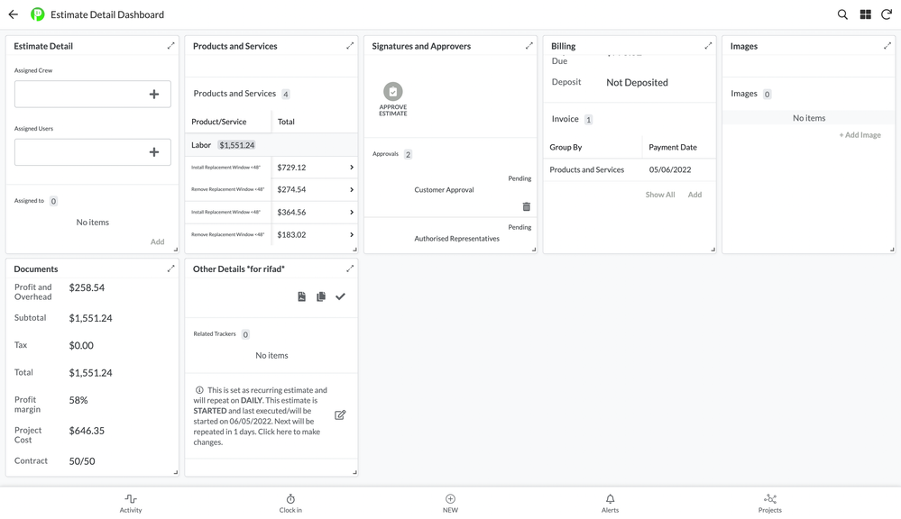
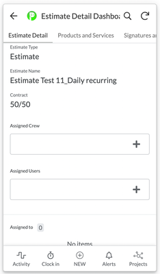
Here is a suggestion for tabs in detail views. This example is from ServiceNow to give you an idea. According to the second image, the tabs in the appsheet look cluttered in desktop view. However, the mobile view is organized, as you can see in the third image.
- Mark as New
- Bookmark
- Subscribe
- Mute
- Subscribe to RSS Feed
- Permalink
- Report Inappropriate Content
- Mark as New
- Bookmark
- Subscribe
- Mute
- Subscribe to RSS Feed
- Permalink
- Report Inappropriate Content
Hello everyone,
We got a lot of very useful feedback from our design partners and the team has been working towards addressing some of that feedback and fixing bugs. We still have more work but we're now reaching a point where we feel we can share this with the broader community. We're aiming to make these changes available in a Public Preview the week of July 25th (barring some internal Google processes that we have less control over, as Matt mentioned).
Due to our deployment process, some users will have access to that new desktop experience sooner than others. So if you can't test it immediately after we make our announcement, please just be patient and allow for up to a week.
We'll be looking forward to your feedback!
Thank you
- Mark as New
- Bookmark
- Subscribe
- Mute
- Subscribe to RSS Feed
- Permalink
- Report Inappropriate Content
- Mark as New
- Bookmark
- Subscribe
- Mute
- Subscribe to RSS Feed
- Permalink
- Report Inappropriate Content
Good news for a new week. Thanks, Google team.
- Mark as New
- Bookmark
- Subscribe
- Mute
- Subscribe to RSS Feed
- Permalink
- Report Inappropriate Content
- Mark as New
- Bookmark
- Subscribe
- Mute
- Subscribe to RSS Feed
- Permalink
- Report Inappropriate Content
We can't wait to see this new feature.
- Mark as New
- Bookmark
- Subscribe
- Mute
- Subscribe to RSS Feed
- Permalink
- Report Inappropriate Content
- Mark as New
- Bookmark
- Subscribe
- Mute
- Subscribe to RSS Feed
- Permalink
- Report Inappropriate Content
Curious what the guts of this look like. This alludes to more than just UI?
-
Account
3 -
Announcements
30 -
App Management
8 -
Automation
30 -
Data
31 -
Errors
17 -
Expressions
21 -
Integrations
24 -
Intelligence
5 -
Other
15 -
Resources
15 -
Security
5 -
Templates
13 -
Users
7 -
UX
34

 Twitter