- AppSheet
- Release Notes & Announcements
- Announcements
- Re: In Preview: New UI design for desktop users
- Subscribe to RSS Feed
- Mark Topic as New
- Mark Topic as Read
- Float this Topic for Current User
- Bookmark
- Subscribe
- Mute
- Printer Friendly Page
- Mark as New
- Bookmark
- Subscribe
- Mute
- Subscribe to RSS Feed
- Permalink
- Report Inappropriate Content
- Mark as New
- Bookmark
- Subscribe
- Mute
- Subscribe to RSS Feed
- Permalink
- Report Inappropriate Content
Hey everyone,
We’re excited to announce we are now previewing our new visual design for applications that are accessed on desktop browsers.
Currently, your AppSheet applications tend to follow mobile design patterns even when your users have large screens and these patterns can be confusing to desktop users. The new design lets these desktop users navigate their apps more easily and access information in context, and provides an efficient way to create and update records without losing context. App creators can also present more information by leveraging the larger screens but still keep it organized.
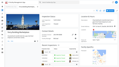
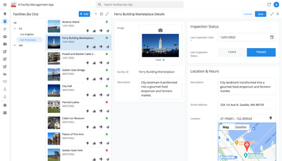
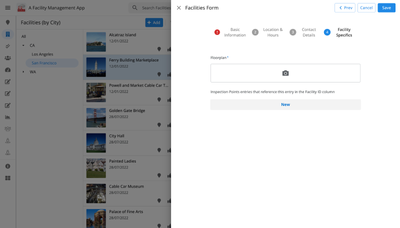
Here are some before and after images that better illustrate the design changes.
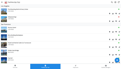
Legacy Design - Screenshot #1: Sifting through a collection of records grouped by City and State after selecting a State (Deck View)
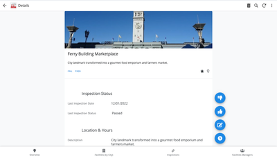
Legacy Design - Screenshot #2: Looking at a specific record after selecting that record in the screen above (Detail View)
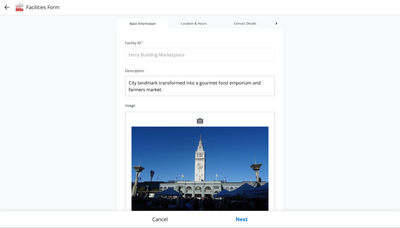
Legacy Design - Screenshot #3: Editing an existing record/Creating a new record (Form View)
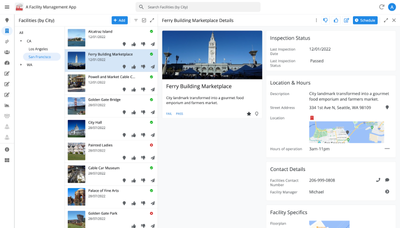
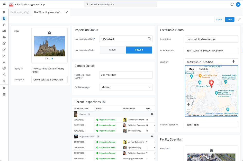
New Design - Screenshot #1: Seeing your data in context (Deck View + Detail View)
New Design - Screenshot #2: Focusing on a specific record (Detail View)
New Design - Screenshot #3: Editing in place an existing record
New Design - Screenshot #4: Creating a new record (Form View)
What’s next? Well, this is still a work in progress. We’ve been gathering feedback from a number of design partners, including some of you in the AppSheet Community, and we know there is more to do before it can properly support all of your applications. At this stage, we feel that it would be good to let you play with the new design and to give you an opportunity to share your feedback - what you like, what doesn't work, what you think could use some improvements. This represents a significant change and your feedback will help us guide our next steps.
As this feature is in Preview, you may see visual changes in your apps as we work to improve the new desktop design in real-time. We don't recommend using the new desktop design in your production apps.
Thank you
The AppSheet Team
FAQ
How do I get access to this new desktop design?
We are currently slowly ramping this new experience over the next week or so, so you may not see this option in the editor immediately.
For each application, you can opt-in to use the new desktop design. You can toggle between the new and legacy desktop modes, as desired.
Follow these steps to enable the new design in your app:
- Open the app in the app editor
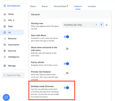
- Navigate to the UX > Options pane
- Enable the Desktop mode (Preview) option - see screenshot below
- Save the app in the Editor
All users of this application that access the app on a desktop browser will then see the new design after their next sync.
How do I configure the design of my app? I don’t see any new settings in the Editor!
There are minimal changes to the Editor for now. Mostly, the same settings are leveraged to specify the desktop and mobile designs. Let me give you an example.
Your apps have “primary views” and “menu views”. With the new desktop design, all of your views will be accessible from a side menu. That menu will list first the “primary views” and then the “secondary views”. In the future, we will adjust the configuration settings and in particular the language so that it makes sense for both mobile and desktop apps. For example, position values of "left most" and "right most" don't make sense for the new desktop design with its vertical menu structure.
We’ll be giving app creators more controls over some features that are currently set by default.
Is there some documentation or more information on what changed?
See Optimize the user experience using the new desktop design (Preview). We’ll update it over time.
Is there a list of functionalities that are known to not work with the new design?
Yes.
First, here is a list [as of July 31st] of (high-level) issues and requests that were reported to us and that still need fixes or assessments. Some of them are independent of the desktop mode, but we're still listing them here since people may want to know about them and so they don't need to report them unless it was reported for different app configurations :
| General theme | Issues |
| Form View |
|
| Navigation expressions: LINKTOROW(), LINKTOFORM(), etc |
|
| Format rules |
|
| Detail View UI |
- In some configurations, showing the wrong display names in a Detail tab - Edit-in-place in Dashboard view - Sync gets the app user out of Editing mode in a Detail View |
| General UI |
- Improvement requests on the subnav bar (e.g. larger text button, better responsiveness w.r.t. title, actions, text) - Clicking in grey area around onboarding view should not navigate the app in the background - Filtering on Dashboard - Tooltip for icon action buttons - Chart Views do not behave like other views |
| Localization of strings | Some strings are missing |
| CSV import/export |
|
| Other app functionalities |
- Missing Share, Feedback buttons - App Gallery behaving differently - Support of Amazon Cognito (missing account icon) - OCR not working on Desktop |
| Functionalities for app creators | “Preview as” is not available for the desktop emulator |
Second, here is a list of some issues and feature requests that we know we are not going to tackle, at least for now.
| Supporting multiple navigation actions in a grouped action |
This is not something that we support. The team very intentionally did not want to support this. App creators should not rely on it and it won’t work in desktop mode. |
| Multiple requests to improve the Table View UI |
We got requests to improve the Table View in general. The requests are valid, but that is out of scope for desktop mode. Changes we would be making would also impact the legacy UI and mobile apps. |
| LINKTOPARENTVIEW() not supported | For desktop users, there are better options to navigate back: the browser’s back button and the breadcrumbs. |
| Font size changes (via app settings) lead to layout issues | Generally, we recommend using the browser’s zoom which does a better job at resizing the app. |
| Background image |
See also Limitations and known issues.
How do I provide feedback?
Please share your feedback in this thread below this message!
- Mark as New
- Bookmark
- Subscribe
- Mute
- Subscribe to RSS Feed
- Permalink
- Report Inappropriate Content
- Mark as New
- Bookmark
- Subscribe
- Mute
- Subscribe to RSS Feed
- Permalink
- Report Inappropriate Content
In my experience, the CONTEXT() expression kinda works, on an unpredictable way from what we are used to because there is now a "Stack" view and CONTEXT() tries to return the right-most view and fails sometimes
- Mark as New
- Bookmark
- Subscribe
- Mute
- Subscribe to RSS Feed
- Permalink
- Report Inappropriate Content
- Mark as New
- Bookmark
- Subscribe
- Mute
- Subscribe to RSS Feed
- Permalink
- Report Inappropriate Content
Thanks for reporting this. I know this happens in some places but not others. Are you able to show us a screenshot of where in the editor this expression is being set, as well as where in the app it's showing up incorrectly?
- Mark as New
- Bookmark
- Subscribe
- Mute
- Subscribe to RSS Feed
- Permalink
- Report Inappropriate Content
- Mark as New
- Bookmark
- Subscribe
- Mute
- Subscribe to RSS Feed
- Permalink
- Report Inappropriate Content
It's kinda easy to troubleshoot, I already provided feedback about it before:
- If Table view is full screen -or expanded view as you called it:
- Context(ViewType) returns "table"
- If you open a record and the new detail view is opened at the right side (it seems this is called "split view?"):
- Context(ViewType) returns "table"
- If you expand the detail view to full screen:
- Context(ViewType) returns "detail"
- If you click on the tab where the table is:
- Context(ViewType) returns "detail"
- If you click on the tab where the detail view is and go back to split:
- Context(ViewType) returns "detail"
So 2 and 5 are actually the same UX but the expression returns different results depending on "where you came".
You can put CONTEXT("VIEW") on the Display Name of the List View (table/deck/whatever) to check the returned value
- Mark as New
- Bookmark
- Subscribe
- Mute
- Subscribe to RSS Feed
- Permalink
- Report Inappropriate Content
- Mark as New
- Bookmark
- Subscribe
- Mute
- Subscribe to RSS Feed
- Permalink
- Report Inappropriate Content
Got it, thank you!
- Mark as New
- Bookmark
- Subscribe
- Mute
- Subscribe to RSS Feed
- Permalink
- Report Inappropriate Content
- Mark as New
- Bookmark
- Subscribe
- Mute
- Subscribe to RSS Feed
- Permalink
- Report Inappropriate Content
Could this also be the reason why CSV import/export doesn't work with Desktop View? Because AppSheet can't be sure which Context the app is currently with?
I noticed that for (not a row level action) behaviors, it will not work if split view is present, so users will have to close the detail views from the right side.
- Mark as New
- Bookmark
- Subscribe
- Mute
- Subscribe to RSS Feed
- Permalink
- Report Inappropriate Content
- Mark as New
- Bookmark
- Subscribe
- Mute
- Subscribe to RSS Feed
- Permalink
- Report Inappropriate Content
Wow @SkrOYC , These repro steps are amazing! Thank you!
It seems that it depends what AppSheet thinks is the active view.
For example, in Item 2, clicking on the row from table view only shows the detail view in split screen, but since the click was made from the table, then the active view is still the table.
But in your Item 5, with the tab expanded, So when you clicked on the Detail view tab, then it is already the active tab. Quite confusing because as you said, they are essentially the same, only difference being that the tabs are expanded.
It's literally thinking that the Detail view is now "on the top" of the layer. As if the table view is not there anymore (imagine that on Mobile View) you don't see this view anymore. That's why even if you click the tab of the table, Appsheet still thinks that Detail View is still the top view that's why it's returning still Detail context.
Would be interesting to see how the team will deal with this. 🙂
- Mark as New
- Bookmark
- Subscribe
- Mute
- Subscribe to RSS Feed
- Permalink
- Report Inappropriate Content
- Mark as New
- Bookmark
- Subscribe
- Mute
- Subscribe to RSS Feed
- Permalink
- Report Inappropriate Content
I wish Appsheet can update new feature for enumlist as belows, so that we only click to add value to list, an we can see all value after select in form
- Mark as New
- Bookmark
- Subscribe
- Mute
- Subscribe to RSS Feed
- Permalink
- Report Inappropriate Content
- Mark as New
- Bookmark
- Subscribe
- Mute
- Subscribe to RSS Feed
- Permalink
- Report Inappropriate Content
I've been using the feature for a week now. Although there are some small fixes needed here and there, this is probably the best rollout I've ever seen from Appsheet. I love this UI, thank you!
- Mark as New
- Bookmark
- Subscribe
- Mute
- Subscribe to RSS Feed
- Permalink
- Report Inappropriate Content
- Mark as New
- Bookmark
- Subscribe
- Mute
- Subscribe to RSS Feed
- Permalink
- Report Inappropriate Content
Looking good for my use....
- Mark as New
- Bookmark
- Subscribe
- Mute
- Subscribe to RSS Feed
- Permalink
- Report Inappropriate Content
- Mark as New
- Bookmark
- Subscribe
- Mute
- Subscribe to RSS Feed
- Permalink
- Report Inappropriate Content
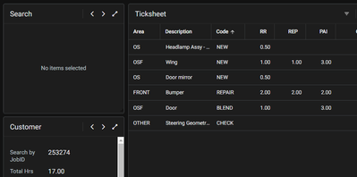
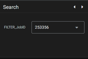
Found an issue, the dropdown is missing from this dash view
It says 'No Items Selected' and it should be as the below
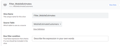
It is fed via a Slice.
Any ideas?
- Mark as New
- Bookmark
- Subscribe
- Mute
- Subscribe to RSS Feed
- Permalink
- Report Inappropriate Content
- Mark as New
- Bookmark
- Subscribe
- Mute
- Subscribe to RSS Feed
- Permalink
- Report Inappropriate Content
Make sure your slice just returns 1 row
- Mark as New
- Bookmark
- Subscribe
- Mute
- Subscribe to RSS Feed
- Permalink
- Report Inappropriate Content
- Mark as New
- Bookmark
- Subscribe
- Mute
- Subscribe to RSS Feed
- Permalink
- Report Inappropriate Content
- Mark as New
- Bookmark
- Subscribe
- Mute
- Subscribe to RSS Feed
- Permalink
- Report Inappropriate Content
- Mark as New
- Bookmark
- Subscribe
- Mute
- Subscribe to RSS Feed
- Permalink
- Report Inappropriate Content
Where did you see the setup for that Dashboard? It was your idea?
In general, when we use a detail view with quickedits in order to change slices used on a dashboard view we return just one row for that purpose, similar to a CurrentUser slice of a Users table.
Since I don't know your schema I can't add more comments for your setup
- Mark as New
- Bookmark
- Subscribe
- Mute
- Subscribe to RSS Feed
- Permalink
- Report Inappropriate Content
- Mark as New
- Bookmark
- Subscribe
- Mute
- Subscribe to RSS Feed
- Permalink
- Report Inappropriate Content
Me too. Please, how you fixed?
- Mark as New
- Bookmark
- Subscribe
- Mute
- Subscribe to RSS Feed
- Permalink
- Report Inappropriate Content
- Mark as New
- Bookmark
- Subscribe
- Mute
- Subscribe to RSS Feed
- Permalink
- Report Inappropriate Content
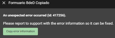
Good morning, I realized that the problem I am having is due to the Desktop mode (Preview), I have 1 button that is responsible for copying a row and then modifying it, but when I am in Desktop mode (Preview) and then I try to modify any of the values of my new form, it tells me the following error:
Error id: 417256
Stack: TypeError: n.recomputeInfluencedAttributes is not a function
at h (https://www.appsheet.com/assets/7c86d27c3beea157360a6bff5a32f0444852415dfd174bf33d3c2e879193eeb3:1:2...)
at https://www.appsheet.com/assets/7c86d27c3beea157360a6bff5a32f0444852415dfd174bf33d3c2e879193eeb3:1:2...
at Array.forEach (<anonymous>)
at g (https://www.appsheet.com/assets/7c86d27c3beea157360a6bff5a32f0444852415dfd174bf33d3c2e879193eeb3:1:2...)
at h (https://www.appsheet.com/assets/7c86d27c3beea157360a6bff5a32f0444852415dfd174bf33d3c2e879193eeb3:1:2...)
at e.value (https://www.appsheet.com/assets/7c86d27c3beea157360a6bff5a32f0444852415dfd174bf33d3c2e879193eeb3:1:2...)
at https://www.appsheet.com/assets/7c86d27c3beea157360a6bff5a32f0444852415dfd174bf33d3c2e879193eeb3:1:3...
at o (https://www.appsheet.com/assets/7c86d27c3beea157360a6bff5a32f0444852415dfd174bf33d3c2e879193eeb3:1:3...)
at Object.onUpdate (https://www.appsheet.com/assets/7c86d27c3beea157360a6bff5a32f0444852415dfd174bf33d3c2e879193eeb3:1:3...)
at e.value (https://www.appsheet.com/assets/7c86d27c3beea157360a6bff5a32f0444852415dfd174bf33d3c2e879193eeb3:1:3...)
at n.value (https://www.appsheet.com/assets/7c86d27c3beea157360a6bff5a32f0444852415dfd174bf33d3c2e879193eeb3:1:2...)
at r.onValueChange (https://www.appsheet.com/assets/7c86d27c3beea157360a6bff5a32f0444852415dfd174bf33d3c2e879193eeb3:1:1...)
at n.value (https://www.appsheet.com/assets/7c86d27c3beea157360a6bff5a32f0444852415dfd174bf33d3c2e879193eeb3:1:2...)
at https://www.appsheet.com/assets/7c86d27c3beea157360a6bff5a32f0444852415dfd174bf33d3c2e879193eeb3:1:1...
at ls (https://www.appsheet.com/assets/7c86d27c3beea157360a6bff5a32f0444852415dfd174bf33d3c2e879193eeb3:1:9...)
at Tl (https://www.appsheet.com/assets/7c86d27c3beea157360a6bff5a32f0444852415dfd174bf33d3c2e879193eeb3:1:9...)
- Mark as New
- Bookmark
- Subscribe
- Mute
- Subscribe to RSS Feed
- Permalink
- Report Inappropriate Content
- Mark as New
- Bookmark
- Subscribe
- Mute
- Subscribe to RSS Feed
- Permalink
- Report Inappropriate Content
When you say, copy a row and modifying it, are you referring to the action copy this row and edit a copy? Or is it a grouped action where open a form to edit this row is the last step?
Appsheet seems to be having issues with form-reopening.
- Mark as New
- Bookmark
- Subscribe
- Mute
- Subscribe to RSS Feed
- Permalink
- Report Inappropriate Content
- Mark as New
- Bookmark
- Subscribe
- Mute
- Subscribe to RSS Feed
- Permalink
- Report Inappropriate Content
Yes, copy this row and edit a copy
- Mark as New
- Bookmark
- Subscribe
- Mute
- Subscribe to RSS Feed
- Permalink
- Report Inappropriate Content
- Mark as New
- Bookmark
- Subscribe
- Mute
- Subscribe to RSS Feed
- Permalink
- Report Inappropriate Content
I got the same error last week on an app that has been in production for a long time. I reported it to support and they fixed it.
- Mark as New
- Bookmark
- Subscribe
- Mute
- Subscribe to RSS Feed
- Permalink
- Report Inappropriate Content
- Mark as New
- Bookmark
- Subscribe
- Mute
- Subscribe to RSS Feed
- Permalink
- Report Inappropriate Content
Hi @Arthur_Rallu / @Summer1
Reporting an issue with Desktop Mode.
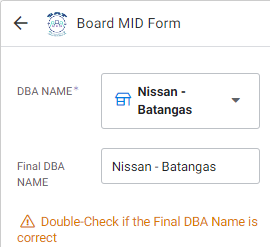
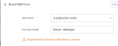
I have a button that used LINKTOFORM() which assigns a value to an Enum Type Ref column.
Mobile View
Works properly displaying the Label Column in the dropdown:
Desktop View
Value assignment works, but it's not showing the label. It's showing the Key.
I'm almost sure this wasn't happening last week.
- Mark as New
- Bookmark
- Subscribe
- Mute
- Subscribe to RSS Feed
- Permalink
- Report Inappropriate Content
- Mark as New
- Bookmark
- Subscribe
- Mute
- Subscribe to RSS Feed
- Permalink
- Report Inappropriate Content
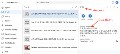
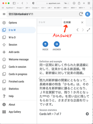
Hi! I'm sure this will be an important option for many but, in my case, it's very important that it be an option and not automatic. My app is a flashcard app. That means it's important for the user NOT to be able to see the answer at first. As you can see in the image I've appended the answer and the question are shown together, rendering the app useless.
Again, if this is just an option, no problem -- I'll just not use it. Otherwise, I'll need an option to allow me to to avoid this problem.
By the way, I tried narrowing the size of the window to see if I could get back to a more smartphone-like appearance but it didn't work -- the answer was still shown:
Another issue is that the interface looks substantially different. I'd like users to see something that looks familiar even when they use the web interface. So, I'll be opting out, if possible.
By the way, smartphone browsers often give one the option of viewing as a computer browser. I think a "view as smartphone device" option (either for the user or for the app builder) will be necessary. You write "We’re excited to announce we are now previewing our new visual design for applications that are accessed on desktop browsers" and we use an option to test it. However, could you confirm that the final application will be an option and not apply universally to everyone using an app on a computer browser?
- Mark as New
- Bookmark
- Subscribe
- Mute
- Subscribe to RSS Feed
- Permalink
- Report Inappropriate Content
- Mark as New
- Bookmark
- Subscribe
- Mute
- Subscribe to RSS Feed
- Permalink
- Report Inappropriate Content
@Kirk_Masden wrote:As you can see in the image I've appended the answer and the question are shown together, rendering the app useless.
I found that the "display name" of the detail view is now the label for that row
- Mark as New
- Bookmark
- Subscribe
- Mute
- Subscribe to RSS Feed
- Permalink
- Report Inappropriate Content
- Mark as New
- Bookmark
- Subscribe
- Mute
- Subscribe to RSS Feed
- Permalink
- Report Inappropriate Content
Right. If I understand you correctly, the "display name" is not what is showing in my example; it's the actual answer (content of the column). That's the problem.
- Mark as New
- Bookmark
- Subscribe
- Mute
- Subscribe to RSS Feed
- Permalink
- Report Inappropriate Content
- Mark as New
- Bookmark
- Subscribe
- Mute
- Subscribe to RSS Feed
- Permalink
- Report Inappropriate Content
I've reported this sometime ago in this thread. The split view screen does not show the Display Name. It shows either the key or the label column.
- Mark as New
- Bookmark
- Subscribe
- Mute
- Subscribe to RSS Feed
- Permalink
- Report Inappropriate Content
- Mark as New
- Bookmark
- Subscribe
- Mute
- Subscribe to RSS Feed
- Permalink
- Report Inappropriate Content
Perhaps this bit of information might allow me to tweak my app to work in this format too. I think, though, that I'll probably prefer to keep it as it is -- more or less the same appearance on a phone and a computer screen.
- Mark as New
- Bookmark
- Subscribe
- Mute
- Subscribe to RSS Feed
- Permalink
- Report Inappropriate Content
- Mark as New
- Bookmark
- Subscribe
- Mute
- Subscribe to RSS Feed
- Permalink
- Report Inappropriate Content
Thanks all for the feedback on this. This has been brought up to us in different cases and we'll see what we can do there.
- Mark as New
- Bookmark
- Subscribe
- Mute
- Subscribe to RSS Feed
- Permalink
- Report Inappropriate Content
- Mark as New
- Bookmark
- Subscribe
- Mute
- Subscribe to RSS Feed
- Permalink
- Report Inappropriate Content
Thanks @Arthur_Rallu ! Has a decision been made yet about whether or not this will remain an option? If it's an option, then it can only be a plus. But, if it's not optional, I'm a bit worried. If nothing else, it will complicate the app building process because we'll have to think of the UX on phones and the UX on computers simultaneously.
- Mark as New
- Bookmark
- Subscribe
- Mute
- Subscribe to RSS Feed
- Permalink
- Report Inappropriate Content
- Mark as New
- Bookmark
- Subscribe
- Mute
- Subscribe to RSS Feed
- Permalink
- Report Inappropriate Content
I think the best way to make apps for desktop, is to make app first for phone, and then make a copy of that app for Desktop use, and modify it. You can then optimize user experience in all areas of the app, while having the same underlying data. In my experience desktop users have more rights to edit and delete data, and are in need of more complex solutions when it comes to presentation.
- Mark as New
- Bookmark
- Subscribe
- Mute
- Subscribe to RSS Feed
- Permalink
- Report Inappropriate Content
- Mark as New
- Bookmark
- Subscribe
- Mute
- Subscribe to RSS Feed
- Permalink
- Report Inappropriate Content
Hi
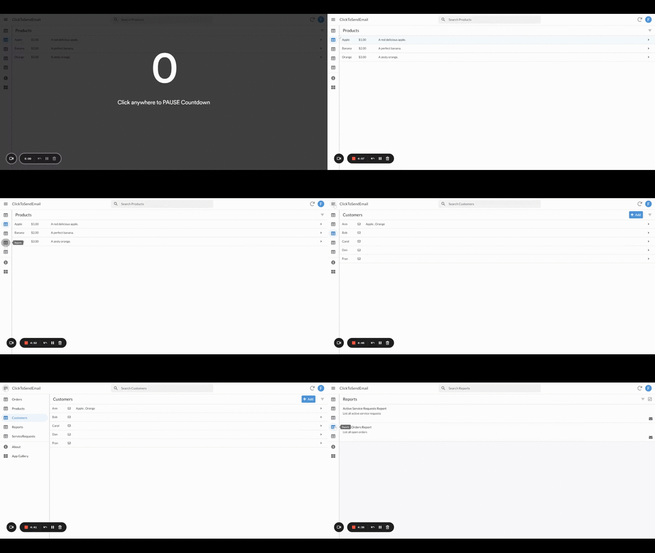
congratulation on this big improvement! I love it even though is it still far from perfect. I tried very quickly and I used the ClickSendEmail App, available here for those that want to test this new feature in the same way.
My first impression was that the APP view was confusing since the menu was hidden (collapsed). I don't know if this was just my case or if it is planned to work in this way but, for a first-time user, I wouldn't want my Apps to show in this way. I would rather prefer to have a collapsable option available and to make the full menu (uncollapsed) as the default option.
- Mark as New
- Bookmark
- Subscribe
- Mute
- Subscribe to RSS Feed
- Permalink
- Report Inappropriate Content
- Mark as New
- Bookmark
- Subscribe
- Mute
- Subscribe to RSS Feed
- Permalink
- Report Inappropriate Content
Sorry, just to make my point clear.
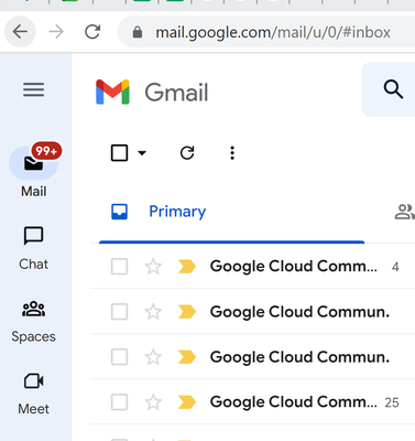
I am not a big fan of the sandwich menu of Gmail but having the name of the tables available makes a lot of difference in the user experience. In Appsheet the length of the name of each column may vary a lot, though, and therefore I think that the App owner should have some control over how to show or hide the columns name in the default view to his users.
- Mark as New
- Bookmark
- Subscribe
- Mute
- Subscribe to RSS Feed
- Permalink
- Report Inappropriate Content
- Mark as New
- Bookmark
- Subscribe
- Mute
- Subscribe to RSS Feed
- Permalink
- Report Inappropriate Content
Although that Material You/3 design was presented around octobre 2021 and I think we will need to wait a lot before we get something like that on both, mobile and desktop mode.
But the idea is clear anyway.
I think that the desition was to provide tooltips when you hover over each menu entry
- Mark as New
- Bookmark
- Subscribe
- Mute
- Subscribe to RSS Feed
- Permalink
- Report Inappropriate Content
- Mark as New
- Bookmark
- Subscribe
- Mute
- Subscribe to RSS Feed
- Permalink
- Report Inappropriate Content
Thanks for the feedback Franc.
- Mark as New
- Bookmark
- Subscribe
- Mute
- Subscribe to RSS Feed
- Permalink
- Report Inappropriate Content
- Mark as New
- Bookmark
- Subscribe
- Mute
- Subscribe to RSS Feed
- Permalink
- Report Inappropriate Content
@Arthur_Rallu Hi Arthur - I'm not sure if this is just me, but I'm experiencing the following:
In desktop preview, I have a dashboard with a Detail view. The fields are not set to automatic in data > columns > table. I specificlaly have the Input Mode as Buttons.
They correctly display as quick edit buttons on the old desktop view, however, when I turn the preview on, all fields are set to drop down.
Thanks!
Mb
- Mark as New
- Bookmark
- Subscribe
- Mute
- Subscribe to RSS Feed
- Permalink
- Report Inappropriate Content
- Mark as New
- Bookmark
- Subscribe
- Mute
- Subscribe to RSS Feed
- Permalink
- Report Inappropriate Content
Hi @CorpIT can you please share a screenshot of what you were expecting and what you are getting instead? Thanks so much!
- Mark as New
- Bookmark
- Subscribe
- Mute
- Subscribe to RSS Feed
- Permalink
- Report Inappropriate Content
- Mark as New
- Bookmark
- Subscribe
- Mute
- Subscribe to RSS Feed
- Permalink
- Report Inappropriate Content
How I thought the "New UI design for desktop users" was going to be...
It's a nice update but I hope one day there will be a wide detail/form view 😄
- Mark as New
- Bookmark
- Subscribe
- Mute
- Subscribe to RSS Feed
- Permalink
- Report Inappropriate Content
- Mark as New
- Bookmark
- Subscribe
- Mute
- Subscribe to RSS Feed
- Permalink
- Report Inappropriate Content
Hey @PabloDemichelis
So we currently offer a more structured and limited approach for editing an existing record, which can look like that:
Have you tried that?
If so, I'd love to hear more feedback from you and how that does not work for your use case.
Thanks
- Mark as New
- Bookmark
- Subscribe
- Mute
- Subscribe to RSS Feed
- Permalink
- Report Inappropriate Content
- Mark as New
- Bookmark
- Subscribe
- Mute
- Subscribe to RSS Feed
- Permalink
- Report Inappropriate Content
Is there any way to set the expansion mode/view as default?
In my case, the information in each cell is short, so it would be better for me to have narrower blocks. I think it would be useful if we could set the cards´ width so that 4, 5 or 6 of them could fit on the screen.
- Mark as New
- Bookmark
- Subscribe
- Mute
- Subscribe to RSS Feed
- Permalink
- Report Inappropriate Content
- Mark as New
- Bookmark
- Subscribe
- Mute
- Subscribe to RSS Feed
- Permalink
- Report Inappropriate Content
Thanks for sharing the screenshot. It's true that in this config (where label and value are one under the other, instead of side by side like in mine), there is some wasted space.
- Mark as New
- Bookmark
- Subscribe
- Mute
- Subscribe to RSS Feed
- Permalink
- Report Inappropriate Content
- Mark as New
- Bookmark
- Subscribe
- Mute
- Subscribe to RSS Feed
- Permalink
- Report Inappropriate Content
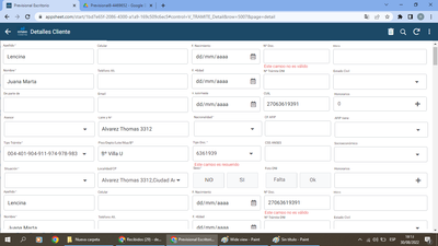
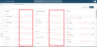
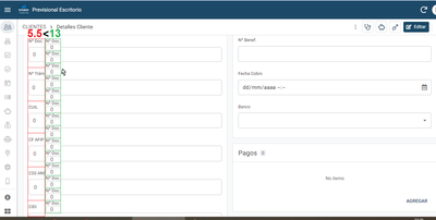
Another observation is that it would be great if the empty space between the lines of the Detail/Form view is reduced. Also reduce the blank padding between the text and the boxes´ borders. In other words, make the text density higher. I know that Appsheet is mainly designed for mobile phones, but using desktop mode we don't need this space between lines, because with the mouse we have MUCH MORE PRESICION than with the touch screen.
I attach an example comparing. I think that the blank space could be better used to have more information at a glance.
This is just a desing recommendation not a bug. Thanks for your work by the way.
- Mark as New
- Bookmark
- Subscribe
- Mute
- Subscribe to RSS Feed
- Permalink
- Report Inappropriate Content
- Mark as New
- Bookmark
- Subscribe
- Mute
- Subscribe to RSS Feed
- Permalink
- Report Inappropriate Content
Thanks, I really appreciate that feedback. We'll see how we can take this into account in the future.
In the meantime, have you tried showing the label and input field side-by-side, instead of one below the other? If you're building an app that's meant to be used on both mobile and desktop, you may not want to do this because it'll change the UI for mobile users, but it might help increase density of information.
Thank you!
- Mark as New
- Bookmark
- Subscribe
- Mute
- Subscribe to RSS Feed
- Permalink
- Report Inappropriate Content
- Mark as New
- Bookmark
- Subscribe
- Mute
- Subscribe to RSS Feed
- Permalink
- Report Inappropriate Content
Please, the map UX filters have retroacted, now it only filters by "keyword". Is there something to activate, or can it be considered a suggestion?
-
Account
3 -
Announcements
30 -
App Management
8 -
Automation
30 -
Data
31 -
Errors
17 -
Expressions
21 -
Integrations
24 -
Intelligence
5 -
Other
15 -
Resources
15 -
Security
5 -
Templates
13 -
Users
7 -
UX
34

 Twitter