- AppSheet
- Release Notes & Announcements
- Announcements
- Re: In Preview: New UI design for desktop users
- Subscribe to RSS Feed
- Mark Topic as New
- Mark Topic as Read
- Float this Topic for Current User
- Bookmark
- Subscribe
- Mute
- Printer Friendly Page
- Mark as New
- Bookmark
- Subscribe
- Mute
- Subscribe to RSS Feed
- Permalink
- Report Inappropriate Content
- Mark as New
- Bookmark
- Subscribe
- Mute
- Subscribe to RSS Feed
- Permalink
- Report Inappropriate Content
Hey everyone,
We’re excited to announce we are now previewing our new visual design for applications that are accessed on desktop browsers.
Currently, your AppSheet applications tend to follow mobile design patterns even when your users have large screens and these patterns can be confusing to desktop users. The new design lets these desktop users navigate their apps more easily and access information in context, and provides an efficient way to create and update records without losing context. App creators can also present more information by leveraging the larger screens but still keep it organized.
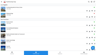
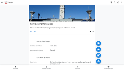
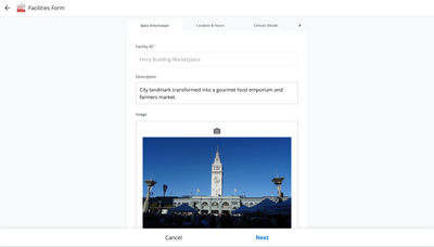
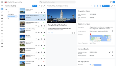
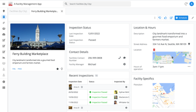
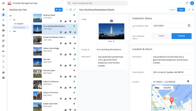
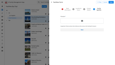
Here are some before and after images that better illustrate the design changes.
Legacy Design - Screenshot #1: Sifting through a collection of records grouped by City and State after selecting a State (Deck View)
Legacy Design - Screenshot #2: Looking at a specific record after selecting that record in the screen above (Detail View)
Legacy Design - Screenshot #3: Editing an existing record/Creating a new record (Form View)
New Design - Screenshot #1: Seeing your data in context (Deck View + Detail View)
New Design - Screenshot #2: Focusing on a specific record (Detail View)
New Design - Screenshot #3: Editing in place an existing record
New Design - Screenshot #4: Creating a new record (Form View)
What’s next? Well, this is still a work in progress. We’ve been gathering feedback from a number of design partners, including some of you in the AppSheet Community, and we know there is more to do before it can properly support all of your applications. At this stage, we feel that it would be good to let you play with the new design and to give you an opportunity to share your feedback - what you like, what doesn't work, what you think could use some improvements. This represents a significant change and your feedback will help us guide our next steps.
As this feature is in Preview, you may see visual changes in your apps as we work to improve the new desktop design in real-time. We don't recommend using the new desktop design in your production apps.
Thank you
The AppSheet Team
FAQ
How do I get access to this new desktop design?
We are currently slowly ramping this new experience over the next week or so, so you may not see this option in the editor immediately.
For each application, you can opt-in to use the new desktop design. You can toggle between the new and legacy desktop modes, as desired.
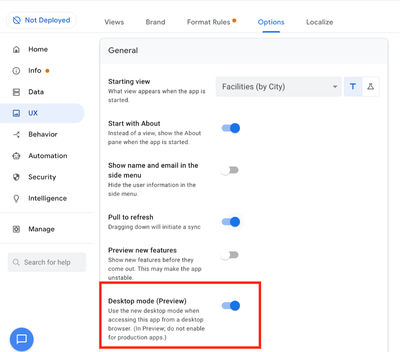
Follow these steps to enable the new design in your app:
- Open the app in the app editor
- Navigate to the UX > Options pane
- Enable the Desktop mode (Preview) option - see screenshot below
- Save the app in the Editor
All users of this application that access the app on a desktop browser will then see the new design after their next sync.
How do I configure the design of my app? I don’t see any new settings in the Editor!
There are minimal changes to the Editor for now. Mostly, the same settings are leveraged to specify the desktop and mobile designs. Let me give you an example.
Your apps have “primary views” and “menu views”. With the new desktop design, all of your views will be accessible from a side menu. That menu will list first the “primary views” and then the “secondary views”. In the future, we will adjust the configuration settings and in particular the language so that it makes sense for both mobile and desktop apps. For example, position values of "left most" and "right most" don't make sense for the new desktop design with its vertical menu structure.
We’ll be giving app creators more controls over some features that are currently set by default.
Is there some documentation or more information on what changed?
See Optimize the user experience using the new desktop design (Preview). We’ll update it over time.
Is there a list of functionalities that are known to not work with the new design?
Yes.
First, here is a list [as of July 31st] of (high-level) issues and requests that were reported to us and that still need fixes or assessments. Some of them are independent of the desktop mode, but we're still listing them here since people may want to know about them and so they don't need to report them unless it was reported for different app configurations :
| General theme | Issues |
| Form View |
|
| Navigation expressions: LINKTOROW(), LINKTOFORM(), etc |
|
| Format rules |
|
| Detail View UI |
- In some configurations, showing the wrong display names in a Detail tab - Edit-in-place in Dashboard view - Sync gets the app user out of Editing mode in a Detail View |
| General UI |
- Improvement requests on the subnav bar (e.g. larger text button, better responsiveness w.r.t. title, actions, text) - Clicking in grey area around onboarding view should not navigate the app in the background - Filtering on Dashboard - Tooltip for icon action buttons - Chart Views do not behave like other views |
| Localization of strings | Some strings are missing |
| CSV import/export |
|
| Other app functionalities |
- Missing Share, Feedback buttons - App Gallery behaving differently - Support of Amazon Cognito (missing account icon) - OCR not working on Desktop |
| Functionalities for app creators | “Preview as” is not available for the desktop emulator |
Second, here is a list of some issues and feature requests that we know we are not going to tackle, at least for now.
| Supporting multiple navigation actions in a grouped action |
This is not something that we support. The team very intentionally did not want to support this. App creators should not rely on it and it won’t work in desktop mode. |
| Multiple requests to improve the Table View UI |
We got requests to improve the Table View in general. The requests are valid, but that is out of scope for desktop mode. Changes we would be making would also impact the legacy UI and mobile apps. |
| LINKTOPARENTVIEW() not supported | For desktop users, there are better options to navigate back: the browser’s back button and the breadcrumbs. |
| Font size changes (via app settings) lead to layout issues | Generally, we recommend using the browser’s zoom which does a better job at resizing the app. |
| Background image |
See also Limitations and known issues.
How do I provide feedback?
Please share your feedback in this thread below this message!
- Mark as New
- Bookmark
- Subscribe
- Mute
- Subscribe to RSS Feed
- Permalink
- Report Inappropriate Content
- Mark as New
- Bookmark
- Subscribe
- Mute
- Subscribe to RSS Feed
- Permalink
- Report Inappropriate Content
All of a sudden desktop view's split screen is acting up weird..
- Mark as New
- Bookmark
- Subscribe
- Mute
- Subscribe to RSS Feed
- Permalink
- Report Inappropriate Content
- Mark as New
- Bookmark
- Subscribe
- Mute
- Subscribe to RSS Feed
- Permalink
- Report Inappropriate Content
There are new changes to Detail Views in the Desktop UI that are currently being rolled out, you can get more info of the changes above (https://www.googlecloudcommunity.com/gc/Announcements/In-Preview-New-UI-design-for-desktop-users/m-p...). Please let us know if you have any specific feedback!
- Mark as New
- Bookmark
- Subscribe
- Mute
- Subscribe to RSS Feed
- Permalink
- Report Inappropriate Content
- Mark as New
- Bookmark
- Subscribe
- Mute
- Subscribe to RSS Feed
- Permalink
- Report Inappropriate Content
Don't really understand the necessity of seperate cards for header and ref list.. it was great before..
and for some reason the show if does not apply to form anymore.
- Mark as New
- Bookmark
- Subscribe
- Mute
- Subscribe to RSS Feed
- Permalink
- Report Inappropriate Content
- Mark as New
- Bookmark
- Subscribe
- Mute
- Subscribe to RSS Feed
- Permalink
- Report Inappropriate Content
Hello thanks for the feedback, could you elaborate more on why you prefer the older detail views and provide some screenshots so I can better understand your use case? Feel free to send me a direct message if you'd like, thanks!
- Mark as New
- Bookmark
- Subscribe
- Mute
- Subscribe to RSS Feed
- Permalink
- Report Inappropriate Content
- Mark as New
- Bookmark
- Subscribe
- Mute
- Subscribe to RSS Feed
- Permalink
- Report Inappropriate Content
Hi,
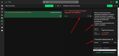
I guess what @NCD is trying to come up with is that when you open a detail view on new desktop UI it dismembers the header from the rest of the record columns. Below is a screenshot:
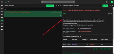
So, when you drag the delimiter from the middle to a short width is rejoins again vertically.
Even if it is not what the person meant, this is one of my personal suggestions:
- Let it always be joined, even if you increase the width from the detail view.
See screenshot below to understand what I'm saying.
This way it is much more presentable, organized and people won't have to move the delimiter to do this everytime they open the app.
I think it's a very good approach and good practice, since, as per my experience, people will not want the separate header from the rest in any case.
- Mark as New
- Bookmark
- Subscribe
- Mute
- Subscribe to RSS Feed
- Permalink
- Report Inappropriate Content
- Mark as New
- Bookmark
- Subscribe
- Mute
- Subscribe to RSS Feed
- Permalink
- Report Inappropriate Content
Hi @checktheclaws,
Wanted to give you an update on what we're doing, and what you'll be seeing.
One column vs Multicolumn option in the editor:
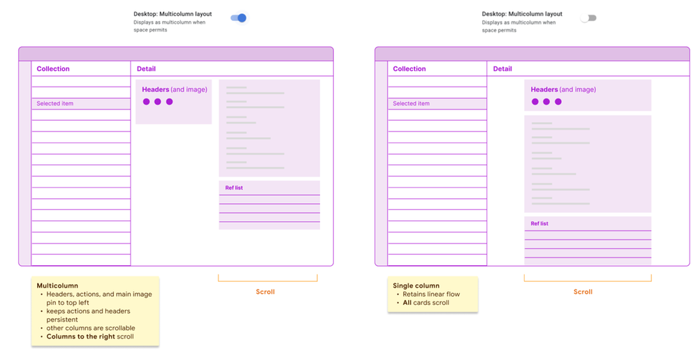
- Multicolumn: One of our goals is to make some use of available space (not jamming everything into the detail pane), but provide some stable areas vs up to 2 scrollable columns (The stable areas mean that headers, actions, and main image are visible and accessible at all times). This is what you see today in the card header layout option on desktop.
- Single column: We know that some apps have either simple detail views with a few properties, or creators prefer to keep a vertical linear flow (with the understanding you'll see less information above the fold).
The top card you see in either option represents a 'Header card'. This card consists of any of the following:
- Headers (1-many)
- Image (main image for your detail view)
- Actions (the circle buttons)
This is decoupled from the layout choice, so if you have single column, it sits on top at all times.
We're going to give you the option in each detail view: see the enclosed sketch.
- Mark as New
- Bookmark
- Subscribe
- Mute
- Subscribe to RSS Feed
- Permalink
- Report Inappropriate Content
- Mark as New
- Bookmark
- Subscribe
- Mute
- Subscribe to RSS Feed
- Permalink
- Report Inappropriate Content
Thank you for the fast reply @Mike_Moss
So if that is going to be a thing we can choose (multi or single column), that surpass my vision and I think is a nice articulation for the developers to choose from.
Very good indeed. Fantastic.
I have to say that Appsheet is really above my expectations in terms of new ideas and implementations since I started to use it about one year ago.
Keep up the good work!
Greetings from Brazil.
- Mark as New
- Bookmark
- Subscribe
- Mute
- Subscribe to RSS Feed
- Permalink
- Report Inappropriate Content
- Mark as New
- Bookmark
- Subscribe
- Mute
- Subscribe to RSS Feed
- Permalink
- Report Inappropriate Content
Hey @Mike_Moss these coming choices look fantastic!
Would it be possible though to designate the header section to be pinned (non scrolling) in the single column layout as well?
- Mark as New
- Bookmark
- Subscribe
- Mute
- Subscribe to RSS Feed
- Permalink
- Report Inappropriate Content
- Mark as New
- Bookmark
- Subscribe
- Mute
- Subscribe to RSS Feed
- Permalink
- Report Inappropriate Content
@scott192 We don't have plans yet for pinning, other than what we do in multicolumn as discussed above. Currently our single column will scroll as a whole.
- Mark as New
- Bookmark
- Subscribe
- Mute
- Subscribe to RSS Feed
- Permalink
- Report Inappropriate Content
- Mark as New
- Bookmark
- Subscribe
- Mute
- Subscribe to RSS Feed
- Permalink
- Report Inappropriate Content
Hi,
The following enhancement has been released with the March 1, 2023 release:
| Item | Description |
| Enhancement | Desktop multicolumn layout setting for detail views
For the desktop UI (preview), we recently made changes to improve how detail views are displayed to try and make use of the available space by introducing a multicolumn layout. But we understand that some app creators prefer to keep a vertical linear flow. We're introducing the new Desktop multicolumn layout toggle in the app editor that will allow app creators to control whether to render single or multiple columns for each detail view. Turn on Desktop multicolumn layout to display details using multiple columns in desktop browsers if space is available. For example: 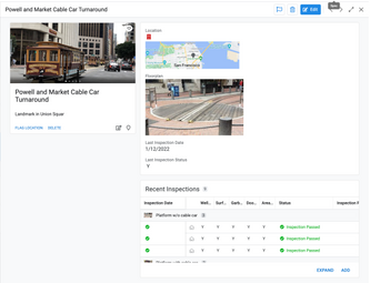
The Desktop multicolumn layout setting is on by default. Turn off the setting to use a single column layout. In this case, all content appears in a single, scrollable column. |
- Mark as New
- Bookmark
- Subscribe
- Mute
- Subscribe to RSS Feed
- Permalink
- Report Inappropriate Content
- Mark as New
- Bookmark
- Subscribe
- Mute
- Subscribe to RSS Feed
- Permalink
- Report Inappropriate Content
Thank you @lizlynch and @Mike_Moss and the rest of the team for this enhancement, which allows the app creator more autonomy and options in choosing the layout of their desktop app!
- Mark as New
- Bookmark
- Subscribe
- Mute
- Subscribe to RSS Feed
- Permalink
- Report Inappropriate Content
- Mark as New
- Bookmark
- Subscribe
- Mute
- Subscribe to RSS Feed
- Permalink
- Report Inappropriate Content
I'm just the messenger! 🙂
- Mark as New
- Bookmark
- Subscribe
- Mute
- Subscribe to RSS Feed
- Permalink
- Report Inappropriate Content
- Mark as New
- Bookmark
- Subscribe
- Mute
- Subscribe to RSS Feed
- Permalink
- Report Inappropriate Content
Please turn off the new desktop's multiple columns. It is very difficult to use.
I Think Team Dev should develop an option for use that can set how many columns are in a form and flexibly change the position and width of columns like PowerApps instead of multiple columns as the new feature.
Thanks
- Mark as New
- Bookmark
- Subscribe
- Mute
- Subscribe to RSS Feed
- Permalink
- Report Inappropriate Content
- Mark as New
- Bookmark
- Subscribe
- Mute
- Subscribe to RSS Feed
- Permalink
- Report Inappropriate Content
thank you @checktheclaws for pointing out that if you just resize the viewing pane, it will revert to the old style.
I find the new card layout to be a waste of screen space. The area underneath the header card stays blank, and then all of the ref cards are squished into merely a quarter of the screen. I would like to suggest that the header card stays inline with the rest of the cards, but perhaps it can be "frozen" so it will stay at the top of the page as the user scrolls through the details.
But I don't think it's necessary at all. In my apps, the display name of the Detail_view is the title name of the record, so you have the name right there on the top of the page.
Is the multicolumn vs. single column option available yet?
- Mark as New
- Bookmark
- Subscribe
- Mute
- Subscribe to RSS Feed
- Permalink
- Report Inappropriate Content
- Mark as New
- Bookmark
- Subscribe
- Mute
- Subscribe to RSS Feed
- Permalink
- Report Inappropriate Content
@NCD wrote:
weird
Could you define that? I see it working as expected, unless you were not using the Show column type before
- Mark as New
- Bookmark
- Subscribe
- Mute
- Subscribe to RSS Feed
- Permalink
- Report Inappropriate Content
- Mark as New
- Bookmark
- Subscribe
- Mute
- Subscribe to RSS Feed
- Permalink
- Report Inappropriate Content
On the new desk top UX, to assign the first column exclusively to the header for details view is not a good idea, as it alway killl the available space for the first row in the new desktop mode. Definitely there should be alternative soltion which makes more usres happy Currently, new desktop mode with the mustiple coluns spliitted view is ont full responsible nor well organized. On the first row, there are bunch of un-used spaces.
- Mark as New
- Bookmark
- Subscribe
- Mute
- Subscribe to RSS Feed
- Permalink
- Report Inappropriate Content
- Mark as New
- Bookmark
- Subscribe
- Mute
- Subscribe to RSS Feed
- Permalink
- Report Inappropriate Content
Agree too
- Mark as New
- Bookmark
- Subscribe
- Mute
- Subscribe to RSS Feed
- Permalink
- Report Inappropriate Content
- Mark as New
- Bookmark
- Subscribe
- Mute
- Subscribe to RSS Feed
- Permalink
- Report Inappropriate Content
Thanks for the feedback! I'd like to understand the pain points a little better, is it mainly the unused space in the Header Column? Could you provide me some screenshots of your apps for more context? Feel free to send me a direct message if you'd like!
- Mark as New
- Bookmark
- Subscribe
- Mute
- Subscribe to RSS Feed
- Permalink
- Report Inappropriate Content
- Mark as New
- Bookmark
- Subscribe
- Mute
- Subscribe to RSS Feed
- Permalink
- Report Inappropriate Content
When it is expected for the Desktop view to move in GA?
- Mark as New
- Bookmark
- Subscribe
- Mute
- Subscribe to RSS Feed
- Permalink
- Report Inappropriate Content
- Mark as New
- Bookmark
- Subscribe
- Mute
- Subscribe to RSS Feed
- Permalink
- Report Inappropriate Content
Please return of last visual of the detailed view.
I see new detail with multiple sections is not good.
- Mark as New
- Bookmark
- Subscribe
- Mute
- Subscribe to RSS Feed
- Permalink
- Report Inappropriate Content
- Mark as New
- Bookmark
- Subscribe
- Mute
- Subscribe to RSS Feed
- Permalink
- Report Inappropriate Content
Hello, could you elaborate a bit more on why you prefer the older detail views and provide some screenshots so I can better understand your use case? Feel free to send me a direct message if you'd like, thanks!
- Mark as New
- Bookmark
- Subscribe
- Mute
- Subscribe to RSS Feed
- Permalink
- Report Inappropriate Content
- Mark as New
- Bookmark
- Subscribe
- Mute
- Subscribe to RSS Feed
- Permalink
- Report Inappropriate Content
@amyplin
My thoughts for what it is worth.
I actually appreciate the new default Desktop multicolumn layout implementation.
Some points to note however.
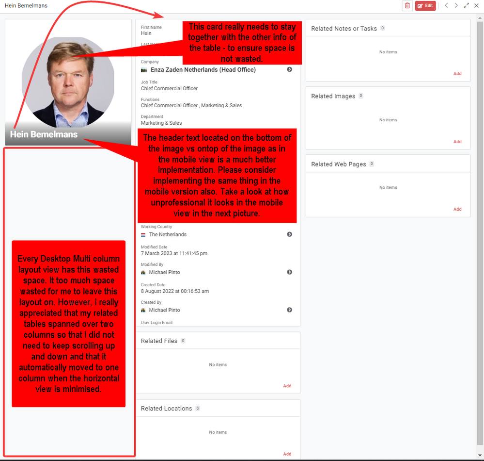
- I believe I would have mostly kept the Desktop Multi column layout toggle on, if it was not for the seperate card for the header column / main image / actions.
This card will always be small, and there will always be a large blank space under it that is wasted.
It really needs to be located on top of each other vs seperated, to ensure that there is not always wasted space under it.
Unfortunatly I would mostly need to go switch this toggle off on most of my views, purely for this reason.
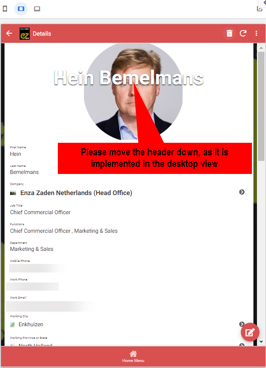
Please consider adjusting it as recommended. - The new header location implementation on the desktop view however is a lot better option vs how it is implemented on the mobile view with head overlapping the main image in the middle.
Compare how the Desktop view looks vs the mobile view on pictures below.
The Desktop is much more professional look vs the current mobile view implemenation.
Pleas consider updating the mobile view to align with the Desktop view.
- Mark as New
- Bookmark
- Subscribe
- Mute
- Subscribe to RSS Feed
- Permalink
- Report Inappropriate Content
- Mark as New
- Bookmark
- Subscribe
- Mute
- Subscribe to RSS Feed
- Permalink
- Report Inappropriate Content
For me the new desktop view adds greater ease of usability. Thank you. I've found a problem that I think may have already been identified, but since it's hard to see a list of open bugs, I'll post it here.
When I click on a row on a table view, then edit the detail view of that row, I land on a form view that is not the form view I've established for that table. It's as if the "edit" view is just creating a "quick edit" of the detail view. My form and detail views contain different different columns for that table. It's working as expected in mobile and table displays.
- Mark as New
- Bookmark
- Subscribe
- Mute
- Subscribe to RSS Feed
- Permalink
- Report Inappropriate Content
- Mark as New
- Bookmark
- Subscribe
- Mute
- Subscribe to RSS Feed
- Permalink
- Report Inappropriate Content
Go into actions pane and that table “edit” and you’ll see a button open as form or detail view ( or something I’m not on Appsheet now so dont know the specific wording) click form and you’re good to go! 🙂
- Mark as New
- Bookmark
- Subscribe
- Mute
- Subscribe to RSS Feed
- Permalink
- Report Inappropriate Content
- Mark as New
- Bookmark
- Subscribe
- Mute
- Subscribe to RSS Feed
- Permalink
- Report Inappropriate Content
Idk if someone reported this already but USERROLE() is not working at all in Desktop Mode.
How could this be a problem at this point? I was not using it until recently and I noticed how it just works on mobile. 😐
- Mark as New
- Bookmark
- Subscribe
- Mute
- Subscribe to RSS Feed
- Permalink
- Report Inappropriate Content
- Mark as New
- Bookmark
- Subscribe
- Mute
- Subscribe to RSS Feed
- Permalink
- Report Inappropriate Content
Hi!
I noticed that USERROLE() expressions are case-sensitive: "ADMIN" <> "Admin"
In my application I use USERROLE() = "ADMIN" - It works for me
- Mark as New
- Bookmark
- Subscribe
- Mute
- Subscribe to RSS Feed
- Permalink
- Report Inappropriate Content
- Mark as New
- Bookmark
- Subscribe
- Mute
- Subscribe to RSS Feed
- Permalink
- Report Inappropriate Content
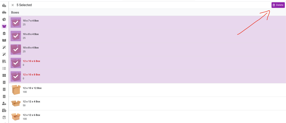
Bulk actions seem to be missing in the Desktop Preview. There is usually a dropdown in the upper right corner with several options, but the only bulk action available seems to be 'Delete'.
Is this a known issue?
- Mark as New
- Bookmark
- Subscribe
- Mute
- Subscribe to RSS Feed
- Permalink
- Report Inappropriate Content
- Mark as New
- Bookmark
- Subscribe
- Mute
- Subscribe to RSS Feed
- Permalink
- Report Inappropriate Content
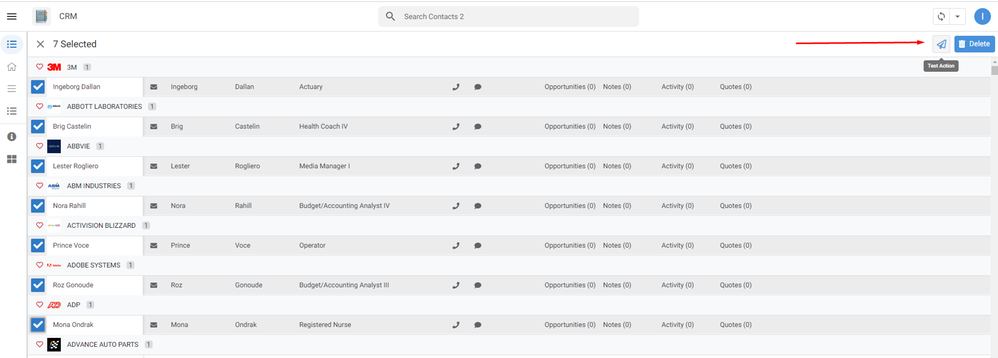
Hi!
1. As a test, I looked, my actions are displayed:
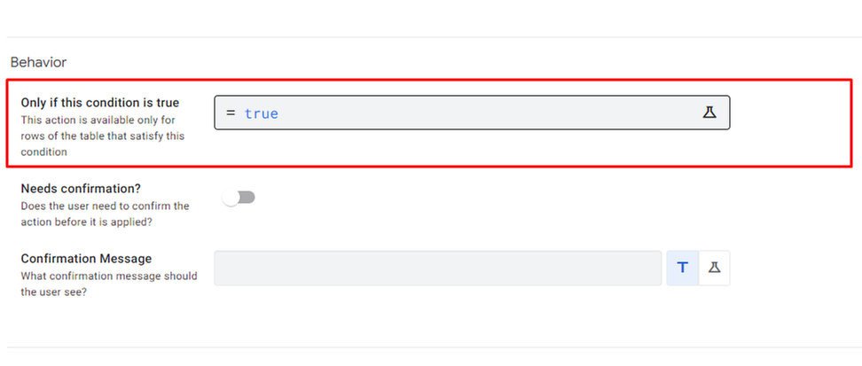
2. It is possible that the condition "Only if this condition is true" is not met for one or more rows?
- Mark as New
- Bookmark
- Subscribe
- Mute
- Subscribe to RSS Feed
- Permalink
- Report Inappropriate Content
- Mark as New
- Bookmark
- Subscribe
- Mute
- Subscribe to RSS Feed
- Permalink
- Report Inappropriate Content
Hi,
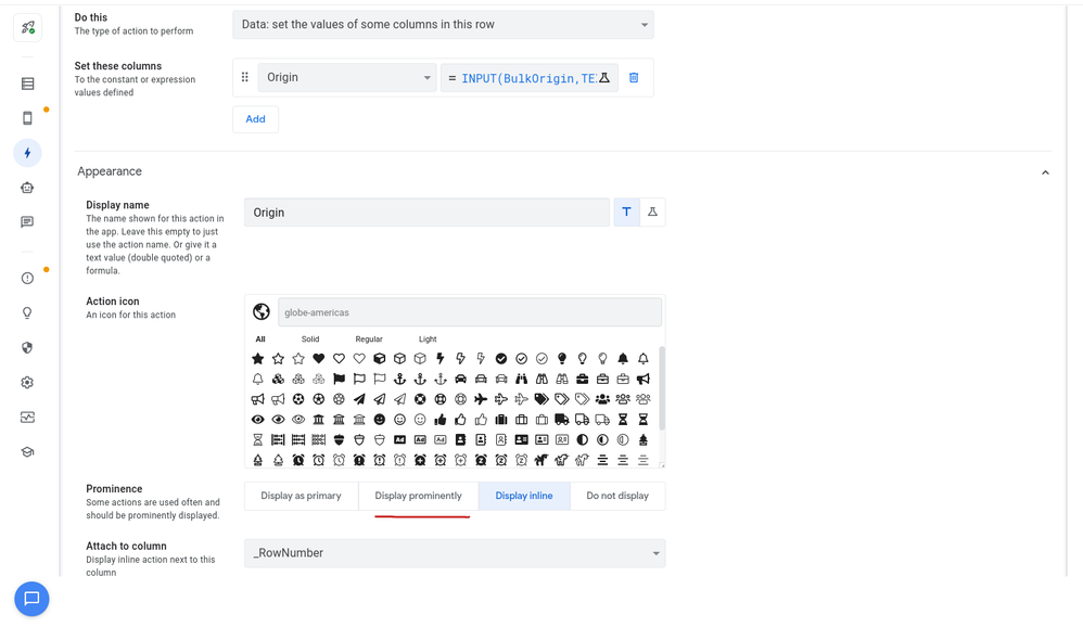
Thank you for trying that out! I looked into the Behavior settings and can confirm the conditions are all met or set to "true". I tried a number of other things and noticed that none of my inline and hidden actions work as bulk edits in the Desktop preview. It appears they have to be set to "Display prominently".
This is not the case with the mobile version and the original desktop version. I'm wondering if this is intentional in the UI that we are limited to "Prominent" actions for bulk edits. Or is this a bug?
- Mark as New
- Bookmark
- Subscribe
- Mute
- Subscribe to RSS Feed
- Permalink
- Report Inappropriate Content
- Mark as New
- Bookmark
- Subscribe
- Mute
- Subscribe to RSS Feed
- Permalink
- Report Inappropriate Content
Indeed, the behavior of "mass actions" is different in the new desktop UI,
below is a comparative table of the old and new UI:
| Prominence | New UI desktop | Old UI |
| Display as primary |  | 1: |
| Display prominently | 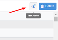 |  |
| Display inline |  Not displayed | 1: |
| Do not display | Not displayed | Not displayed |
I would like to use the "Action" located in the "Display inline" for "mass use" as in the old version of the UI
- Mark as New
- Bookmark
- Subscribe
- Mute
- Subscribe to RSS Feed
- Permalink
- Report Inappropriate Content
- Mark as New
- Bookmark
- Subscribe
- Mute
- Subscribe to RSS Feed
- Permalink
- Report Inappropriate Content
I just noticed today that this feature is now working for Inline actions. 😀
- Mark as New
- Bookmark
- Subscribe
- Mute
- Subscribe to RSS Feed
- Permalink
- Report Inappropriate Content
- Mark as New
- Bookmark
- Subscribe
- Mute
- Subscribe to RSS Feed
- Permalink
- Report Inappropriate Content
At the moment, the problem is solved in the release of March 7
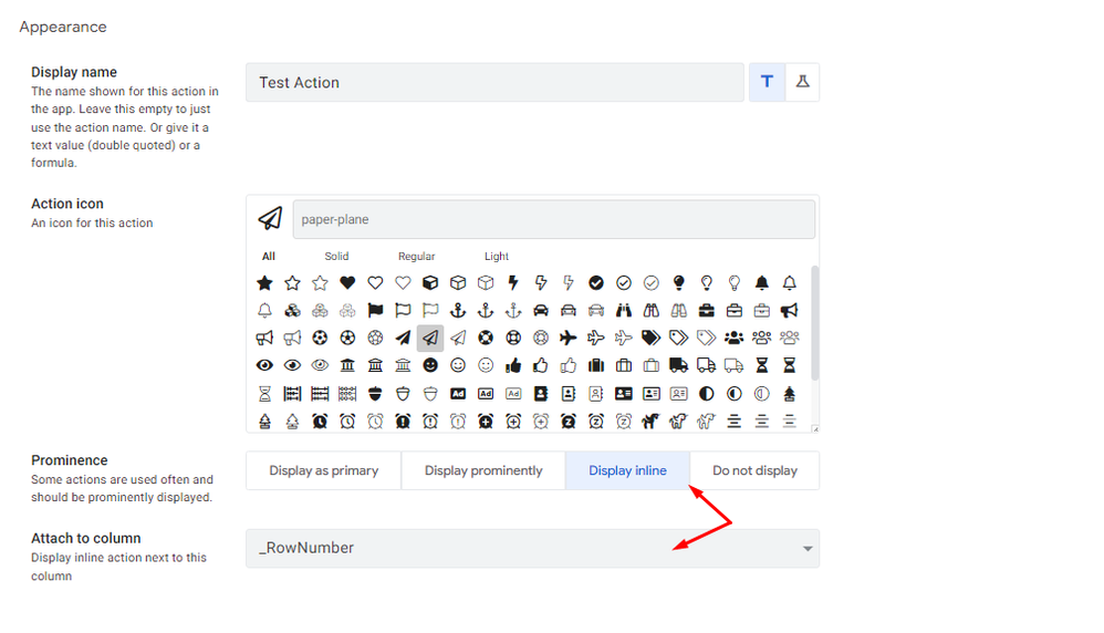
Now the actions located in "Display inline":
are displayed when selecting "mass actions":
Thanks to the AppSheet team!
- Mark as New
- Bookmark
- Subscribe
- Mute
- Subscribe to RSS Feed
- Permalink
- Report Inappropriate Content
- Mark as New
- Bookmark
- Subscribe
- Mute
- Subscribe to RSS Feed
- Permalink
- Report Inappropriate Content
A recent change in the Desktop View search limits the functionality of the search.
Having the row opened and clicking on the Referenced Row shows "No items selected" instead of opening the selected row.
To see the row details, the Search window has to be cleared... This is confusing and look like a bug that could be fixed.
Any comments? Please
- Mark as New
- Bookmark
- Subscribe
- Mute
- Subscribe to RSS Feed
- Permalink
- Report Inappropriate Content
- Mark as New
- Bookmark
- Subscribe
- Mute
- Subscribe to RSS Feed
- Permalink
- Report Inappropriate Content
I can confirm I have seen this too when navigating the children or grandchildren dissappear and search bar sometimes is gone when drilled down deep. My work around was to add VC on each table at least referencing back to my main search criteria such as an address, it's unnecessary but solves this for now.
On a second note, the search also clears entire dashboard view where slices on deck view end up filtered by search even when no fields ticked searchable in columns.
- Mark as New
- Bookmark
- Subscribe
- Mute
- Subscribe to RSS Feed
- Permalink
- Report Inappropriate Content
- Mark as New
- Bookmark
- Subscribe
- Mute
- Subscribe to RSS Feed
- Permalink
- Report Inappropriate Content
I join the question posed, I have indicated this in detail here:
- Mark as New
- Bookmark
- Subscribe
- Mute
- Subscribe to RSS Feed
- Permalink
- Report Inappropriate Content
- Mark as New
- Bookmark
- Subscribe
- Mute
- Subscribe to RSS Feed
- Permalink
- Report Inappropriate Content
I can confirm. This is the same issue we are experiencing currently. Looks like the search bar is not context aware yet.
I have instructed my testers to use the column filter instead of search until this issue is fixed.
- Mark as New
- Bookmark
- Subscribe
- Mute
- Subscribe to RSS Feed
- Permalink
- Report Inappropriate Content
- Mark as New
- Bookmark
- Subscribe
- Mute
- Subscribe to RSS Feed
- Permalink
- Report Inappropriate Content
Hi,
The following issue has been fixed in the February 21, 2023 release:
| Item | Description |
| Bug | For the desktop UI (preview), clicking a pin in a Map inline view now behaves the same as in the mobile UI. |
- Mark as New
- Bookmark
- Subscribe
- Mute
- Subscribe to RSS Feed
- Permalink
- Report Inappropriate Content
- Mark as New
- Bookmark
- Subscribe
- Mute
- Subscribe to RSS Feed
- Permalink
- Report Inappropriate Content
Auto re-open Automatically re-open the form after saving.
Last few day it's not working in Desktop mode can you tell me how to solve that?
- Mark as New
- Bookmark
- Subscribe
- Mute
- Subscribe to RSS Feed
- Permalink
- Report Inappropriate Content
- Mark as New
- Bookmark
- Subscribe
- Mute
- Subscribe to RSS Feed
- Permalink
- Report Inappropriate Content
Hi,
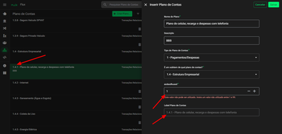
I guess I found another need for a fix.
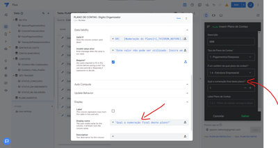
I think the [_THISROW_BEFORE].[Column] expression is not working in the desktop view.
I have a form that, in the end, creates a numbering of a tree of records in levels.
It should not allow the user to enter a number that is already used in other records, but it should allow it's own number, for when you're editing the record. So it should allow the user to let the number be the same that it was at the time of the edit (or an unused one).
The expression I used is this: (in "asdasdhuasd" column name in the screenshots)
OR(
   [Numeração do Plano]=[_THISROW_BEFORE].[Numeração do Plano],
   NOT(
       IN(
          [_THISROW].[Numeração do Plano],
          Plano de Contas[Numeração do Plano]
       )
   )
)
line 1: The first part is to let the user use the same number the record already has.
line 3: The second part is to get the list of all the records and prevent the user from using it.
In the older desktop and mobile versions it works fine. So I guess it is a problem with the new UI. Even in the desktop preview mode it works fine.
Or if I'm doing something wrong or there's a workaround you can point out, please.
Here are some screens so you can understand better:
Sorry about the "asdasdhuasd"... I was testing the Description field in the editor about a month ago and somehow I can't get rid of it anymore... It's still showing up, even though the field is blank in the editor. So maybe this is another bug. I even wrote something different there and it still displays this. This test name ["asdasdhuasd"] I wrote about a month ago, just for the record.
So, as you can see the record is 1.4.1 originally, but when someone edits it, it gets the valid if error, even if it's the same number. But I guess the expression is correct, since in the other visual versions of the app (mobile or old desktop view) it works fine, no problem, even the column name works fine.
I guess the problem is in [_THISROW_BEFORE] expression.
Or maybe because I was using Suggested Values field in editor and now it's gone.
Just some hints.
Feel free to ask anything to understand better this situation.
Ps. If someone could check why I can't get rid of the description field in the name of the column from a month ago, would be great too!
- Mark as New
- Bookmark
- Subscribe
- Mute
- Subscribe to RSS Feed
- Permalink
- Report Inappropriate Content
- Mark as New
- Bookmark
- Subscribe
- Mute
- Subscribe to RSS Feed
- Permalink
- Report Inappropriate Content
Hi, thanks for reporting it. I tried a similar expression and could observe the following in desktop mode:
1. when adding a new row and entering a value for this column, the expression result is always true (valid) even if the same value does exist in another row in the table.
2. when editing a row and changing the value of this column, the expression result is always false (invalid) even if the same value doesn't exist in any other row in the table.
#2 is caused by a known inconsistency between mobile and desktop in whether an expression that searches the table like Table[Column] "sees" the form's unsaved changes (when the form is based on the same table). There is a fix currently rolling out to make the desktop mode behavior consistent with the status quo (see release notes for details).
It looks like #1 is due to [_THISROW_BEFORE] resolving to the current value in add-row forms, rather than the initial state of the row. This makes the first part of the OR condition always true when adding a new row, even if the value changes, which prevents enforcing the second uniqueness condition. This will require a separate fix.
Regarding the column description, perhaps changing the display name would override the stale description? Or could it be the display name itself has the unwanted value, if the description is blank?
-
Account
3 -
Announcements
30 -
App Management
8 -
Automation
30 -
Data
31 -
Errors
17 -
Expressions
21 -
Integrations
24 -
Intelligence
5 -
Other
15 -
Resources
15 -
Security
5 -
Templates
13 -
Users
7 -
UX
34

 Twitter