- AppSheet
- Release Notes & Announcements
- Announcements
- Introducing Virtual Column calculation time in Per...
- Subscribe to RSS Feed
- Mark Topic as New
- Mark Topic as Read
- Float this Topic for Current User
- Bookmark
- Subscribe
- Mute
- Printer Friendly Page
- Mark as New
- Bookmark
- Subscribe
- Mute
- Subscribe to RSS Feed
- Permalink
- Report Inappropriate Content
- Mark as New
- Bookmark
- Subscribe
- Mute
- Subscribe to RSS Feed
- Permalink
- Report Inappropriate Content
Hi everyone,
Virtual columns, though useful, are often based on complex App formulas that can quickly consume resources and impact the overall performance of your app. Until now, there was no way to determine the average computation time required by virtual columns when compared to the total sync time.
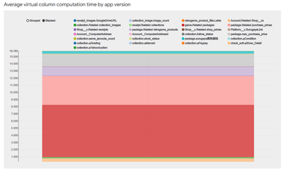
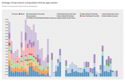
The new Average virtual column computation time by app version graph is now available when you access the Performance Profile by selecting Manage > Performance Analyzer. Use this graph to better understand how the computation time for virtual columns in different app versions is affecting the sync performance, and gain insights to improve app performance.
This feature has been rolled out to all the customers. We would love to hear your feedback.
- Mark as New
- Bookmark
- Subscribe
- Mute
- Subscribe to RSS Feed
- Permalink
- Report Inappropriate Content
- Mark as New
- Bookmark
- Subscribe
- Mute
- Subscribe to RSS Feed
- Permalink
- Report Inappropriate Content
Just checked this out in an app. It looks invaluable! It will be great to monitor sync time by virtual column in order to target the most impactful improvements.
- Mark as New
- Bookmark
- Subscribe
- Mute
- Subscribe to RSS Feed
- Permalink
- Report Inappropriate Content
- Mark as New
- Bookmark
- Subscribe
- Mute
- Subscribe to RSS Feed
- Permalink
- Report Inappropriate Content
Hi @Sai1
Very nice feature.🤩
I can intuitively see where improvements can be made.
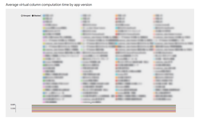
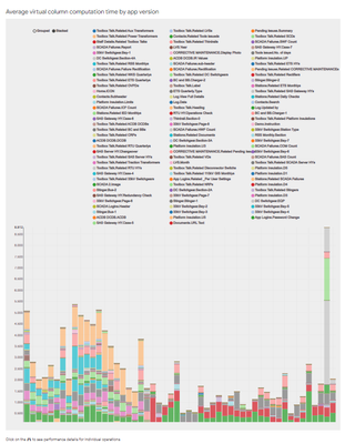
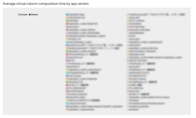
On the other hand, the graphs may need to be improved for more complex apps that may need this feature more.
Here is an example of a production app for one of our clients.
- Mark as New
- Bookmark
- Subscribe
- Mute
- Subscribe to RSS Feed
- Permalink
- Report Inappropriate Content
- Mark as New
- Bookmark
- Subscribe
- Mute
- Subscribe to RSS Feed
- Permalink
- Report Inappropriate Content
@Sai1
Maybe it would be good to narrow down the list to the Top 10 Virtual columns that are in need of time, and so on.😃
- Mark as New
- Bookmark
- Subscribe
- Mute
- Subscribe to RSS Feed
- Permalink
- Report Inappropriate Content
- Mark as New
- Bookmark
- Subscribe
- Mute
- Subscribe to RSS Feed
- Permalink
- Report Inappropriate Content
Good addition, thanks for the feature.
Two ideas:
- Would be useful to have an "open on new tab" so we can see the data more clearly
- Since now this info is available to the editor (I guess it was not before), it would be useful to have this data on the expression assistant of each virtual column, or in any place of the virtual column config, showing how much it took on last sync
- Mark as New
- Bookmark
- Subscribe
- Mute
- Subscribe to RSS Feed
- Permalink
- Report Inappropriate Content
- Mark as New
- Bookmark
- Subscribe
- Mute
- Subscribe to RSS Feed
- Permalink
- Report Inappropriate Content
I was surprised to see how some "Related something" are consistently taking 2 seconds each
- Mark as New
- Bookmark
- Subscribe
- Mute
- Subscribe to RSS Feed
- Permalink
- Report Inappropriate Content
- Mark as New
- Bookmark
- Subscribe
- Mute
- Subscribe to RSS Feed
- Permalink
- Report Inappropriate Content
It seems not to reflect the time to calculate the Related something, but to load the table.
https://support.google.com/appsheet/answer/10104997
Often there are references between tables and, therefore, automatically added REF_ROWS() virtual columns that compute the relationships between the tables. It may appear that one of the virtual column computations is taking a long time to complete. However, this is rarely the case. The time required by this computation is typically used to fetch the table itself before computing the relationship. In other words, fetching tables is almost always the source of delay.
- Mark as New
- Bookmark
- Subscribe
- Mute
- Subscribe to RSS Feed
- Permalink
- Report Inappropriate Content
- Mark as New
- Bookmark
- Subscribe
- Mute
- Subscribe to RSS Feed
- Permalink
- Report Inappropriate Content
Yep, which makes this feature a little bit less appealing.
The fact that I'm getting 1.8 to 2.2 on each Related column is related to the table fetching which also has (sometimes) some virtual columns.
Another thing that surprised me the most is that this was not just on big child tables with a lot of cells. I have some that just save data from people like Name, Email, Phone and with just 100 rows and it was also a 2 second calculation from the parent.
In summary, [Related ...] computation is hard to debug
- Mark as New
- Bookmark
- Subscribe
- Mute
- Subscribe to RSS Feed
- Permalink
- Report Inappropriate Content
- Mark as New
- Bookmark
- Subscribe
- Mute
- Subscribe to RSS Feed
- Permalink
- Report Inappropriate Content
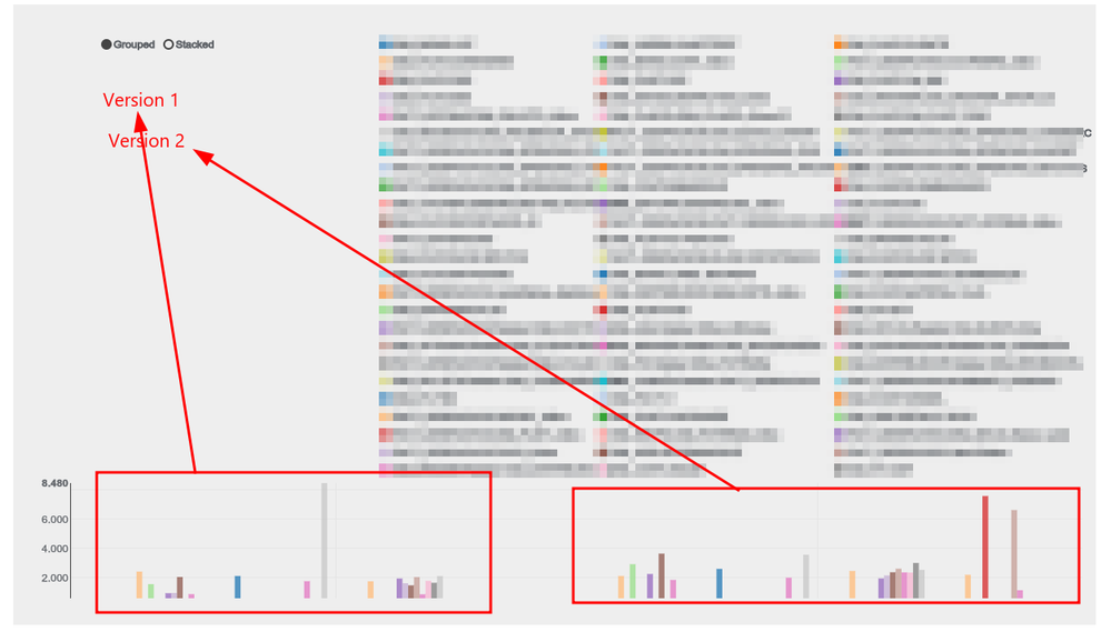
The same way we can select which virtual columns can be left out of the chart, we should be able to select which version/s we want to see on the chart.
If we are interested just on the last one to improve expressions, the previous versions just add noise to the chart
- Mark as New
- Bookmark
- Subscribe
- Mute
- Subscribe to RSS Feed
- Permalink
- Report Inappropriate Content
- Mark as New
- Bookmark
- Subscribe
- Mute
- Subscribe to RSS Feed
- Permalink
- Report Inappropriate Content
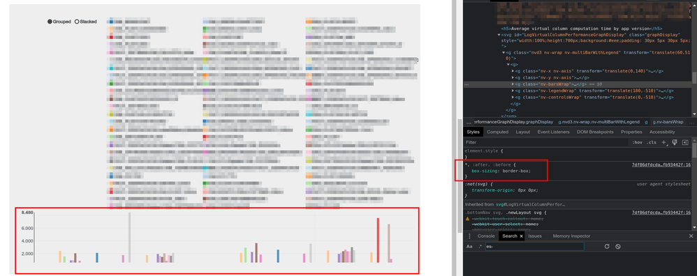
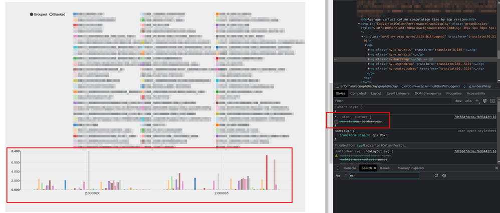
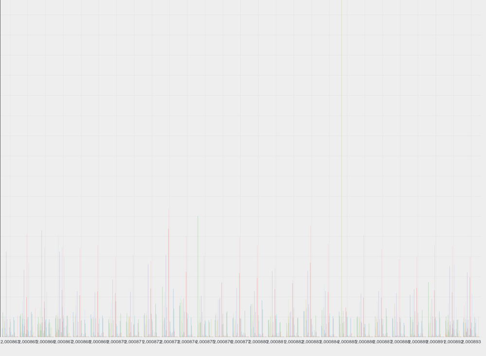
There is a "box-sizing" css property that prevents the chart from showing the X axis label:
- Mark as New
- Bookmark
- Subscribe
- Mute
- Subscribe to RSS Feed
- Permalink
- Report Inappropriate Content
- Mark as New
- Bookmark
- Subscribe
- Mute
- Subscribe to RSS Feed
- Permalink
- Report Inappropriate Content
Hi,
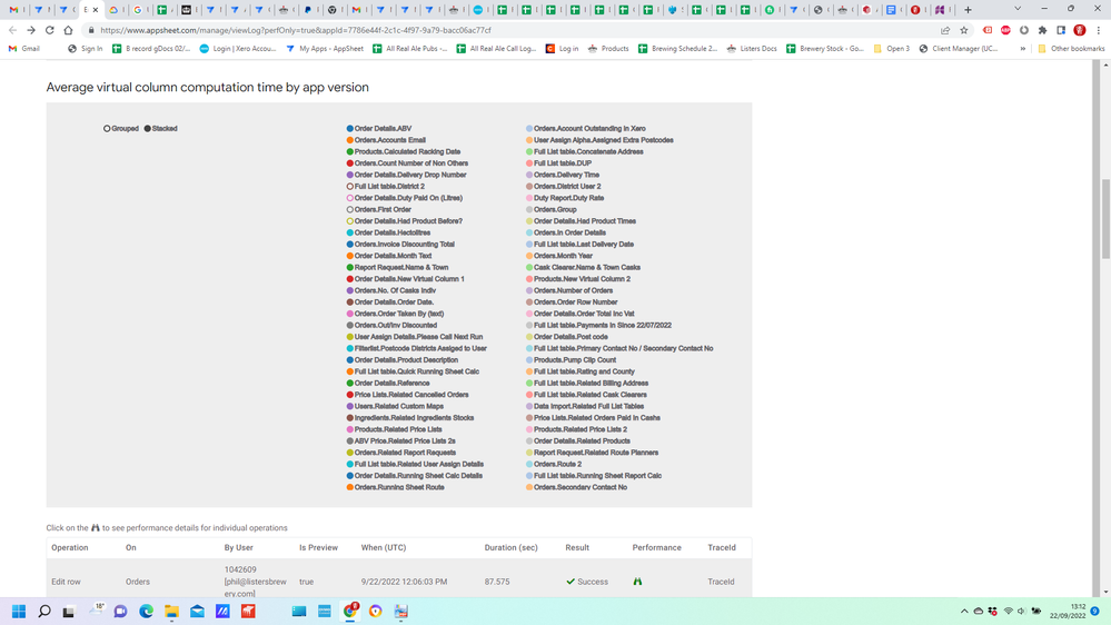
Am I missing something? i just see a list of columns but no graph etc.
Thanks
phil
- Mark as New
- Bookmark
- Subscribe
- Mute
- Subscribe to RSS Feed
- Permalink
- Report Inappropriate Content
- Mark as New
- Bookmark
- Subscribe
- Mute
- Subscribe to RSS Feed
- Permalink
- Report Inappropriate Content
There are still some refinements to make, I wasn't able to see the chart at some point if the window was too narrow for example, although it's not your case.
Try with a simpler app to see the chart
- Mark as New
- Bookmark
- Subscribe
- Mute
- Subscribe to RSS Feed
- Permalink
- Report Inappropriate Content
- Mark as New
- Bookmark
- Subscribe
- Mute
- Subscribe to RSS Feed
- Permalink
- Report Inappropriate Content
Hi @SkrOYC
I am also now unable to see the Chart of VC calculation time though it was showing correctly few days back. Is there a solution or workaround.
- Mark as New
- Bookmark
- Subscribe
- Mute
- Subscribe to RSS Feed
- Permalink
- Report Inappropriate Content
- Mark as New
- Bookmark
- Subscribe
- Mute
- Subscribe to RSS Feed
- Permalink
- Report Inappropriate Content
Just try zooming out
- Mark as New
- Bookmark
- Subscribe
- Mute
- Subscribe to RSS Feed
- Permalink
- Report Inappropriate Content
- Mark as New
- Bookmark
- Subscribe
- Mute
- Subscribe to RSS Feed
- Permalink
- Report Inappropriate Content
Zoom out didn't work
- Mark as New
- Bookmark
- Subscribe
- Mute
- Subscribe to RSS Feed
- Permalink
- Report Inappropriate Content
- Mark as New
- Bookmark
- Subscribe
- Mute
- Subscribe to RSS Feed
- Permalink
- Report Inappropriate Content
Yeah, sorry, I tested after that and it doesn't work.
Let's push the team to make this a better feature with a more usable UI
- Mark as New
- Bookmark
- Subscribe
- Mute
- Subscribe to RSS Feed
- Permalink
- Report Inappropriate Content
- Mark as New
- Bookmark
- Subscribe
- Mute
- Subscribe to RSS Feed
- Permalink
- Report Inappropriate Content
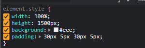
@SkrOYC @Koichi_Tsuji @Phil_Waite Finally found a work around to display the graph
STEP 1 : changed the height from 700 to 1500
STEP 2 : deselect any VC from list for the graph to update and then select back if needed
- Mark as New
- Bookmark
- Subscribe
- Mute
- Subscribe to RSS Feed
- Permalink
- Report Inappropriate Content
- Mark as New
- Bookmark
- Subscribe
- Mute
- Subscribe to RSS Feed
- Permalink
- Report Inappropriate Content
People dont wanna manipulate CSS styling to get the graph become visible.
AppSheet dev team needs to fix the problems, that's the only one solution.
- Mark as New
- Bookmark
- Subscribe
- Mute
- Subscribe to RSS Feed
- Permalink
- Report Inappropriate Content
- Mark as New
- Bookmark
- Subscribe
- Mute
- Subscribe to RSS Feed
- Permalink
- Report Inappropriate Content
It is just a workaround for the time being that i found accidentally. Just posted it here.
- Mark as New
- Bookmark
- Subscribe
- Mute
- Subscribe to RSS Feed
- Permalink
- Report Inappropriate Content
- Mark as New
- Bookmark
- Subscribe
- Mute
- Subscribe to RSS Feed
- Permalink
- Report Inappropriate Content
You have to be careful that Google may consider the problem is solved by your post!
You need to understand the AppSheet is no-code (or low-code) solutions, for those who hae no idea bout HTML/CSS. I m one of them.
- Mark as New
- Bookmark
- Subscribe
- Mute
- Subscribe to RSS Feed
- Permalink
- Report Inappropriate Content
- Mark as New
- Bookmark
- Subscribe
- Mute
- Subscribe to RSS Feed
- Permalink
- Report Inappropriate Content
Correct. Sorry for that.
- Mark as New
- Bookmark
- Subscribe
- Mute
- Subscribe to RSS Feed
- Permalink
- Report Inappropriate Content
- Mark as New
- Bookmark
- Subscribe
- Mute
- Subscribe to RSS Feed
- Permalink
- Report Inappropriate Content
No problem.
- Mark as New
- Bookmark
- Subscribe
- Mute
- Subscribe to RSS Feed
- Permalink
- Report Inappropriate Content
- Mark as New
- Bookmark
- Subscribe
- Mute
- Subscribe to RSS Feed
- Permalink
- Report Inappropriate Content
Hi,
All my apps have lots of vitual columns so I am splitting them up to reduce that. I use these apps for my team of 20 sales people and drivers so finding the virtual columns that slow the apps down the most would be really useful.
The simpler the app the less I need to see the chart.
- Mark as New
- Bookmark
- Subscribe
- Mute
- Subscribe to RSS Feed
- Permalink
- Report Inappropriate Content
- Mark as New
- Bookmark
- Subscribe
- Mute
- Subscribe to RSS Feed
- Permalink
- Report Inappropriate Content
@Phil_Waite wrote:The simpler the app the less I need to see the chart
Sure, I was just trying to help you to see the chart, but obviously it wouldn't be helpful.
What if you zoom out?
- Mark as New
- Bookmark
- Subscribe
- Mute
- Subscribe to RSS Feed
- Permalink
- Report Inappropriate Content
- Mark as New
- Bookmark
- Subscribe
- Mute
- Subscribe to RSS Feed
- Permalink
- Report Inappropriate Content
Thank you so much,This literally saved me half a minute of time everytime I open one of my apps!!!
- Mark as New
- Bookmark
- Subscribe
- Mute
- Subscribe to RSS Feed
- Permalink
- Report Inappropriate Content
- Mark as New
- Bookmark
- Subscribe
- Mute
- Subscribe to RSS Feed
- Permalink
- Report Inappropriate Content
We never ever see the graph with our production apps (which are usually highly complex).
- Mark as New
- Bookmark
- Subscribe
- Mute
- Subscribe to RSS Feed
- Permalink
- Report Inappropriate Content
- Mark as New
- Bookmark
- Subscribe
- Mute
- Subscribe to RSS Feed
- Permalink
- Report Inappropriate Content
Same here
- Mark as New
- Bookmark
- Subscribe
- Mute
- Subscribe to RSS Feed
- Permalink
- Report Inappropriate Content
- Mark as New
- Bookmark
- Subscribe
- Mute
- Subscribe to RSS Feed
- Permalink
- Report Inappropriate Content
Yo he notado que si convierto columnas virtuales en columnas propias de la tabla aún siguen apareciendo en la gráfica, de hecho aparecen columnas virtuales que ya he eliminado completamente de la app. Si copio la app, en la copia ya solo aparecen las columnas virtuales existentes
También noto que la gráfica sólo calcula el tiempo que tarda en sincronizar cuando las columnas han sido usadas, esto da la ilusión de que esas columnas funcionan óptimamente cuando no se están utilizando. Es así como se supone que funcione?
Por ultimo quería preguntar, la velocidad del internet es un factor a considerar? el otro día usé mi app con los datos móviles y viendo la gráfica me dio la impresión de que algunas columnas virtuales aumentaron el tiempo de computación, podría deberse a la velocidad y disponibilidad del internet?
- Mark as New
- Bookmark
- Subscribe
- Mute
- Subscribe to RSS Feed
- Permalink
- Report Inappropriate Content
- Mark as New
- Bookmark
- Subscribe
- Mute
- Subscribe to RSS Feed
- Permalink
- Report Inappropriate Content
@Kabuliño wrote:Yo he notado que si convierto columnas virtuales en columnas propias de la tabla aún siguen apareciendo en la gráfica, de hecho aparecen columnas virtuales que ya he eliminado completamente de la app. Si copio la app, en la copia ya solo aparecen las columnas virtuales existentes
Los gráficos te muestran el historial de tardanza en sincronizar por versión. Por eso no importa cuál es tu configuración actual, seguirán los datos de la versión anterior guardados.
Existe un bug que no se ve claramente a qué versión corresponden los datos en el gráfico.
@Kabuliño wrote:También noto que la gráfica sólo calcula el tiempo que tarda en sincronizar cuando las columnas han sido usadas, esto da la ilusión de que esas columnas funcionan óptimamente cuando no se están utilizando. Es así como se supone que funcione?
La verdad es que jamás he tenido problemas con el performance del cálculo de las columnas virtuales en el dispositivo, solo al sincronizar. Esto depende de las capacidades del dispositivo.
@Kabuliño wrote:Por ultimo quería preguntar, la velocidad del internet es un factor a considerar? el otro día usé mi app con los datos móviles y viendo la gráfica me dio la impresión de que algunas columnas virtuales aumentaron el tiempo de computación, podría deberse a la velocidad y disponibilidad del internet?
Por supuesto.
Improve the speed of Sync - AppSheet Help
- Mark as New
- Bookmark
- Subscribe
- Mute
- Subscribe to RSS Feed
- Permalink
- Report Inappropriate Content
- Mark as New
- Bookmark
- Subscribe
- Mute
- Subscribe to RSS Feed
- Permalink
- Report Inappropriate Content
as @Koichi_Tsuji said, complex apps have thousands versions , the graph does not display.
as my friend @Aurelien suggests, Is-it possible to select the number of versions to display ? with a limit ?
- Mark as New
- Bookmark
- Subscribe
- Mute
- Subscribe to RSS Feed
- Permalink
- Report Inappropriate Content
- Mark as New
- Bookmark
- Subscribe
- Mute
- Subscribe to RSS Feed
- Permalink
- Report Inappropriate Content
yeah, just display top 10 slow sync VC by default could be one of the possible solutions.
Currently, the list of VC is squeezing the graph.
Too much heavy pressure, and flattened...

- Mark as New
- Bookmark
- Subscribe
- Mute
- Subscribe to RSS Feed
- Permalink
- Report Inappropriate Content
- Mark as New
- Bookmark
- Subscribe
- Mute
- Subscribe to RSS Feed
- Permalink
- Report Inappropriate Content
Is-it the number of VC or version that squeeze the graph ? or both ?
( version : number of column / VC : number of line )
- Mark as New
- Bookmark
- Subscribe
- Mute
- Subscribe to RSS Feed
- Permalink
- Report Inappropriate Content
- Mark as New
- Bookmark
- Subscribe
- Mute
- Subscribe to RSS Feed
- Permalink
- Report Inappropriate Content
If its improved to serve the actual purpose of actual VC Calculation Time then i guess it can help to significantly improve the sync times.
- Mark as New
- Bookmark
- Subscribe
- Mute
- Subscribe to RSS Feed
- Permalink
- Report Inappropriate Content
- Mark as New
- Bookmark
- Subscribe
- Mute
- Subscribe to RSS Feed
- Permalink
- Report Inappropriate Content
Thanks @jyothis_m
@SkrOYC wrote:The same way we can select which virtual columns can be left out of the chart, we should be able to select which version/s we want to see on the chart
Please consider this asap. My graph is practically useless:
- Mark as New
- Bookmark
- Subscribe
- Mute
- Subscribe to RSS Feed
- Permalink
- Report Inappropriate Content
- Mark as New
- Bookmark
- Subscribe
- Mute
- Subscribe to RSS Feed
- Permalink
- Report Inappropriate Content
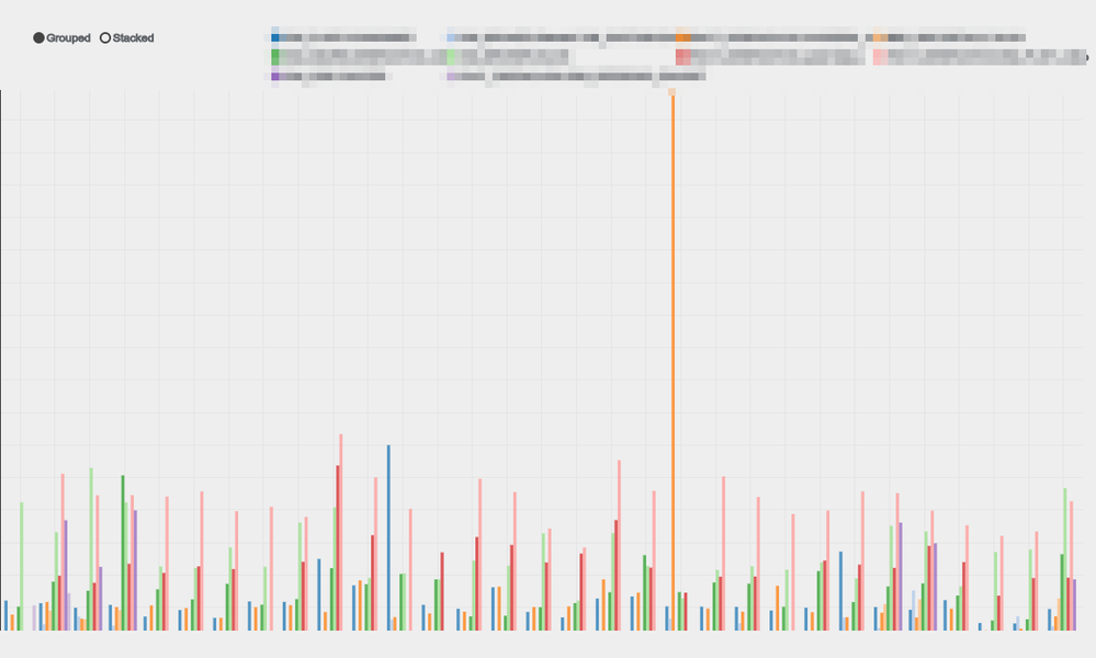
I think the stacked option will reduce the clutter due to the version numbers.
- Mark as New
- Bookmark
- Subscribe
- Mute
- Subscribe to RSS Feed
- Permalink
- Report Inappropriate Content
- Mark as New
- Bookmark
- Subscribe
- Mute
- Subscribe to RSS Feed
- Permalink
- Report Inappropriate Content
For the performance analysis and profiles,we can get the slow sync to jump on the possible root causes for issues we may have.
I only have an interest in which VCs are taking time, and top ten columns (by default) should be file to troubleshoot. I dont need to have a look at all of the VC - sync time by default, which is actually killing graph for now.
Leave it to Google devs decision what to do.They must understand the appsheet app is naturally complex.
- Mark as New
- Bookmark
- Subscribe
- Mute
- Subscribe to RSS Feed
- Permalink
- Report Inappropriate Content
- Mark as New
- Bookmark
- Subscribe
- Mute
- Subscribe to RSS Feed
- Permalink
- Report Inappropriate Content
👍
- Mark as New
- Bookmark
- Subscribe
- Mute
- Subscribe to RSS Feed
- Permalink
- Report Inappropriate Content
- Mark as New
- Bookmark
- Subscribe
- Mute
- Subscribe to RSS Feed
- Permalink
- Report Inappropriate Content
I think the team has finally fixed it to show the top 10 time-intensive virtual columns 😀 @SkrOYC @Koichi_Tsuji @Fabian_Weller @Jacquouille
- Mark as New
- Bookmark
- Subscribe
- Mute
- Subscribe to RSS Feed
- Permalink
- Report Inappropriate Content
- Mark as New
- Bookmark
- Subscribe
- Mute
- Subscribe to RSS Feed
- Permalink
- Report Inappropriate Content
Seems like it, although I'm most interested on comparing all my virtual columns on latest version rather than just checking all versions side-by-side
- Mark as New
- Bookmark
- Subscribe
- Mute
- Subscribe to RSS Feed
- Permalink
- Report Inappropriate Content
- Mark as New
- Bookmark
- Subscribe
- Mute
- Subscribe to RSS Feed
- Permalink
- Report Inappropriate Content
This chart is a great release. It really helps to visually see what could only otherwise be seen by manually opening each individual sync performance tree from before.
I'd like to suggest similar charts in order to visualize sync times and number of records in tables, over time and/or over version, as well as their interactions.
Also a question. Similar to how a "Related..." VC on the chart is really showing the time to load the related table, not actual VC compute time, I was also surprised by the VC time with a simple dereference expression in it. Like [ref].[column]. Shouldn't that be really performant? We have a rather large bar in our chart for a column like that, but the ref'd table also has lots of records. So I'm wondering if maybe the load time of that table is also partially attributed to that VC's compute time? Either that, or simple dereferences aren't near as performant as I've always thought they were?
-
Account
3 -
Announcements
30 -
App Management
8 -
Automation
30 -
Data
31 -
Errors
17 -
Expressions
21 -
Integrations
24 -
Intelligence
5 -
Other
15 -
Resources
15 -
Security
5 -
Templates
13 -
Users
7 -
UX
34

 Twitter