- AppSheet
- AppSheet Forum
- AppSheet Q&A
- Re: Charts - Daily Time Series
- Subscribe to RSS Feed
- Mark Topic as New
- Mark Topic as Read
- Float this Topic for Current User
- Bookmark
- Subscribe
- Mute
- Printer Friendly Page
- Mark as New
- Bookmark
- Subscribe
- Mute
- Subscribe to RSS Feed
- Permalink
- Report Inappropriate Content
- Mark as New
- Bookmark
- Subscribe
- Mute
- Subscribe to RSS Feed
- Permalink
- Report Inappropriate Content
This is probably a simple question, but can’t figure out how to do it!
I have a dataset with three variables, [category], [date], [measure]
I would like to create a line chart where the x-axis is [date], the y-axis is [measure] and the graph only presents 1 level of category (either by drop down, or via table/dashboard)
Can anyone help?
- Labels:
-
UX
- Mark as New
- Bookmark
- Subscribe
- Mute
- Subscribe to RSS Feed
- Permalink
- Report Inappropriate Content
- Mark as New
- Bookmark
- Subscribe
- Mute
- Subscribe to RSS Feed
- Permalink
- Report Inappropriate Content
Attach you chart to a slice.
- Mark as New
- Bookmark
- Subscribe
- Mute
- Subscribe to RSS Feed
- Permalink
- Report Inappropriate Content
- Mark as New
- Bookmark
- Subscribe
- Mute
- Subscribe to RSS Feed
- Permalink
- Report Inappropriate Content
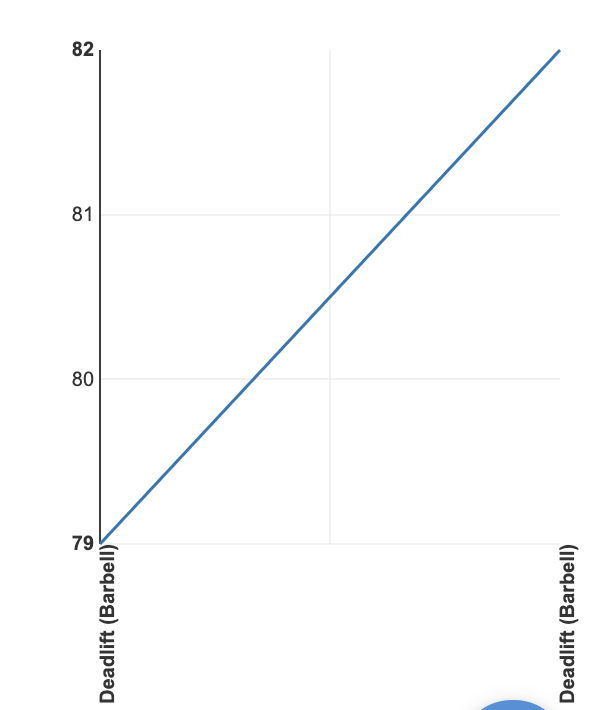
Thanks, it’s less the slicing more using the date on a time series that I am having issues with. I can’t seem to get the X axis to show the date field:
The Figure below should show [date] on the axis instead it shows the [category]

On my chart view I don’t seem to have the option to select date at any point (e.g. chart columns does not allow selection of dates).
I’m probably missing something obvious as this seems like a pretty simple graphic…
- Mark as New
- Bookmark
- Subscribe
- Mute
- Subscribe to RSS Feed
- Permalink
- Report Inappropriate Content
- Mark as New
- Bookmark
- Subscribe
- Mute
- Subscribe to RSS Feed
- Permalink
- Report Inappropriate Content
I’ve also got the same problem. I’ve worked with Appsheet charts a lot and have never realised that you actually can’t have a chart with time (or date, or datetime) as the x-axis!
Surely this is an omission!
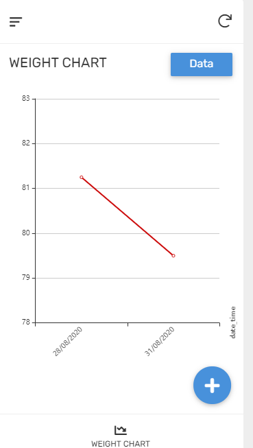
If I want to chart [Blood Pressure] against [DateTime] where [Blood Pressure] is Decimal and [DateTime] is a Datetime then the best I can do is to have [DateTime] as the label.
But this is not actually what @Dave_Inman or myself were really after. It displays the points in a sequence, but if you miss a week then this gap will not be reflected in the chart because it’s just a sequence of dots with lables.
The behaviour that @Dave_Inman or myself were really after is a real plot of how a parameter varies with time.
Try it. It’s impossible.
- Mark as New
- Bookmark
- Subscribe
- Mute
- Subscribe to RSS Feed
- Permalink
- Report Inappropriate Content
- Mark as New
- Bookmark
- Subscribe
- Mute
- Subscribe to RSS Feed
- Permalink
- Report Inappropriate Content
@TDhers This is pretty much exactly what we were discussing RE: Resource histograms. Often for date/datetime… It’s important to be able to define that continuity somehow…
- Mark as New
- Bookmark
- Subscribe
- Mute
- Subscribe to RSS Feed
- Permalink
- Report Inappropriate Content
- Mark as New
- Bookmark
- Subscribe
- Mute
- Subscribe to RSS Feed
- Permalink
- Report Inappropriate Content

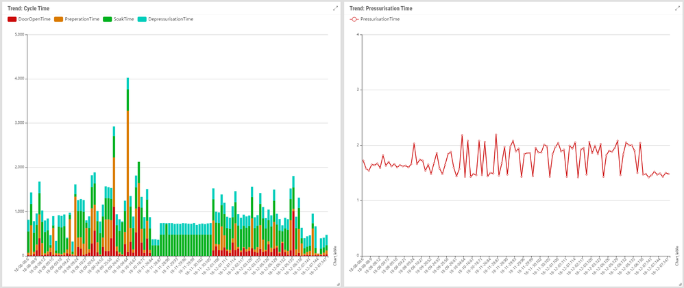
These charts for example display process parameters.
Plotting things in ‘time’ has GOT to be the most popular use of charts surely …
It’s only months later that I realise that it’s not actually a plot of a value against time …
- Mark as New
- Bookmark
- Subscribe
- Mute
- Subscribe to RSS Feed
- Permalink
- Report Inappropriate Content
- Mark as New
- Bookmark
- Subscribe
- Mute
- Subscribe to RSS Feed
- Permalink
- Report Inappropriate Content
it’s only data ordered by a label.
And hence any gaps will not be rendered correctly on the chart because every point only has a y-value and a label.
- Mark as New
- Bookmark
- Subscribe
- Mute
- Subscribe to RSS Feed
- Permalink
- Report Inappropriate Content
- Mark as New
- Bookmark
- Subscribe
- Mute
- Subscribe to RSS Feed
- Permalink
- Report Inappropriate Content
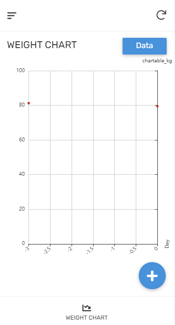
I also note that if I’m happy to have no actual x-axis (i.e. use dates as labels) then my y-axis DOES zoom to the data range being displayed …

But if I want to plot an X-Y plot (which I can ONLY achieve by constructing a virtual numeric column expressing each date as a decimal number of days from today) then my y0axis DOESN’T zoom to the data range being displayed …

The expected behaviour would be to have it zoom the same.
- Mark as New
- Bookmark
- Subscribe
- Mute
- Subscribe to RSS Feed
- Permalink
- Report Inappropriate Content
- Mark as New
- Bookmark
- Subscribe
- Mute
- Subscribe to RSS Feed
- Permalink
- Report Inappropriate Content
- Mark as New
- Bookmark
- Subscribe
- Mute
- Subscribe to RSS Feed
- Permalink
- Report Inappropriate Content
- Mark as New
- Bookmark
- Subscribe
- Mute
- Subscribe to RSS Feed
- Permalink
- Report Inappropriate Content
Yes, totally agreed and understood.
-
!
1 -
Account
1,680 -
App Management
3,117 -
AppSheet
1 -
Automation
10,340 -
Bug
986 -
Data
9,696 -
Errors
5,746 -
Expressions
11,812 -
General Miscellaneous
1 -
Google Cloud Deploy
1 -
image and text
1 -
Integrations
1,615 -
Intelligence
578 -
Introductions
85 -
Other
2,916 -
Photos
1 -
Resources
541 -
Security
830 -
Templates
1,309 -
Users
1,562 -
UX
9,126
- « Previous
- Next »
| User | Count |
|---|---|
| 42 | |
| 34 | |
| 27 | |
| 23 | |
| 16 |

 Twitter