- AppSheet
- AppSheet Forum
- AppSheet Q&A
- Dashboard UI - Make it Bigger!
- Subscribe to RSS Feed
- Mark Topic as New
- Mark Topic as Read
- Float this Topic for Current User
- Bookmark
- Subscribe
- Mute
- Printer Friendly Page
- Mark as New
- Bookmark
- Subscribe
- Mute
- Subscribe to RSS Feed
- Permalink
- Report Inappropriate Content
- Mark as New
- Bookmark
- Subscribe
- Mute
- Subscribe to RSS Feed
- Permalink
- Report Inappropriate Content
I am (re)building my dashboard in a much less fractured format, using VCs instead of many, many different views.
My QQ is this: Can I edit the formatting of these windows?
Especially on a large screen, this text is awfully small. This is more to do with UX than anything else, I hope to use the dashboard as a quick-look screen, but that only works if you can easily read everything on it...
Solved! Go to Solution.
- Mark as New
- Bookmark
- Subscribe
- Mute
- Subscribe to RSS Feed
- Permalink
- Report Inappropriate Content
- Mark as New
- Bookmark
- Subscribe
- Mute
- Subscribe to RSS Feed
- Permalink
- Report Inappropriate Content
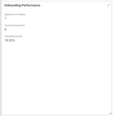
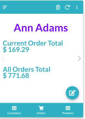
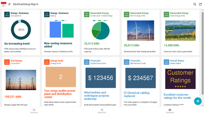
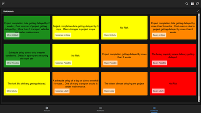
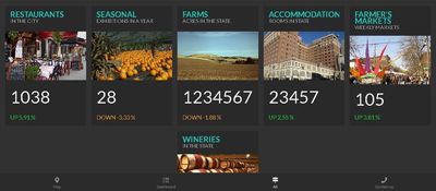
There are various possibilities with dashboards. One is SVGs as mentioned by @Rifad
You could imaginatively use card views, show columns and some external services to create meaningful and attractive dashboards.
The below picture shows certain columns formatted using Show columns and Header column property in detail view
There are some more relevant tips in Tips and Tricks sections
https://www.googlecloudcommunity.com/gc/Tips-Tricks/Interactive-Dashboard/m-p/285964
https://www.googlecloudcommunity.com/gc/Tips-Tricks/Dashboarding-Options-With-Card-Views/m-p/358305
https://www.googlecloudcommunity.com/gc/AppSheet-Q-A/Customize-My-Dashboard-Data-for-User/m-p/369647
- Mark as New
- Bookmark
- Subscribe
- Mute
- Subscribe to RSS Feed
- Permalink
- Report Inappropriate Content
- Mark as New
- Bookmark
- Subscribe
- Mute
- Subscribe to RSS Feed
- Permalink
- Report Inappropriate Content
You can try using Dynamic SVG Images.
- Mark as New
- Bookmark
- Subscribe
- Mute
- Subscribe to RSS Feed
- Permalink
- Report Inappropriate Content
- Mark as New
- Bookmark
- Subscribe
- Mute
- Subscribe to RSS Feed
- Permalink
- Report Inappropriate Content
I have never come across this before, some research required, thank you!
- Mark as New
- Bookmark
- Subscribe
- Mute
- Subscribe to RSS Feed
- Permalink
- Report Inappropriate Content
- Mark as New
- Bookmark
- Subscribe
- Mute
- Subscribe to RSS Feed
- Permalink
- Report Inappropriate Content
There are various possibilities with dashboards. One is SVGs as mentioned by @Rifad
You could imaginatively use card views, show columns and some external services to create meaningful and attractive dashboards.
The below picture shows certain columns formatted using Show columns and Header column property in detail view
There are some more relevant tips in Tips and Tricks sections
https://www.googlecloudcommunity.com/gc/Tips-Tricks/Interactive-Dashboard/m-p/285964
https://www.googlecloudcommunity.com/gc/Tips-Tricks/Dashboarding-Options-With-Card-Views/m-p/358305
https://www.googlecloudcommunity.com/gc/AppSheet-Q-A/Customize-My-Dashboard-Data-for-User/m-p/369647
- Mark as New
- Bookmark
- Subscribe
- Mute
- Subscribe to RSS Feed
- Permalink
- Report Inappropriate Content
- Mark as New
- Bookmark
- Subscribe
- Mute
- Subscribe to RSS Feed
- Permalink
- Report Inappropriate Content
Love a bit of inspo, thank you!
- Mark as New
- Bookmark
- Subscribe
- Mute
- Subscribe to RSS Feed
- Permalink
- Report Inappropriate Content
- Mark as New
- Bookmark
- Subscribe
- Mute
- Subscribe to RSS Feed
- Permalink
- Report Inappropriate Content
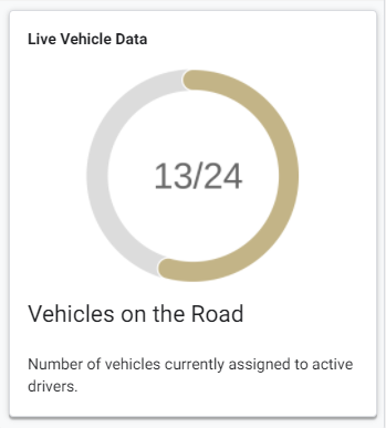
OK I have it something like working, thank you so much!
I have an odd issue though, the central numbers always appear off centre.
Any idea why this is and how to fix it?
CONCATENATE(
 "https://quickchart.io/chart?c={type:'radialGauge',
  data:{
   datasets:[{
    data:[",NUMBER([Vehicles On The Road]),"],
    backgroundColor:'rgb(195, 180, 135)'
   }
  ]
 },
options:{
 domain: [0,24],
 trackColor: 'rgb(220, 220, 220)',
 centerPercentage: 80,
 roundedCorners: true,
centerArea:{
 text:' ",NUMBER([Vehicles On The Road]) & "/24","'}
  }
 }"
)
-
!
1 -
Account
1,683 -
App Management
3,125 -
AppSheet
1 -
Automation
10,352 -
Bug
992 -
Data
9,708 -
Errors
5,757 -
Expressions
11,823 -
General Miscellaneous
1 -
Google Cloud Deploy
1 -
image and text
1 -
Integrations
1,619 -
Intelligence
580 -
Introductions
86 -
Other
2,925 -
Photos
1 -
Resources
542 -
Security
832 -
Templates
1,313 -
Users
1,563 -
UX
9,131
- « Previous
- Next »
| User | Count |
|---|---|
| 40 | |
| 34 | |
| 29 | |
| 23 | |
| 17 |

 Twitter