- AppSheet
- AppSheet Forum
- AppSheet Q&A
- Row Series Stack Chart does show any columns
- Subscribe to RSS Feed
- Mark Topic as New
- Mark Topic as Read
- Float this Topic for Current User
- Bookmark
- Subscribe
- Mute
- Printer Friendly Page
- Mark as New
- Bookmark
- Subscribe
- Mute
- Subscribe to RSS Feed
- Permalink
- Report Inappropriate Content
- Mark as New
- Bookmark
- Subscribe
- Mute
- Subscribe to RSS Feed
- Permalink
- Report Inappropriate Content
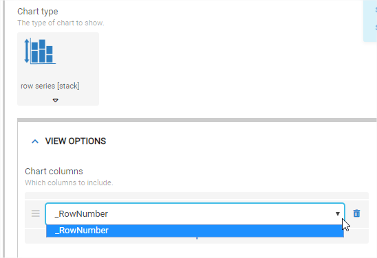
Hi, I am trying to create a Row Series Stack Chart however the only Chart Columns that appears is the _RowNumber:
Choosing a different chart (e.g. Row or Column) I can see my columns ok.
What am I doing wrong?
Thanks!
- Labels:
-
Data
- Mark as New
- Bookmark
- Subscribe
- Mute
- Subscribe to RSS Feed
- Permalink
- Report Inappropriate Content
- Mark as New
- Bookmark
- Subscribe
- Mute
- Subscribe to RSS Feed
- Permalink
- Report Inappropriate Content
Help please… Is this a Bug?
- Mark as New
- Bookmark
- Subscribe
- Mute
- Subscribe to RSS Feed
- Permalink
- Report Inappropriate Content
- Mark as New
- Bookmark
- Subscribe
- Mute
- Subscribe to RSS Feed
- Permalink
- Report Inappropriate Content
Do you have any other columns that are marked as the number type?
- Mark as New
- Bookmark
- Subscribe
- Mute
- Subscribe to RSS Feed
- Permalink
- Report Inappropriate Content
- Mark as New
- Bookmark
- Subscribe
- Mute
- Subscribe to RSS Feed
- Permalink
- Report Inappropriate Content
Hi @MultiTech_Visions, thanks for your answer!
I had a couple more Number type columns (which did not appear) however the columns I want to aggregate are dates (aggregating rows with the same date).
From your question I did some testing and figured out they had to be Number type.
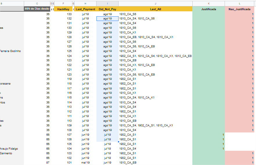
I changed my columns to be number type (value of 1 on each row I want to stack) however I now have to figure out how to set the vertical axis to the column that I want.
Is it possible?
My data set now looks like the image below.
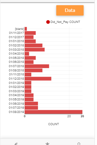
I want to stack columns K and L in a per-month count basis.
An example of the graph I want is further below.
How do I do that?
Data set:
Example chart (I want the red bars to be decomposed into green and red):
Thanks for helping!
- Mark as New
- Bookmark
- Subscribe
- Mute
- Subscribe to RSS Feed
- Permalink
- Report Inappropriate Content
- Mark as New
- Bookmark
- Subscribe
- Mute
- Subscribe to RSS Feed
- Permalink
- Report Inappropriate Content
Just for a quicker solution, have you checked out the histogram type of charts? They allow you to do aggregate grouping type things kind of like what you’re wanting.
To your actual question: in the space where you select the colums to chart, did you include both K and L?

In this image I only see one column to show:
and that’s “Did_Not_Pay COUNT”.
- Mark as New
- Bookmark
- Subscribe
- Mute
- Subscribe to RSS Feed
- Permalink
- Report Inappropriate Content
- Mark as New
- Bookmark
- Subscribe
- Mute
- Subscribe to RSS Feed
- Permalink
- Report Inappropriate Content
Hi @MultiTech_Visions,
I am currently using histogram chart but for one column which contains the month in stake (type date). It is the image I shared above.
When I try to add more columns in the histogram I get this:
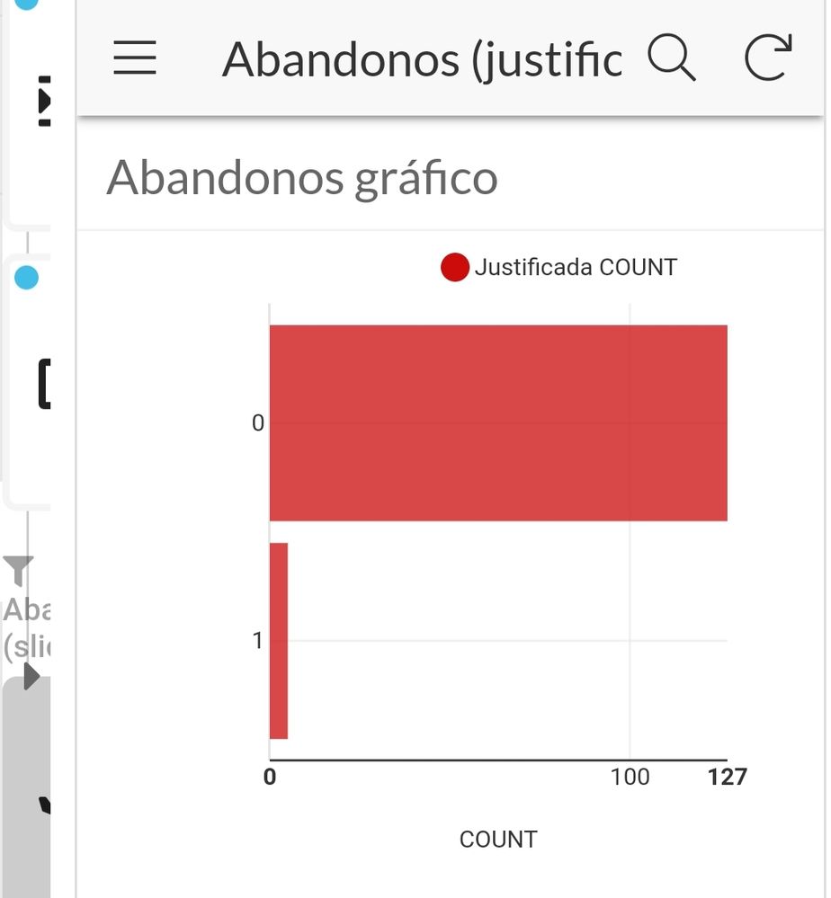
I can not get it to accumulate over month (like the red histogram graph above)
The configuration I used to obtain this (undesirable) result is the following:
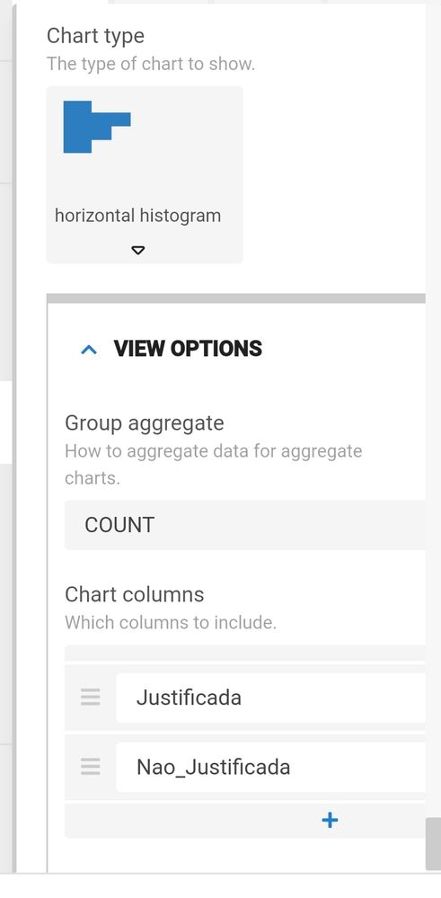
How can I get the chart to be ‘over months’ based on 2 stacked columns ? (1 bar for each mobth, composed of 2 stacked colours)
- Mark as New
- Bookmark
- Subscribe
- Mute
- Subscribe to RSS Feed
- Permalink
- Report Inappropriate Content
- Mark as New
- Bookmark
- Subscribe
- Mute
- Subscribe to RSS Feed
- Permalink
- Report Inappropriate Content
Hmm… unfortunately getting charts to work is a matter of experimentation. I’ll refer you to someone on the apsheet team, perhaps they can better guide you from here.
- Mark as New
- Bookmark
- Subscribe
- Mute
- Subscribe to RSS Feed
- Permalink
- Report Inappropriate Content
- Mark as New
- Bookmark
- Subscribe
- Mute
- Subscribe to RSS Feed
- Permalink
- Report Inappropriate Content
Hi!, can anyone help with this please?
![]()
- Mark as New
- Bookmark
- Subscribe
- Mute
- Subscribe to RSS Feed
- Permalink
- Report Inappropriate Content
- Mark as New
- Bookmark
- Subscribe
- Mute
- Subscribe to RSS Feed
- Permalink
- Report Inappropriate Content
Send an email to support@appsheet.com to get their attention better.
-
!
1 -
Account
1,681 -
App Management
3,118 -
AppSheet
1 -
Automation
10,342 -
Bug
988 -
Data
9,700 -
Errors
5,750 -
Expressions
11,815 -
General Miscellaneous
1 -
Google Cloud Deploy
1 -
image and text
1 -
Integrations
1,615 -
Intelligence
579 -
Introductions
85 -
Other
2,919 -
Photos
1 -
Resources
541 -
Security
830 -
Templates
1,309 -
Users
1,562 -
UX
9,127
- « Previous
- Next »
| User | Count |
|---|---|
| 41 | |
| 36 | |
| 28 | |
| 23 | |
| 16 |

 Twitter