- AppSheet
- AppSheet Forum
- AppSheet Q&A
- Target in Chart
- Subscribe to RSS Feed
- Mark Topic as New
- Mark Topic as Read
- Float this Topic for Current User
- Bookmark
- Subscribe
- Mute
- Printer Friendly Page
- Mark as New
- Bookmark
- Subscribe
- Mute
- Subscribe to RSS Feed
- Permalink
- Report Inappropriate Content
- Mark as New
- Bookmark
- Subscribe
- Mute
- Subscribe to RSS Feed
- Permalink
- Report Inappropriate Content
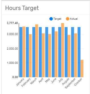
Hi. I have a monthly sales target which I would like to show in a chart along with the sales actual sold.
Is this possible and how would I do this?
Kind Regards
- Labels:
-
UX
- Mark as New
- Bookmark
- Subscribe
- Mute
- Subscribe to RSS Feed
- Permalink
- Report Inappropriate Content
- Mark as New
- Bookmark
- Subscribe
- Mute
- Subscribe to RSS Feed
- Permalink
- Report Inappropriate Content
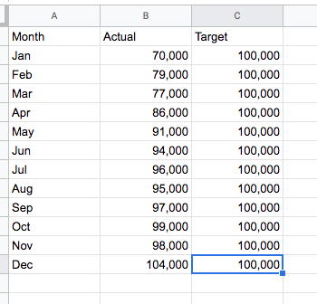
Hi! There are a few ways to do this. First in your data you need the x axis part of a chart - e.g. Month. Then you need the Target and Actual Sales number for each x-axis point.
I created a simple example where I have Month, Actual and Target. But these values can be part of a much larger row.
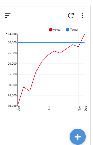
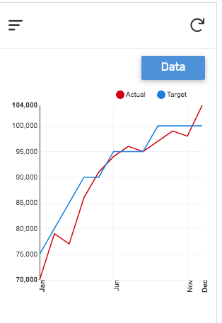
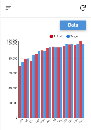
Now just create a Chart view. Below are a few examples of what i think are the best options. Please post again if you have more questions.
Line Chart -Column series - Target is the same each Month
Line Chart - Column series - Target is different each Month
Bar Chart - Column series - Target is different each Month
- Mark as New
- Bookmark
- Subscribe
- Mute
- Subscribe to RSS Feed
- Permalink
- Report Inappropriate Content
- Mark as New
- Bookmark
- Subscribe
- Mute
- Subscribe to RSS Feed
- Permalink
- Report Inappropriate Content
Very well illustrated @WillowMobileSystems.
- Mark as New
- Bookmark
- Subscribe
- Mute
- Subscribe to RSS Feed
- Permalink
- Report Inappropriate Content
- Mark as New
- Bookmark
- Subscribe
- Mute
- Subscribe to RSS Feed
- Permalink
- Report Inappropriate Content
Hi Guys. This is very useful, if I can configure my csv along this theme then this will be a great solution.
Thank you.
- Mark as New
- Bookmark
- Subscribe
- Mute
- Subscribe to RSS Feed
- Permalink
- Report Inappropriate Content
- Mark as New
- Bookmark
- Subscribe
- Mute
- Subscribe to RSS Feed
- Permalink
- Report Inappropriate Content
Voila ![]()
-
Account
1,677 -
App Management
3,099 -
AppSheet
1 -
Automation
10,323 -
Bug
983 -
Data
9,676 -
Errors
5,733 -
Expressions
11,779 -
General Miscellaneous
1 -
Google Cloud Deploy
1 -
image and text
1 -
Integrations
1,610 -
Intelligence
578 -
Introductions
85 -
Other
2,904 -
Photos
1 -
Resources
538 -
Security
827 -
Templates
1,309 -
Users
1,559 -
UX
9,110
- « Previous
- Next »
| User | Count |
|---|---|
| 43 | |
| 28 | |
| 24 | |
| 24 | |
| 13 |

 Twitter