- AppSheet
- AppSheet Forum
- AppSheet Q&A
- Text & Image Alignment in a Onboarding View
- Subscribe to RSS Feed
- Mark Topic as New
- Mark Topic as Read
- Float this Topic for Current User
- Bookmark
- Subscribe
- Mute
- Printer Friendly Page
- Mark as New
- Bookmark
- Subscribe
- Mute
- Subscribe to RSS Feed
- Permalink
- Report Inappropriate Content
- Mark as New
- Bookmark
- Subscribe
- Mute
- Subscribe to RSS Feed
- Permalink
- Report Inappropriate Content
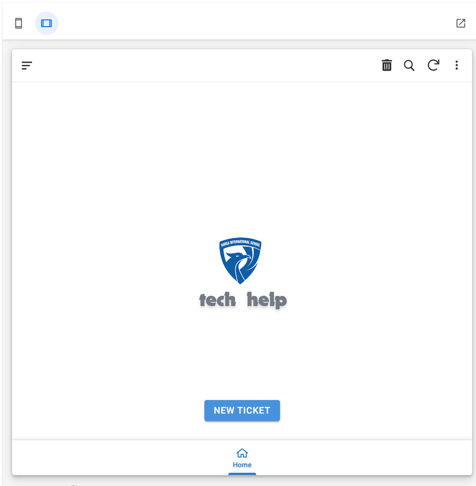
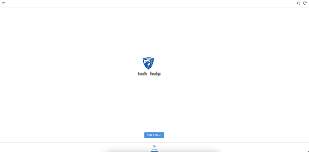
1. Why is this happening?
2. Is there any options to customize text alignment in the AppSheet Onboarding view?
Solved! Go to Solution.
- Mark as New
- Bookmark
- Subscribe
- Mute
- Subscribe to RSS Feed
- Permalink
- Report Inappropriate Content
- Mark as New
- Bookmark
- Subscribe
- Mute
- Subscribe to RSS Feed
- Permalink
- Report Inappropriate Content
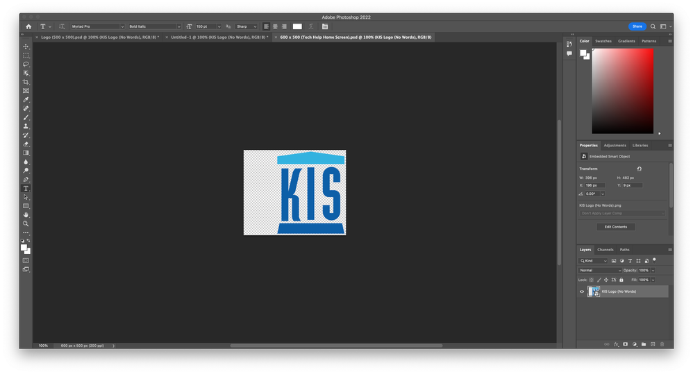
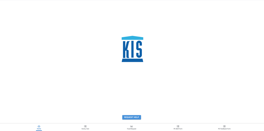
Here is my solution:
- Mark as New
- Bookmark
- Subscribe
- Mute
- Subscribe to RSS Feed
- Permalink
- Report Inappropriate Content
- Mark as New
- Bookmark
- Subscribe
- Mute
- Subscribe to RSS Feed
- Permalink
- Report Inappropriate Content
Sadly the Onboarding view development was basically abandoned and will work as it's currently shown.
Maybe @Arthur_Rallu knows if it's going to be improved in the future
- Mark as New
- Bookmark
- Subscribe
- Mute
- Subscribe to RSS Feed
- Permalink
- Report Inappropriate Content
- Mark as New
- Bookmark
- Subscribe
- Mute
- Subscribe to RSS Feed
- Permalink
- Report Inappropriate Content
Thanks for getting back to me. I would appreciate a workaround to create neatly looking screens.
- Mark as New
- Bookmark
- Subscribe
- Mute
- Subscribe to RSS Feed
- Permalink
- Report Inappropriate Content
- Mark as New
- Bookmark
- Subscribe
- Mute
- Subscribe to RSS Feed
- Permalink
- Report Inappropriate Content
Here is my solution:


-
!
1 -
Account
1,686 -
App Management
3,141 -
AppSheet
1 -
Automation
10,381 -
Bug
1,001 -
Data
9,729 -
Errors
5,778 -
Expressions
11,852 -
General Miscellaneous
1 -
Google Cloud Deploy
1 -
image and text
1 -
Integrations
1,627 -
Intelligence
582 -
Introductions
86 -
Other
2,937 -
Photos
1 -
Resources
544 -
Security
837 -
Templates
1,317 -
Users
1,565 -
UX
9,141
- « Previous
- Next »
| User | Count |
|---|---|
| 37 | |
| 31 | |
| 29 | |
| 22 | |
| 18 |

 Twitter