- AppSheet
- AppSheet Forum
- AppSheet Q&A
- Grouping by user and activity type, and show graph
- Subscribe to RSS Feed
- Mark Topic as New
- Mark Topic as Read
- Float this Topic for Current User
- Bookmark
- Subscribe
- Mute
- Printer Friendly Page
- Mark as New
- Bookmark
- Subscribe
- Mute
- Subscribe to RSS Feed
- Permalink
- Report Inappropriate Content
- Mark as New
- Bookmark
- Subscribe
- Mute
- Subscribe to RSS Feed
- Permalink
- Report Inappropriate Content
Hallo, it's my first appSheet experience, I need to track operator activity, the idea was to use google form + google sheet + google app script, but appSheet seem to be more friendly for user .
The goal is to let the user to track the activity time and type on the fly, and be aware when he/she is near to the limit for an acivity type. At the moment this tracking is on paper monthly!
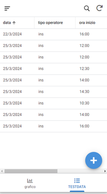
So i create a minimal testing appSheet project, where the operator can see his records
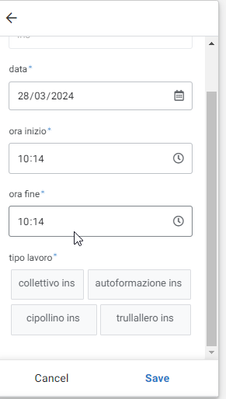
and add new records
Data are stored in a google spreadsheet
the record sheet called TESTDATA
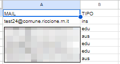
The operator table called UTENTI, at every operator is assigned the operator type
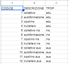
the activity type sheet called TIPILAV, where the activity tipe is coded, and associated to a operator type
The appsheet let the operator insert only the activity type assigned to his operator type.
What i'm missing is a way to give the operator a quick view of the hour spent in every activity type and, of course, try to not overcome the limit.
I was thinking to add a limit column to the TIPILAV sheet, but first i'm tryng to get a graph to show the total hours for activity type, but despite my search in this forum the result is not satisfying.
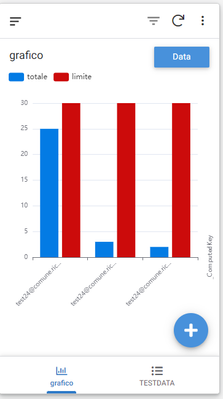
This is my best result
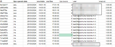
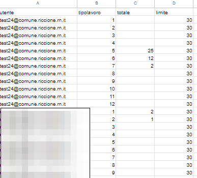
reached after hard coding a sheet called PIVOT to summarize every activity type for any operator, in future i could update this table using google app script, but as there are about 100 operators and 30 activity type it will be a heavy sheet.
The tag in the bar is the operator email, I'd like it to be the actyvity type name.
the questions are:
1) how to get subtotal for activity type without create the PIVOT sheet, if possible
2) how to set actyvity type as tag in the orizontal axis
Sorry for my english, and thank's for any suggestion!
Marco
Solved! Go to Solution.
- Mark as New
- Bookmark
- Subscribe
- Mute
- Subscribe to RSS Feed
- Permalink
- Report Inappropriate Content
- Mark as New
- Bookmark
- Subscribe
- Mute
- Subscribe to RSS Feed
- Permalink
- Report Inappropriate Content
Found solution for question number one,
The PIVOT table manually filled to test the graph now is filled by query and filter formula!
=QUERY(TESTDATA!A:H,"select G,F, SUM(H) WHERE G<>'' group by G,F")
This query sum hours grouping by user and activity type and give me the subtotals i need for chart.
=FILTER({PIVOT!B2:B,VLOOKUP(PIVOT!B2:B, {TIPILAV!A2:A,TIPILAV!B2:D}, {4}, false)}, PIVOT!B2:B<>"")
This filter let me associate the limit to any total, so the user can be aware when he is reacing the boundary
This is the "PIVOT" table resulting.
Hope this can help someone 🙂
- Mark as New
- Bookmark
- Subscribe
- Mute
- Subscribe to RSS Feed
- Permalink
- Report Inappropriate Content
- Mark as New
- Bookmark
- Subscribe
- Mute
- Subscribe to RSS Feed
- Permalink
- Report Inappropriate Content
I found solution for the question number 2, a simple edit to the computed column formula done the job!
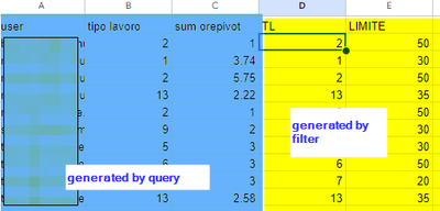
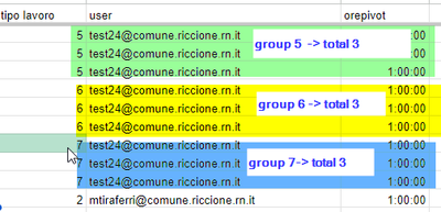
Still working to find a solution to have group totals as in this example
Of course the various activity type (tipo lavoro) may be mixex.
- Mark as New
- Bookmark
- Subscribe
- Mute
- Subscribe to RSS Feed
- Permalink
- Report Inappropriate Content
- Mark as New
- Bookmark
- Subscribe
- Mute
- Subscribe to RSS Feed
- Permalink
- Report Inappropriate Content
Found solution for question number one,
The PIVOT table manually filled to test the graph now is filled by query and filter formula!
=QUERY(TESTDATA!A:H,"select G,F, SUM(H) WHERE G<>'' group by G,F")
This query sum hours grouping by user and activity type and give me the subtotals i need for chart.
=FILTER({PIVOT!B2:B,VLOOKUP(PIVOT!B2:B, {TIPILAV!A2:A,TIPILAV!B2:D}, {4}, false)}, PIVOT!B2:B<>"")
This filter let me associate the limit to any total, so the user can be aware when he is reacing the boundary
This is the "PIVOT" table resulting.
Hope this can help someone 🙂
-
Account
1,677 -
App Management
3,099 -
AppSheet
1 -
Automation
10,323 -
Bug
983 -
Data
9,676 -
Errors
5,733 -
Expressions
11,780 -
General Miscellaneous
1 -
Google Cloud Deploy
1 -
image and text
1 -
Integrations
1,610 -
Intelligence
578 -
Introductions
85 -
Other
2,904 -
Photos
1 -
Resources
538 -
Security
828 -
Templates
1,309 -
Users
1,559 -
UX
9,110
- « Previous
- Next »
| User | Count |
|---|---|
| 43 | |
| 28 | |
| 24 | |
| 24 | |
| 13 |

 Twitter