This website uses Cookies. Click Accept to agree to our website's cookie use as described in our Privacy Policy. Click Preferences to customize your cookie settings.
Turn on suggestions
Auto-suggest helps you quickly narrow down your search results by suggesting possible matches as you type.
Showing results for
- AppSheet
- Feature Ideas
- Range of numbers in a dark themed form
Topic Options
- Subscribe to RSS Feed
- Mark as New
- Mark as Read
- Bookmark
- Subscribe
- Printer Friendly Page
- Report Inappropriate Content
Idea Options
- Mark as New
- Bookmark
- Subscribe
- Mute
- Subscribe to RSS Feed
- Permalink
- Report Inappropriate Content
Hi!
I love the dark theme and what the UI design team has done with it. I just have a suggestion.
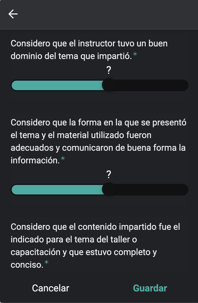
Sometimes, depending on the brightness of the screen, it is hard to spot the button tu adjust a range of numbers in a form because the button and the bar are almost the same color, so maybe changing the tone of either of them could improve the UX.
I’ll attach a picture of what i’m talking about:


 Twitter