- AppSheet
- Tips & Resources
- Tips & Tricks
- Re: Create heat map table chart using table views
- Subscribe to RSS Feed
- Mark Topic as New
- Mark Topic as Read
- Float this Topic for Current User
- Bookmark
- Subscribe
- Mute
- Printer Friendly Page
- Mark as New
- Bookmark
- Subscribe
- Mute
- Subscribe to RSS Feed
- Permalink
- Report Inappropriate Content
- Mark as New
- Bookmark
- Subscribe
- Mute
- Subscribe to RSS Feed
- Permalink
- Report Inappropriate Content
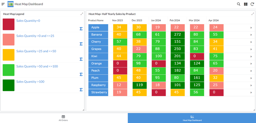
This tip is for creating heat map table charts using table views in AppSheet. There are multiple articles available on heat maps on the internet. Heat maps are a useful tool to understand multiple related data points at one glance. In the sample app below, the app user can understand how quantities of various products have been sold in the past six months including current month.
The sample app is based on another sample app "Order Capture" that is available as a sample app in AppSheet help article.
There are 10 products in the app and the heat map shows the sales of those 10 products in last six months. So the user can observe 60 data points at one glance and get a quick understanding of products that are selling well and any pattern in their month wise sales.
A screenshot of the heat map chart is attached below.
A few points to note:
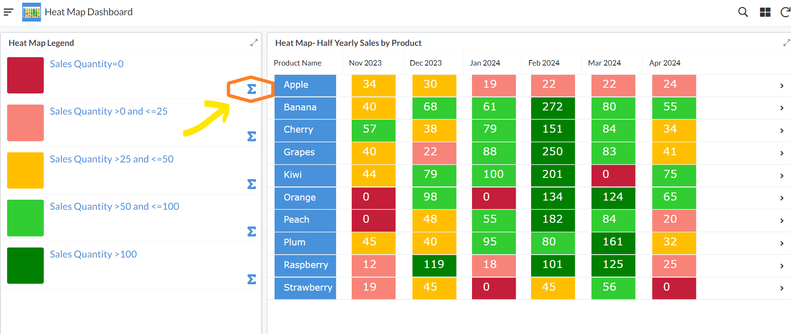
1. The chart can be updated on demand by using the inline action titled "Update Sales Quantity" in any of the rows of the "Heat Map Legend" view as shown below. Alternatively there is also a daily scheduled bot that will update the sold quantity by adding order quantity of the day
2. The chart will of course update only when new data has got added since last snapshot. For new data , please add new orders in the All Orders view. The order status needs to be "Complete" to be included in the chart.
3. The chart will automatically show the sold quantities of last 6 months including current month.
4. The chart obviously looks better in the desktop view mode than mobile view.
Here is the sample app:
- Mark as New
- Bookmark
- Subscribe
- Mute
- Subscribe to RSS Feed
- Permalink
- Report Inappropriate Content
- Mark as New
- Bookmark
- Subscribe
- Mute
- Subscribe to RSS Feed
- Permalink
- Report Inappropriate Content
Neat! congrats @Suvrutt_Gurjar
-
Account
6 -
App Management
22 -
Automation
188 -
Data
142 -
Errors
20 -
Expressions
206 -
Integrations
105 -
Intelligence
18 -
Other
57 -
Resources
24 -
Security
14 -
Templates
56 -
Users
20 -
UX
222

 Twitter
