- AppSheet
- AppSheet Forum
- AppSheet Q&A
- AGAIN PLEASE ?! What the heck is going on with For...
- Subscribe to RSS Feed
- Mark Topic as New
- Mark Topic as Read
- Float this Topic for Current User
- Bookmark
- Subscribe
- Mute
- Printer Friendly Page
- Mark as New
- Bookmark
- Subscribe
- Mute
- Subscribe to RSS Feed
- Permalink
- Report Inappropriate Content
- Mark as New
- Bookmark
- Subscribe
- Mute
- Subscribe to RSS Feed
- Permalink
- Report Inappropriate Content
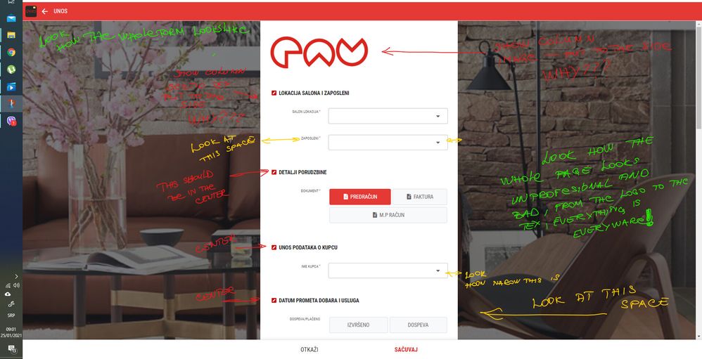
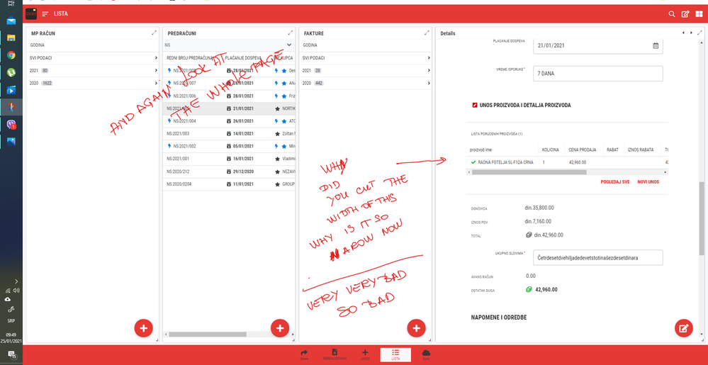
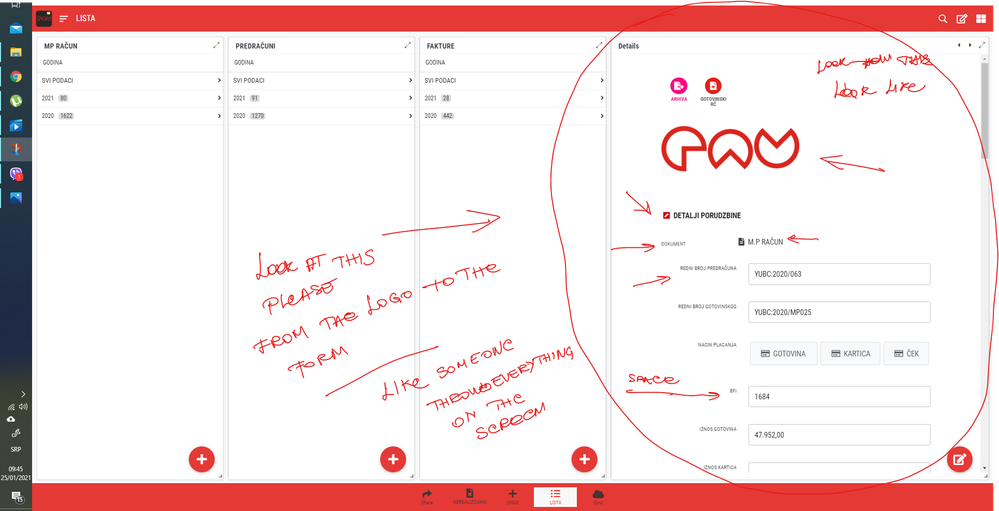
WHAT this again, it is so SO bad.
what are they doing to this platform??? and why is this so bad now.
They are messing with something that nobody had a problem with, and they are making it to be realy bad.
I really don’t know is there some team or some person that seats all day thinking how to mess up this platform and interface. nobody nobody had a problem with look of the ux, but they are fixing it to be worst, not beter.
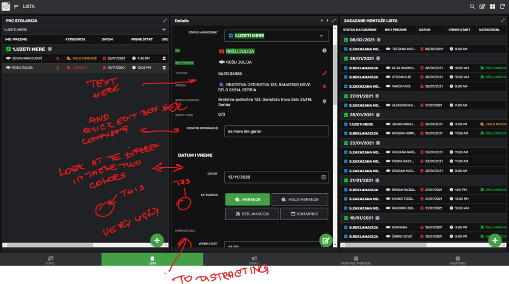
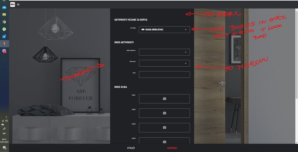
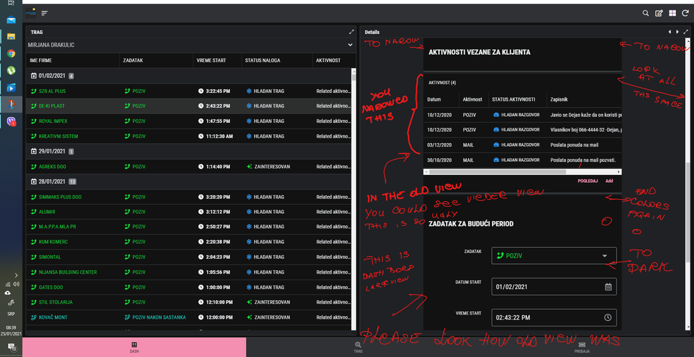
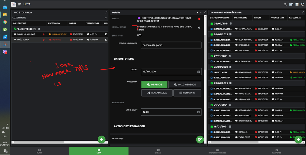
it is plain ugly, dark team pitch black, form view confusing badly done, and with so many mistakes that it look like some amateur did it. please if you can test this first on some example apps, what we all think or does it work for one. We (all the users of the platform) are using this platform we know what end users want, not some dude over there.
Please redirect those people to figure how to print document directly from the app, they will never solve that, but at least they wont mess up UX of the platform, and make it so un a piling and ugly.
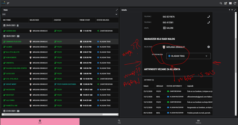
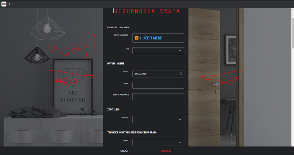
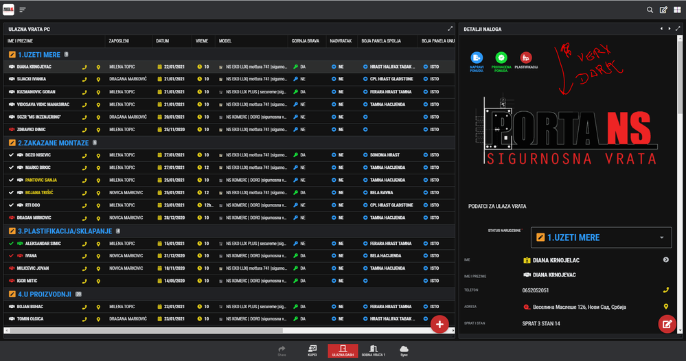
HERE SI WHAT SI NEW
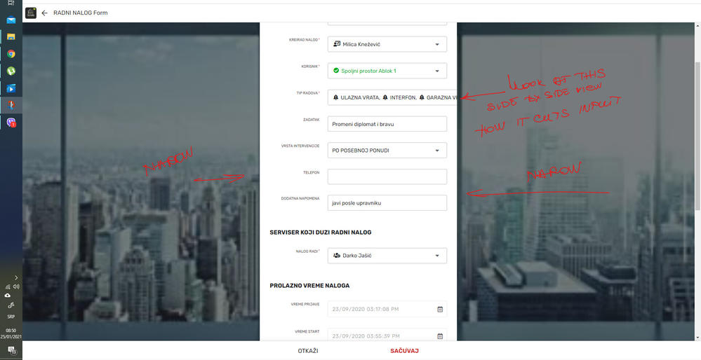
THIS IS OLD UX /GOLDEN/ FITS ENUM VALUES IN FORM
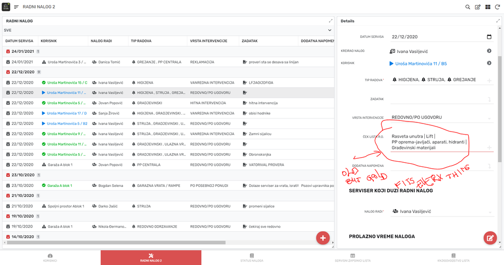
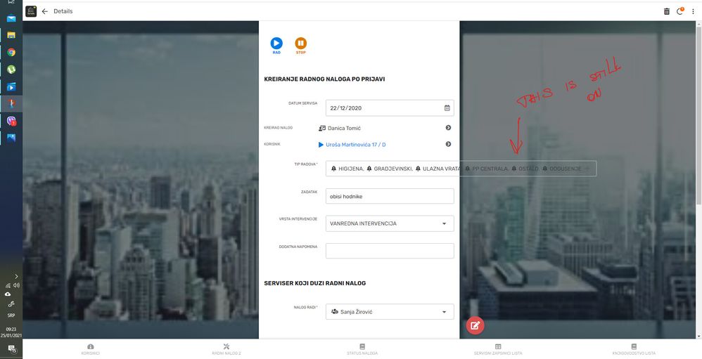
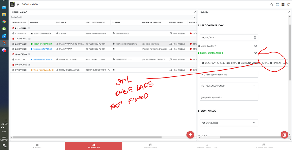
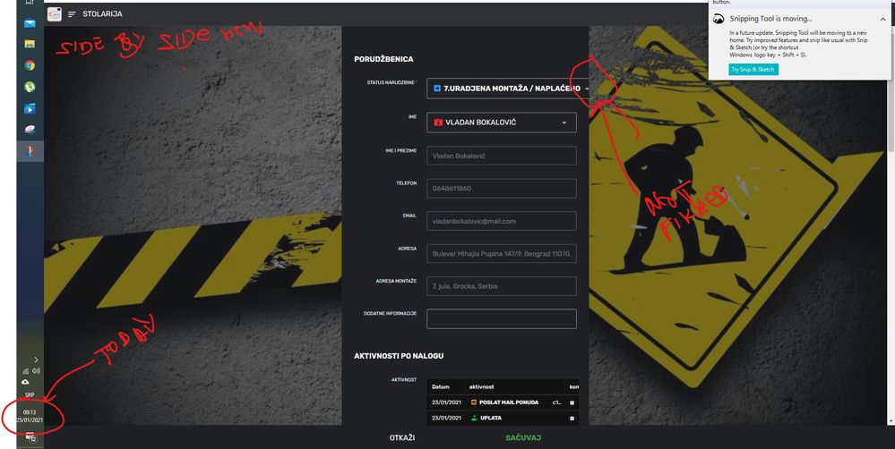
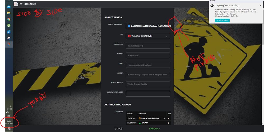
THIS IS NEW: IT DOESEN FIT IN ENUM LIST VIEW

IT EXPANDES ![]()
![]()
![]()
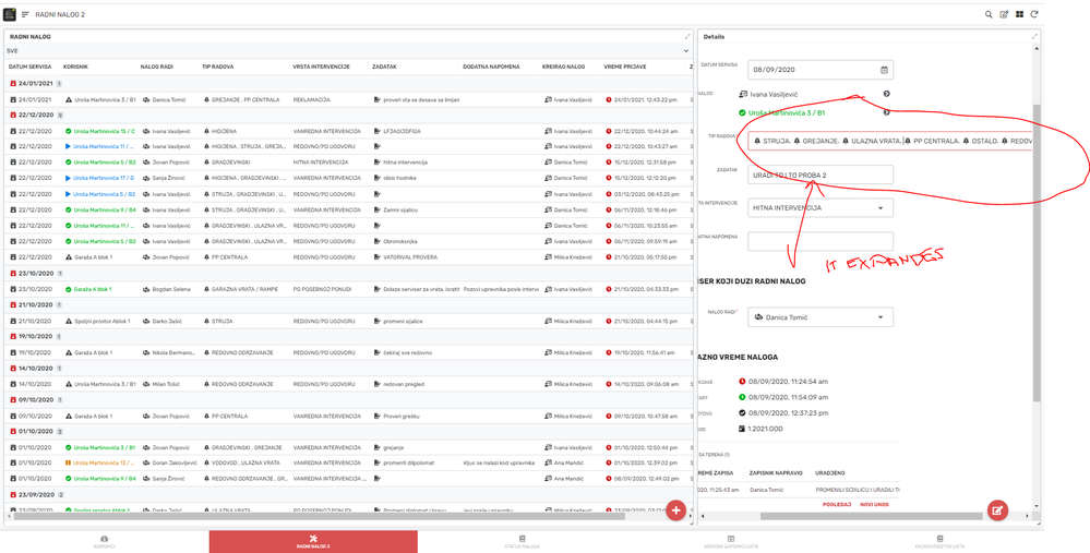
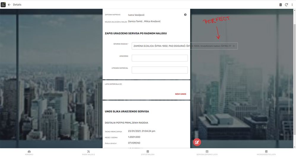
AND CUTS LIST FIELDS
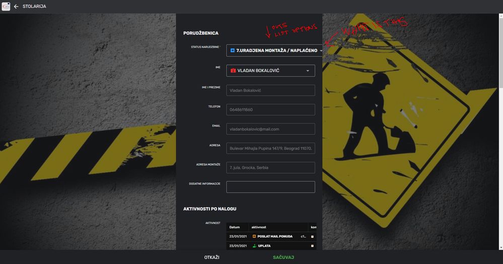
Solved! Go to Solution.
- Mark as New
- Bookmark
- Subscribe
- Mute
- Subscribe to RSS Feed
- Permalink
- Report Inappropriate Content
- Mark as New
- Bookmark
- Subscribe
- Mute
- Subscribe to RSS Feed
- Permalink
- Report Inappropriate Content
Hi @ns_soft_studio1 —
Please just give our team a bit of time to look at your detailed pics, discuss the feedback, and see what they should do about it. We don’t get to visual test all the apps ahead of each change. So your feedback is valuable and we pay attention to it, and it helps us better understand the impact of the changes we make if we get things wrong.
- Mark as New
- Bookmark
- Subscribe
- Mute
- Subscribe to RSS Feed
- Permalink
- Report Inappropriate Content
- Mark as New
- Bookmark
- Subscribe
- Mute
- Subscribe to RSS Feed
- Permalink
- Report Inappropriate Content
Thank you for reporting this in such level of details and with all the screenshots. That is very helpful.
The form witdh had been addressed, so not sure why you are seeing it again today but we had a rollout last night that seems to have missed a couple fixes. The form color issue and Enumlist wordwrap issue is new to me.
I sent a couple of email around to have some of my UX engineers look at it expeditiously.
I apologize for these issue and promise we are looking at it promptly.
Thierry
- Mark as New
- Bookmark
- Subscribe
- Mute
- Subscribe to RSS Feed
- Permalink
- Report Inappropriate Content
- Mark as New
- Bookmark
- Subscribe
- Mute
- Subscribe to RSS Feed
- Permalink
- Report Inappropriate Content
You are welcome, but please do some testing and ask people if they want that to be changed?
Why fixing something that everybody is ok with.
But not fixing the issues that are useful for the platform, for example printing, or automatic numbering of the document.
And do not let, please for the love of god, that people who do appsheet ux design to touch the platform.
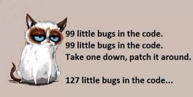
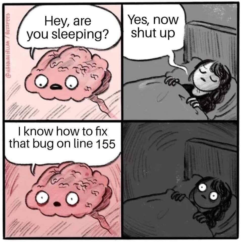
this sums it up, just kidding, not intended to insult somebody but for some laughs, ![]()
![]()

one for the team.
- Mark as New
- Bookmark
- Subscribe
- Mute
- Subscribe to RSS Feed
- Permalink
- Report Inappropriate Content
- Mark as New
- Bookmark
- Subscribe
- Mute
- Subscribe to RSS Feed
- Permalink
- Report Inappropriate Content
I COMPLETELY agree with your frustrations.
- Mark as New
- Bookmark
- Subscribe
- Mute
- Subscribe to RSS Feed
- Permalink
- Report Inappropriate Content
- Mark as New
- Bookmark
- Subscribe
- Mute
- Subscribe to RSS Feed
- Permalink
- Report Inappropriate Content
Unfortunately, this is just how it goes.
- Mark as New
- Bookmark
- Subscribe
- Mute
- Subscribe to RSS Feed
- Permalink
- Report Inappropriate Content
- Mark as New
- Bookmark
- Subscribe
- Mute
- Subscribe to RSS Feed
- Permalink
- Report Inappropriate Content
- Mark as New
- Bookmark
- Subscribe
- Mute
- Subscribe to RSS Feed
- Permalink
- Report Inappropriate Content
- Mark as New
- Bookmark
- Subscribe
- Mute
- Subscribe to RSS Feed
- Permalink
- Report Inappropriate Content
This is sent to the [Arthur_Rallu] but i think it should be here also if somebody have something to add please do.
As far as i can see here, nothing is changed since yesterday.
it is very unprofessional and if you have to explain to the future customer that this is a god platform as soon as he sees this form view it is hard to convince him in that.,
Because the smaller platforms have better ux design and look professional, this all looks like some child is playing over there, MS DOS stile is back in appsheet design team.
and again what is the purpose if you can tall me for changing this WHY???
- Mark as New
- Bookmark
- Subscribe
- Mute
- Subscribe to RSS Feed
- Permalink
- Report Inappropriate Content
- Mark as New
- Bookmark
- Subscribe
- Mute
- Subscribe to RSS Feed
- Permalink
- Report Inappropriate Content
Hi @ns_soft_studio1 —
Please just give our team a bit of time to look at your detailed pics, discuss the feedback, and see what they should do about it. We don’t get to visual test all the apps ahead of each change. So your feedback is valuable and we pay attention to it, and it helps us better understand the impact of the changes we make if we get things wrong.
- Mark as New
- Bookmark
- Subscribe
- Mute
- Subscribe to RSS Feed
- Permalink
- Report Inappropriate Content
- Mark as New
- Bookmark
- Subscribe
- Mute
- Subscribe to RSS Feed
- Permalink
- Report Inappropriate Content
Hi @ns_soft_studio1. I’m one of the developers responsible for the recent changes to this view. I’m sorry you’re finding problems with it. I’ve identified a fix for the bug you discovered where EnumList inputs were overflowing their container, thank you for reporting that and including the details I needed to reproduce it. You should see the fix deployed and available in your apps soon. As for the rest of your feedback, I hear you. Like Praveen said, we are looking at that feedback and deciding what we should do about it. I hope we can get this interface to a place where you are happy with it in the future.
- Mark as New
- Bookmark
- Subscribe
- Mute
- Subscribe to RSS Feed
- Permalink
- Report Inappropriate Content
- Mark as New
- Bookmark
- Subscribe
- Mute
- Subscribe to RSS Feed
- Permalink
- Report Inappropriate Content
HI @Summer, tnx for the replay, here is some more of the pics how it really looks like for the end user.
so you can to the necessary judgment on this new look.
and hope you don’t take this pics offensive it is not meant to do that but for you to see how ugly distracting and not useful this is, if you ware the user of this ux be honest what would you think.
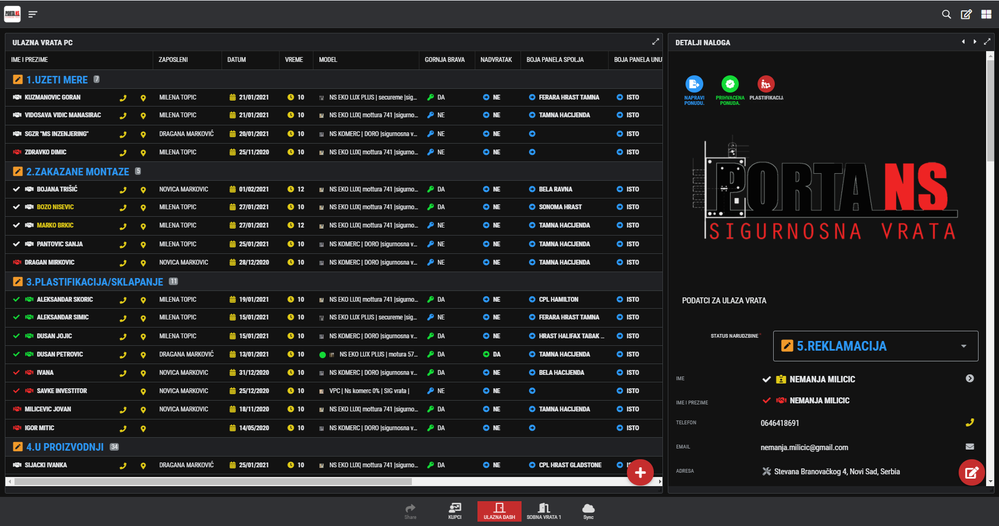
for me is: i don’t want to look at this it is to heavy for the brain, not knowing what to look at because is too distracting, confusing, messy, and big contrasts like you are looking at a neon sign.
this all got to a point that it really looks like someone wants to degrade this wonderful platform to the point we cant use it no more, become so unstable and ugly in the last few mounts.
earlier we didn’t have that problems at all.
and if you can only see what the customers are telling us you would be surprised.
just be objective and look thru the ayes of the end user, and you will get it.
in one poin eartlier it look realy good, esasy to use and look at and now is like bomb exploded.
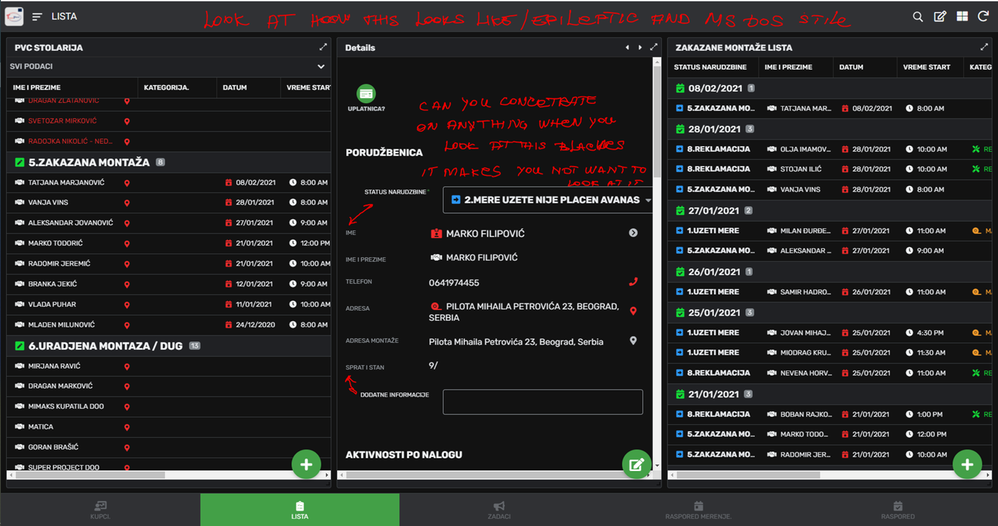
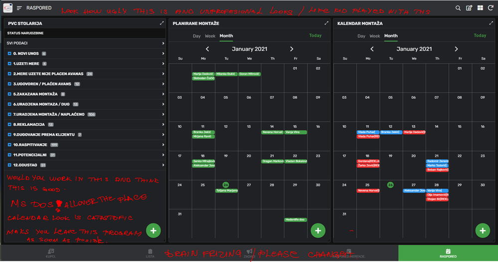
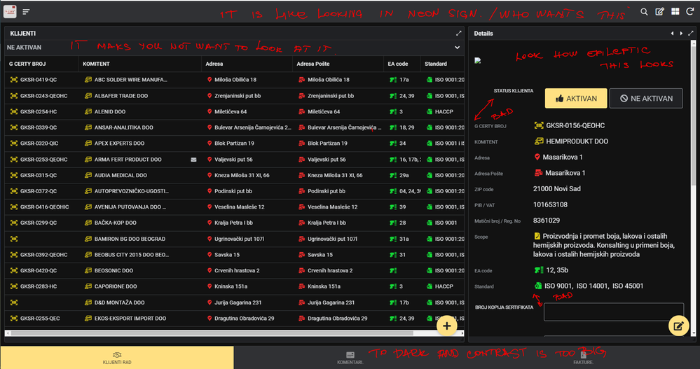
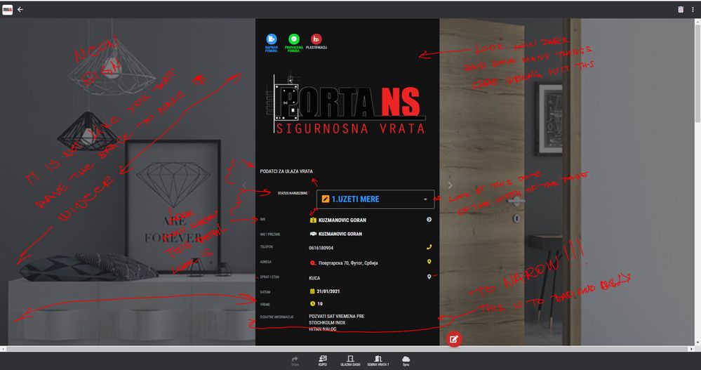
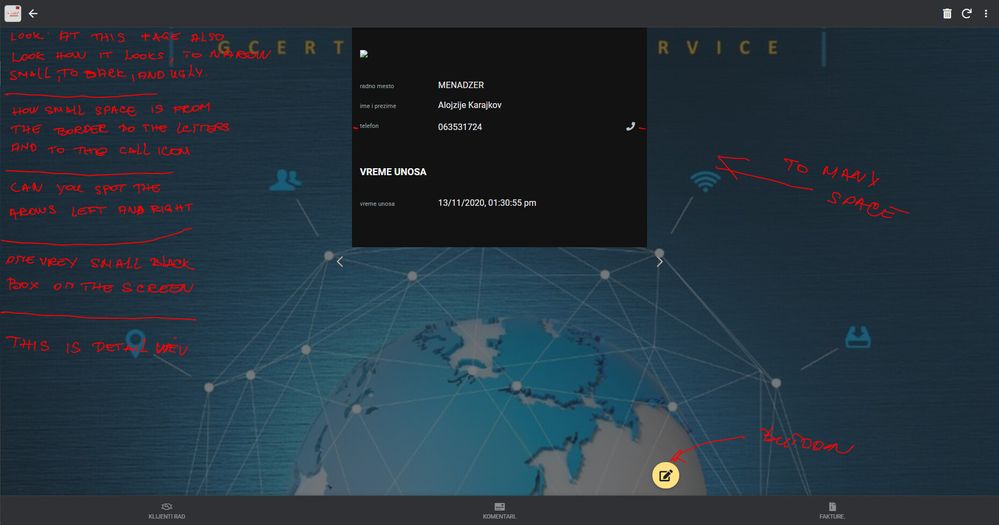
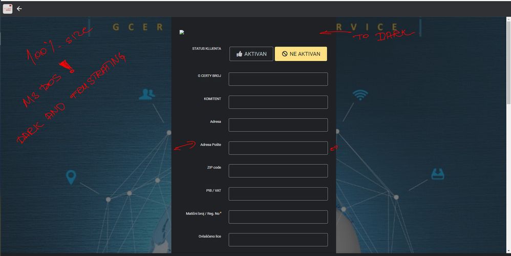
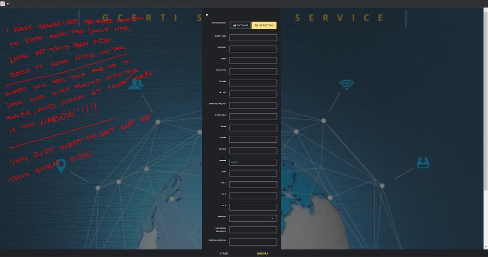
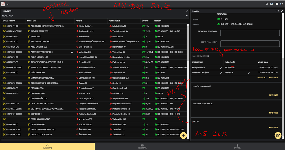
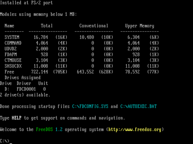
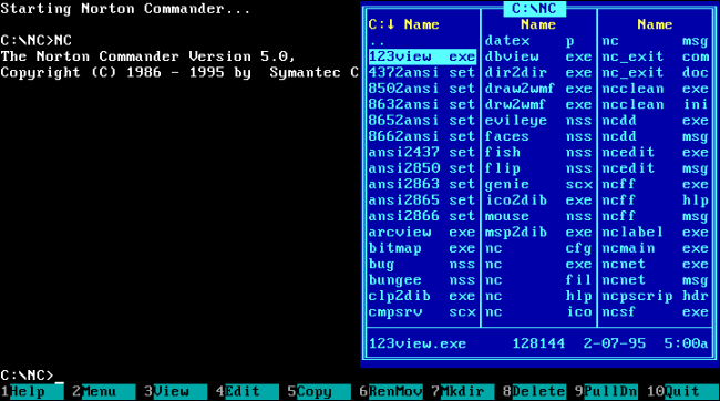
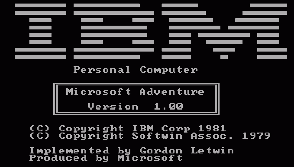
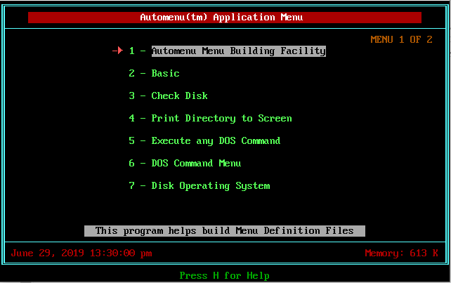
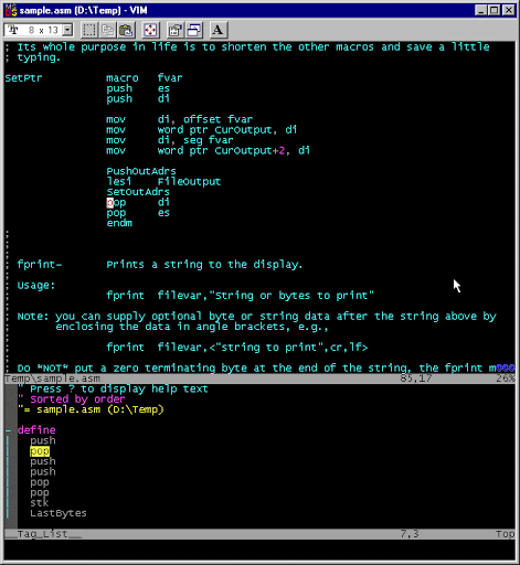
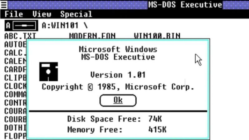
Here are some MS DOS pic so you can compare:
- Mark as New
- Bookmark
- Subscribe
- Mute
- Subscribe to RSS Feed
- Permalink
- Report Inappropriate Content
- Mark as New
- Bookmark
- Subscribe
- Mute
- Subscribe to RSS Feed
- Permalink
- Report Inappropriate Content
Hi @ns_soft_studio1 — ah I’d forgotten MS-DOS :]
So there’s a few different issues you are calling out here. I’m just wondering if you can help Madeline more directly by listing them specifically …
*) In the dark theme, the background feels too dark to you I think
*) Width of the form and details view in the full-screen browser
*) Padding on left and right of the form and some alignment issues for a few of the labels in the form
*) Left & right arrow in the details view and the action button are separated from the content.
*) ?? other things I have missed ??
Btw, I take it it is important to you that this app have a dark theme? It seems a pretty busy app with a lot of formatting colors and I wonder if it would look fundamentally better with a light/white theme. That’s independent of any of the changes you’re suggesting but I’m wondering this all the same.
- Mark as New
- Bookmark
- Subscribe
- Mute
- Subscribe to RSS Feed
- Permalink
- Report Inappropriate Content
- Mark as New
- Bookmark
- Subscribe
- Mute
- Subscribe to RSS Feed
- Permalink
- Report Inappropriate Content
we have a light theme apps also, (pic added in previus chat) but mostly our costumers like the dark team because it was not eye stressing and colors was milled and pleasing. with light grey colors that are now gone.
not all user in our case want to look at white screen like in the light bulb it is easier for them do look at dark one, and now that is gone to.
they have downsized every view in the app, calendar and everything, text in every positon on the form, different positions, section heeders and show image position is like a program had a stroke, in general it has changed so much that it looks really bad, not just from my perspective please do a research on this topic, no mater is it dark or ligt team.
please take a look at the older ux versions and compare the two, offer to the users to decide, because i really think this solution is so bad and ugly.
Is there a way for you to see how many apps are done in dark team and how many in light versions?
this platform was so good at one point that we based all our business around it and it had so much positive feed back from the costumers that you can not believe and now are mostly complaints, we are now contacting support more then ever, we never had that problem before, and now on top of things this UX design that is just (do not want to be rude) plain ugly.
And please keep in mind that we have to convince the future costumers that this is better from the other app platforms, that are sorry to say, at this point looking much better to somebody who don’t understand functions but only looking at it.
i love this platform so much and that is why this is so frustrating, it is far more greater and superior then others out there, but it look and feels unprofessional and bad.
look how clean this was and nice and look at now how lighte verison looks like.
and look at the whiteness of this, with no diference in rows, added some lines to separete the rows, exel format like, (agiain this is my opinion) there si no supstance to this it looks like some one badly copied the google sheet to the program.
when you had light and dark rows it felt reliable and how it should program be now its just plain white, with some lines and boxes, empty totally.
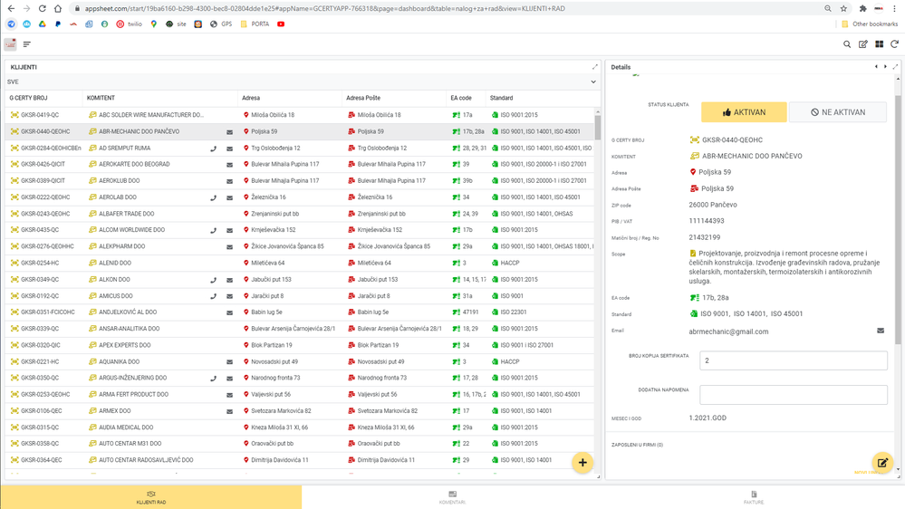
just try to concentrate and read all off this in here for 2 min without head exploding from colors and contrast. try to work in this environment
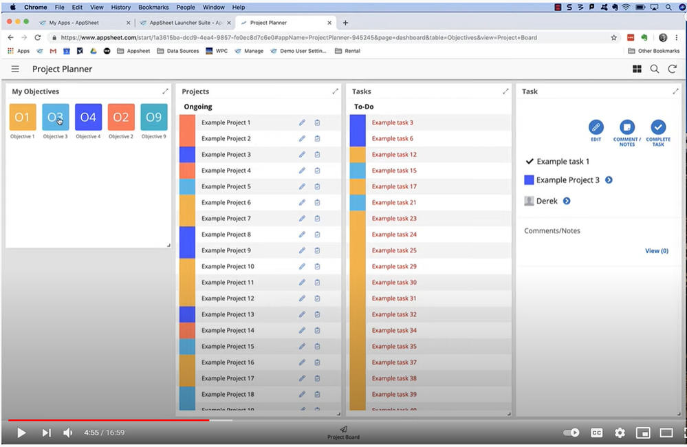
and look at this old ux how pleasing and nice it looks
-
Account
1,676 -
App Management
3,099 -
AppSheet
1 -
Automation
10,321 -
Bug
983 -
Data
9,676 -
Errors
5,733 -
Expressions
11,778 -
General Miscellaneous
1 -
Google Cloud Deploy
1 -
image and text
1 -
Integrations
1,609 -
Intelligence
578 -
Introductions
85 -
Other
2,904 -
Photos
1 -
Resources
538 -
Security
827 -
Templates
1,308 -
Users
1,558 -
UX
9,110
- « Previous
- Next »
| User | Count |
|---|---|
| 41 | |
| 29 | |
| 24 | |
| 24 | |
| 13 |

 Twitter
