- AppSheet
- Feature Ideas
- Alert, Confirmation Message design and style shoul...
- Subscribe to RSS Feed
- Mark as New
- Mark as Read
- Bookmark
- Subscribe
- Printer Friendly Page
- Report Inappropriate Content
- Mark as New
- Bookmark
- Subscribe
- Mute
- Subscribe to RSS Feed
- Permalink
- Report Inappropriate Content
This is also one of the requests for improvement of UI/UX for Appsheet.
Setting up the action with “confirmation message”, it will give a pop up window with simple UI. Then user is asked to explicitly hit the buttons, basically either YES or NO to interact with App further.
For the current design of this pop up window, we don t have much of flexibility in terms of customizing the texts, design etc.
Among others, the feedback from app users are claiming a bit of improvement really.
First of all, the users are give choices of YES or NO basically with confirmation/alert window.
But this window is not really “Appealing” to guide the user in terms of what to do for next.
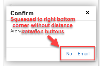
This is a simple example which looks pretty much default view of those windows.
The action button is looking just texts instead of proper “button” looking. Also those actions which will do the opposite stuffs are located at the right bottom corner, and they are getting unnecessarily closer to each other without reasonable margins in between.
In additionn, the text on the right handside, button name is always Action name, which sometimes does not make sense.
For this sample, “No Email” ?
What ? It does not make sense to users.
When the alert/confirmation window pops up, i know what to do as I do have years experience with Appsheet, but for majority of app users are not. So they are puzzled by seeing this modal window, as far as the claim and feedback from my app users are concerned.
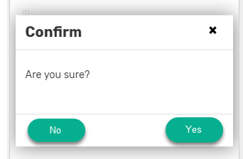
To make this window is getting more self-explanatory and infer what to do for app user for next, the action button should be looking “more proper button style”. To separete the action which stands on the opposite corner and side, they should be located with reasonable distance in between.
Instead of text style, it should be more proper action button style to let the app users interact with app more easily.
Taking into account those factors, Ideally it should be looking like this in my opinion.
Thank you for considering.

 Twitter
