- AppSheet
- AppSheet Forum
- AppSheet Q&A
- All the points in Y axis in Col series Chart
- Subscribe to RSS Feed
- Mark Topic as New
- Mark Topic as Read
- Float this Topic for Current User
- Bookmark
- Subscribe
- Mute
- Printer Friendly Page
- Mark as New
- Bookmark
- Subscribe
- Mute
- Subscribe to RSS Feed
- Permalink
- Report Inappropriate Content
- Mark as New
- Bookmark
- Subscribe
- Mute
- Subscribe to RSS Feed
- Permalink
- Report Inappropriate Content
Hello Experts,
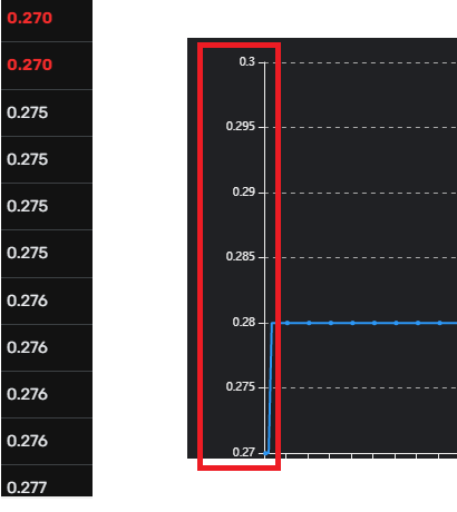
I have used one col series chart in the application. But in the Y axis, the all values are not coming. In dataset my values are like 0.270, 0272, 0.275, 0.276, 0.277, 0.280 etc. But in chart I can see the values like 0.270, 0.275, 0.280 etc. The difference between the points is 0.005, alawys. Below is my screen shot:
I would like to have all the points as available in the data set. Is it possible to show all the points in the Y axis?
Any Idea?
Thanks,
Arindam
- Labels:
-
UX
- Mark as New
- Bookmark
- Subscribe
- Mute
- Subscribe to RSS Feed
- Permalink
- Report Inappropriate Content
- Mark as New
- Bookmark
- Subscribe
- Mute
- Subscribe to RSS Feed
- Permalink
- Report Inappropriate Content
Could you update what is the range of values in the dataset that you wish to plot?
- Mark as New
- Bookmark
- Subscribe
- Mute
- Subscribe to RSS Feed
- Permalink
- Report Inappropriate Content
- Mark as New
- Bookmark
- Subscribe
- Mute
- Subscribe to RSS Feed
- Permalink
- Report Inappropriate Content
Hello Suvrutt,
Thanks for your reply. My range would be dynamic based on business. If I consider above picture, My lower limit is 0.270 & upper limit is 0.300. In between anything can be possible for business & I wan all of them in the Y axis. But in my application its taking only 0.005 intervals.
Hope you can understand.
Thanks,
Arindam
- Mark as New
- Bookmark
- Subscribe
- Mute
- Subscribe to RSS Feed
- Permalink
- Report Inappropriate Content
- Mark as New
- Bookmark
- Subscribe
- Mute
- Subscribe to RSS Feed
- Permalink
- Report Inappropriate Content
Thank you for the update. I believe the data range will decide the resolution of Y axis. With the data set having values from 0.270 to 0.300 , if you wish to see resolutions of .001, you will need 30 steps on the Y axis.
I believe the chart engine cleverly and rightfully adjusts the steps based on the data range. So if you test with a dataset having data values range of say 0.270 to 0.276 or 0.277, you will possibly get resolution of 0.001
My testing shows that the Y axis adjusts to around 7 steps based on data range values.
To display a large range with small Y axis steps or resolution, I believe you will need to possibly present the data to the chart in slices with smaller data range.
- Mark as New
- Bookmark
- Subscribe
- Mute
- Subscribe to RSS Feed
- Permalink
- Report Inappropriate Content
- Mark as New
- Bookmark
- Subscribe
- Mute
- Subscribe to RSS Feed
- Permalink
- Report Inappropriate Content
Thanks again Suvrutt. Same opinion for me. Based on my dataset, chart engine adjusts accordingly. I did the same test & same result.
Thanks,
Arindam.
- Mark as New
- Bookmark
- Subscribe
- Mute
- Subscribe to RSS Feed
- Permalink
- Report Inappropriate Content
- Mark as New
- Bookmark
- Subscribe
- Mute
- Subscribe to RSS Feed
- Permalink
- Report Inappropriate Content
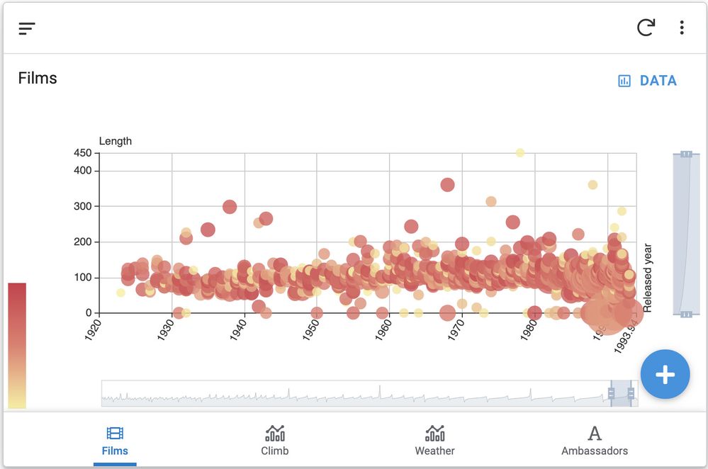
Yes any chart engine, not just ours, will update dynamically the X and Y axis for continuous values (ie measures) and plot the tickers automatically. The reason it doesn’t plot ALL the values is because it could very quickly become very crowded if you had a lot of them close to each other in ranges.
Look at this eample and imagine if we plotted every single value both on X and X.

Anyway I encourage you to try to new Chart engine we are about to release for preview to everyone next week. It has a lot more charting capabilities than the current one.
Thierry
- Mark as New
- Bookmark
- Subscribe
- Mute
- Subscribe to RSS Feed
- Permalink
- Report Inappropriate Content
- Mark as New
- Bookmark
- Subscribe
- Mute
- Subscribe to RSS Feed
- Permalink
- Report Inappropriate Content
Hello THhers,
Thanks, for your kind response. I will be waiting for new chart engine. Lets see the new one.
Thanks,
Arindam
-
Account
1,675 -
App Management
3,090 -
AppSheet
1 -
Automation
10,313 -
Bug
979 -
Data
9,670 -
Errors
5,727 -
Expressions
11,769 -
General Miscellaneous
1 -
Google Cloud Deploy
1 -
image and text
1 -
Integrations
1,605 -
Intelligence
578 -
Introductions
85 -
Other
2,898 -
Photos
1 -
Resources
536 -
Security
827 -
Templates
1,305 -
Users
1,557 -
UX
9,109
- « Previous
- Next »
| User | Count |
|---|---|
| 46 | |
| 29 | |
| 24 | |
| 22 | |
| 13 |

 Twitter