- AppSheet
- AppSheet Forum
- AppSheet Q&A
- Appearance change affecting Interactive Dashboard ...
- Subscribe to RSS Feed
- Mark Topic as New
- Mark Topic as Read
- Float this Topic for Current User
- Bookmark
- Subscribe
- Mute
- Printer Friendly Page
- Mark as New
- Bookmark
- Subscribe
- Mute
- Subscribe to RSS Feed
- Permalink
- Report Inappropriate Content
- Mark as New
- Bookmark
- Subscribe
- Mute
- Subscribe to RSS Feed
- Permalink
- Report Inappropriate Content
Hello Appsheet team!
A few days ago I noticed a small change in the way that the UI of my APPs looked, I presume it is related to the Google Cloud adaptation process and actually looks really nice, the problem is that before that change happening when I selected a record on some interactive dashboard, that record change color, which let me know that in the other areas or windows of the dashboard I was looking information related to the record I selected (the colored one).
I open this question because that small change is affecting the easy use of dashboards, cause I need to press two times the record to be completely sure that it is the one I am looking related info, would be nice if again when a record is selected it change color to easily let you know what are you looking at in the whole dashboard.
As an example, one of the sample apps may illustrate my issue:
https://www.appsheet.com/Template/AppDef?appName=InspectionAnalytics-626900&product_tour_id=59455#UX...
You may notice there that when you select one of the images there is a slight attenuation happening, in my case since its tabular data the whole line should change color, but I doesn’t anymore.
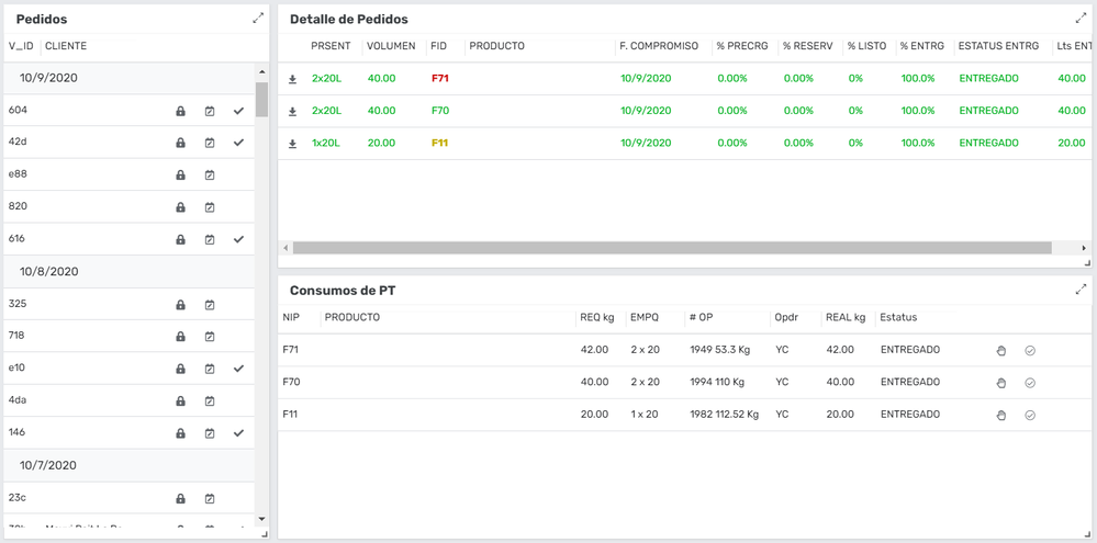
I share another picture to illustrate:

The 3 areas are related, but when I select a record of the Pedidos window and only related records are showed in Detalle de Pedidos and Consumos de PT, the record in Pedidos does not change color, it is difficult to know what record (Pedido) are you looking at.
Is this something that will be back to usual soon or it is this the new way of behaving of interactive dashboards?
Thanks in advance for any help/information you can give me.
BTW, Appsheet is awesome!
- Labels:
-
Automation
-
Errors
-
UX
- Mark as New
- Bookmark
- Subscribe
- Mute
- Subscribe to RSS Feed
- Permalink
- Report Inappropriate Content
- Mark as New
- Bookmark
- Subscribe
- Mute
- Subscribe to RSS Feed
- Permalink
- Report Inappropriate Content
Hi, this was a bug and fix should be released when we next time deploy (Monday). Sorry about this.
- Mark as New
- Bookmark
- Subscribe
- Mute
- Subscribe to RSS Feed
- Permalink
- Report Inappropriate Content
- Mark as New
- Bookmark
- Subscribe
- Mute
- Subscribe to RSS Feed
- Permalink
- Report Inappropriate Content
Excellent! Good to know, thanks for your answer.
-
Account
1,675 -
App Management
3,088 -
AppSheet
1 -
Automation
10,312 -
Bug
978 -
Data
9,668 -
Errors
5,726 -
Expressions
11,767 -
General Miscellaneous
1 -
Google Cloud Deploy
1 -
image and text
1 -
Integrations
1,604 -
Intelligence
578 -
Introductions
85 -
Other
2,895 -
Photos
1 -
Resources
536 -
Security
827 -
Templates
1,305 -
Users
1,557 -
UX
9,109
- « Previous
- Next »
| User | Count |
|---|---|
| 45 | |
| 29 | |
| 24 | |
| 21 | |
| 13 |

 Twitter