- AppSheet
- AppSheet Forum
- AppSheet Q&A
- Background Image in Card View
- Subscribe to RSS Feed
- Mark Topic as New
- Mark Topic as Read
- Float this Topic for Current User
- Bookmark
- Subscribe
- Mute
- Printer Friendly Page
- Mark as New
- Bookmark
- Subscribe
- Mute
- Subscribe to RSS Feed
- Permalink
- Report Inappropriate Content
- Mark as New
- Bookmark
- Subscribe
- Mute
- Subscribe to RSS Feed
- Permalink
- Report Inappropriate Content
Hi,
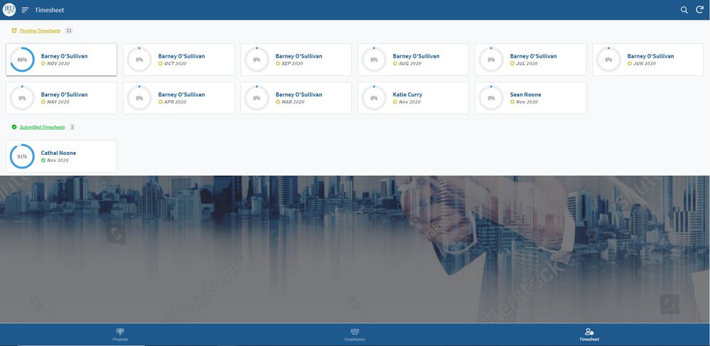
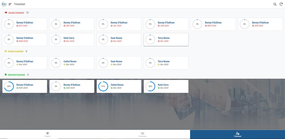
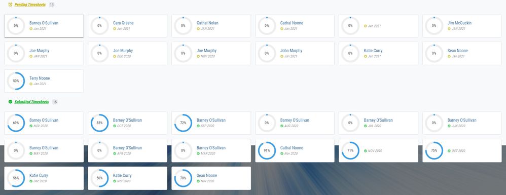
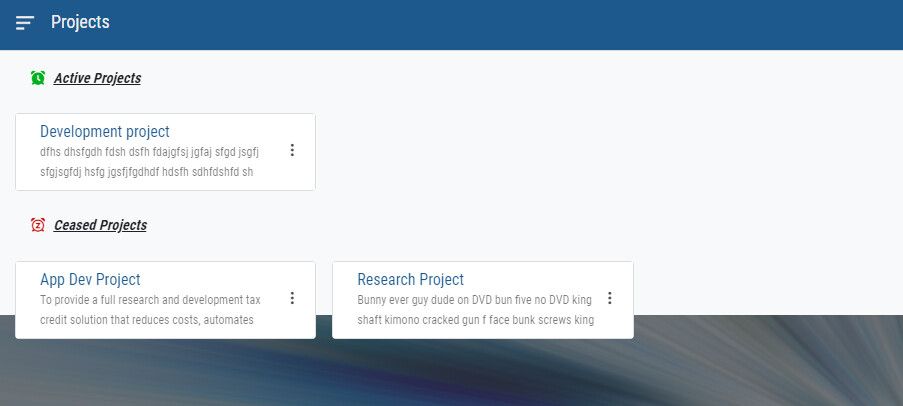
I’m just back after Christmas and I’m wondering if there has been a change to the way the background image displays in the card view? Before I left all the grey areas behind the cards showed the background image. This is happening on all my card views.
Thanks

Solved! Go to Solution.
- Mark as New
- Bookmark
- Subscribe
- Mute
- Subscribe to RSS Feed
- Permalink
- Report Inappropriate Content
- Mark as New
- Bookmark
- Subscribe
- Mute
- Subscribe to RSS Feed
- Permalink
- Report Inappropriate Content
Hi @Cathal_Noone, thanks for posting this – we’ve been aware of this change and have it on our list to address asap.
- Mark as New
- Bookmark
- Subscribe
- Mute
- Subscribe to RSS Feed
- Permalink
- Report Inappropriate Content
- Mark as New
- Bookmark
- Subscribe
- Mute
- Subscribe to RSS Feed
- Permalink
- Report Inappropriate Content
Hi @Cathal_Noone
I think that is a known problem and is being fixed.
- Mark as New
- Bookmark
- Subscribe
- Mute
- Subscribe to RSS Feed
- Permalink
- Report Inappropriate Content
- Mark as New
- Bookmark
- Subscribe
- Mute
- Subscribe to RSS Feed
- Permalink
- Report Inappropriate Content
Thanks @Lynn
- Mark as New
- Bookmark
- Subscribe
- Mute
- Subscribe to RSS Feed
- Permalink
- Report Inappropriate Content
- Mark as New
- Bookmark
- Subscribe
- Mute
- Subscribe to RSS Feed
- Permalink
- Report Inappropriate Content
Hi @Lynn,
Do you know if there is another post on this forum, somewhere that I can check on to see the status of this or get a notification of when it’s fixed?
Thanks again,
Cathal
- Mark as New
- Bookmark
- Subscribe
- Mute
- Subscribe to RSS Feed
- Permalink
- Report Inappropriate Content
- Mark as New
- Bookmark
- Subscribe
- Mute
- Subscribe to RSS Feed
- Permalink
- Report Inappropriate Content
Just want to follow up on this if anyone knows anything more. I redesigned all my views to card views, as my users are mostly desktop. Is this been worked on and if so any idea of when it’ll be back up and running properly? I’m going to revert back to the old views but I’ll hold off if a fix is imminent. I don’t want to deploy the app that is going to look different to the version I demonstrated before Christmas to the users.
- Mark as New
- Bookmark
- Subscribe
- Mute
- Subscribe to RSS Feed
- Permalink
- Report Inappropriate Content
- Mark as New
- Bookmark
- Subscribe
- Mute
- Subscribe to RSS Feed
- Permalink
- Report Inappropriate Content
- Mark as New
- Bookmark
- Subscribe
- Mute
- Subscribe to RSS Feed
- Permalink
- Report Inappropriate Content
- Mark as New
- Bookmark
- Subscribe
- Mute
- Subscribe to RSS Feed
- Permalink
- Report Inappropriate Content
Hi @Cathal_Noone, thanks for posting this – we’ve been aware of this change and have it on our list to address asap.
- Mark as New
- Bookmark
- Subscribe
- Mute
- Subscribe to RSS Feed
- Permalink
- Report Inappropriate Content
- Mark as New
- Bookmark
- Subscribe
- Mute
- Subscribe to RSS Feed
- Permalink
- Report Inappropriate Content
I wish to make this Option to the app creators, meaning by default the background of card view is solid color (like current setting) otherwise making it to the transparent where the background of app image will become visible.
In my personnel opinion, current configulation is fine. Once the background is made to transparent, one of my concerns is it become distractive to the app users, depending on what sort of app background image we would push.
All in all, the best solution is to make this setting optional.
- Mark as New
- Bookmark
- Subscribe
- Mute
- Subscribe to RSS Feed
- Permalink
- Report Inappropriate Content
- Mark as New
- Bookmark
- Subscribe
- Mute
- Subscribe to RSS Feed
- Permalink
- Report Inappropriate Content
Yes - the solid background is intentional. But we’re seeing that people have different preferences, so I’m researching some into simple ways to make the view flexible to different options without too much overload of settings in the editor.
- Mark as New
- Bookmark
- Subscribe
- Mute
- Subscribe to RSS Feed
- Permalink
- Report Inappropriate Content
- Mark as New
- Bookmark
- Subscribe
- Mute
- Subscribe to RSS Feed
- Permalink
- Report Inappropriate Content
Mines kinda doing both at the same time at the moment

- Mark as New
- Bookmark
- Subscribe
- Mute
- Subscribe to RSS Feed
- Permalink
- Report Inappropriate Content
- Mark as New
- Bookmark
- Subscribe
- Mute
- Subscribe to RSS Feed
- Permalink
- Report Inappropriate Content
Well, that’s not good! ![]()
- Mark as New
- Bookmark
- Subscribe
- Mute
- Subscribe to RSS Feed
- Permalink
- Report Inappropriate Content
- Mark as New
- Bookmark
- Subscribe
- Mute
- Subscribe to RSS Feed
- Permalink
- Report Inappropriate Content
Hi @morgan,
I just wanted to check in on this again, have you guys made any progress on it? The background is only partially covering the are behind the tile throughout my app at the moment.


- Mark as New
- Bookmark
- Subscribe
- Mute
- Subscribe to RSS Feed
- Permalink
- Report Inappropriate Content
- Mark as New
- Bookmark
- Subscribe
- Mute
- Subscribe to RSS Feed
- Permalink
- Report Inappropriate Content
HI Morgan,
Is this still in the pipeline or has it been parked? I’m still seeing the same issues.
Kind Regards,
Cathal
- Mark as New
- Bookmark
- Subscribe
- Mute
- Subscribe to RSS Feed
- Permalink
- Report Inappropriate Content
- Mark as New
- Bookmark
- Subscribe
- Mute
- Subscribe to RSS Feed
- Permalink
- Report Inappropriate Content
He is no longer with Appsheet, I learned so.
- Mark as New
- Bookmark
- Subscribe
- Mute
- Subscribe to RSS Feed
- Permalink
- Report Inappropriate Content
- Mark as New
- Bookmark
- Subscribe
- Mute
- Subscribe to RSS Feed
- Permalink
- Report Inappropriate Content
Thanks @tsuji_koichi,
@Steve is there someone else on the UX team that might be looking at this?
Thanks Cathal
- Mark as New
- Bookmark
- Subscribe
- Mute
- Subscribe to RSS Feed
- Permalink
- Report Inappropriate Content
- Mark as New
- Bookmark
- Subscribe
- Mute
- Subscribe to RSS Feed
- Permalink
- Report Inappropriate Content
I have no idea. Best to contact support@appsheet.com at this point.
- Mark as New
- Bookmark
- Subscribe
- Mute
- Subscribe to RSS Feed
- Permalink
- Report Inappropriate Content
- Mark as New
- Bookmark
- Subscribe
- Mute
- Subscribe to RSS Feed
- Permalink
- Report Inappropriate Content
Im not able to reproduce the problem. (Issue : bottom of the background of Card view is cut off. I cant reproduce)
If you try to make the background color transparent, I m afraid it is not possible as they (Google) set this as default.
It is disputable, but I perfer the background for card view should be colored (like currently it does) rather than transparent.
-
Account
1,676 -
App Management
3,097 -
AppSheet
1 -
Automation
10,317 -
Bug
981 -
Data
9,674 -
Errors
5,730 -
Expressions
11,775 -
General Miscellaneous
1 -
Google Cloud Deploy
1 -
image and text
1 -
Integrations
1,606 -
Intelligence
578 -
Introductions
85 -
Other
2,900 -
Photos
1 -
Resources
537 -
Security
827 -
Templates
1,306 -
Users
1,558 -
UX
9,109
- « Previous
- Next »
| User | Count |
|---|---|
| 41 | |
| 28 | |
| 28 | |
| 23 | |
| 13 |

 Twitter