- AppSheet
- Tips & Resources
- Tips & Tricks
- Card view as alterntive to Deck View type
- Subscribe to RSS Feed
- Mark Topic as New
- Mark Topic as Read
- Float this Topic for Current User
- Bookmark
- Subscribe
- Mute
- Printer Friendly Page
- Mark as New
- Bookmark
- Subscribe
- Mute
- Subscribe to RSS Feed
- Permalink
- Report Inappropriate Content
- Mark as New
- Bookmark
- Subscribe
- Mute
- Subscribe to RSS Feed
- Permalink
- Report Inappropriate Content
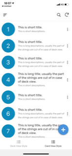
Deck view currently shows only single line of text strings when we push texts to primary or secondary. In case we have long text, the part of text are cut off.
In compensation for losing the functionality available on deck view, the Card View List type could work as alternative.
This is deck view as a sample
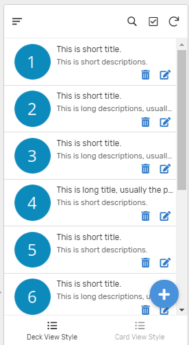
This turns to be …
Is it possible we draw the light weight boarder line between card view list to distinguish the area?
- Labels:
-
UX
- Mark as New
- Bookmark
- Subscribe
- Mute
- Subscribe to RSS Feed
- Permalink
- Report Inappropriate Content
- Mark as New
- Bookmark
- Subscribe
- Mute
- Subscribe to RSS Feed
- Permalink
- Report Inappropriate Content
I agree, some form of “card definition” like the line, or shadow, or rounding… I agree.
- Mark as New
- Bookmark
- Subscribe
- Mute
- Subscribe to RSS Feed
- Permalink
- Report Inappropriate Content
- Mark as New
- Bookmark
- Subscribe
- Mute
- Subscribe to RSS Feed
- Permalink
- Report Inappropriate Content
Love the Card View as well for this reason. However, the interface I need is still inadequate because Format Symbols are not displaying on Card View. Tagging @morgan
- Mark as New
- Bookmark
- Subscribe
- Mute
- Subscribe to RSS Feed
- Permalink
- Report Inappropriate Content
- Mark as New
- Bookmark
- Subscribe
- Mute
- Subscribe to RSS Feed
- Permalink
- Report Inappropriate Content
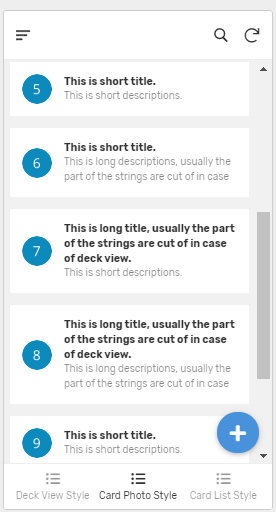
Card view with Photo type (no main image)instead of list returns UI like this. Still multiple rows for long texts if we need.
In this view, we have some amount of margins around the items.
As an option.
- Mark as New
- Bookmark
- Subscribe
- Mute
- Subscribe to RSS Feed
- Permalink
- Report Inappropriate Content
- Mark as New
- Bookmark
- Subscribe
- Mute
- Subscribe to RSS Feed
- Permalink
- Report Inappropriate Content
Got the same issue, but then i found a solution. First creating the card view and then display that carview in a Dashboard view it looked like this.
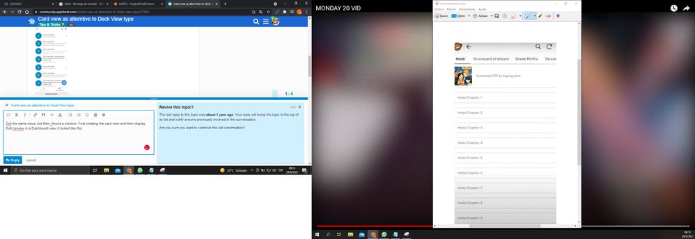
But starting this week they eliminated tha option and now it looks like this.
Can you guys fix this
-
Account
6 -
App Management
21 -
Automation
186 -
Data
140 -
Errors
19 -
Expressions
206 -
Integrations
103 -
Intelligence
17 -
Other
57 -
Resources
24 -
Security
14 -
Templates
54 -
Users
19 -
UX
217

 Twitter