- AppSheet
- Feature Ideas
- Card views with nested inline tables prevent users...
- Subscribe to RSS Feed
- Mark as New
- Mark as Read
- Bookmark
- Subscribe
- Printer Friendly Page
- Report Inappropriate Content
- Mark as New
- Bookmark
- Subscribe
- Mute
- Subscribe to RSS Feed
- Permalink
- Report Inappropriate Content
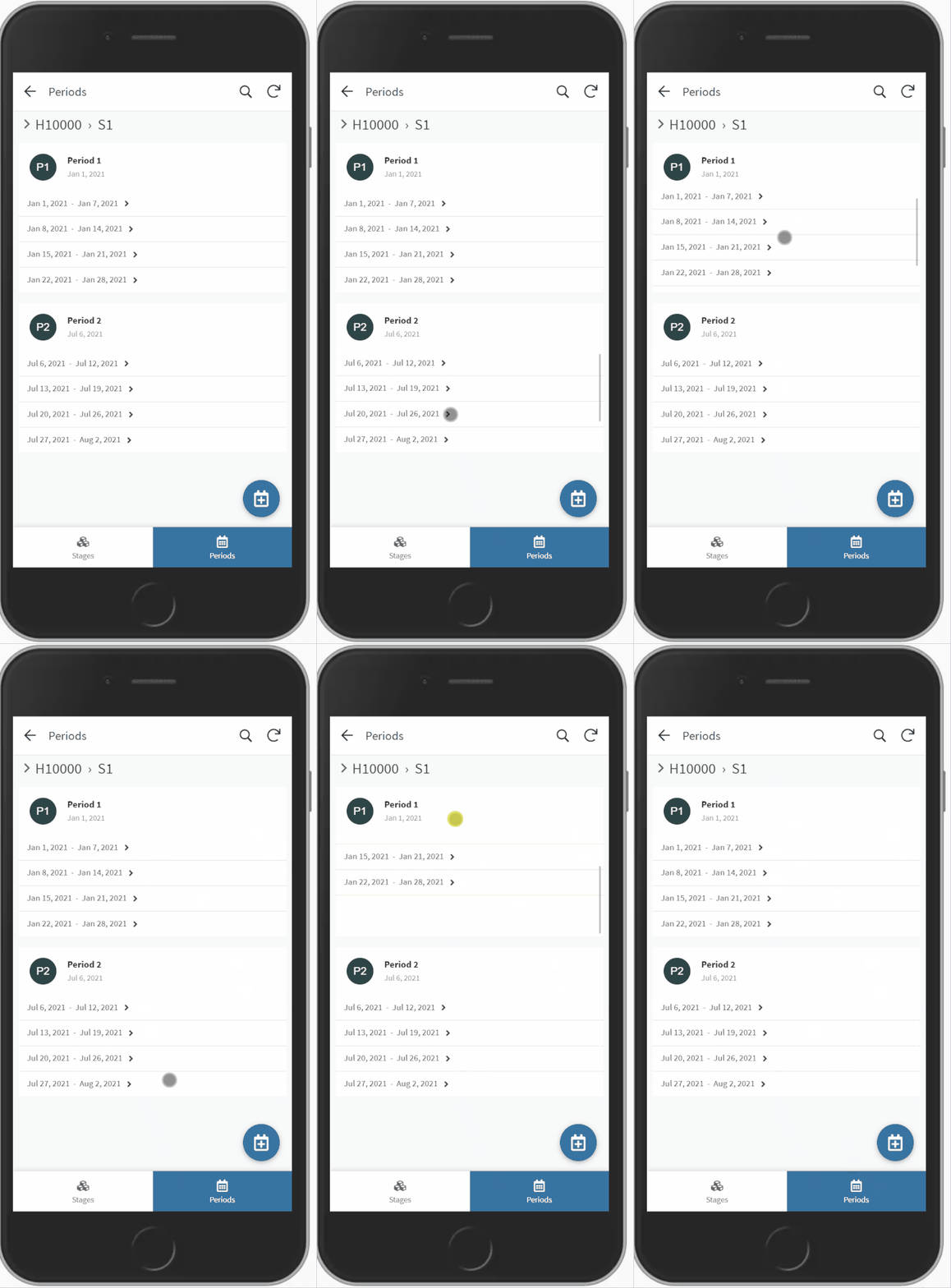
Problem 1: Nested inline tables take up the same space, whether they have 0 rows or 1000 rows
Problem 2: When mobile users swipe down through card records, they inadvertently swipe on the nested tables causing them to scroll instead.
Problem 3: Users can scroll down, hiding records in a really unintuitive way:

This has been standard behavior for a while, perhaps to accommodate the variable size that nested inline views can occupy? In any case, the current implementation is mostly unusable save for very niche scenarios.
Soution?: We should be able to specify how many rows we want to display here, similar to detail UX views. Ideally, the container would be flexible to some threshold upon it would default to the existing scrollable behavior. Currently this is 4 rows of data without column headers or groupings…

 Twitter