- AppSheet
- AppSheet Forum
- AppSheet Q&A
- Chart format limitations
- Subscribe to RSS Feed
- Mark Topic as New
- Mark Topic as Read
- Float this Topic for Current User
- Bookmark
- Subscribe
- Mute
- Printer Friendly Page
- Mark as New
- Bookmark
- Subscribe
- Mute
- Subscribe to RSS Feed
- Permalink
- Report Inappropriate Content
- Mark as New
- Bookmark
- Subscribe
- Mute
- Subscribe to RSS Feed
- Permalink
- Report Inappropriate Content
I’m been using AppSheet for a while but am still pretty much of a novice in regard to charts so I need some help.
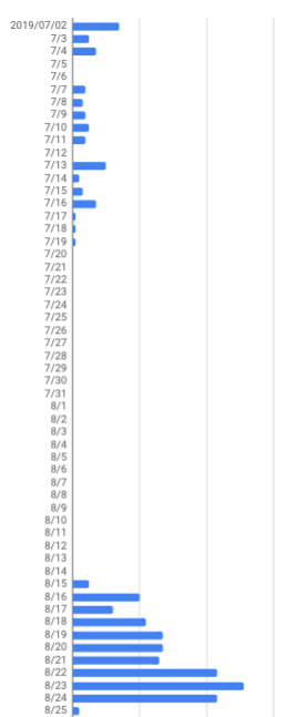
I’m interested in doing something like this:

I know I can do it horizontally but, because people normally hold their phones vertically and also because it would be great if the user could scroll to take in a long image like this, I’d like to do it vertically.
I’ve looked but, as far as I can tell, vertical orientation isn’t possible in AppSheet. Am I correct about that? Could I make a horizontal chart like this that could be scrolled so that the whole thing didn’t have to fit in the narrow screen of a phone?
I’m think that I’d like to display charts like this in a dashboard view, which seems to be quite flexible in regard to scrolling. However, if the charts can only be horizontal or can only be of certain dimensions, that may not help much.
Any thoughts will be greatly appreciated.
- Labels:
-
UX
- Mark as New
- Bookmark
- Subscribe
- Mute
- Subscribe to RSS Feed
- Permalink
- Report Inappropriate Content
- Mark as New
- Bookmark
- Subscribe
- Mute
- Subscribe to RSS Feed
- Permalink
- Report Inappropriate Content
As I’ve been thinking some more about this it occurred to me that I might want to utilize a text solution that I can prepare on my Google spreadsheet. It’s taken me some time to get this ready but from now on the spreadsheet should do all of the work for me. What you see will be contained in a single cell and displayed as such, probably in the “detail” part of a deck or table view:
㋆㏡ ▋
㋆㏢ ███▎
㋆㏣ █▊
㋆㏤ █
㋆㏥
㋆㏦
㋆㏧ █▊
㋆㏨
㋆㏩ █▎
㋆㏪ █
㋆㏫ █
㋆㏬ ▎
㋆㏭ ██▌
㋆㏮ ▊
㋆㏯ ▊
㋆㏰ █▎
㋆㏱ ▎
㋆㏲ ▎
㋆㏳
㋆㏴
㋆㏵
㋆㏶
㋆㏷
㋆㏸
㋆㏹
㋆㏺
㋆㏻
㋆㏼
㋆㏽
㋆㏾
㋇㏠
㋇㏡
㋇㏢
㋇㏣
㋇㏤
㋇㏥
㋇㏦
㋇㏧
㋇㏨
㋇㏩
㋇㏪
㋇㏫
㋇㏬
㋇㏭
㋇㏮ ▎
㋇㏯ █▏
㋇㏰ █████▏
㋇㏱ ███▋
㋇㏲ █████
㋇㏳ ███████
㋇㏴ ███████▊
㋇㏵ ██████▏
㋇㏶ ███████████▌
㋇㏷ ████████████▏
㋇㏸ ███████████▌
㋇㏹ ▋
㋇㏺ █████▊
㋇㏻ █▏
㋇㏼ ███████████▊
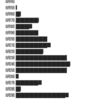
I see now that the tips of the bars look jagged in a way they did not in my spreadsheet. I hope they don’t look this way in my app but, even if they do, I still may go with this.
- Mark as New
- Bookmark
- Subscribe
- Mute
- Subscribe to RSS Feed
- Permalink
- Report Inappropriate Content
- Mark as New
- Bookmark
- Subscribe
- Mute
- Subscribe to RSS Feed
- Permalink
- Report Inappropriate Content
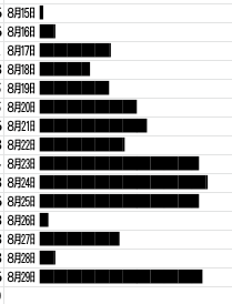
On my Android phone the bars look nice and clean, more-or-less like this
but on my iOS device the tips are jagged, as they appear to me on this web page and in the following image:
To get more definition in the lengths of the bars I’m using full blocks with end pieces that are 1/8 to 7/8 of a block in length:
That seems to be the problem. Oh well, I may go with this anyway. My first I idea was to make approximate illustrations with simple ascii characters. This is probably better than that. Or, I might just give up on the detail that the smaller blocks bring.
- Mark as New
- Bookmark
- Subscribe
- Mute
- Subscribe to RSS Feed
- Permalink
- Report Inappropriate Content
- Mark as New
- Bookmark
- Subscribe
- Mute
- Subscribe to RSS Feed
- Permalink
- Report Inappropriate Content
As far as I can tell, this is a font issue. It would be nice if AppSheet could have one compatible font.
- Mark as New
- Bookmark
- Subscribe
- Mute
- Subscribe to RSS Feed
- Permalink
- Report Inappropriate Content
- Mark as New
- Bookmark
- Subscribe
- Mute
- Subscribe to RSS Feed
- Permalink
- Report Inappropriate Content
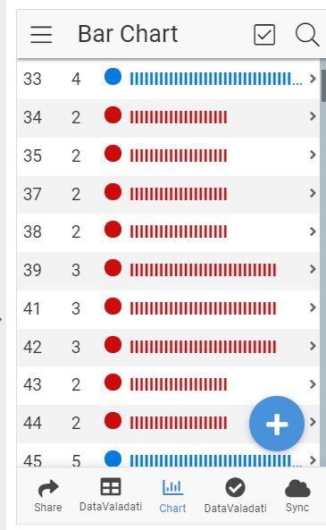
Hi @Kirk_Masden I made one with an In cell Bar Chart just using I,

- Mark as New
- Bookmark
- Subscribe
- Mute
- Subscribe to RSS Feed
- Permalink
- Report Inappropriate Content
- Mark as New
- Bookmark
- Subscribe
- Mute
- Subscribe to RSS Feed
- Permalink
- Report Inappropriate Content
Thanks @Lynnn! Looks very good! I forgot about what color could do for this.
I’ve been experimenting with the following three:
Unicode Character “⫿” (U+2AFF)
Unicode Character “⫾” (U+2AFE)
Unicode Character “𝄀” (U+1D100)
Here’s what the last one looks like:
㋇㏬
㋇㏭
㋇㏮ 𝄀𝄀𝄀𝄀𝄀𝄀𝄀𝄀𝄀𝄀
㋇㏯ 𝄀𝄀𝄀𝄀𝄀𝄀𝄀𝄀𝄀𝄀𝄀𝄀𝄀𝄀𝄀𝄀𝄀𝄀𝄀𝄀𝄀𝄀𝄀𝄀𝄀𝄀𝄀𝄀𝄀𝄀𝄀𝄀𝄀𝄀𝄀𝄀𝄀𝄀𝄀𝄀𝄀
㋇㏰ 𝄀𝄀𝄀𝄀𝄀𝄀𝄀𝄀𝄀𝄀𝄀𝄀𝄀𝄀𝄀𝄀𝄀𝄀𝄀𝄀𝄀𝄀𝄀𝄀𝄀
㋇㏱ 𝄀𝄀𝄀𝄀𝄀𝄀𝄀𝄀𝄀𝄀𝄀𝄀𝄀𝄀𝄀𝄀𝄀𝄀𝄀𝄀𝄀𝄀𝄀𝄀𝄀𝄀𝄀𝄀𝄀𝄀𝄀𝄀𝄀𝄀𝄀𝄀𝄀𝄀𝄀𝄀𝄀𝄀𝄀𝄀𝄀
㋇㏲ 𝄀𝄀𝄀𝄀𝄀𝄀𝄀𝄀𝄀𝄀𝄀𝄀𝄀𝄀𝄀𝄀𝄀𝄀𝄀𝄀𝄀𝄀𝄀𝄀𝄀𝄀𝄀𝄀𝄀𝄀𝄀𝄀𝄀𝄀𝄀𝄀𝄀𝄀𝄀𝄀𝄀𝄀𝄀𝄀𝄀𝄀𝄀𝄀𝄀𝄀𝄀𝄀𝄀𝄀𝄀𝄀
㋇㏳ 𝄀𝄀𝄀𝄀𝄀𝄀𝄀𝄀𝄀𝄀𝄀𝄀𝄀𝄀𝄀𝄀𝄀𝄀𝄀𝄀𝄀𝄀𝄀𝄀𝄀𝄀𝄀𝄀𝄀𝄀𝄀𝄀𝄀𝄀𝄀𝄀𝄀𝄀𝄀𝄀𝄀𝄀𝄀𝄀𝄀𝄀𝄀𝄀𝄀𝄀𝄀𝄀𝄀𝄀𝄀𝄀
㋇㏴ 𝄀𝄀𝄀𝄀𝄀𝄀𝄀𝄀𝄀𝄀𝄀𝄀𝄀𝄀𝄀𝄀𝄀𝄀𝄀𝄀𝄀𝄀𝄀𝄀𝄀𝄀𝄀𝄀𝄀𝄀𝄀𝄀𝄀𝄀𝄀𝄀𝄀𝄀𝄀𝄀𝄀𝄀𝄀𝄀𝄀𝄀𝄀𝄀𝄀𝄀𝄀𝄀𝄀𝄀
㋇㏵ 𝄀𝄀𝄀𝄀𝄀𝄀𝄀𝄀𝄀𝄀𝄀𝄀𝄀𝄀𝄀𝄀𝄀𝄀𝄀𝄀𝄀𝄀𝄀𝄀𝄀𝄀𝄀𝄀𝄀𝄀𝄀𝄀𝄀𝄀𝄀𝄀𝄀𝄀𝄀𝄀𝄀𝄀𝄀𝄀𝄀𝄀𝄀𝄀𝄀𝄀𝄀𝄀𝄀𝄀𝄀𝄀𝄀𝄀𝄀𝄀𝄀𝄀𝄀𝄀𝄀𝄀𝄀𝄀𝄀𝄀𝄀𝄀𝄀𝄀𝄀𝄀𝄀𝄀𝄀𝄀𝄀𝄀𝄀𝄀𝄀𝄀𝄀𝄀𝄀
㋇㏶ 𝄀𝄀𝄀𝄀𝄀𝄀𝄀𝄀𝄀𝄀𝄀𝄀𝄀𝄀𝄀𝄀𝄀𝄀𝄀𝄀𝄀𝄀𝄀𝄀𝄀𝄀𝄀𝄀𝄀𝄀𝄀𝄀𝄀𝄀𝄀𝄀𝄀𝄀𝄀𝄀𝄀𝄀𝄀𝄀𝄀𝄀𝄀𝄀𝄀𝄀𝄀𝄀𝄀𝄀𝄀𝄀𝄀𝄀𝄀𝄀𝄀𝄀𝄀𝄀𝄀𝄀𝄀𝄀𝄀𝄀𝄀𝄀𝄀𝄀𝄀𝄀𝄀𝄀𝄀𝄀𝄀𝄀𝄀𝄀𝄀𝄀𝄀𝄀𝄀𝄀𝄀𝄀𝄀𝄀𝄀𝄀𝄀𝄀𝄀𝄀
㋇㏷ 𝄀𝄀𝄀𝄀𝄀𝄀𝄀𝄀𝄀𝄀𝄀𝄀𝄀𝄀𝄀𝄀𝄀𝄀𝄀𝄀𝄀𝄀𝄀𝄀𝄀𝄀𝄀𝄀𝄀𝄀𝄀𝄀𝄀𝄀𝄀𝄀𝄀𝄀𝄀𝄀𝄀𝄀𝄀𝄀𝄀𝄀𝄀𝄀𝄀𝄀𝄀𝄀𝄀𝄀𝄀𝄀𝄀𝄀𝄀𝄀𝄀𝄀𝄀𝄀𝄀𝄀𝄀𝄀𝄀𝄀𝄀𝄀𝄀𝄀𝄀𝄀𝄀𝄀𝄀𝄀𝄀𝄀𝄀𝄀𝄀𝄀𝄀𝄀𝄀
㋇㏸ 𝄀𝄀𝄀𝄀
㋇㏹ 𝄀𝄀𝄀𝄀𝄀𝄀𝄀𝄀𝄀𝄀𝄀𝄀𝄀𝄀𝄀𝄀𝄀𝄀𝄀𝄀𝄀𝄀𝄀𝄀𝄀𝄀𝄀𝄀𝄀𝄀𝄀𝄀𝄀𝄀𝄀𝄀𝄀𝄀𝄀𝄀𝄀𝄀𝄀𝄀𝄀
㋇㏺ 𝄀𝄀𝄀𝄀𝄀𝄀𝄀𝄀𝄀𝄀𝄀𝄀𝄀𝄀
㋇㏻ 𝄀𝄀𝄀𝄀𝄀𝄀𝄀𝄀𝄀𝄀𝄀𝄀𝄀𝄀𝄀𝄀𝄀𝄀𝄀𝄀𝄀𝄀𝄀𝄀𝄀𝄀𝄀𝄀𝄀𝄀𝄀𝄀𝄀𝄀𝄀𝄀𝄀𝄀𝄀𝄀𝄀𝄀𝄀𝄀𝄀𝄀𝄀𝄀𝄀𝄀𝄀𝄀𝄀𝄀𝄀𝄀𝄀𝄀𝄀𝄀𝄀𝄀𝄀𝄀𝄀𝄀𝄀𝄀𝄀𝄀𝄀𝄀𝄀𝄀𝄀𝄀𝄀𝄀𝄀𝄀𝄀𝄀𝄀𝄀𝄀𝄀𝄀𝄀𝄀
㋇㏼ 𝄀𝄀𝄀𝄀𝄀𝄀𝄀𝄀𝄀𝄀𝄀𝄀𝄀𝄀𝄀𝄀𝄀𝄀𝄀𝄀𝄀𝄀
The first one looks like this:
㋇㏬
㋇㏭
㋇㏮ ⫿⫿⫿⫿⫿
㋇㏯ ⫿⫿⫿⫿⫿⫿⫿⫿⫿⫿⫿⫿⫿⫿⫿⫿⫿⫿⫿⫿
㋇㏰ ⫿⫿⫿⫿⫿⫿⫿⫿⫿⫿⫿⫿
㋇㏱ ⫿⫿⫿⫿⫿⫿⫿⫿⫿⫿⫿⫿⫿⫿⫿⫿⫿⫿⫿⫿⫿⫿
㋇㏲ ⫿⫿⫿⫿⫿⫿⫿⫿⫿⫿⫿⫿⫿⫿⫿⫿⫿⫿⫿⫿⫿⫿⫿⫿⫿⫿⫿⫿
㋇㏳ ⫿⫿⫿⫿⫿⫿⫿⫿⫿⫿⫿⫿⫿⫿⫿⫿⫿⫿⫿⫿⫿⫿⫿⫿⫿⫿⫿⫿
㋇㏴ ⫿⫿⫿⫿⫿⫿⫿⫿⫿⫿⫿⫿⫿⫿⫿⫿⫿⫿⫿⫿⫿⫿⫿⫿⫿⫿⫿
㋇㏵ ⫿⫿⫿⫿⫿⫿⫿⫿⫿⫿⫿⫿⫿⫿⫿⫿⫿⫿⫿⫿⫿⫿⫿⫿⫿⫿⫿⫿⫿⫿⫿⫿⫿⫿⫿⫿⫿⫿⫿⫿⫿⫿⫿⫿
㋇㏶ ⫿⫿⫿⫿⫿⫿⫿⫿⫿⫿⫿⫿⫿⫿⫿⫿⫿⫿⫿⫿⫿⫿⫿⫿⫿⫿⫿⫿⫿⫿⫿⫿⫿⫿⫿⫿⫿⫿⫿⫿⫿⫿⫿⫿⫿⫿⫿⫿⫿⫿
㋇㏷ ⫿⫿⫿⫿⫿⫿⫿⫿⫿⫿⫿⫿⫿⫿⫿⫿⫿⫿⫿⫿⫿⫿⫿⫿⫿⫿⫿⫿⫿⫿⫿⫿⫿⫿⫿⫿⫿⫿⫿⫿⫿⫿⫿⫿
㋇㏸ ⫿⫿
㋇㏹ ⫿⫿⫿⫿⫿⫿⫿⫿⫿⫿⫿⫿⫿⫿⫿⫿⫿⫿⫿⫿⫿⫿
㋇㏺ ⫿⫿⫿⫿⫿⫿⫿
㋇㏻ ⫿⫿⫿⫿⫿⫿⫿⫿⫿⫿⫿⫿⫿⫿⫿⫿⫿⫿⫿⫿⫿⫿⫿⫿⫿⫿⫿⫿⫿⫿⫿⫿⫿⫿⫿⫿⫿⫿⫿⫿⫿⫿⫿⫿
㋇㏼ ⫿⫿⫿⫿⫿⫿⫿⫿⫿⫿⫿
Not quite as fine (narrow) as the other one but it has a fairly nice appearance.
I guess my question about horizontal bar graphs has been answered: AppSheet doesn’t do it at this point, right?
Also, @Lynn, I’d like to ask if you have done what you need to do to put the bar graphs together all in AppSheet. I know how to do it in Google Sheets (I use REPT() with some other calculations). Is it done the same way in AppSheet? Thanks again!
- Mark as New
- Bookmark
- Subscribe
- Mute
- Subscribe to RSS Feed
- Permalink
- Report Inappropriate Content
- Mark as New
- Bookmark
- Subscribe
- Mute
- Subscribe to RSS Feed
- Permalink
- Report Inappropriate Content
@Lynn Sometimes there are lot of different options ![]()
![]()
-
!
1 -
Account
1,683 -
App Management
3,126 -
AppSheet
1 -
Automation
10,353 -
Bug
993 -
Data
9,708 -
Errors
5,757 -
Expressions
11,825 -
General Miscellaneous
1 -
Google Cloud Deploy
1 -
image and text
1 -
Integrations
1,619 -
Intelligence
580 -
Introductions
86 -
Other
2,926 -
Photos
1 -
Resources
542 -
Security
832 -
Templates
1,313 -
Users
1,563 -
UX
9,132
- « Previous
- Next »
| User | Count |
|---|---|
| 38 | |
| 34 | |
| 27 | |
| 23 | |
| 17 |

 Twitter
