- AppSheet
- AppSheet Forum
- AppSheet Q&A
- Column Series Stack Behavior - Problem
- Subscribe to RSS Feed
- Mark Topic as New
- Mark Topic as Read
- Float this Topic for Current User
- Bookmark
- Subscribe
- Mute
- Printer Friendly Page
- Mark as New
- Bookmark
- Subscribe
- Mute
- Subscribe to RSS Feed
- Permalink
- Report Inappropriate Content
- Mark as New
- Bookmark
- Subscribe
- Mute
- Subscribe to RSS Feed
- Permalink
- Report Inappropriate Content
Hi everyone,
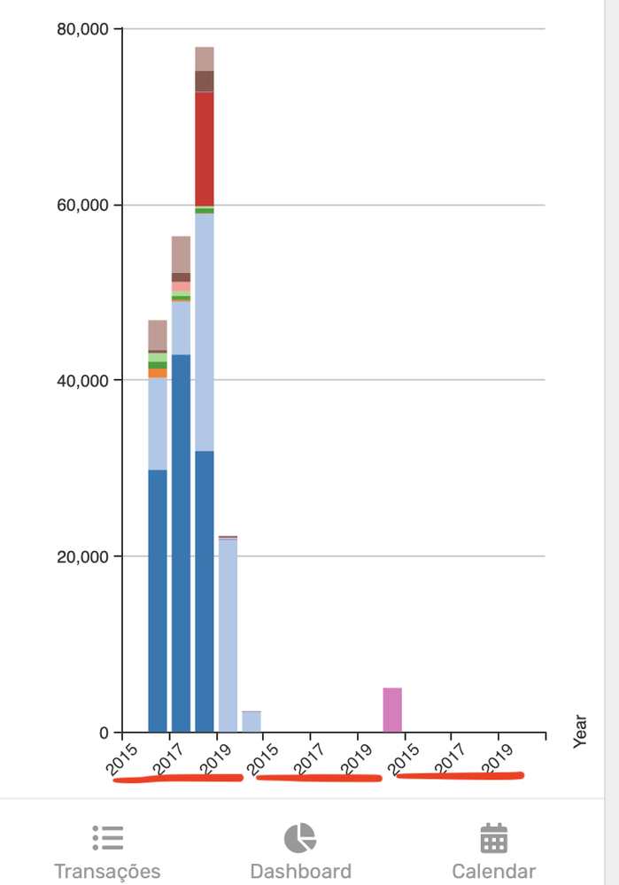
I had previously done a “col series stack” chart that was working fine and now it isn’t working anymore. I show a picture to better explain my problem:

As you can see, the x-axis, “Year” is repeating itself from 2015 to 2020 (three times). I believe the 3 times repetition is because I have a Filter in the top of my Dashboard with three categories, so as I click in one of them it disappears the two other and the x-axis is presented correctly from 2015 to 2020 (without repeating).
The problem is that two weeks ago it was working fine (even with the Filter feature), I had a x-axis from 2015-2020 (without repeating) and the values would stack over each bar and when I applied the Filter, it would just disappear some of the bars, but the x-axis (2015 to 2020) would always be static.
What should I do to come back the same behavior of a static x-axis with the criteria/conditions that I just explained?
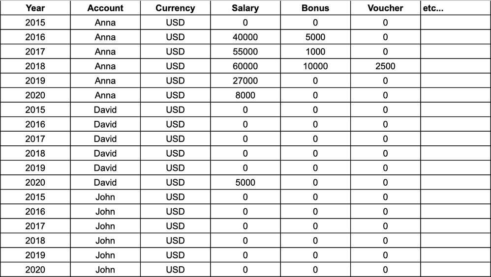
Briefly, I have data in the following way (approximation, it does not represent the chart):

The “Year” column is repeated 3 times because in the “Account” column we have 3 people, which are the Filter that I previously mentioned and then I have many columns which represent the colored bars in the chart.
I hope someone can help me, I tried to solve already by doing:
- On AppSheet -> Data-> Table, I put column “Year” as Label.
- In the Slice (where I put [Currency]=USD), I changed from “auto” and selected all the columns except “Account” which is the one that I am afraid that is making the repetition, but I didn’t succeed with “col series stack” chart, maybe another type of chart would work.
Anyway, I will keep trying but if anyone could help me I would really appreciate, it’s quite annoying when things change and you have to change as well, but I guess is for the better and smoothness of AppSheet.
Thanks,
Eduardo
- Labels:
-
Automation
-
UX
- Mark as New
- Bookmark
- Subscribe
- Mute
- Subscribe to RSS Feed
- Permalink
- Report Inappropriate Content
- Mark as New
- Bookmark
- Subscribe
- Mute
- Subscribe to RSS Feed
- Permalink
- Report Inappropriate Content
Hi @edulk ,
This might be related to some recent charting updates. I can revert the change for you while I debug the issue. Can you PM me your account id? (Which can be found at https://www.appsheet.com/Account/Account)
- Mark as New
- Bookmark
- Subscribe
- Mute
- Subscribe to RSS Feed
- Permalink
- Report Inappropriate Content
- Mark as New
- Bookmark
- Subscribe
- Mute
- Subscribe to RSS Feed
- Permalink
- Report Inappropriate Content
It looks appsheet natural behaviror for the time being. Appsheet will not “aggregate” the value for the selected dimention. For instance, you have “year” value in x axis. It will be repeated to have in the order of random. Appsheet chart will display the dimension and its value as they are.
To solve, what I do is to generate the master table for “YEAR” value. just one single column storing value of year, 2000, 2001, 2002, 2003, 2004 cont.
Then make a ref connection to your table and the column you have year value to make parent/child relationship.
Then on your newly created year value master table, you will run the calculation to sum, average, or aggregate or even mean value , based on what you need.
Then create the chart out of this mater table.
You may lose a functionalities to see “DATA” upon clicking the chart element, but you will be push another trick to attach action to this master table to show accosicated set of data with deeplink based actions.
- Mark as New
- Bookmark
- Subscribe
- Mute
- Subscribe to RSS Feed
- Permalink
- Report Inappropriate Content
- Mark as New
- Bookmark
- Subscribe
- Mute
- Subscribe to RSS Feed
- Permalink
- Report Inappropriate Content
Thank you for your answer and suggestion @tsuji_koichi.
To solve, what I do is to generate the master table for “YEAR” value. just one single column storing value of year, 2000, 2001, 2002, 2003, 2004 cont.
I understand what you mean, in this case I would have a Master Table with Column “Year” with unique year values (2015, 2016, 2017, 2018, 2019 and 2020). Then, the next columns would be “Salary”, “Bonus”, etc. with the sum of all individuals (“Account” column). I think that is okay, it would work but on my dashboard View (which contains this bar chart), there is also a filter for “Account”.
This filter would select only “John” or “John”+“Anna” and it should give the sum on the chart, would that be possible?
I understand the Ref connection between the filter and the bar chart (dashboard with interactive mode), which I already implemented. In my case, my chart is based on a table or slice that contains the column “Account”.
But as I mentioned above and from what I understood, I would delete the “Account” column for the Master Table to be able to SUM up, so I would not be able to filter anymore, is that correct?
Many thanks!
- Mark as New
- Bookmark
- Subscribe
- Mute
- Subscribe to RSS Feed
- Permalink
- Report Inappropriate Content
- Mark as New
- Bookmark
- Subscribe
- Mute
- Subscribe to RSS Feed
- Permalink
- Report Inappropriate Content
The new table (as master) for yearly aggregaed data does not contain the level of details basis “account” you mention, which also mean this table is no way to break data up to per account level.
This new table is only able to present data “per year”, where all the row data is aggregated to year level. For this table alone, we are able to filter data basis selected years. If you have another filter on dashboard, to select the account, this table does not have account fields, so they will not react to filter.
What I think now.
Now we have master table for “year”. And let year fileds set to key for this table.
Then next.
On original table, you already have , or if not, you get the fields contain year value. And make that year value fileds to REF type and look up year master table.
Then once we place the chart or any other type of view to the same dashboard, then user select YERA on year fiter, the chart made out of year master should be filtered, as well as view made out of original table should be responsed, i.e. filtered on select.
Apply the same sort of trick to “account”
YOu make account master table. Then on your original table with account field, make it REF type to look up account master.
You place the account master to same dashboard.
SO we have two filters. One for year, another for account.
I m not testing yet, but once use select, for instance, year 2020. All the other fields should be filtered accordingly. Then keep the filter selected as it is. Then on the another filter to select the account. Original table should be filtered by two different filter I believe, as i m not yet testing if this is true.
Alternatively, you make a slice for “account” using usersettings.
This slice will be filter the data based on the selected Acccount basis ENUMLIST type selection. Then the view in dashboard will be naturally fitered by selected accounts. On top of it, user will apply “year” filter.
As a result, I hope you will see the result that you demand.
- Mark as New
- Bookmark
- Subscribe
- Mute
- Subscribe to RSS Feed
- Permalink
- Report Inappropriate Content
- Mark as New
- Bookmark
- Subscribe
- Mute
- Subscribe to RSS Feed
- Permalink
- Report Inappropriate Content
Yeah, this is a major issue for me as well. I have a lot of columns that depended on that… whats the update @jared?
-
Account
1,673 -
App Management
3,074 -
AppSheet
1 -
Automation
10,293 -
Bug
967 -
Data
9,657 -
Errors
5,719 -
Expressions
11,750 -
General Miscellaneous
1 -
Google Cloud Deploy
1 -
image and text
1 -
Integrations
1,599 -
Intelligence
578 -
Introductions
85 -
Other
2,882 -
Photos
1 -
Resources
535 -
Security
827 -
Templates
1,300 -
Users
1,551 -
UX
9,096
- « Previous
- Next »
| User | Count |
|---|---|
| 44 | |
| 29 | |
| 22 | |
| 20 | |
| 14 |

 Twitter