- AppSheet
- Release Notes & Announcements
- Announcements
- Coming Soon: AppSheet's Fresh New Look
- Subscribe to RSS Feed
- Mark Topic as New
- Mark Topic as Read
- Float this Topic for Current User
- Bookmark
- Subscribe
- Mute
- Printer Friendly Page
- Mark as New
- Bookmark
- Subscribe
- Mute
- Subscribe to RSS Feed
- Permalink
- Report Inappropriate Content
- Mark as New
- Bookmark
- Subscribe
- Mute
- Subscribe to RSS Feed
- Permalink
- Report Inappropriate Content
Hello everyone!
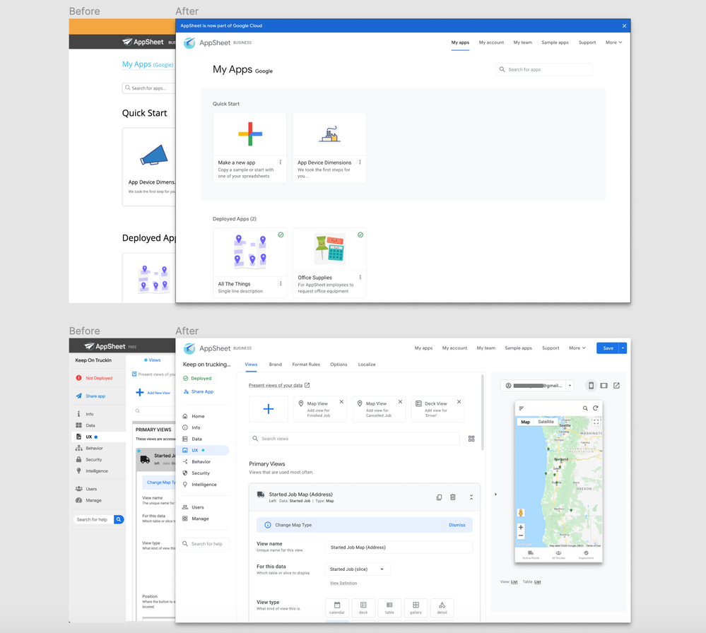
Just a heads up, now that AppSheet is a part of Google Cloud we’re freshening up our UI to better fit with the Google family of products
This new “Material” look will only affect colors, fonts, and icons. It’s still the same AppSheet under the hood! Here’s a sneak peak of what’s coming:
- Mark as New
- Bookmark
- Subscribe
- Mute
- Subscribe to RSS Feed
- Permalink
- Report Inappropriate Content
- Mark as New
- Bookmark
- Subscribe
- Mute
- Subscribe to RSS Feed
- Permalink
- Report Inappropriate Content
How will this change affect the UX that the actual app user will see?
- Mark as New
- Bookmark
- Subscribe
- Mute
- Subscribe to RSS Feed
- Permalink
- Report Inappropriate Content
- Mark as New
- Bookmark
- Subscribe
- Mute
- Subscribe to RSS Feed
- Permalink
- Report Inappropriate Content
None at this point.
- Mark as New
- Bookmark
- Subscribe
- Mute
- Subscribe to RSS Feed
- Permalink
- Report Inappropriate Content
- Mark as New
- Bookmark
- Subscribe
- Mute
- Subscribe to RSS Feed
- Permalink
- Report Inappropriate Content
Would love feedback from all of you — especially around the editor which many of us live in every day.
No change to the app UX — this is only about website and editor changes
- Mark as New
- Bookmark
- Subscribe
- Mute
- Subscribe to RSS Feed
- Permalink
- Report Inappropriate Content
- Mark as New
- Bookmark
- Subscribe
- Mute
- Subscribe to RSS Feed
- Permalink
- Report Inappropriate Content
Thanks Praveen! I like first change for “My Apps” (It looks clean), but there are a few things in the Editor that I would recommend changing.
And also, i’ve never found a use for the recommended added views that appear next to the “+” button at the top. Maybe this is just me, or maybe other users feel the same way, I don’t know. But that clutters up the screen in my opinion.
Rather than these small things, good job!
This is what I envision in my head…
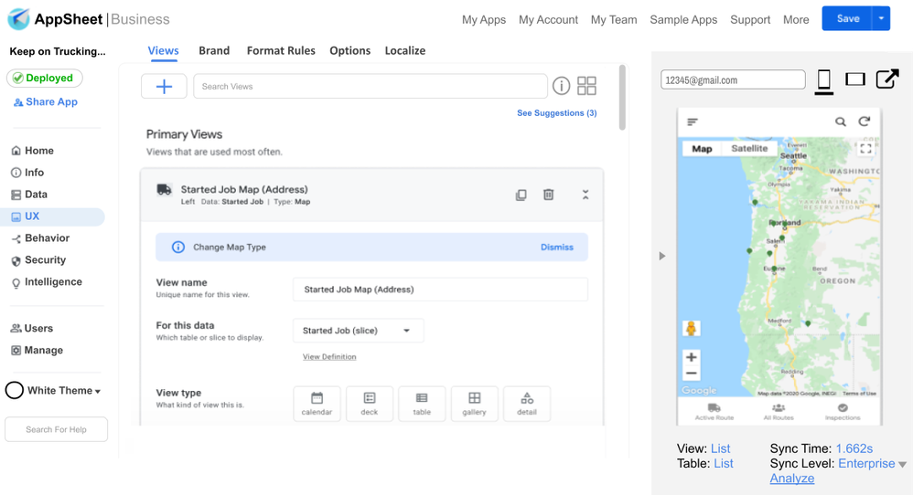
- Bold Menu Options
- Concentrated +, search bar, link, suggestions, and 4 squares to one line
- Changed look of “AppSheet | Business”
- Different Icons in Emulator
- My post at bottom (Post #42) has a fuller list
Comparison
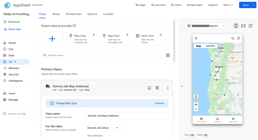
I am not a design expert by any means, but this is my feedback. Still, the changes that AppSheet are about to make are a big step forward from a design standpoint! It looks much cleaner!
This is just my opinion, others might disagree…
- Mark as New
- Bookmark
- Subscribe
- Mute
- Subscribe to RSS Feed
- Permalink
- Report Inappropriate Content
- Mark as New
- Bookmark
- Subscribe
- Mute
- Subscribe to RSS Feed
- Permalink
- Report Inappropriate Content
I agree with the add views. This is nice for new comers but gets annoying fast. We should have the ability to turn this off in account settings for All our apps.
- Mark as New
- Bookmark
- Subscribe
- Mute
- Subscribe to RSS Feed
- Permalink
- Report Inappropriate Content
- Mark as New
- Bookmark
- Subscribe
- Mute
- Subscribe to RSS Feed
- Permalink
- Report Inappropriate Content
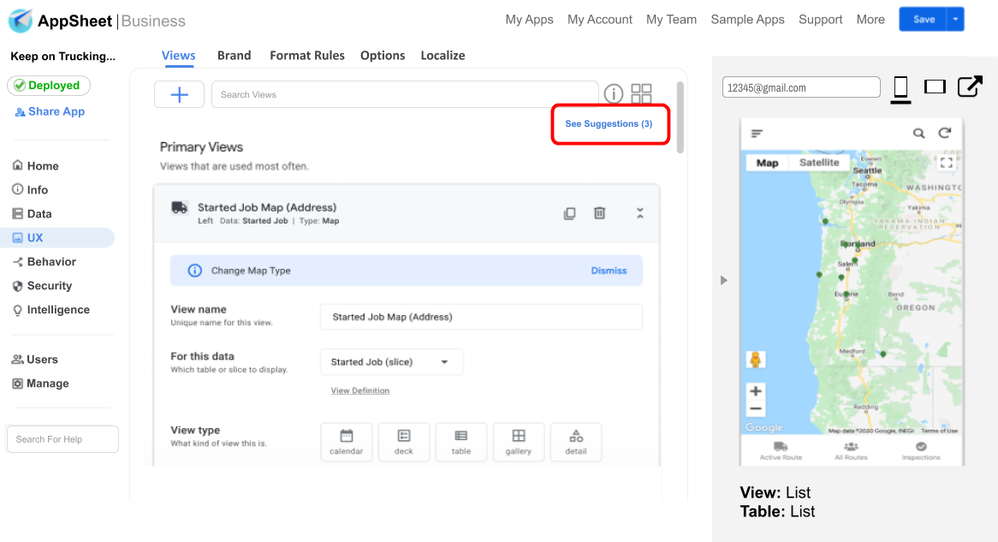
Totally agree. I like the new UI overall, but that’s a big section of ‘front-and-center’ screen space to give up for auto-suggestions that rarely get used.
Maybe all the suggestions could be nested inside the (+) button, so that you choose to add a view first, then see suggestions.
- Mark as New
- Bookmark
- Subscribe
- Mute
- Subscribe to RSS Feed
- Permalink
- Report Inappropriate Content
- Mark as New
- Bookmark
- Subscribe
- Mute
- Subscribe to RSS Feed
- Permalink
- Report Inappropriate Content
Maybe like this…
- Mark as New
- Bookmark
- Subscribe
- Mute
- Subscribe to RSS Feed
- Permalink
- Report Inappropriate Content
- Mark as New
- Bookmark
- Subscribe
- Mute
- Subscribe to RSS Feed
- Permalink
- Report Inappropriate Content
Yes, but I’d condense it even further, removing the entire row with the large plus button. Then just shorten the search bar row to add the (+) button there.
I think they’ve done a great job of keeping the same overall layout and applying the Material theme and Google ‘feel’. But I saw that whole section as a waste of screen space before, and it seems even worse now, with the extra padding that Material adds. I’m sure some new users find the suggestions useful, but they take up a lot of room in the first place you look and just get in the way for some users.
That was carried over from the old UI though, not part of the new update. I think the new UI is awesome. Just not a fan of the suggestions taking up so much space.
- Mark as New
- Bookmark
- Subscribe
- Mute
- Subscribe to RSS Feed
- Permalink
- Report Inappropriate Content
- Mark as New
- Bookmark
- Subscribe
- Mute
- Subscribe to RSS Feed
- Permalink
- Report Inappropriate Content
This…

Compared to…

- Mark as New
- Bookmark
- Subscribe
- Mute
- Subscribe to RSS Feed
- Permalink
- Report Inappropriate Content
- Mark as New
- Bookmark
- Subscribe
- Mute
- Subscribe to RSS Feed
- Permalink
- Report Inappropriate Content
Dang, you’re fast! Yeah, that looks way better than all the suggestions having their own box. ![]()
- Mark as New
- Bookmark
- Subscribe
- Mute
- Subscribe to RSS Feed
- Permalink
- Report Inappropriate Content
- Mark as New
- Bookmark
- Subscribe
- Mute
- Subscribe to RSS Feed
- Permalink
- Report Inappropriate Content
Thanks! I use google drawings and screenshots
- Mark as New
- Bookmark
- Subscribe
- Mute
- Subscribe to RSS Feed
- Permalink
- Report Inappropriate Content
- Mark as New
- Bookmark
- Subscribe
- Mute
- Subscribe to RSS Feed
- Permalink
- Report Inappropriate Content
I agree. I have yet to use a recommended view to create. I’d rather have that real estate for something else.
The other suggestions look good, as well.
- Mark as New
- Bookmark
- Subscribe
- Mute
- Subscribe to RSS Feed
- Permalink
- Report Inappropriate Content
- Mark as New
- Bookmark
- Subscribe
- Mute
- Subscribe to RSS Feed
- Permalink
- Report Inappropriate Content
- Ability to group apps by tags
- Dark theme
![]()
- Mark as New
- Bookmark
- Subscribe
- Mute
- Subscribe to RSS Feed
- Permalink
- Report Inappropriate Content
- Mark as New
- Bookmark
- Subscribe
- Mute
- Subscribe to RSS Feed
- Permalink
- Report Inappropriate Content
I agree 100% on the first one, that would help me a lot.
- Mark as New
- Bookmark
- Subscribe
- Mute
- Subscribe to RSS Feed
- Permalink
- Report Inappropriate Content
- Mark as New
- Bookmark
- Subscribe
- Mute
- Subscribe to RSS Feed
- Permalink
- Report Inappropriate Content
I AM AMPED! Loved the Google Material system! As a Graphic Designer each post I see about UX/UI for app design or the editor gets me more excited for the future of this platform. Thank you AppSheet and Google team for your constant dedication to improving your platform! ![]()
Not a big fan of the New logo Icon. ![]()
But WOW, ‘AppSheet’ sure does look good in Product Sans!
- Mark as New
- Bookmark
- Subscribe
- Mute
- Subscribe to RSS Feed
- Permalink
- Report Inappropriate Content
- Mark as New
- Bookmark
- Subscribe
- Mute
- Subscribe to RSS Feed
- Permalink
- Report Inappropriate Content
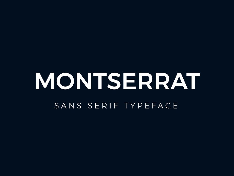
I assume this means AppSheet font list is going to include Montserrat now?
- Mark as New
- Bookmark
- Subscribe
- Mute
- Subscribe to RSS Feed
- Permalink
- Report Inappropriate Content
- Mark as New
- Bookmark
- Subscribe
- Mute
- Subscribe to RSS Feed
- Permalink
- Report Inappropriate Content
With any luck we’ll be able to get access to all of Google’s fonts.
- Mark as New
- Bookmark
- Subscribe
- Mute
- Subscribe to RSS Feed
- Permalink
- Report Inappropriate Content
- Mark as New
- Bookmark
- Subscribe
- Mute
- Subscribe to RSS Feed
- Permalink
- Report Inappropriate Content
Yes, this would be great!
- Mark as New
- Bookmark
- Subscribe
- Mute
- Subscribe to RSS Feed
- Permalink
- Report Inappropriate Content
- Mark as New
- Bookmark
- Subscribe
- Mute
- Subscribe to RSS Feed
- Permalink
- Report Inappropriate Content
Exactly my thoughts/hopes. But for me if I can at least finagle Montserrat; its a win!
- Mark as New
- Bookmark
- Subscribe
- Mute
- Subscribe to RSS Feed
- Permalink
- Report Inappropriate Content
- Mark as New
- Bookmark
- Subscribe
- Mute
- Subscribe to RSS Feed
- Permalink
- Report Inappropriate Content
Love it, just looking for a native dark theme to help my delicate eyes. Especially since everything in the default Material theme is even brighter than the current theme.
- Mark as New
- Bookmark
- Subscribe
- Mute
- Subscribe to RSS Feed
- Permalink
- Report Inappropriate Content
- Mark as New
- Bookmark
- Subscribe
- Mute
- Subscribe to RSS Feed
- Permalink
- Report Inappropriate Content
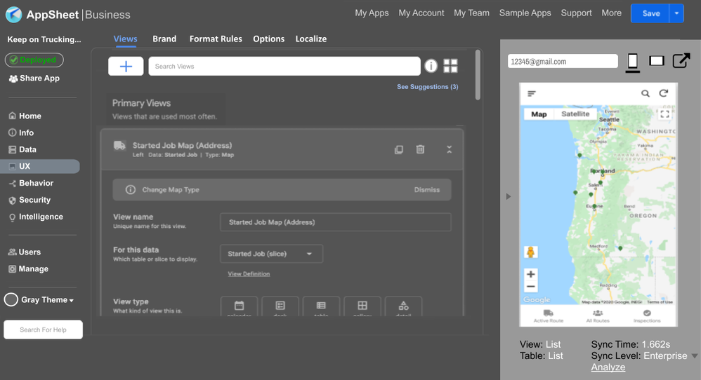
Yes please dark mode is a must for us that love the dark ![]()
Dark mode chrome, gmail, youtube, slack, and my IDE’s. Add appsheet to that list and I’d be in heaven.
- Mark as New
- Bookmark
- Subscribe
- Mute
- Subscribe to RSS Feed
- Permalink
- Report Inappropriate Content
- Mark as New
- Bookmark
- Subscribe
- Mute
- Subscribe to RSS Feed
- Permalink
- Report Inappropriate Content
- Mark as New
- Bookmark
- Subscribe
- Mute
- Subscribe to RSS Feed
- Permalink
- Report Inappropriate Content
- Mark as New
- Bookmark
- Subscribe
- Mute
- Subscribe to RSS Feed
- Permalink
- Report Inappropriate Content
I could live with that. Though my preference would be a true amoled dark mode (ie black pixels are off), that would work for me, or matching the colors to the dark mode here in the community.
- Mark as New
- Bookmark
- Subscribe
- Mute
- Subscribe to RSS Feed
- Permalink
- Report Inappropriate Content
- Mark as New
- Bookmark
- Subscribe
- Mute
- Subscribe to RSS Feed
- Permalink
- Report Inappropriate Content
I know its been mentioned before when topics asking for darkmode come up, but i’ll mention it again here. There are extensions for Chrome or Firefox for making websites darker / easier to read. Here is my google cloud console with the Chrome extension ‘Dark Reader’ enabled:
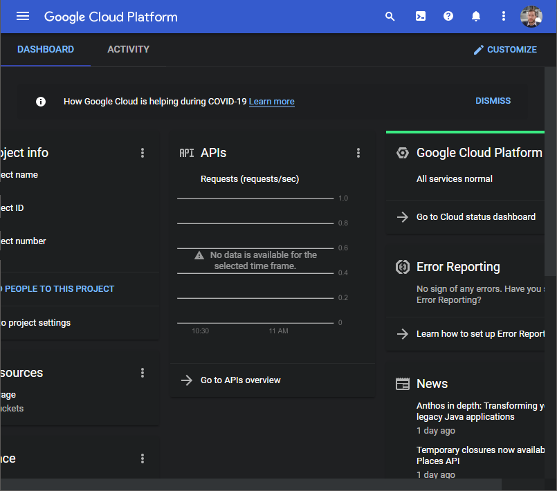
AppSheets redesign would look similar to the above when using the extension.
- Mark as New
- Bookmark
- Subscribe
- Mute
- Subscribe to RSS Feed
- Permalink
- Report Inappropriate Content
- Mark as New
- Bookmark
- Subscribe
- Mute
- Subscribe to RSS Feed
- Permalink
- Report Inappropriate Content
I’ve played with some of those. They’re fine, but the AppSheet editor is already kind of a heavy website and pretty much all of them work by post-processing.
- Mark as New
- Bookmark
- Subscribe
- Mute
- Subscribe to RSS Feed
- Permalink
- Report Inappropriate Content
- Mark as New
- Bookmark
- Subscribe
- Mute
- Subscribe to RSS Feed
- Permalink
- Report Inappropriate Content
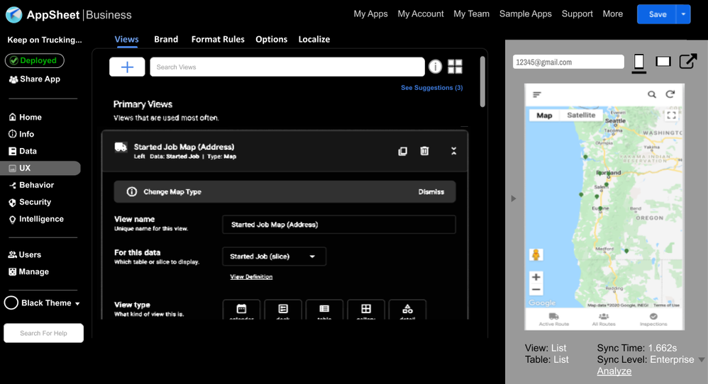
It would be better native to AppSheet. Maybe like this…
White Mode

Gray Mode

Black Mode
- Mark as New
- Bookmark
- Subscribe
- Mute
- Subscribe to RSS Feed
- Permalink
- Report Inappropriate Content
- Mark as New
- Bookmark
- Subscribe
- Mute
- Subscribe to RSS Feed
- Permalink
- Report Inappropriate Content
Yes! This!
- Mark as New
- Bookmark
- Subscribe
- Mute
- Subscribe to RSS Feed
- Permalink
- Report Inappropriate Content
- Mark as New
- Bookmark
- Subscribe
- Mute
- Subscribe to RSS Feed
- Permalink
- Report Inappropriate Content
Looks amazing; have always been a fan of Google’s aesthetic. Has a much more professional feel to it.
- Mark as New
- Bookmark
- Subscribe
- Mute
- Subscribe to RSS Feed
- Permalink
- Report Inappropriate Content
- Mark as New
- Bookmark
- Subscribe
- Mute
- Subscribe to RSS Feed
- Permalink
- Report Inappropriate Content
AWESOME! I can’t wait to start using it! I think it looks great overall, and I’m really excited to see what’s next now that we’re in the Google ecosystem.
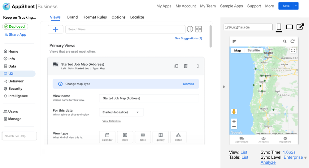
The one thing that stands out is, there’s a lot of wasted space around the emulator preview.
It would be awesome to see the sync time displayed there again! That was really helpful during development when performance testing and trying different formulas. ![]()
- Mark as New
- Bookmark
- Subscribe
- Mute
- Subscribe to RSS Feed
- Permalink
- Report Inappropriate Content
- Mark as New
- Bookmark
- Subscribe
- Mute
- Subscribe to RSS Feed
- Permalink
- Report Inappropriate Content
I would also love to see the sync time back again.
- Mark as New
- Bookmark
- Subscribe
- Mute
- Subscribe to RSS Feed
- Permalink
- Report Inappropriate Content
- Mark as New
- Bookmark
- Subscribe
- Mute
- Subscribe to RSS Feed
- Permalink
- Report Inappropriate Content
Yeah, I have always wondered why that was taken off.
- Mark as New
- Bookmark
- Subscribe
- Mute
- Subscribe to RSS Feed
- Permalink
- Report Inappropriate Content
- Mark as New
- Bookmark
- Subscribe
- Mute
- Subscribe to RSS Feed
- Permalink
- Report Inappropriate Content
Agreed! There is plenty of screen real estate. It is so helpful to have it right there.
- Mark as New
- Bookmark
- Subscribe
- Mute
- Subscribe to RSS Feed
- Permalink
- Report Inappropriate Content
- Mark as New
- Bookmark
- Subscribe
- Mute
- Subscribe to RSS Feed
- Permalink
- Report Inappropriate Content
- Mark as New
- Bookmark
- Subscribe
- Mute
- Subscribe to RSS Feed
- Permalink
- Report Inappropriate Content
- Mark as New
- Bookmark
- Subscribe
- Mute
- Subscribe to RSS Feed
- Permalink
- Report Inappropriate Content
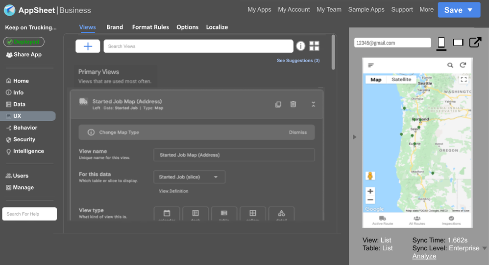
I do hate to say I’m not the biggest fan of the google aesthetics as a whole. Maybe adding different themes with slight changes to the new UI at a later point would be a possibility.
- Mark as New
- Bookmark
- Subscribe
- Mute
- Subscribe to RSS Feed
- Permalink
- Report Inappropriate Content
- Mark as New
- Bookmark
- Subscribe
- Mute
- Subscribe to RSS Feed
- Permalink
- Report Inappropriate Content
Maybe Like This
- Mark as New
- Bookmark
- Subscribe
- Mute
- Subscribe to RSS Feed
- Permalink
- Report Inappropriate Content
- Mark as New
- Bookmark
- Subscribe
- Mute
- Subscribe to RSS Feed
- Permalink
- Report Inappropriate Content
Awesomeness like the new look
- Mark as New
- Bookmark
- Subscribe
- Mute
- Subscribe to RSS Feed
- Permalink
- Report Inappropriate Content
- Mark as New
- Bookmark
- Subscribe
- Mute
- Subscribe to RSS Feed
- Permalink
- Report Inappropriate Content
Love all the comments, suggestions, and mockups so far! 100% agree, still a lot of room for improvement. This is but one of many iterations to come, so please keep the conversation going, we’re taking a lot of notes ![]()
- Mark as New
- Bookmark
- Subscribe
- Mute
- Subscribe to RSS Feed
- Permalink
- Report Inappropriate Content
- Mark as New
- Bookmark
- Subscribe
- Mute
- Subscribe to RSS Feed
- Permalink
- Report Inappropriate Content
This is what I love about Appsheet’s relationship with the community. You guys have something really special here
- Mark as New
- Bookmark
- Subscribe
- Mute
- Subscribe to RSS Feed
- Permalink
- Report Inappropriate Content
- Mark as New
- Bookmark
- Subscribe
- Mute
- Subscribe to RSS Feed
- Permalink
- Report Inappropriate Content
List of Suggestions so Far…
1. Logo

2. Dark Mode/Light Mode (Maybe White/Gray/Black?)


3. “See Suggestions” button instead of showing suggestions every time
4. Put + button, search bar, link to documentation about views (i), and 4 squares button on same line
5. Sync Analyzer in Emulator
6. Bolder Vertical and Horizontal Menu Options
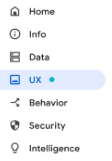
7. Themes/Changes
8. Wasted Space around emulator preview
9. Fonts
10. “Community” added to top menu next to "Save"
Mock Up Editors (Open to suggestions!)


Please reply to this post if you would like me to change anything on the mockup suggestion editor. Thanks!
-
Account
3 -
Announcements
30 -
App Management
8 -
Automation
30 -
Data
31 -
Errors
17 -
Expressions
21 -
Integrations
24 -
Intelligence
5 -
Other
15 -
Resources
15 -
Security
5 -
Templates
13 -
Users
7 -
UX
34

 Twitter


