- AppSheet
- AppSheet Forum
- AppSheet Q&A
- Dashboard from one table
- Subscribe to RSS Feed
- Mark Topic as New
- Mark Topic as Read
- Float this Topic for Current User
- Bookmark
- Subscribe
- Mute
- Printer Friendly Page
- Mark as New
- Bookmark
- Subscribe
- Mute
- Subscribe to RSS Feed
- Permalink
- Report Inappropriate Content
- Mark as New
- Bookmark
- Subscribe
- Mute
- Subscribe to RSS Feed
- Permalink
- Report Inappropriate Content
Hi, I have a Device table and one column in that table is the Customer the device is associated with. I chose not to have a separate customer table for this one field but instead use suggested values to eliminate duplicates. The Devices table also has a field that I will call Version.
I would like to create an interactive dashboard to allow me to select the customer and see a pie chart of the versions. I have the frame work of this working but the chart in not interactive with the table.
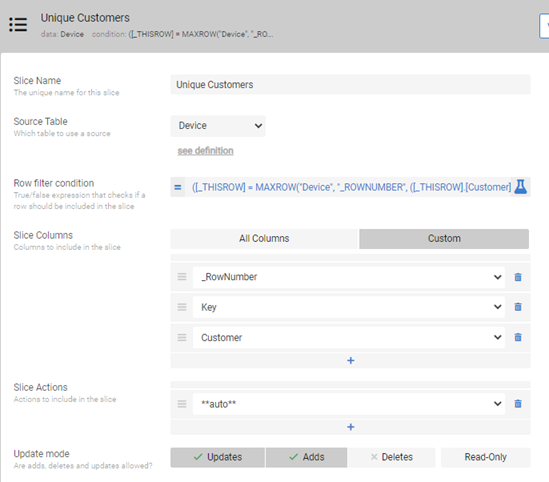
I have a slice of the Devices table that just gives me the unique Customer names.
I have a table view based upon this slice. I also have a chart view based upon the Device table using the Version as the aggregated column
My Dashboard view (With Interactive enabled) is just these two views but as I say at the beginning, selecting a customer in my table view has no impact on the chart.
Any suggestions?
Solved! Go to Solution.
- Mark as New
- Bookmark
- Subscribe
- Mute
- Subscribe to RSS Feed
- Permalink
- Report Inappropriate Content
- Mark as New
- Bookmark
- Subscribe
- Mute
- Subscribe to RSS Feed
- Permalink
- Report Inappropriate Content
Thank you. I believe you will need to add another small filter table containing names of the customers to filter the version rows for that customer.
This is required because, I believe, the row selection based interactive dashboard will work if you have all the values of the chart are in same row. However in your case the versions for a customerare spread over multiple rows.
Please take a look at the following sample app to get an idea on applying filter to the data.
The sample app also has interactive dashboard, even though not interactive. The filter table has options Red/Blue for colors. You will have selection of customers. You could have valid_if of the filter table selection column with customer names drawn from your Device table.
- Mark as New
- Bookmark
- Subscribe
- Mute
- Subscribe to RSS Feed
- Permalink
- Report Inappropriate Content
- Mark as New
- Bookmark
- Subscribe
- Mute
- Subscribe to RSS Feed
- Permalink
- Report Inappropriate Content
I believe you may wish to share the column structure of the table with a few representative rows of dummy data. This will enable community to revert with appropriate solution.
It sounds that you wish to have a pie chart of versions a customer has. However you may wish to mention if a customer can have many different devices and in turn many versions for each of those devices for example.
- Mark as New
- Bookmark
- Subscribe
- Mute
- Subscribe to RSS Feed
- Permalink
- Report Inappropriate Content
- Mark as New
- Bookmark
- Subscribe
- Mute
- Subscribe to RSS Feed
- Permalink
- Report Inappropriate Content
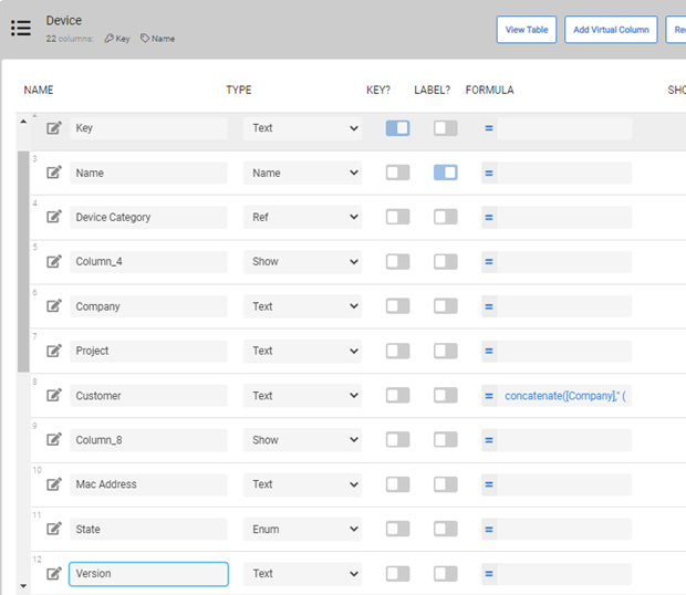
The table:
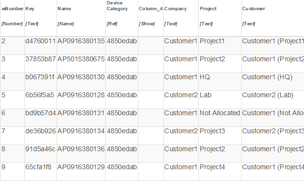
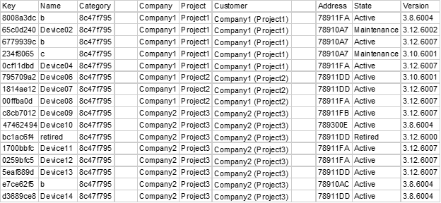
And some sample data:
My slice to get the unique customer names:
([_THISROW] = MAXROW(“Device”, “_ROWNUMBER”, ([_THISROW].[Customer] = [Customer])))
My Dashboard View is simply two view:
Customer List
Firmware
“Customer List” is based of from “Unique Customer (Slice)” and just shows the customer column in a table view
“Firmware” is a chart view based on the Device table. It is an aggregated donut chart on Version
I hope this gives a bit more insight.
- Mark as New
- Bookmark
- Subscribe
- Mute
- Subscribe to RSS Feed
- Permalink
- Report Inappropriate Content
- Mark as New
- Bookmark
- Subscribe
- Mute
- Subscribe to RSS Feed
- Permalink
- Report Inappropriate Content
Thank you very much. I may be missing some point but Version column is not in the sample data. Could you add it?
Also could you share how "Firmware Chart"is constructed. There is Device category column. Does one customer have only one device (category) and associated versions ?
- Mark as New
- Bookmark
- Subscribe
- Mute
- Subscribe to RSS Feed
- Permalink
- Report Inappropriate Content
- Mark as New
- Bookmark
- Subscribe
- Mute
- Subscribe to RSS Feed
- Permalink
- Report Inappropriate Content
Looks like the image is cropped when I paste so I have created some new data and will attempt to paste again
Here is the Chart view:
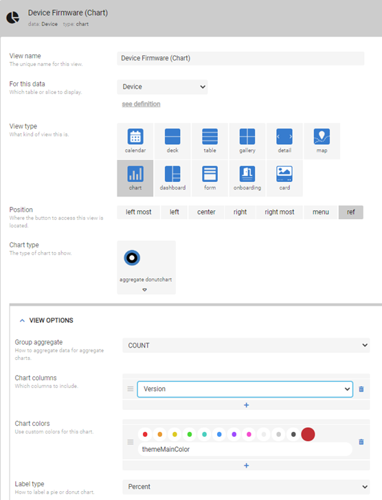
Each Device only has one Customer, one Device Category and one Version
- Mark as New
- Bookmark
- Subscribe
- Mute
- Subscribe to RSS Feed
- Permalink
- Report Inappropriate Content
- Mark as New
- Bookmark
- Subscribe
- Mute
- Subscribe to RSS Feed
- Permalink
- Report Inappropriate Content
Thank you. I believe you will need to add another small filter table containing names of the customers to filter the version rows for that customer.
This is required because, I believe, the row selection based interactive dashboard will work if you have all the values of the chart are in same row. However in your case the versions for a customerare spread over multiple rows.
Please take a look at the following sample app to get an idea on applying filter to the data.
The sample app also has interactive dashboard, even though not interactive. The filter table has options Red/Blue for colors. You will have selection of customers. You could have valid_if of the filter table selection column with customer names drawn from your Device table.
- Mark as New
- Bookmark
- Subscribe
- Mute
- Subscribe to RSS Feed
- Permalink
- Report Inappropriate Content
- Mark as New
- Bookmark
- Subscribe
- Mute
- Subscribe to RSS Feed
- Permalink
- Report Inappropriate Content
Many thanks, that worked!
-
Account
1,675 -
App Management
3,091 -
AppSheet
1 -
Automation
10,314 -
Bug
979 -
Data
9,671 -
Errors
5,729 -
Expressions
11,772 -
General Miscellaneous
1 -
Google Cloud Deploy
1 -
image and text
1 -
Integrations
1,606 -
Intelligence
579 -
Introductions
85 -
Other
2,898 -
Photos
1 -
Resources
536 -
Security
827 -
Templates
1,305 -
Users
1,557 -
UX
9,109
- « Previous
- Next »
| User | Count |
|---|---|
| 41 | |
| 27 | |
| 27 | |
| 20 | |
| 13 |

 Twitter