- AppSheet
- Tips & Resources
- Tips & Tricks
- Dashboarding Options With Card Views
- Subscribe to RSS Feed
- Mark Topic as New
- Mark Topic as Read
- Float this Topic for Current User
- Bookmark
- Subscribe
- Mute
- Printer Friendly Page
- Mark as New
- Bookmark
- Subscribe
- Mute
- Subscribe to RSS Feed
- Permalink
- Report Inappropriate Content
- Mark as New
- Bookmark
- Subscribe
- Mute
- Subscribe to RSS Feed
- Permalink
- Report Inappropriate Content
Just thought of posting use of card views to make useful dashboard reports.
There are some challenges, but these are because of extending use of card views for dashboard purpose. The card views in themselves work nicely. Kudos to @morgan and AppSheet team for these versatile card views.
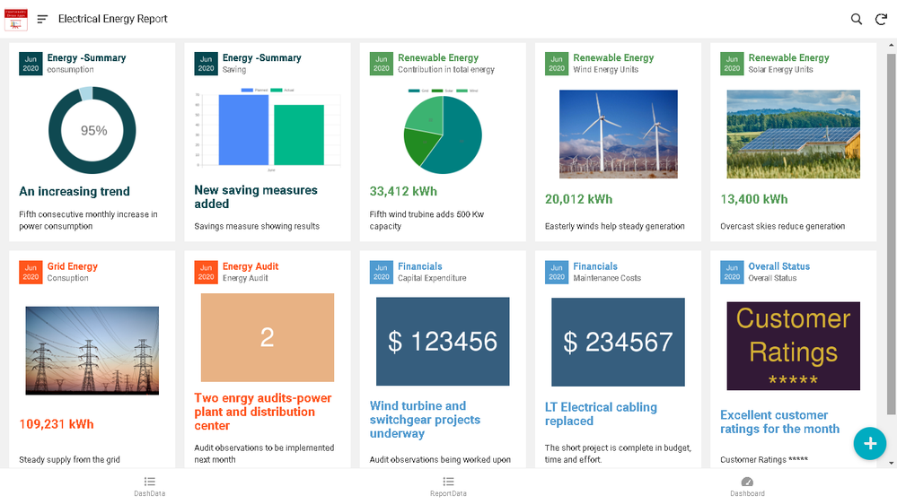
So I created a test app based on some test data. The below screenshot shows the card view in desktop mode from that test app.

Following services I used while creating teh test app-
- Quickcharts for graphs - Thank you @tsuji_koichi and @Fabian for excellent inputs on charting servcies.
Radial Gauge / "Meter" - Inline Dynamic Icon - How to create?
Observation: Only dial charts seem to render well. For bar , pie charts, trick for increasing the font of legends and pie/ bar values is required.
- placehold.jp for cards having images with digits and small image at the top left in all cards ( Containing the report period “Jun 2020”). Again thank you to @tsuji_koichi and @Fabian for excellent inputs below
Observation: Text inside the placeholder image is of same size. Trick to vary font size , color and possibly include icons will help to create more meaningful main card images.
I was looking for creating some user friendly dashboards for some time. While participating in the post below, thought of using card views.Then added more options with above tips.
The dashboard is rendered from a "presentation layer " table in the test app. The table is purely created to feed only the card view and has no other business logic in it.
While using the dashboard card views alongwith other app views, data from main app table will need to be massaged and put in to this “presentation” table for rendering through the dashboard.
Hope it helps and I am sure , community will come out with many more creative options.
**Edit:**Made some changes to the description to make it clearer.
- Mark as New
- Bookmark
- Subscribe
- Mute
- Subscribe to RSS Feed
- Permalink
- Report Inappropriate Content
- Mark as New
- Bookmark
- Subscribe
- Mute
- Subscribe to RSS Feed
- Permalink
- Report Inappropriate Content
@martin check this out!
-
Account
6 -
App Management
21 -
Automation
186 -
Data
140 -
Errors
19 -
Expressions
206 -
Integrations
103 -
Intelligence
17 -
Other
57 -
Resources
24 -
Security
14 -
Templates
56 -
Users
19 -
UX
218

 Twitter