- AppSheet
- AppSheet Forum
- AppSheet Q&A
- Deck View: On the deck view, we are able to ...
- Subscribe to RSS Feed
- Mark Topic as New
- Mark Topic as Read
- Float this Topic for Current User
- Bookmark
- Subscribe
- Mute
- Printer Friendly Page
- Mark as New
- Bookmark
- Subscribe
- Mute
- Subscribe to RSS Feed
- Permalink
- Report Inappropriate Content
- Mark as New
- Bookmark
- Subscribe
- Mute
- Subscribe to RSS Feed
- Permalink
- Report Inappropriate Content
Deck View:
On the deck view, we are able to add primary, secondary header and summary column, which appears to the views based on app creator’s selection. On top of that, we are able to add image as header as well, which is nice.
However, I would say we are killing the space for secondary header.
When we put relatively long texts for secondary column, most of the part of text is cut off and first few words are only visible.
This is Appsheet “design”, but I wonder if we are able to get options to show more for secondary header?
For instance, like Excel cell format, we can select 1) default (as it is now) 2) Wrap text 3) Shrink to fit out of options to determine how to view the secondary texts.
Depending on the length of the texts, but i m not saying to show “all texts” in this available view space.
When we select option of “Wrap text”, then i wish to have “two lines of texts” on the deck view, it is okey to cut off the rest of text after 2nd line.
By doing that, we are able to utilise the space (bottom of the each deck view lines) to display more useful information to guide users.
Appreciate if this is considered.
- Labels:
-
UX
- Mark as New
- Bookmark
- Subscribe
- Mute
- Subscribe to RSS Feed
- Permalink
- Report Inappropriate Content
- Mark as New
- Bookmark
- Subscribe
- Mute
- Subscribe to RSS Feed
- Permalink
- Report Inappropriate Content
Reasonable request. Adding @praveen
- Mark as New
- Bookmark
- Subscribe
- Mute
- Subscribe to RSS Feed
- Permalink
- Report Inappropriate Content
- Mark as New
- Bookmark
- Subscribe
- Mute
- Subscribe to RSS Feed
- Permalink
- Report Inappropriate Content
Wondering if I can get an update to this request. Is it on the short term list and if not, when?
Thanks,
Jayaram
- Mark as New
- Bookmark
- Subscribe
- Mute
- Subscribe to RSS Feed
- Permalink
- Report Inappropriate Content
- Mark as New
- Bookmark
- Subscribe
- Mute
- Subscribe to RSS Feed
- Permalink
- Report Inappropriate Content
I agree. Would love to wrap and show two lines of text. Any update on this?
- Mark as New
- Bookmark
- Subscribe
- Mute
- Subscribe to RSS Feed
- Permalink
- Report Inappropriate Content
- Mark as New
- Bookmark
- Subscribe
- Mute
- Subscribe to RSS Feed
- Permalink
- Report Inappropriate Content
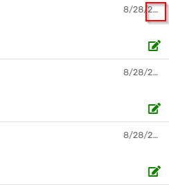
It would be great to have some control over this. A date in the Summary column gets cut off even when there is plenty of space to the left.
-
Account
1,677 -
App Management
3,099 -
AppSheet
1 -
Automation
10,322 -
Bug
983 -
Data
9,676 -
Errors
5,733 -
Expressions
11,779 -
General Miscellaneous
1 -
Google Cloud Deploy
1 -
image and text
1 -
Integrations
1,610 -
Intelligence
578 -
Introductions
85 -
Other
2,904 -
Photos
1 -
Resources
538 -
Security
827 -
Templates
1,309 -
Users
1,559 -
UX
9,110
- « Previous
- Next »
| User | Count |
|---|---|
| 43 | |
| 28 | |
| 24 | |
| 24 | |
| 13 |

 Twitter