- AppSheet
- AppSheet Forum
- AppSheet Q&A
- Deck view summary column
- Subscribe to RSS Feed
- Mark Topic as New
- Mark Topic as Read
- Float this Topic for Current User
- Bookmark
- Subscribe
- Mute
- Printer Friendly Page
- Mark as New
- Bookmark
- Subscribe
- Mute
- Subscribe to RSS Feed
- Permalink
- Report Inappropriate Content
- Mark as New
- Bookmark
- Subscribe
- Mute
- Subscribe to RSS Feed
- Permalink
- Report Inappropriate Content
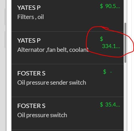
Hi, Should m deck view summary column look like this?
Solved! Go to Solution.
- Mark as New
- Bookmark
- Subscribe
- Mute
- Subscribe to RSS Feed
- Permalink
- Report Inappropriate Content
- Mark as New
- Bookmark
- Subscribe
- Mute
- Subscribe to RSS Feed
- Permalink
- Report Inappropriate Content
I think the Deck View is one of the strongest views in the app but does have limitations like this that make it a challenge and more limited than I think it could be. One solution is to use Format Rules in the UX to shrink your text for that column so more can fit.
- Mark as New
- Bookmark
- Subscribe
- Mute
- Subscribe to RSS Feed
- Permalink
- Report Inappropriate Content
- Mark as New
- Bookmark
- Subscribe
- Mute
- Subscribe to RSS Feed
- Permalink
- Report Inappropriate Content
I have seen this too. Did you try Save and Verify to see if it will fix it?
- Mark as New
- Bookmark
- Subscribe
- Mute
- Subscribe to RSS Feed
- Permalink
- Report Inappropriate Content
- Mark as New
- Bookmark
- Subscribe
- Mute
- Subscribe to RSS Feed
- Permalink
- Report Inappropriate Content
Hi @Bellave_Jayaram
Yes, I did try save and verify and it doesn’t seem to make any difference.
- Mark as New
- Bookmark
- Subscribe
- Mute
- Subscribe to RSS Feed
- Permalink
- Report Inappropriate Content
- Mark as New
- Bookmark
- Subscribe
- Mute
- Subscribe to RSS Feed
- Permalink
- Report Inappropriate Content
Try to remove decimals…
- Mark as New
- Bookmark
- Subscribe
- Mute
- Subscribe to RSS Feed
- Permalink
- Report Inappropriate Content
- Mark as New
- Bookmark
- Subscribe
- Mute
- Subscribe to RSS Feed
- Permalink
- Report Inappropriate Content
Hi @Aleksi I removed the decimals and they returned to one line but I need the decimals in there as it is a Price column.
- Mark as New
- Bookmark
- Subscribe
- Mute
- Subscribe to RSS Feed
- Permalink
- Report Inappropriate Content
- Mark as New
- Bookmark
- Subscribe
- Mute
- Subscribe to RSS Feed
- Permalink
- Report Inappropriate Content
Another option could be… remove the dollar sign from your column.
- Mark as New
- Bookmark
- Subscribe
- Mute
- Subscribe to RSS Feed
- Permalink
- Report Inappropriate Content
- Mark as New
- Bookmark
- Subscribe
- Mute
- Subscribe to RSS Feed
- Permalink
- Report Inappropriate Content
I think the Deck View is one of the strongest views in the app but does have limitations like this that make it a challenge and more limited than I think it could be. One solution is to use Format Rules in the UX to shrink your text for that column so more can fit.
- Mark as New
- Bookmark
- Subscribe
- Mute
- Subscribe to RSS Feed
- Permalink
- Report Inappropriate Content
- Mark as New
- Bookmark
- Subscribe
- Mute
- Subscribe to RSS Feed
- Permalink
- Report Inappropriate Content
As an option…
Create a new column and CONCATENATE the $figure with item under the name, in that order. Reference that column instead of the current one under the name
Otherwise you might have to go to a Table View
- Mark as New
- Bookmark
- Subscribe
- Mute
- Subscribe to RSS Feed
- Permalink
- Report Inappropriate Content
- Mark as New
- Bookmark
- Subscribe
- Mute
- Subscribe to RSS Feed
- Permalink
- Report Inappropriate Content
Thank you for the replies, I reduced the font size and it now looks a bit tidier.
-
Account
1,673 -
App Management
3,074 -
AppSheet
1 -
Automation
10,293 -
Bug
967 -
Data
9,657 -
Errors
5,719 -
Expressions
11,750 -
General Miscellaneous
1 -
Google Cloud Deploy
1 -
image and text
1 -
Integrations
1,599 -
Intelligence
578 -
Introductions
85 -
Other
2,882 -
Photos
1 -
Resources
535 -
Security
827 -
Templates
1,300 -
Users
1,551 -
UX
9,096
- « Previous
- Next »
| User | Count |
|---|---|
| 44 | |
| 29 | |
| 22 | |
| 20 | |
| 14 |

 Twitter