- AppSheet
- Release Notes & Announcements
- Announcements
- Desktop changes coming to Preview Program
- Subscribe to RSS Feed
- Mark Topic as New
- Mark Topic as Read
- Float this Topic for Current User
- Bookmark
- Subscribe
- Mute
- Printer Friendly Page
- Mark as New
- Bookmark
- Subscribe
- Mute
- Subscribe to RSS Feed
- Permalink
- Report Inappropriate Content
- Mark as New
- Bookmark
- Subscribe
- Mute
- Subscribe to RSS Feed
- Permalink
- Report Inappropriate Content
Not a brief post, but there’s a lot to touch upon. There will be further posts, as we develop, release and get feedback, but we wanted to let you know some things we’re up to. Still a lot in the works, and iteration…
TL:DR;
We’ve been researching and working on some patterns for desktop apps; these will start being released in the Preview Program, giving us some extensive use across variety of apps, and iterating along the way. We asked the community for some desktop use cases earlier this year as well.
The major desktop elements are discussed below:
- Navigation rail (aka sidebar) and top appbar changes
- Detail view developments:
- Using the expanded real estate for laying out dense content
- App bar patterns, such as breadcrumbs, action buttons, and sibling navigation controls
- Splitting and grouping content
- Collection views
- Open search
- Split view options
What’s not in motion at this time:
- Dashboards
- Forms
Here’s a high level overview and concept sketches of what we’re working on, and will be coming to the preview program:
1. New desktop element: Navigation rail (aka sidenav)
When AppSheet is being used on a desktop, we’re exposing the app views as a visible navigation rail on the left side of the viewport.
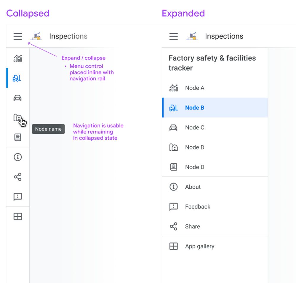
Besides being present at all times, we’d like you to be able to work with this in two modes: Collapsed or Expanded. Here’s a sketch:
Collapsed mode
When collapsed, you’ll see the icon associated with the view, and on hover you’ll see the view name in a tooltip. Collapsed means you can have more space dedicated to the content pane. Either mode is scrollable for apps with lots of views.
If you don’t show an app icon in your app bar, you’ll see the app icon (and the app name) when you expand the drawer, similar to what you see today on mobile.
Expanded mode
When expanded, it resembles the mobile navigation drawer you see today, except it occupies persistent space, i.e. the menu links are visible.
Moving the bottom app bar nodes into the navigation rail
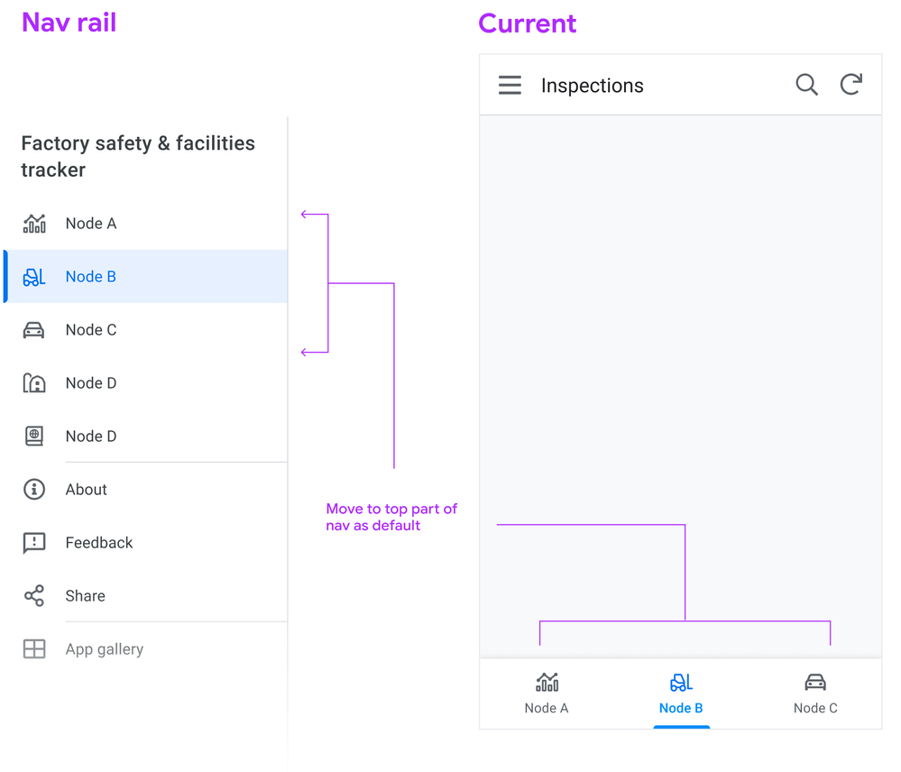
Following a more standard desktop web app pattern, you won’t see the bottom app bar on desktop.
Tab nodes ⇒ Top of nav rail
This means we map the visible tabs on mobile to the top of the view list in the sidebar, putting them in the top position in the list:
Swapping menu and icon position
Another change we’re making is switching the position of the menu bars and the app logo (if you use one), so the menu control is directly aligned above the navigation links. Pressing the menu control toggles between Collapsed and Expanded states.
2. Detail view changes
We’re starting with detail views, as it’s one of the most important and potentially information dense, and currently it’s designed primarily for mobile.
We’re looking to use the available real estate afforded by desktop to break out the content into sections. These sections can be laid out across columns.
Let’s look at the basic structure:
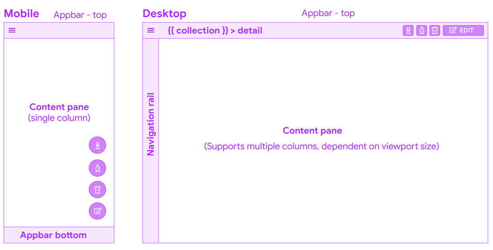
Appbar top - breadcrumbs
Starting from the top, you’ll see a a common pattern when you drill down into a detail from a collection: a (hierarchical) breadcrumb bar:

This means there’s one click up to the collection, and if a user lands in this view from a link, it’s clear what collection this instance belongs to.
Overlay buttons placement
The use of Overlay buttons (aka FAB: Material Floating Action Buttons) is a fairly standard mobile pattern. The core idea is that it’s for the ONE most important action, but AppSheet lets you add multiple.
Translated to the desktop, Material originally kept the floating overlays in the bottom right of the viewport, but after testing and research, transitioned to the top app bar, because of discoverability issues and content overlay. App creators we’ve interviewed have brought this issue to our attention.
System action primary buttons will have a label
Right now, we’re starting with having the primary system action button, Edit appearing as a contained button with a label.
How to handle multiple overlay buttons?
The remaining overlay buttons take are displayed as secondary action buttons, and other system actions (delete, sync) remain as icon buttons, and all buttons will have tooltips as well:
Here’s a sketch of how we are structuring the top right of the app bar for Detail views:
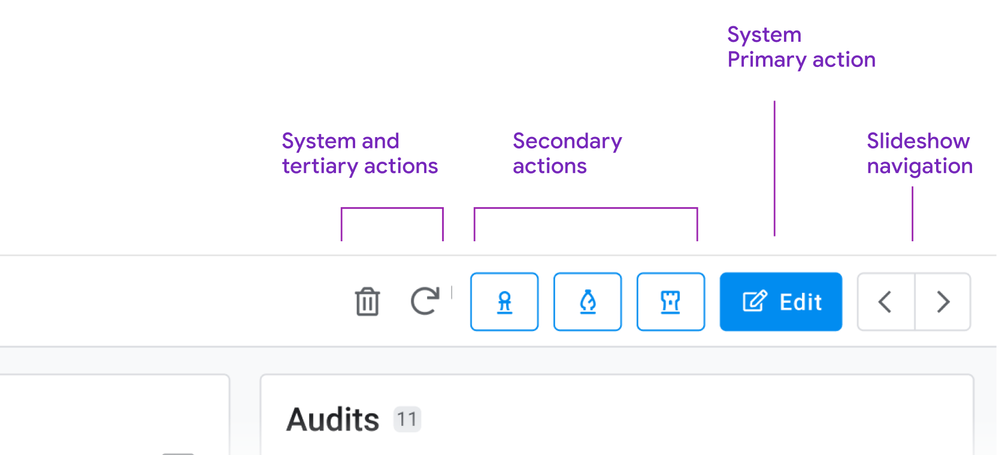
Slideshow controls
For these, we’re moving to dedicated buttons for navigating sibling records. If you have to skim back and forth between records, the buttons are in a stable place, and close together. We’re also exploring (future) keyboard shortcuts to aid in sibling navigation: This can aid in quickly traversing records, and is effective for power users.
You may have seen this pattern before: We’re currently using it for detail views in dashboards:

Consolidating interaction patterns when possible is part of a larger push.
Content: Sections, columns, and flow
Right now, detail views form one long strip of mostly undifferentiated content.
We’re working on a way of grouping these into the following types of sections.
- Primary
- Secondary: Properties (columns and their values)
- Inline lists
These sections can be ordered, and sections can be arranged into columns.
So a layout on a browser can form up to 3 columns, containing multiple sections.
Here’s an sketch of a detail view with 1. a primary section with an image and some overlay text, a medium amount of secondary properties, and 2 inline lists:
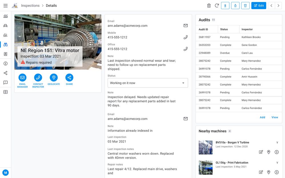
Primary section
Consider a ‘primary’ section (name may change for clarity) as including some of the following:
- Title (often the instance name from the label column)
- Any other headers
- An image
- Actions (Prominent Display actions as currently seen in mobile)
There are many permutations of headers, images, and both combined, currently in apps. There are combination of headers and images, just headers (up to 6), or the card layout.
Right now we’re giving any and all of these prominent placements in the upper left of the content pane when multicolumn layouts are in effect.
Together a primary section of content allows you to:
- See the instance and most important details (expressed as headers)
- Take relevant actions (Prominent display actions)
- View the image (when there is one)
Properties
Next are the remaining properties (columns) of the record. These can have tremendous variance: we have customer apps with anywhere from 5 - 70 plus properties represented in their detail views.
Tradeoffs: There will be some potentially large height differences in sections, simply due to how many properties a section contains.
Grouping properties
To start with these will default to a single section, and we want to empower you to break these into more groupings, and we’d like to allow you to use the SHOW type header as one means of doing so:
Ref lists
The third section type is inline views, such as ref lists. These form other individual sections.
3. Collection views
Next we have our collection views. Starting from the top:
Top app bar: Open search

Another common pattern is a visible search field. With large lists, a persistent field with a visible label provides a quick way to find items.
The other aspect is that the filter icon is visible, and can be accessed with a single click.
Split pane patterns: collection detail views
We notice that app creators are configuring interactive dashboards, setting up a table or similar collection, and adding a detail view. This is recreating the common collection - detail pattern (aka split pane or two-panel selector).
We’d like to allow app creators to configure a collection view to accommodate a split pane, no dashboard creation required. This will facilitate working in context, and avoiding jumping from collection to detail and back to collection. Here’s a concept sketch:
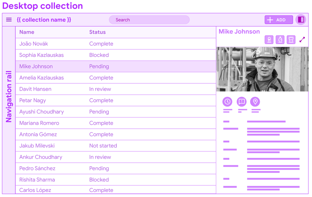
You’ll see this pattern in Gmail: users can invoke the split pane from an icon control, and a single click allows for viewing details.
I’m displaying a data table for the concept mock, but this pattern can apply to other forms of collections (cards).
In conclusion
It’s a long post, but we wanted to bundle this together to give you a heads up, and break down some of the core concepts and patterns. There’s a bunch of details we’ll dive into more in other posts.
We put out a call for desktop views and use cases earlier this year, and have gotten some excellent examples of dense data displays. We look forward to receiving more as we go forward.
Stay tuned for more specific details…There’s a lot of tuning to do, big and small.
- Labels:
-
UX
- Mark as New
- Bookmark
- Subscribe
- Mute
- Subscribe to RSS Feed
- Permalink
- Report Inappropriate Content
- Mark as New
- Bookmark
- Subscribe
- Mute
- Subscribe to RSS Feed
- Permalink
- Report Inappropriate Content
- Mark as New
- Bookmark
- Subscribe
- Mute
- Subscribe to RSS Feed
- Permalink
- Report Inappropriate Content
- Mark as New
- Bookmark
- Subscribe
- Mute
- Subscribe to RSS Feed
- Permalink
- Report Inappropriate Content
Yes!!! I confess ![]()
- Mark as New
- Bookmark
- Subscribe
- Mute
- Subscribe to RSS Feed
- Permalink
- Report Inappropriate Content
- Mark as New
- Bookmark
- Subscribe
- Mute
- Subscribe to RSS Feed
- Permalink
- Report Inappropriate Content
@Mike_Moss, How to put millions of hearts? ![]()
- Mark as New
- Bookmark
- Subscribe
- Mute
- Subscribe to RSS Feed
- Permalink
- Report Inappropriate Content
- Mark as New
- Bookmark
- Subscribe
- Mute
- Subscribe to RSS Feed
- Permalink
- Report Inappropriate Content
Looks great! Love the proposed changes to the detail view!
- Mark as New
- Bookmark
- Subscribe
- Mute
- Subscribe to RSS Feed
- Permalink
- Report Inappropriate Content
- Mark as New
- Bookmark
- Subscribe
- Mute
- Subscribe to RSS Feed
- Permalink
- Report Inappropriate Content
This is going to be awesome! I’m all in!
- Mark as New
- Bookmark
- Subscribe
- Mute
- Subscribe to RSS Feed
- Permalink
- Report Inappropriate Content
- Mark as New
- Bookmark
- Subscribe
- Mute
- Subscribe to RSS Feed
- Permalink
- Report Inappropriate Content
Sorry, I missed this. I hope I can help now.
Man, this is sooo important for me. As a tilling window manager linux user I feel really stupid clicking everywhere in order to make simple actions like selecting a certain record, openning the edit form, saving the forms, etc. This should be top 3 on priority list.
Thanks for the hard work!
- Mark as New
- Bookmark
- Subscribe
- Mute
- Subscribe to RSS Feed
- Permalink
- Report Inappropriate Content
- Mark as New
- Bookmark
- Subscribe
- Mute
- Subscribe to RSS Feed
- Permalink
- Report Inappropriate Content
Thanks you for all the works you and your team made for this thus far. This is what I have been waiting for years and years now.
As @MultiTech_Visions mentioned, there are so much detailed information, to grab those, only our hands on testing with new UI will tell all the story. Looking foward to testing through preview programme.
Among others, the multiple column settings for detail view is awaited. Detail view and Form view is kinda of sibline relationship, from my point of view, so I m just wondering the same new concept will be applied to form view, i.e. to split the sections into muliple column on Form View as well, is it in your plan and roadmap?
- Mark as New
- Bookmark
- Subscribe
- Mute
- Subscribe to RSS Feed
- Permalink
- Report Inappropriate Content
- Mark as New
- Bookmark
- Subscribe
- Mute
- Subscribe to RSS Feed
- Permalink
- Report Inappropriate Content
@tsuji_koichi we’re going to be tackling form view at a later date; and there’s lots we can do there too. I don’t have an exact timeline for forms at them moment.
- Mark as New
- Bookmark
- Subscribe
- Mute
- Subscribe to RSS Feed
- Permalink
- Report Inappropriate Content
- Mark as New
- Bookmark
- Subscribe
- Mute
- Subscribe to RSS Feed
- Permalink
- Report Inappropriate Content
Hi @Mike_Moss thanks you for your clarification, all understood.
- Mark as New
- Bookmark
- Subscribe
- Mute
- Subscribe to RSS Feed
- Permalink
- Report Inappropriate Content
- Mark as New
- Bookmark
- Subscribe
- Mute
- Subscribe to RSS Feed
- Permalink
- Report Inappropriate Content
Wowwww !!!
Thanks so much, This will be a big improvement.
I hope there will be something like this about pdf reports.
- Mark as New
- Bookmark
- Subscribe
- Mute
- Subscribe to RSS Feed
- Permalink
- Report Inappropriate Content
- Mark as New
- Bookmark
- Subscribe
- Mute
- Subscribe to RSS Feed
- Permalink
- Report Inappropriate Content
I hope the split pane will be available on tablet landscape mode as well. It will be really useful.
I think a lot of other changes will look good on tablet landscape mode. Not only on desktop.
- Mark as New
- Bookmark
- Subscribe
- Mute
- Subscribe to RSS Feed
- Permalink
- Report Inappropriate Content
- Mark as New
- Bookmark
- Subscribe
- Mute
- Subscribe to RSS Feed
- Permalink
- Report Inappropriate Content
Wow …the much awaited thing is here… Hope this keeps me hooked to onto appsheet forever for my business app. Kudos Team Appsheet
- Mark as New
- Bookmark
- Subscribe
- Mute
- Subscribe to RSS Feed
- Permalink
- Report Inappropriate Content
- Mark as New
- Bookmark
- Subscribe
- Mute
- Subscribe to RSS Feed
- Permalink
- Report Inappropriate Content
Thank you! When this is released, it will provide a higher UX for people who use AppSheet at their desks.
I’ll check the details when the Preview is released, but I personally feel that it would be easier to use if the System Action and Slideshow UI were replaced.
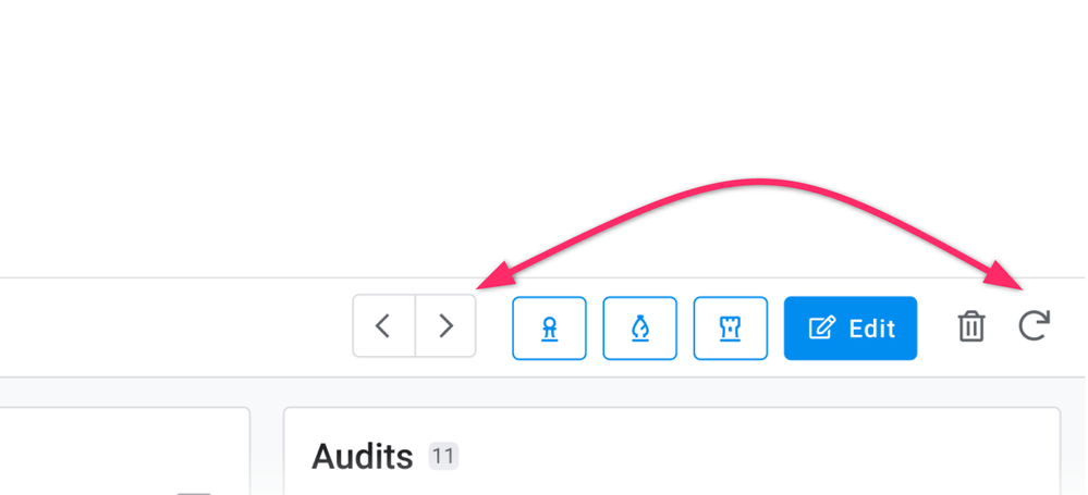
As you know, Sync Action has a special meaning in AppSheet, and it would be more natural if it is always displayed on the right side of the screen without being affected by the placement of Costum Action.
Maybe it’s because I’m only using AppSheet now! ![]()
- Mark as New
- Bookmark
- Subscribe
- Mute
- Subscribe to RSS Feed
- Permalink
- Report Inappropriate Content
- Mark as New
- Bookmark
- Subscribe
- Mute
- Subscribe to RSS Feed
- Permalink
- Report Inappropriate Content
Love the coming desktop changes. Thank you for the hard work.
- Mark as New
- Bookmark
- Subscribe
- Mute
- Subscribe to RSS Feed
- Permalink
- Report Inappropriate Content
- Mark as New
- Bookmark
- Subscribe
- Mute
- Subscribe to RSS Feed
- Permalink
- Report Inappropriate Content
![]()
![]()
![]()
![]()
![]()
These recent UI updates are exciting!
- Mark as New
- Bookmark
- Subscribe
- Mute
- Subscribe to RSS Feed
- Permalink
- Report Inappropriate Content
- Mark as New
- Bookmark
- Subscribe
- Mute
- Subscribe to RSS Feed
- Permalink
- Report Inappropriate Content
Mike presented you with multiple changes all at once.
In terms of roll out to the Preview Program, we’ll be rolling changes in stages as they are available. So for instance, the left nav menu will become available before the Detail View for desktop. That also means that an app enrolled into the Preview Program may not fully as Mike showed during this process.
We’re proceeding this way because we know we cannot think of all edge cases and because we’ll receive feedback faster.
- Mark as New
- Bookmark
- Subscribe
- Mute
- Subscribe to RSS Feed
- Permalink
- Report Inappropriate Content
- Mark as New
- Bookmark
- Subscribe
- Mute
- Subscribe to RSS Feed
- Permalink
- Report Inappropriate Content
Thanks @Arthur_Rallu
This changes coveres bunch of items and we need to review broad areas to see how new UI goes.
Releasing items piece by pieces should be welcomed by us to address new view one by one to provide feedback. We would like to hear your annoucement further once we are able to reach out to it through the preview once they get ready.
thanks again.
- Mark as New
- Bookmark
- Subscribe
- Mute
- Subscribe to RSS Feed
- Permalink
- Report Inappropriate Content
- Mark as New
- Bookmark
- Subscribe
- Mute
- Subscribe to RSS Feed
- Permalink
- Report Inappropriate Content
This is so welcome!!! ![]()
![]()
![]()
![]()
![]()
![]()
![]()
![]()
![]()
![]()
- Mark as New
- Bookmark
- Subscribe
- Mute
- Subscribe to RSS Feed
- Permalink
- Report Inappropriate Content
- Mark as New
- Bookmark
- Subscribe
- Mute
- Subscribe to RSS Feed
- Permalink
- Report Inappropriate Content
@Mike_Moss are y’all planning on taking on multi column form views as well?
- Mark as New
- Bookmark
- Subscribe
- Mute
- Subscribe to RSS Feed
- Permalink
- Report Inappropriate Content
- Mark as New
- Bookmark
- Subscribe
- Mute
- Subscribe to RSS Feed
- Permalink
- Report Inappropriate Content
- Mark as New
- Bookmark
- Subscribe
- Mute
- Subscribe to RSS Feed
- Permalink
- Report Inappropriate Content
- Mark as New
- Bookmark
- Subscribe
- Mute
- Subscribe to RSS Feed
- Permalink
- Report Inappropriate Content
WOWWWWW
![]()
- Mark as New
- Bookmark
- Subscribe
- Mute
- Subscribe to RSS Feed
- Permalink
- Report Inappropriate Content
- Mark as New
- Bookmark
- Subscribe
- Mute
- Subscribe to RSS Feed
- Permalink
- Report Inappropriate Content
Love it! been waiting for years for this.
- Mark as New
- Bookmark
- Subscribe
- Mute
- Subscribe to RSS Feed
- Permalink
- Report Inappropriate Content
- Mark as New
- Bookmark
- Subscribe
- Mute
- Subscribe to RSS Feed
- Permalink
- Report Inappropriate Content
This is brilliant, I still havent chosen to use appsheet though, opting or Bubble.io, because for small startups, less than 20 people, the google appsheet plan to allow external API usage blocks us out, they want minimum a 20 people paying, so much for google embracing startups to use its cloud.
- Mark as New
- Bookmark
- Subscribe
- Mute
- Subscribe to RSS Feed
- Permalink
- Report Inappropriate Content
- Mark as New
- Bookmark
- Subscribe
- Mute
- Subscribe to RSS Feed
- Permalink
- Report Inappropriate Content
Have you rolled out these new updates or yet to. I cannot see the new options on my app.
- Mark as New
- Bookmark
- Subscribe
- Mute
- Subscribe to RSS Feed
- Permalink
- Report Inappropriate Content
- Mark as New
- Bookmark
- Subscribe
- Mute
- Subscribe to RSS Feed
- Permalink
- Report Inappropriate Content
@Manish_Jain1 Not yet. We wanted to give you a peek into what we’re working on. We’ll have things rolling out in pieces to the Preview Program, and will let you know.
- Mark as New
- Bookmark
- Subscribe
- Mute
- Subscribe to RSS Feed
- Permalink
- Report Inappropriate Content
- Mark as New
- Bookmark
- Subscribe
- Mute
- Subscribe to RSS Feed
- Permalink
- Report Inappropriate Content
If you get this right, you have no idea how big this will be.
Until now it has been too unprofessional looking and lacking certain features.
I’m guessing this may become your biggest market.
- Mark as New
- Bookmark
- Subscribe
- Mute
- Subscribe to RSS Feed
- Permalink
- Report Inappropriate Content
- Mark as New
- Bookmark
- Subscribe
- Mute
- Subscribe to RSS Feed
- Permalink
- Report Inappropriate Content
Hi Mike, what is the best way to be notified on when these features will become available in preview? I’d like to try them out!
Thanks.
- Mark as New
- Bookmark
- Subscribe
- Mute
- Subscribe to RSS Feed
- Permalink
- Report Inappropriate Content
- Mark as New
- Bookmark
- Subscribe
- Mute
- Subscribe to RSS Feed
- Permalink
- Report Inappropriate Content
When these are available, we’ll be announcing them.
As the various changes will be available at different times, we’ll put new posts in the announcements section and we will also updated the status on this specific thread.
- Mark as New
- Bookmark
- Subscribe
- Mute
- Subscribe to RSS Feed
- Permalink
- Report Inappropriate Content
- Mark as New
- Bookmark
- Subscribe
- Mute
- Subscribe to RSS Feed
- Permalink
- Report Inappropriate Content
Hi there!
I’m just curious. Is there any ETA?
- Mark as New
- Bookmark
- Subscribe
- Mute
- Subscribe to RSS Feed
- Permalink
- Report Inappropriate Content
- Mark as New
- Bookmark
- Subscribe
- Mute
- Subscribe to RSS Feed
- Permalink
- Report Inappropriate Content
Hy,
Looking foreword for all these improvements ![]()
Any chance a solution for this issue is included?
Thank you ![]()
- Mark as New
- Bookmark
- Subscribe
- Mute
- Subscribe to RSS Feed
- Permalink
- Report Inappropriate Content
- Mark as New
- Bookmark
- Subscribe
- Mute
- Subscribe to RSS Feed
- Permalink
- Report Inappropriate Content
OMG THIS IS GOING TO BE EPIC PAPUS! ![]()
- Mark as New
- Bookmark
- Subscribe
- Mute
- Subscribe to RSS Feed
- Permalink
- Report Inappropriate Content
- Mark as New
- Bookmark
- Subscribe
- Mute
- Subscribe to RSS Feed
- Permalink
- Report Inappropriate Content
- Mark as New
- Bookmark
- Subscribe
- Mute
- Subscribe to RSS Feed
- Permalink
- Report Inappropriate Content
- Mark as New
- Bookmark
- Subscribe
- Mute
- Subscribe to RSS Feed
- Permalink
- Report Inappropriate Content
@Mike_Moss you looking for alpha testers?? 
(^_^)
- Mark as New
- Bookmark
- Subscribe
- Mute
- Subscribe to RSS Feed
- Permalink
- Report Inappropriate Content
- Mark as New
- Bookmark
- Subscribe
- Mute
- Subscribe to RSS Feed
- Permalink
- Report Inappropriate Content
I feel uncomfortable about the UI in the upper right corner of Detail View.
I understand that they are making changes to make it more Google-like, but I don’t think it blends well with the traditional AppSheet UI yet.
Specifically, I think the following points need to be fixed
- The Sync button is no longer placed on the right side of the screen, which is leading to the wrong operation.
- The Delete button in System Action is duplicated and looks different to the user.
Thanks
- Mark as New
- Bookmark
- Subscribe
- Mute
- Subscribe to RSS Feed
- Permalink
- Report Inappropriate Content
- Mark as New
- Bookmark
- Subscribe
- Mute
- Subscribe to RSS Feed
- Permalink
- Report Inappropriate Content
I’m sorry.
The Detail View menu has always been arranged like this.
It was my mistake. Just forget it.🙇♂️
- Mark as New
- Bookmark
- Subscribe
- Mute
- Subscribe to RSS Feed
- Permalink
- Report Inappropriate Content
- Mark as New
- Bookmark
- Subscribe
- Mute
- Subscribe to RSS Feed
- Permalink
- Report Inappropriate Content
I agree, it doesn’t make much sense to duplicate actions both on the top bar and in the dropdown.
- Mark as New
- Bookmark
- Subscribe
- Mute
- Subscribe to RSS Feed
- Permalink
- Report Inappropriate Content
- Mark as New
- Bookmark
- Subscribe
- Mute
- Subscribe to RSS Feed
- Permalink
- Report Inappropriate Content
I'd would love to hide the delete action in the top bar but when you hide it the action in the corner dropdown disappears as well lol doesn't make any sense to have them connected since an "Are updates allowed? setting already exists.
- Mark as New
- Bookmark
- Subscribe
- Mute
- Subscribe to RSS Feed
- Permalink
- Report Inappropriate Content
- Mark as New
- Bookmark
- Subscribe
- Mute
- Subscribe to RSS Feed
- Permalink
- Report Inappropriate Content
What would the ETA be on this to start previewing? Been quiet for almost (4) months and chomping at the bit lol
- Mark as New
- Bookmark
- Subscribe
- Mute
- Subscribe to RSS Feed
- Permalink
- Report Inappropriate Content
- Mark as New
- Bookmark
- Subscribe
- Mute
- Subscribe to RSS Feed
- Permalink
- Report Inappropriate Content
same here!
-
Account
3 -
Announcements
30 -
App Management
8 -
Automation
30 -
Data
31 -
Errors
17 -
Expressions
21 -
Integrations
24 -
Intelligence
5 -
Other
15 -
Resources
15 -
Security
5 -
Templates
13 -
Users
7 -
UX
34

 Twitter