This website uses Cookies. Click Accept to agree to our website's cookie use as described in our Privacy Policy. Click Preferences to customize your cookie settings.
Turn on suggestions
Auto-suggest helps you quickly narrow down your search results by suggesting possible matches as you type.
Showing results for
- AppSheet
- Feature Ideas
- Fix "Show Legend" & "Chart color" for Scatterplot ...
Topic Options
- Subscribe to RSS Feed
- Mark as New
- Mark as Read
- Bookmark
- Subscribe
- Printer Friendly Page
- Report Inappropriate Content
Idea Options
- Mark as New
- Bookmark
- Subscribe
- Mute
- Subscribe to RSS Feed
- Permalink
- Report Inappropriate Content
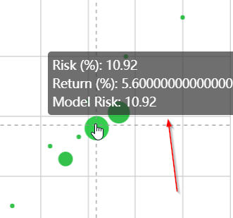
The Scatterplot is a great visualization of data and works well in Appsheet. My only complaint is that you’re unable to label data points so that the user knows what they’re looking at. This is partially solved with the popup (image attached) when you hover over a data point but you’re unable to add text columns in Scatterplot view.
Enabling the legend and multiple chart colors has no effect in Scatterplot view (see image).
Two proposed solutions:
- Add the key/label to the popup
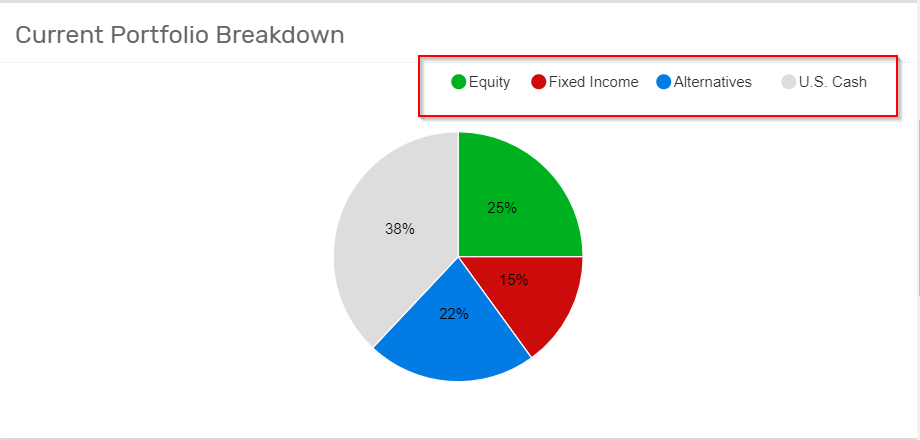
- Add the ability to render certain data points different colors so that they can labeled like with the Pie Chart view (example attached)


 Twitter