- AppSheet
- Feature Ideas
- Form UX with save/cancel at the top
- Subscribe to RSS Feed
- Mark as New
- Mark as Read
- Bookmark
- Subscribe
- Printer Friendly Page
- Report Inappropriate Content
- Mark as New
- Bookmark
- Subscribe
- Mute
- Subscribe to RSS Feed
- Permalink
- Report Inappropriate Content
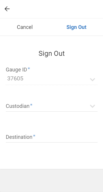
Currently, we can choose to have the save/cancel position of forms display at the top or bottom.
When displaying the save/cancel buttons at the top, the back (

It would be nice if this portion of the UX could be tweaked in some fashion to remove the redundancy
@morgan, for some background… We have created an equipment management application which is runnign on a raspberry pi and Chromium browser in kiosk mode.
This is useful as the pi boots straight to the appsheet application after any power loss and can be connected to a network via network cable instead of wifi, and can live right at the equipment storage location.
One problem with this implementation is, the onscreen keyboard options available for this setup sometimes obscurs the buttons at the bottom of AppSheet form.

 Twitter