- AppSheet
- AppSheet Forum
- AppSheet Q&A
- Giant white space when using nested table column
- Subscribe to RSS Feed
- Mark Topic as New
- Mark Topic as Read
- Float this Topic for Current User
- Bookmark
- Subscribe
- Mute
- Printer Friendly Page
- Mark as New
- Bookmark
- Subscribe
- Mute
- Subscribe to RSS Feed
- Permalink
- Report Inappropriate Content
- Mark as New
- Bookmark
- Subscribe
- Mute
- Subscribe to RSS Feed
- Permalink
- Report Inappropriate Content

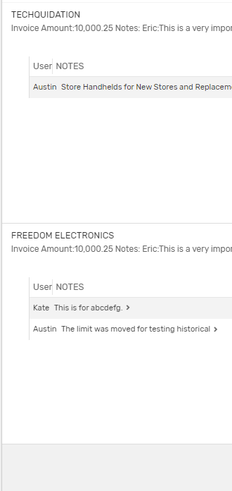
Does anyone have a solution to the giant white space below rows in a deck view with nested table columns? It would be really nice to be able to display more than 2 lines of text while getting the swipe left and right functionality of the deck view
- Labels:
-
UX
- Mark as New
- Bookmark
- Subscribe
- Mute
- Subscribe to RSS Feed
- Permalink
- Report Inappropriate Content
- Mark as New
- Bookmark
- Subscribe
- Mute
- Subscribe to RSS Feed
- Permalink
- Report Inappropriate Content
@morgan Any thoughts about this?
- Mark as New
- Bookmark
- Subscribe
- Mute
- Subscribe to RSS Feed
- Permalink
- Report Inappropriate Content
- Mark as New
- Bookmark
- Subscribe
- Mute
- Subscribe to RSS Feed
- Permalink
- Report Inappropriate Content
@Austin_Lambeth Were you able to find a solution for this? The giant white space looks terrible.
@Steve perhaps you have some thoughts on this?
- Mark as New
- Bookmark
- Subscribe
- Mute
- Subscribe to RSS Feed
- Permalink
- Report Inappropriate Content
- Mark as New
- Bookmark
- Subscribe
- Mute
- Subscribe to RSS Feed
- Permalink
- Report Inappropriate Content
I’m with @Grant_Stead on this.
- Mark as New
- Bookmark
- Subscribe
- Mute
- Subscribe to RSS Feed
- Permalink
- Report Inappropriate Content
- Mark as New
- Bookmark
- Subscribe
- Mute
- Subscribe to RSS Feed
- Permalink
- Report Inappropriate Content
Solution is don’t use them until they’re “fixed”. They’re disgusting and I’m assuming its just auto padding the spacing for 5 rows or so.
- Mark as New
- Bookmark
- Subscribe
- Mute
- Subscribe to RSS Feed
- Permalink
- Report Inappropriate Content
- Mark as New
- Bookmark
- Subscribe
- Mute
- Subscribe to RSS Feed
- Permalink
- Report Inappropriate Content
The aesthetics of the nested tables is the reason why I don’t ever use them.
- Mark as New
- Bookmark
- Subscribe
- Mute
- Subscribe to RSS Feed
- Permalink
- Report Inappropriate Content
- Mark as New
- Bookmark
- Subscribe
- Mute
- Subscribe to RSS Feed
- Permalink
- Report Inappropriate Content
Exactly. I was excited to see the feature added at first, but after testing I chose not to use it based on aesthetics. ![]()
I’ve had plenty of use-case where nested tables would have been perfect, but this feature just isn’t ready for prime-time.
I don’t want to show my clients a view that looks like that and tell them that’s the best I, or AppSheet, can do. It gives the wrong impression about both of our capabilities.
- Mark as New
- Bookmark
- Subscribe
- Mute
- Subscribe to RSS Feed
- Permalink
- Report Inappropriate Content
- Mark as New
- Bookmark
- Subscribe
- Mute
- Subscribe to RSS Feed
- Permalink
- Report Inappropriate Content
I usually just opt for a detail view, grouping, or some form of LINKTOFILTEREDVIEW…
-
Account
1,675 -
App Management
3,090 -
AppSheet
1 -
Automation
10,313 -
Bug
979 -
Data
9,670 -
Errors
5,726 -
Expressions
11,771 -
General Miscellaneous
1 -
Google Cloud Deploy
1 -
image and text
1 -
Integrations
1,605 -
Intelligence
578 -
Introductions
85 -
Other
2,898 -
Photos
1 -
Resources
536 -
Security
827 -
Templates
1,305 -
Users
1,557 -
UX
9,109
- « Previous
- Next »
| User | Count |
|---|---|
| 46 | |
| 29 | |
| 24 | |
| 22 | |
| 13 |

 Twitter