- AppSheet
- AppSheet Forum
- AppSheet Q&A
- Help Replicating Chart
- Subscribe to RSS Feed
- Mark Topic as New
- Mark Topic as Read
- Float this Topic for Current User
- Bookmark
- Subscribe
- Mute
- Printer Friendly Page
- Mark as New
- Bookmark
- Subscribe
- Mute
- Subscribe to RSS Feed
- Permalink
- Report Inappropriate Content
- Mark as New
- Bookmark
- Subscribe
- Mute
- Subscribe to RSS Feed
- Permalink
- Report Inappropriate Content

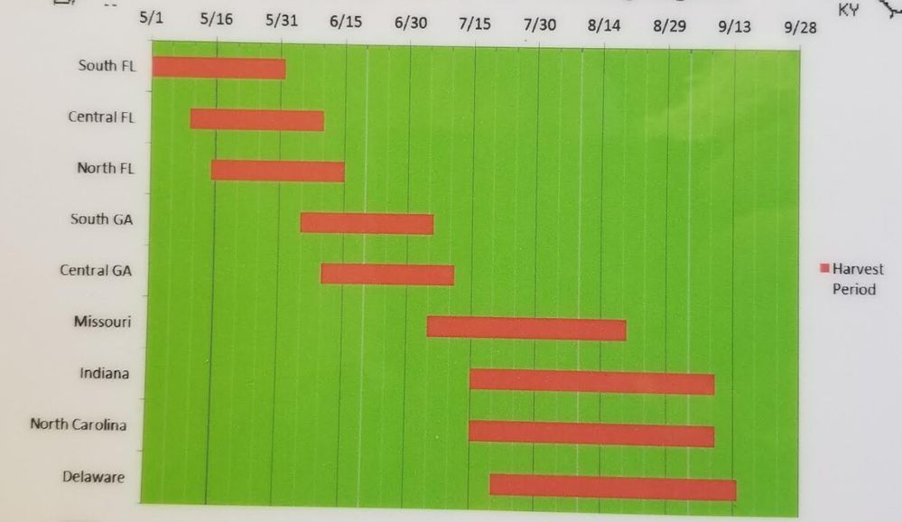
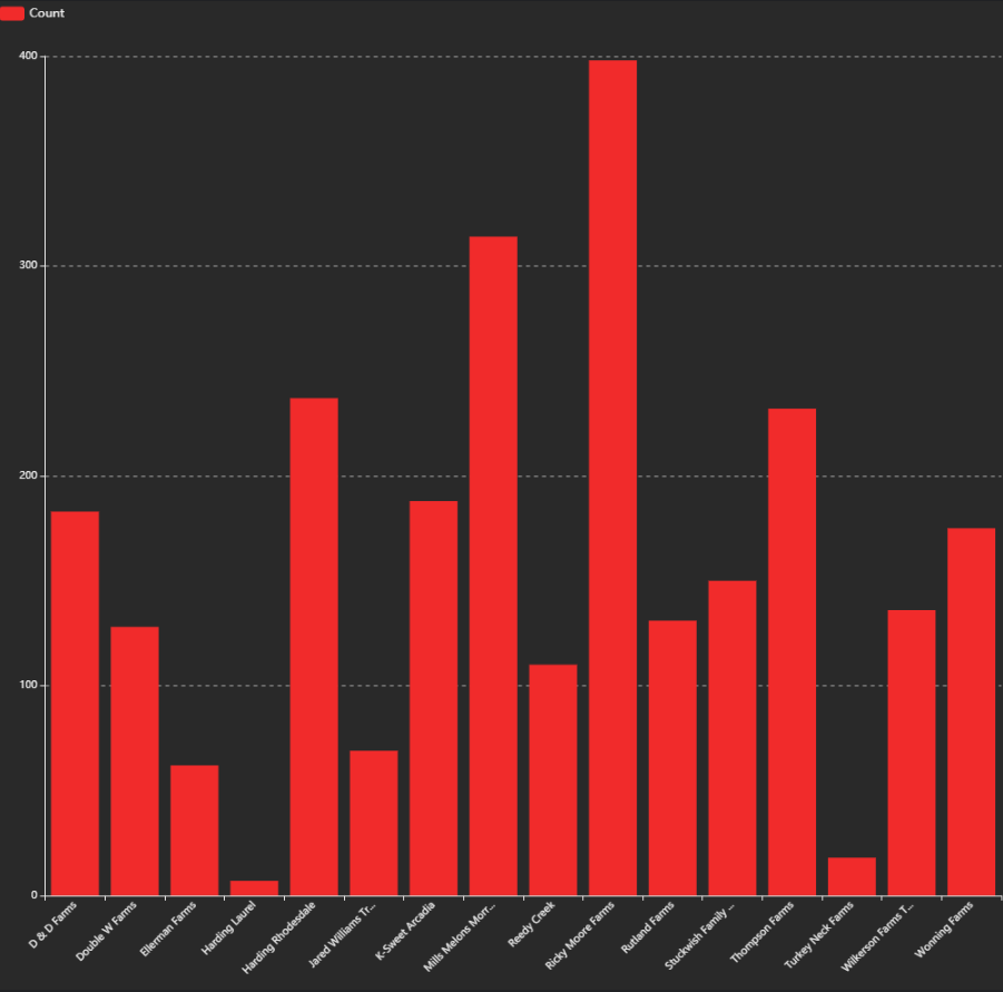
I’ve been tasked to replicate this chart within AppSheet, but can’t wrap my mind around how to do it. I know how to get the COUNT of each order within our system, but am not sure how to show that on a weekly basis, like it is displayed in the non-AppSheet chart above. Here is what I have so far. Any and all help is greatly appreciated. @Greg_Stevenson

- Labels:
-
UX
- Mark as New
- Bookmark
- Subscribe
- Mute
- Subscribe to RSS Feed
- Permalink
- Report Inappropriate Content
- Mark as New
- Bookmark
- Subscribe
- Mute
- Subscribe to RSS Feed
- Permalink
- Report Inappropriate Content
The chart you are trying to replicate is not currently possible with AppSheets native charting options.
It would be possible to generate such a chart with external charting tools. As an example, you can pass data as JSON to charttt.com and it will return a .png chart… I don’t believe charttt generates the chart you are looking for, but there may be some service online that does.
- Mark as New
- Bookmark
- Subscribe
- Mute
- Subscribe to RSS Feed
- Permalink
- Report Inappropriate Content
- Mark as New
- Bookmark
- Subscribe
- Mute
- Subscribe to RSS Feed
- Permalink
- Report Inappropriate Content
Thanks @Jonathon, I appreciate the feedback. That’s was I was afraid of. I also appreciate the insight into charttt. I will be looking into this as well as I’m sure I can utilize it somehow.
- Mark as New
- Bookmark
- Subscribe
- Mute
- Subscribe to RSS Feed
- Permalink
- Report Inappropriate Content
- Mark as New
- Bookmark
- Subscribe
- Mute
- Subscribe to RSS Feed
- Permalink
- Report Inappropriate Content
I thought I recently read somewhere here in the comments that Appsheet was going to integrate better/different chart controls. Might be worth checking into.
- Mark as New
- Bookmark
- Subscribe
- Mute
- Subscribe to RSS Feed
- Permalink
- Report Inappropriate Content
- Mark as New
- Bookmark
- Subscribe
- Mute
- Subscribe to RSS Feed
- Permalink
- Report Inappropriate Content
Maybe a Calendar View would fit?
- Mark as New
- Bookmark
- Subscribe
- Mute
- Subscribe to RSS Feed
- Permalink
- Report Inappropriate Content
- Mark as New
- Bookmark
- Subscribe
- Mute
- Subscribe to RSS Feed
- Permalink
- Report Inappropriate Content
HI All,
We are upgrading our chart capability to enable expressing more flexible charts. However we don’t have any plans at the moment to support waterfall type of charts like the one above. It’s not to say we will never do it, but there are so many more common common type of chart and interactive analytic capabilities we need to focus on delivering first.
My recommendation would be to use a BI tool like Tableau or others capable of shaping a waterfall charts and integrate it in your dashboard using the iframe option (Detail view → Detail column option) .
@Arthur_Rallu ^ FYI
- Mark as New
- Bookmark
- Subscribe
- Mute
- Subscribe to RSS Feed
- Permalink
- Report Inappropriate Content
- Mark as New
- Bookmark
- Subscribe
- Mute
- Subscribe to RSS Feed
- Permalink
- Report Inappropriate Content
Wait… the iframe option is released? I dont see it ![]()
-
Account
1,677 -
App Management
3,099 -
AppSheet
1 -
Automation
10,322 -
Bug
983 -
Data
9,676 -
Errors
5,733 -
Expressions
11,779 -
General Miscellaneous
1 -
Google Cloud Deploy
1 -
image and text
1 -
Integrations
1,610 -
Intelligence
578 -
Introductions
85 -
Other
2,904 -
Photos
1 -
Resources
538 -
Security
827 -
Templates
1,309 -
Users
1,559 -
UX
9,110
- « Previous
- Next »
| User | Count |
|---|---|
| 43 | |
| 28 | |
| 24 | |
| 24 | |
| 13 |

 Twitter