- AppSheet
- Tips & Resources
- Tips & Tricks
- How does my App look on a specific device?
- Subscribe to RSS Feed
- Mark Topic as New
- Mark Topic as Read
- Float this Topic for Current User
- Bookmark
- Subscribe
- Mute
- Printer Friendly Page
- Mark as New
- Bookmark
- Subscribe
- Mute
- Subscribe to RSS Feed
- Permalink
- Report Inappropriate Content
- Mark as New
- Bookmark
- Subscribe
- Mute
- Subscribe to RSS Feed
- Permalink
- Report Inappropriate Content
In AppSheet Editor, we can change between preview in mobile, tablet, or full screen.
But this is not exactly how it looks on your device.
Let’s say you use one or two device models in your business.
If you like for example, a table view to show all the columns without truncating, you have to test it on your one or two devices.
The good news: You can do this with your PC and Google Chrome ![]()
- Open the Full Screen Mode of your App
- Open the DevTools: press Command+Option+C (Mac) or Control+Shift+C (Windows, Linux, Chrome OS)
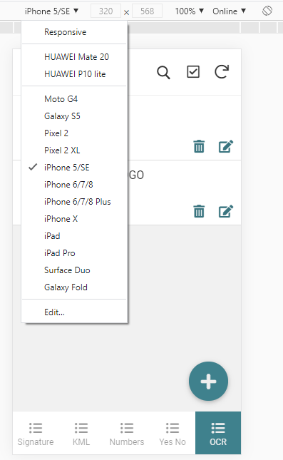
- Click on “Toggle Device Toolbar”

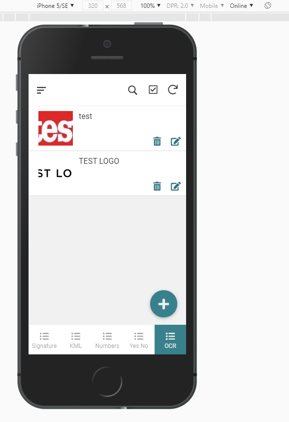
Now you can play around with different models.
You can also add your own model.
To do so, look up the Viewport for your device. I found 2 websites:
Responsive Checker
Device Atlas
But I found it more accurate, to find the right Viewport by testing out.
So for my Huawei Mate 20 it’s not 360 x 780, but 377 x 683.
You can do also:
Rotate to landscape orientation.
Show device frame

Throttle the Network or the CPU
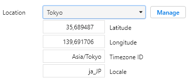
Override geolocation
For more Information
- Labels:
-
UX
- Mark as New
- Bookmark
- Subscribe
- Mute
- Subscribe to RSS Feed
- Permalink
- Report Inappropriate Content
- Mark as New
- Bookmark
- Subscribe
- Mute
- Subscribe to RSS Feed
- Permalink
- Report Inappropriate Content
@Fabian this is an awesome tip bud, thanks for sharing it. Very much appreciated ![]()
- Mark as New
- Bookmark
- Subscribe
- Mute
- Subscribe to RSS Feed
- Permalink
- Report Inappropriate Content
- Mark as New
- Bookmark
- Subscribe
- Mute
- Subscribe to RSS Feed
- Permalink
- Report Inappropriate Content
Very Useful!! Thanks Fabian!
-
Account
6 -
App Management
21 -
Automation
186 -
Data
140 -
Errors
19 -
Expressions
206 -
Integrations
103 -
Intelligence
17 -
Other
57 -
Resources
24 -
Security
14 -
Templates
54 -
Users
19 -
UX
217

 Twitter


