- AppSheet
- AppSheet Forum
- AppSheet Q&A
- How to Solve: Histogram Chart (Horizontal Bar Char...
- Subscribe to RSS Feed
- Mark Topic as New
- Mark Topic as Read
- Float this Topic for Current User
- Bookmark
- Subscribe
- Mute
- Printer Friendly Page
- Mark as New
- Bookmark
- Subscribe
- Mute
- Subscribe to RSS Feed
- Permalink
- Report Inappropriate Content
- Mark as New
- Bookmark
- Subscribe
- Mute
- Subscribe to RSS Feed
- Permalink
- Report Inappropriate Content
Not sure how to solve this. I’ve created a slice (shown below) that shows ACTIVITIES and the DURATION of those activities.
I want to show the TOTAL DURATIONS per activity but the best I can do is get the COUNT (# of times the activity was listed). I’d like to show the X axis to include the TOTAL DURATIONS (TIME) and the Y axis as the independant activities.
Can anyone point me to the right direction in how to set this properly?
Thank You

- Labels:
-
Automation
-
UX
- Mark as New
- Bookmark
- Subscribe
- Mute
- Subscribe to RSS Feed
- Permalink
- Report Inappropriate Content
- Mark as New
- Bookmark
- Subscribe
- Mute
- Subscribe to RSS Feed
- Permalink
- Report Inappropriate Content
Please explore following
In order to add durations for each activity , you may need to convert those to decimal durations. So 01:00:00 hour is represented as 1.00 hour , 00:30:00 hour is represnted as 0.5 hour , 00:45:00 is represnted as 0.75and so on.
For this, please add a VC called say DecimalDurations with an expressions as TOTALHOURS([Duaration])
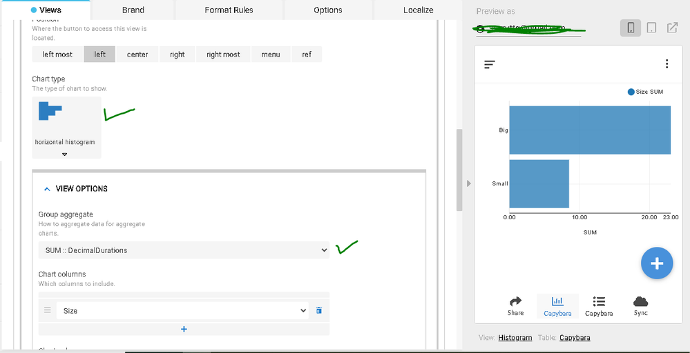
Now please base your histogram on Chart column as [ACTIVITY] and group aggregate as SUM : DecimalDurations ( Settings available in UX -> View -> Chart Type View settings)
- Mark as New
- Bookmark
- Subscribe
- Mute
- Subscribe to RSS Feed
- Permalink
- Report Inappropriate Content
- Mark as New
- Bookmark
- Subscribe
- Mute
- Subscribe to RSS Feed
- Permalink
- Report Inappropriate Content
Hi Suvrutt,
I’ve created the new Virtual Column as DecimalDurations, which seems to be have worked properly (see below)

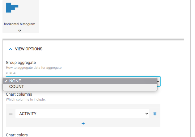
For the Histogram Chart, I’ve grouped as [ACTIVITY] however there is no option to group aggregate as SUM : Decimal Durations. See screenshot below. Looks like “COUNT” is the only option.
Any thoughts?
- Mark as New
- Bookmark
- Subscribe
- Mute
- Subscribe to RSS Feed
- Permalink
- Report Inappropriate Content
- Mark as New
- Bookmark
- Subscribe
- Mute
- Subscribe to RSS Feed
- Permalink
- Report Inappropriate Content
Hope you have regenerated the table and synched the app after adding the new column and filling in values. I am able to get the SUM aggregate for DecimalDurations

- Mark as New
- Bookmark
- Subscribe
- Mute
- Subscribe to RSS Feed
- Permalink
- Report Inappropriate Content
- Mark as New
- Bookmark
- Subscribe
- Mute
- Subscribe to RSS Feed
- Permalink
- Report Inappropriate Content
HI Survutt,
Got it to work! So yes, I had synced the app and regenerated the table before. The issue was I had set the VIRTUAL COLUMN for DECIMALDURATIONS to NOT SHOW as I don’t want to see this value in my table. The group by aggregate SUM :: DECIMALDURATIONS does not show if the SHOW is off. When I toggled the DECIMALDURATIONS to SHOW, and then went back to the UX > CHART > GROUP AGGREGATE the SUM :: DECIMALDURATIONS appears. This is interesting, not sure if you see the same thing?
There may be a hack to this. If I SHOW the column, then go to the UX and group aggregrate by SUM :: DECIMALDURATION, then go back to the column and turn of SHOW, it looks like the chart still remains SUM :: DECIMALDURATION.
Separately, I think it would be more beneficial if the X axis was not a decimal number and rather in the 00:00:00 format. It’s hard for a user to know how many hours and minutes and seconds 6.25 is (for example). Wonder if this is just an AppSheet capabilitiy issue of not being able to show 00:00:00 in the x-axis.
- Mark as New
- Bookmark
- Subscribe
- Mute
- Subscribe to RSS Feed
- Permalink
- Report Inappropriate Content
- Mark as New
- Bookmark
- Subscribe
- Mute
- Subscribe to RSS Feed
- Permalink
- Report Inappropriate Content
Thank you @Tony_Insua for the updates.
Great to know this hack works. Other alternative may be to use CONTEXT(“ViewType”)= “Chart” in the show if constraint of the column [DECIMALDURATION]
Yes, true. However, as we experienced, both the Time type and Duration type columns do not appear in aggregate function in the chart view settings. So we needed to go for the decimal time workaround.
-
Account
1,673 -
App Management
3,073 -
AppSheet
1 -
Automation
10,293 -
Bug
967 -
Data
9,657 -
Errors
5,719 -
Expressions
11,750 -
General Miscellaneous
1 -
Google Cloud Deploy
1 -
image and text
1 -
Integrations
1,599 -
Intelligence
578 -
Introductions
85 -
Other
2,882 -
Photos
1 -
Resources
535 -
Security
827 -
Templates
1,300 -
Users
1,551 -
UX
9,096
- « Previous
- Next »
| User | Count |
|---|---|
| 44 | |
| 29 | |
| 22 | |
| 20 | |
| 14 |

 Twitter