- AppSheet
- AppSheet Forum
- AppSheet Q&A
- In side menu, how do you know when you're viewing ...
- Subscribe to RSS Feed
- Mark Topic as New
- Mark Topic as Read
- Float this Topic for Current User
- Bookmark
- Subscribe
- Mute
- Printer Friendly Page
- Mark as New
- Bookmark
- Subscribe
- Mute
- Subscribe to RSS Feed
- Permalink
- Report Inappropriate Content
- Mark as New
- Bookmark
- Subscribe
- Mute
- Subscribe to RSS Feed
- Permalink
- Report Inappropriate Content
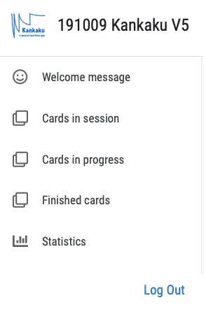
Here’s a screenshot from my app as it appears in the app editor:
Notice how the user has no visual clue regarding the fact that there are menu items after “Statistics.” Here’s the same menu in my phone:

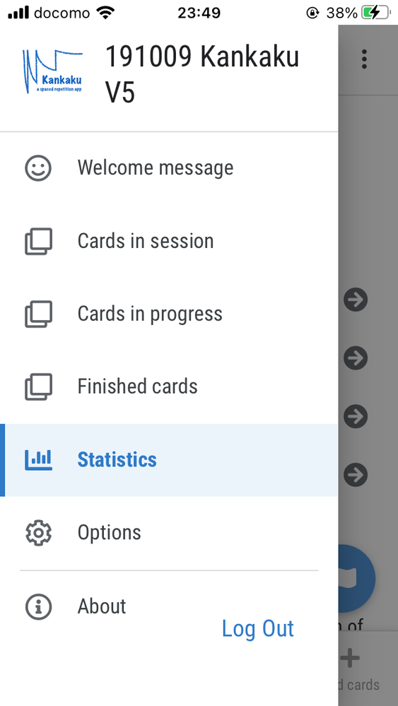
Here as well, the “App Gallery” is not displayed but, if you are not already aware that there should be such a menu below “About,” you would probably assume that you are seeing the entire menu. Or, if there were several more menus in the side menu, you wouldn’t have any visual clues regarding the menus that were not being displayed, unless one happened to be only half visible.
I would think that either a line or some kind of color distinction or some other kind of visual clue would be preferable. I wonder what other app creators think. Please tap the heart ( ![]() ) if you agree.
) if you agree.
- Mark as New
- Bookmark
- Subscribe
- Mute
- Subscribe to RSS Feed
- Permalink
- Report Inappropriate Content
- Mark as New
- Bookmark
- Subscribe
- Mute
- Subscribe to RSS Feed
- Permalink
- Report Inappropriate Content
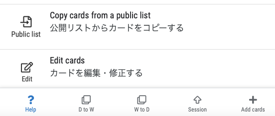
Here’s a screenshot of the how the border between the main part of the app and the bottom bar appears:
I think we need this kind of contrast in the side menu as well.
-
Account
1,677 -
App Management
3,099 -
AppSheet
1 -
Automation
10,322 -
Bug
983 -
Data
9,676 -
Errors
5,733 -
Expressions
11,779 -
General Miscellaneous
1 -
Google Cloud Deploy
1 -
image and text
1 -
Integrations
1,610 -
Intelligence
578 -
Introductions
85 -
Other
2,904 -
Photos
1 -
Resources
538 -
Security
827 -
Templates
1,309 -
Users
1,559 -
UX
9,110
- « Previous
- Next »
| User | Count |
|---|---|
| 43 | |
| 28 | |
| 24 | |
| 24 | |
| 13 |

 Twitter
