- AppSheet
- AppSheet Forum
- AppSheet Q&A
- Inline action placement
- Subscribe to RSS Feed
- Mark Topic as New
- Mark Topic as Read
- Float this Topic for Current User
- Bookmark
- Subscribe
- Mute
- Printer Friendly Page
- Mark as New
- Bookmark
- Subscribe
- Mute
- Subscribe to RSS Feed
- Permalink
- Report Inappropriate Content
- Mark as New
- Bookmark
- Subscribe
- Mute
- Subscribe to RSS Feed
- Permalink
- Report Inappropriate Content
It seems that the placement of inline actions has changed. In the following screen, the action used to appear immediately after the text:
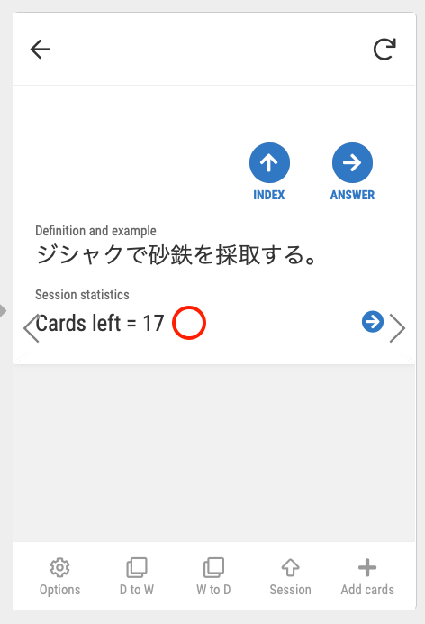
The difference is starker when viewed on a wide computer screen (which is one important way in which my app is used):
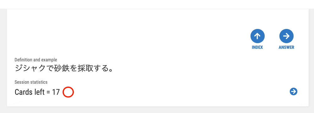
I’m not sure if this is a bug or if a decision to change the placement was made. If this was done intentionally, I’d like to inquire about the reasoning. I’m not aware of a request for such a change and I don’t see the advantage of it.
Also, I make videos to show users how to use my app. If the appearance of the app changes significantly, I may need to redo my videos. So, I appreciate consistency and/or discussion before appearance changes are made.
- Labels:
-
Automation
-
Errors
- Mark as New
- Bookmark
- Subscribe
- Mute
- Subscribe to RSS Feed
- Permalink
- Report Inappropriate Content
- Mark as New
- Bookmark
- Subscribe
- Mute
- Subscribe to RSS Feed
- Permalink
- Report Inappropriate Content
Hi again!
I sent an inquiry to support@appsheet.com and got a prompt response:
“This behavior is under investigation and has been reported by other customers too.”
Judging from past experience I would guess that this will be resolved within a week or so (he wrote hopefully ![]() ).
).
- Mark as New
- Bookmark
- Subscribe
- Mute
- Subscribe to RSS Feed
- Permalink
- Report Inappropriate Content
- Mark as New
- Bookmark
- Subscribe
- Mute
- Subscribe to RSS Feed
- Permalink
- Report Inappropriate Content
I just found an additional change in appearance. When I found the inline actions on the right side of the screen I thought “Well, it’s not my preference but it does line them up with the ‘prominent’ actions, which are on the right.” Now, however, those “display prominently” actions are on the left.
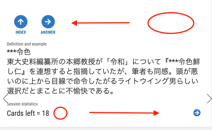
- Mark as New
- Bookmark
- Subscribe
- Mute
- Subscribe to RSS Feed
- Permalink
- Report Inappropriate Content
- Mark as New
- Bookmark
- Subscribe
- Mute
- Subscribe to RSS Feed
- Permalink
- Report Inappropriate Content
The UI be all like “Sike!”
- Mark as New
- Bookmark
- Subscribe
- Mute
- Subscribe to RSS Feed
- Permalink
- Report Inappropriate Content
- Mark as New
- Bookmark
- Subscribe
- Mute
- Subscribe to RSS Feed
- Permalink
- Report Inappropriate Content
I understand that AppSheet is considering this issue and am happy to wait for a final decision. In the meantime, however, I noticed another problem with putting inline actions on the right side so I thought I’d take a few minutes to explain what I noticed.
The following is a “Welcome” view that appears when a student opens my app. This morning I was considering adding another overlay action but realized that, in this case, doing so would hide the link mark, which is an inline action that now appears on the right side. So, instead on having inline actions on the right, I think returning them to the old position is a better use of space on the screen. Thanks for your consideration.

- Mark as New
- Bookmark
- Subscribe
- Mute
- Subscribe to RSS Feed
- Permalink
- Report Inappropriate Content
- Mark as New
- Bookmark
- Subscribe
- Mute
- Subscribe to RSS Feed
- Permalink
- Report Inappropriate Content
It’s been a little more than a month since this issue came up. I understand that it is being investigated but I’m surprised at how much time has passed. I imagine that what might seem to be a simple matter of appearance may have deeper roots with implications for other aspects of the platform. Still, I would really appreciate any information regarding the status of this issue that those working on it might be willing to share.
Might it be the case that a decision has been made to stick with this appearance?
- Mark as New
- Bookmark
- Subscribe
- Mute
- Subscribe to RSS Feed
- Permalink
- Report Inappropriate Content
- Mark as New
- Bookmark
- Subscribe
- Mute
- Subscribe to RSS Feed
- Permalink
- Report Inappropriate Content
I made a point of noting this internally, but that’s about all I can do. Consider engaging support@appsheet.com, if just to get your concern on the formal record.
- Mark as New
- Bookmark
- Subscribe
- Mute
- Subscribe to RSS Feed
- Permalink
- Report Inappropriate Content
- Mark as New
- Bookmark
- Subscribe
- Mute
- Subscribe to RSS Feed
- Permalink
- Report Inappropriate Content
Thanks a lot, @Steve! I think I’ll give the matter more time. Perhaps another month. Then, if there’s no change I think I’ll write to them again. ![]()
- Mark as New
- Bookmark
- Subscribe
- Mute
- Subscribe to RSS Feed
- Permalink
- Report Inappropriate Content
- Mark as New
- Bookmark
- Subscribe
- Mute
- Subscribe to RSS Feed
- Permalink
- Report Inappropriate Content
Morning @Kirk_Masden
In terms of “prominent” action position, yes, I agree with you, I wish to get it restored to the original positions, i.e. aligned to the right hand side rather than left. Not sure those voice will be taken by Appsheet team or not as it is entirely up to their decision as always.
Once again, under the limited circumstance, why dont you place the dummy prominent actions x 3 which will do NOTHING and give it color of pure white? It looks like this.
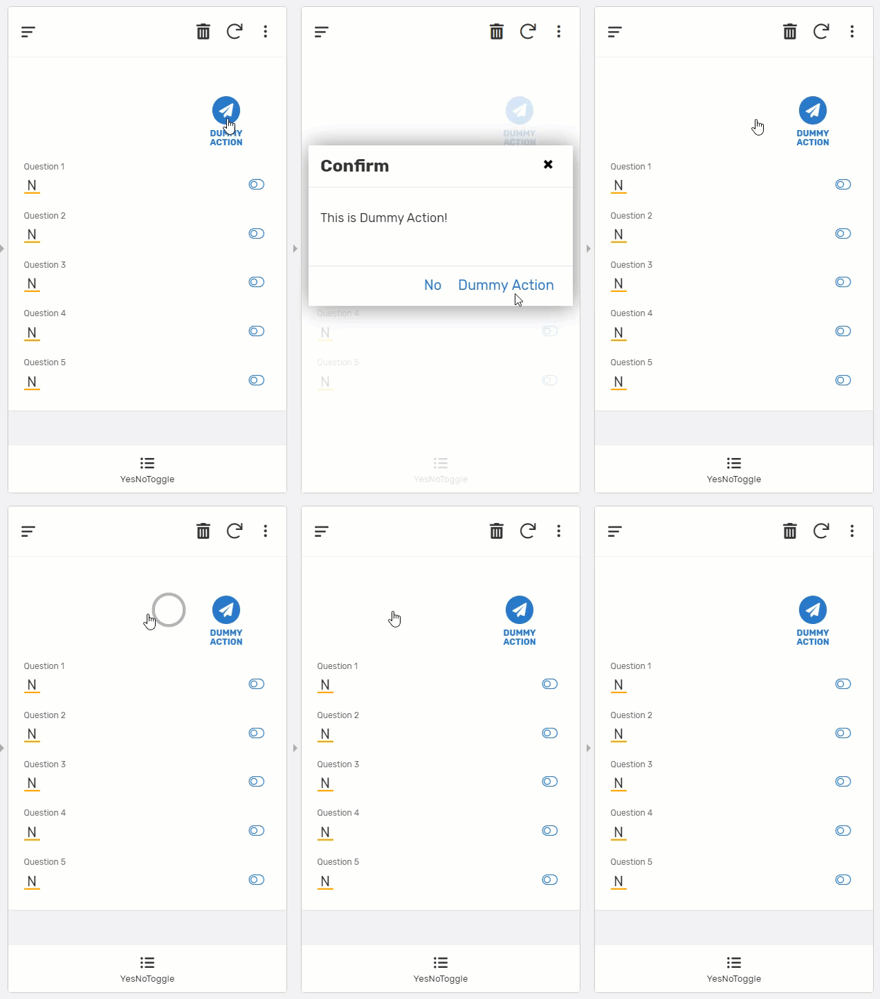
I updated sample app made for you yesterday.
Once again, this is not ideal solution at all, but just a temporary workaround and solution until we see the permanent fixes.
Have a great day, and stay hydrated !
Tsuji
- Mark as New
- Bookmark
- Subscribe
- Mute
- Subscribe to RSS Feed
- Permalink
- Report Inappropriate Content
- Mark as New
- Bookmark
- Subscribe
- Mute
- Subscribe to RSS Feed
- Permalink
- Report Inappropriate Content
Looks a little like a game. “Find the action!” ![]()
I hadn’t thought of this approach. I’ll keep it in mind. Thanks!
- Mark as New
- Bookmark
- Subscribe
- Mute
- Subscribe to RSS Feed
- Permalink
- Report Inappropriate Content
- Mark as New
- Bookmark
- Subscribe
- Mute
- Subscribe to RSS Feed
- Permalink
- Report Inappropriate Content
About a week ago I wrote to support@appsheet.com again to inquire about the status of this issue. I asked if AppSheet had decided to go with the current configuration or if the matter was still under consideration. I didn’t get a response this time. I assume that there are circumstances that make it difficult for AppSheet to provide a clear response at the moment. I hope the issue gets resolved eventually.
- Mark as New
- Bookmark
- Subscribe
- Mute
- Subscribe to RSS Feed
- Permalink
- Report Inappropriate Content
- Mark as New
- Bookmark
- Subscribe
- Mute
- Subscribe to RSS Feed
- Permalink
- Report Inappropriate Content
Footnote: I received a response later. As I recall the thrust of it was that the matter is still being looked at.
- Mark as New
- Bookmark
- Subscribe
- Mute
- Subscribe to RSS Feed
- Permalink
- Report Inappropriate Content
- Mark as New
- Bookmark
- Subscribe
- Mute
- Subscribe to RSS Feed
- Permalink
- Report Inappropriate Content
It’s been over a year now since I asked this question and I still haven’t gotten a definitive answer, though I did get a response about the matter being looked in to. I wonder if this is the final version or if the matter is still being looked into. @praveen , would you or someone else at AppSheet be so kind as to explain the where we are with this?
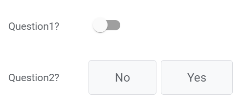
By the way, when a Y/N column is designated as a quick edit column in detail view, it looks like this:
Unlike the current setting for inline actions, the action is placed near the text. Whichever way AppSheet would like to go, I think it would probably be better to be consistent about inline placement. Thanks for your consideration.
- Mark as New
- Bookmark
- Subscribe
- Mute
- Subscribe to RSS Feed
- Permalink
- Report Inappropriate Content
- Mark as New
- Bookmark
- Subscribe
- Mute
- Subscribe to RSS Feed
- Permalink
- Report Inappropriate Content
We avoid to use the y/n data type without pushing value to y/n labels.
Once you place the labels, quick edit more on detail view will display two buttons with labels rather than toggle icons.
toggle icon is not user friendly, on quick edit mode for y/n type as users do not know what it does mean by toggling to right or left.
I pointed out to AppSheet team, then they did work. Now the y/n type with label values are displayed as button
- Mark as New
- Bookmark
- Subscribe
- Mute
- Subscribe to RSS Feed
- Permalink
- Report Inappropriate Content
- Mark as New
- Bookmark
- Subscribe
- Mute
- Subscribe to RSS Feed
- Permalink
- Report Inappropriate Content
But my image is from today. I wonder why it’s not a button then.
- Mark as New
- Bookmark
- Subscribe
- Mute
- Subscribe to RSS Feed
- Permalink
- Report Inappropriate Content
- Mark as New
- Bookmark
- Subscribe
- Mute
- Subscribe to RSS Feed
- Permalink
- Report Inappropriate Content
Hi @Kirk_Masden you have to put values for No and Yes. Then you will have buttons.
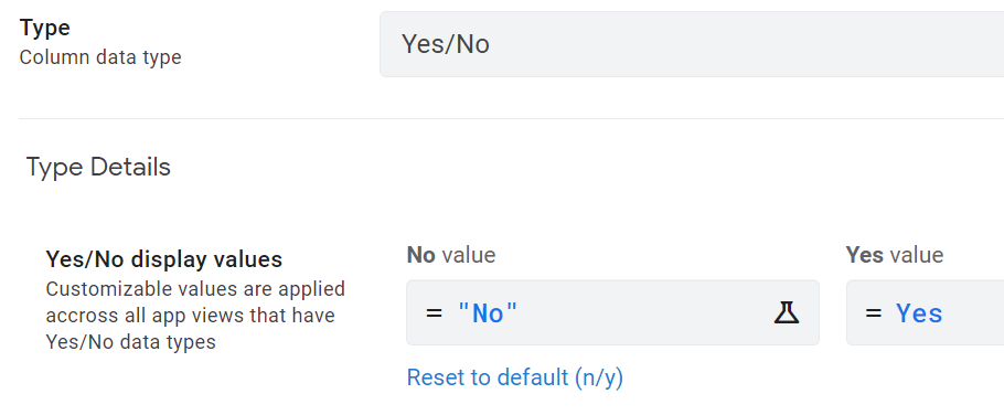
Question1 is without values; Question2 is with values.
- Mark as New
- Bookmark
- Subscribe
- Mute
- Subscribe to RSS Feed
- Permalink
- Report Inappropriate Content
- Mark as New
- Bookmark
- Subscribe
- Mute
- Subscribe to RSS Feed
- Permalink
- Report Inappropriate Content
Thanks @Fabian! I didn’t know that and am glad to learn about this. Actually, though, my point was a little different. I wanted to point out that, while inline actions now appear on the far right, this action appears close to the text on the left. I like the action to be close to the text but I wonder why the inline actions aren’t placed similarly.
-
Account
1,673 -
App Management
3,073 -
AppSheet
1 -
Automation
10,293 -
Bug
967 -
Data
9,657 -
Errors
5,719 -
Expressions
11,750 -
General Miscellaneous
1 -
Google Cloud Deploy
1 -
image and text
1 -
Integrations
1,599 -
Intelligence
578 -
Introductions
85 -
Other
2,882 -
Photos
1 -
Resources
535 -
Security
827 -
Templates
1,300 -
Users
1,551 -
UX
9,096
- « Previous
- Next »
| User | Count |
|---|---|
| 44 | |
| 29 | |
| 22 | |
| 20 | |
| 14 |

 Twitter