- AppSheet
- AppSheet Forum
- AppSheet Q&A
- Invoice app into chart data
- Subscribe to RSS Feed
- Mark Topic as New
- Mark Topic as Read
- Float this Topic for Current User
- Bookmark
- Subscribe
- Mute
- Printer Friendly Page
- Mark as New
- Bookmark
- Subscribe
- Mute
- Subscribe to RSS Feed
- Permalink
- Report Inappropriate Content
- Mark as New
- Bookmark
- Subscribe
- Mute
- Subscribe to RSS Feed
- Permalink
- Report Inappropriate Content
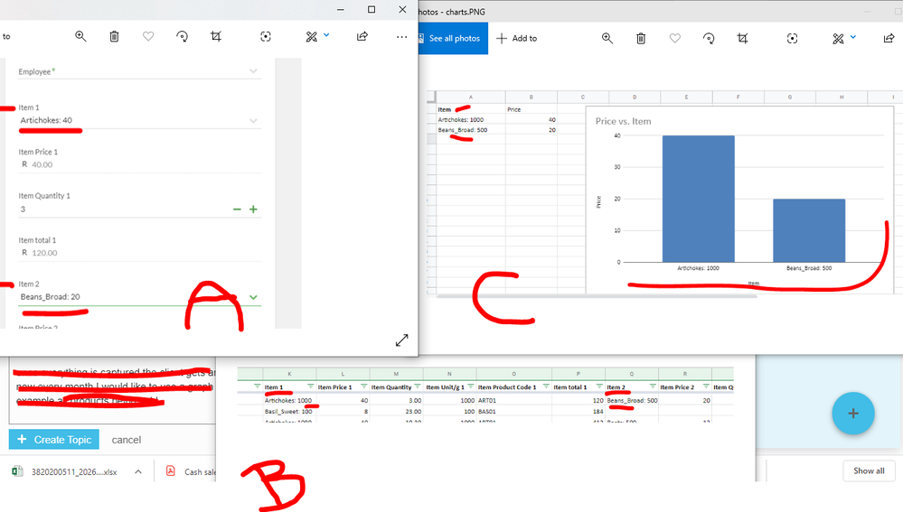
Hi guys so I’ve made an invoice app that works pretty well. the sales person fills in the fields item 1 artichokes item 2 broad beans etc. PIC A

once everything is captured the client gets an email and all is well.
now every month I would like to use a graph in googlesheets off the source data to show for example all products being sold.
PIC B
now because all the products are in different columns eg item 1 and item 2 it’s difficult to create the chart. google sheets would prefer it if the data was in the format below.
PIC C
just want to know if anyone else ran into a problem like this?
Ultimately I would like to report on all the produce sold, but the structure of the data currently does not allow me.
I could not find a good sample app that would give me the app in the format I wanted because most invoice apps only catered for one line item.
thanks for the read guys and any thought would be appreciated.
- Labels:
-
Automation
-
Data
-
UX
- Mark as New
- Bookmark
- Subscribe
- Mute
- Subscribe to RSS Feed
- Permalink
- Report Inappropriate Content
- Mark as New
- Bookmark
- Subscribe
- Mute
- Subscribe to RSS Feed
- Permalink
- Report Inappropriate Content
First, you can create Google Bar charts in sheets from data in columns. I have done some fairly complicated charts in that manner. I would recommend you look into using Google QUERY statements. These allow you to create SQL-like statements that can grab and aggregate your data from the AppSheet datasource sheet.
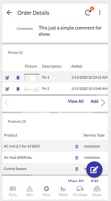
Have you looked into creating Parent/Child tables. (See article link below.) The idea is that you have two tables. The first being the Order table as the parent and then, in your case, an Items or maybe Ordered Items table that is set as the child table.
With this structure you can enter as many child Items as needed for the Order and they can be displayed in a mini-table within the Order record. See image below.
An Order record with Photos and Products as children tables

Parent/Child relationships - scroll down to "Expressing Ownership Between Tables"
-
Account
1,676 -
App Management
3,097 -
AppSheet
1 -
Automation
10,315 -
Bug
981 -
Data
9,673 -
Errors
5,730 -
Expressions
11,775 -
General Miscellaneous
1 -
Google Cloud Deploy
1 -
image and text
1 -
Integrations
1,606 -
Intelligence
578 -
Introductions
85 -
Other
2,900 -
Photos
1 -
Resources
537 -
Security
827 -
Templates
1,305 -
Users
1,557 -
UX
9,109
- « Previous
- Next »
| User | Count |
|---|---|
| 44 | |
| 28 | |
| 28 | |
| 21 | |
| 13 |

 Twitter