- AppSheet
- AppSheet Forum
- AppSheet Q&A
- Is this Ok (I mean "OK")?
- Subscribe to RSS Feed
- Mark Topic as New
- Mark Topic as Read
- Float this Topic for Current User
- Bookmark
- Subscribe
- Mute
- Printer Friendly Page
- Mark as New
- Bookmark
- Subscribe
- Mute
- Subscribe to RSS Feed
- Permalink
- Report Inappropriate Content
- Mark as New
- Bookmark
- Subscribe
- Mute
- Subscribe to RSS Feed
- Permalink
- Report Inappropriate Content
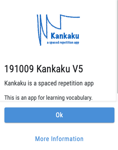
I just noticed this “OK” button in the “About” menu of my app. “Ok” looks odd to me. Shouldn’t it be “OK”? I think we all have the same “Ok” buttons on our apps. If the default is not changed (or even if it is), it would be nice if we could change the appearance or wording with the localize feature (see UX menu).

- Labels:
-
Errors
- Mark as New
- Bookmark
- Subscribe
- Mute
- Subscribe to RSS Feed
- Permalink
- Report Inappropriate Content
- Mark as New
- Bookmark
- Subscribe
- Mute
- Subscribe to RSS Feed
- Permalink
- Report Inappropriate Content
Agree.
- Mark as New
- Bookmark
- Subscribe
- Mute
- Subscribe to RSS Feed
- Permalink
- Report Inappropriate Content
- Mark as New
- Bookmark
- Subscribe
- Mute
- Subscribe to RSS Feed
- Permalink
- Report Inappropriate Content
After writing this I noticed that buttons like this should be all capitals anyway, according to Google’s material design standards:
- Mark as New
- Bookmark
- Subscribe
- Mute
- Subscribe to RSS Feed
- Permalink
- Report Inappropriate Content
- Mark as New
- Bookmark
- Subscribe
- Mute
- Subscribe to RSS Feed
- Permalink
- Report Inappropriate Content
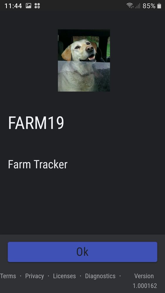
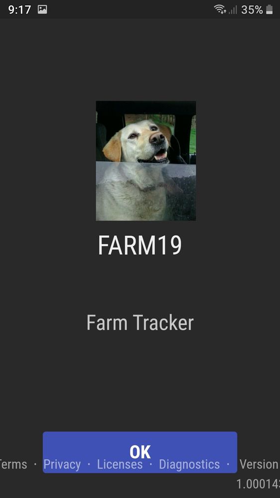
This is my old app with OK and the new design with Ok


I actually like the old version better, except for the oerflow on the bottom.
I dont like the dark Ok, it looks better white. The cancel buttons are still whit text but the save is black.
- Mark as New
- Bookmark
- Subscribe
- Mute
- Subscribe to RSS Feed
- Permalink
- Report Inappropriate Content
- Mark as New
- Bookmark
- Subscribe
- Mute
- Subscribe to RSS Feed
- Permalink
- Report Inappropriate Content
Thanks!! It may take until Monday, Seattle time, to get a response from someone at AppSheet. If no one from the company chimes in on this thread, I’ll send the URL to support@appsheet.com.
- Mark as New
- Bookmark
- Subscribe
- Mute
- Subscribe to RSS Feed
- Permalink
- Report Inappropriate Content
- Mark as New
- Bookmark
- Subscribe
- Mute
- Subscribe to RSS Feed
- Permalink
- Report Inappropriate Content
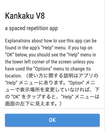
Thanks to AppSheet for fixing his. It’s truly OK now:
- Mark as New
- Bookmark
- Subscribe
- Mute
- Subscribe to RSS Feed
- Permalink
- Report Inappropriate Content
- Mark as New
- Bookmark
- Subscribe
- Mute
- Subscribe to RSS Feed
- Permalink
- Report Inappropriate Content
![]()
- Mark as New
- Bookmark
- Subscribe
- Mute
- Subscribe to RSS Feed
- Permalink
- Report Inappropriate Content
- Mark as New
- Bookmark
- Subscribe
- Mute
- Subscribe to RSS Feed
- Permalink
- Report Inappropriate Content
Yay OK
-
Account
1,675 -
App Management
3,091 -
AppSheet
1 -
Automation
10,314 -
Bug
979 -
Data
9,671 -
Errors
5,729 -
Expressions
11,772 -
General Miscellaneous
1 -
Google Cloud Deploy
1 -
image and text
1 -
Integrations
1,606 -
Intelligence
579 -
Introductions
85 -
Other
2,898 -
Photos
1 -
Resources
536 -
Security
827 -
Templates
1,305 -
Users
1,557 -
UX
9,109
- « Previous
- Next »
| User | Count |
|---|---|
| 42 | |
| 27 | |
| 25 | |
| 20 | |
| 13 |

 Twitter