- AppSheet
- AppSheet Forum
- AppSheet Q&A
- Labeling the X Axis in a Column Series Line Chart
- Subscribe to RSS Feed
- Mark Topic as New
- Mark Topic as Read
- Float this Topic for Current User
- Bookmark
- Subscribe
- Mute
- Printer Friendly Page
- Mark as New
- Bookmark
- Subscribe
- Mute
- Subscribe to RSS Feed
- Permalink
- Report Inappropriate Content
- Mark as New
- Bookmark
- Subscribe
- Mute
- Subscribe to RSS Feed
- Permalink
- Report Inappropriate Content
Dear Forum Members,
I would like to know how I can Labeling the X Axis in a Column Series Line Chart please?
I can see the Y Axis is defined by VIEW OPTIONS -> Chart columns. However, it seems the underlying table’s table is used by default in the X Axis. How can we specify a column instead please?
Thanks,
Colin.
- Mark as New
- Bookmark
- Subscribe
- Mute
- Subscribe to RSS Feed
- Permalink
- Report Inappropriate Content
- Mark as New
- Bookmark
- Subscribe
- Mute
- Subscribe to RSS Feed
- Permalink
- Report Inappropriate Content
Hi! Sorry that two weeks have passed without a response. I don’t work with charts very often but I got curious and to a look at the following sample app to try to see how things work:
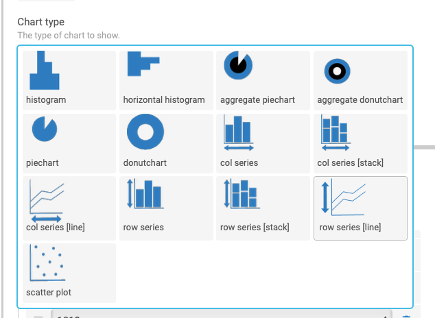
The first thing I can say is that AppSheet needs to add keywords to its sample apps to help users find related examples. In this case, the words “line” and “chart” didn’t lead me to the sample, even though a “col series [line]” chart is used:
Second, I couldn’t find any options to help me control the labels. I would guess that one would need to restructure the data in the original table or use virtual columns or something to tweak the labels. I’ve been a bit frustrated with labels on charts myself. It’s difficult to control the appearance.
On a more positive note, I think the chart options have expanded since I last looked at them. I’m intrigued and may try to play around with them a bit more.
- Mark as New
- Bookmark
- Subscribe
- Mute
- Subscribe to RSS Feed
- Permalink
- Report Inappropriate Content
- Mark as New
- Bookmark
- Subscribe
- Mute
- Subscribe to RSS Feed
- Permalink
- Report Inappropriate Content
Thank you Kirk, I’ve shared your very fair feedback on sample tagging to our Marketing team.
We haven’t touched the chart very much in the last year so I’m surprise you found it expanded.
We definitely want to improve them but we might need to do some open heart surgery on these in order to add more impactful capability to our charting capabilities, which I acknowledge are somewhat limited today. I really dream to revamp them and get us closer to a Tableau/Looker style interaction level. But that won’t happen with the library we are currently using. So stay tuned on this.
Thierry
- Mark as New
- Bookmark
- Subscribe
- Mute
- Subscribe to RSS Feed
- Permalink
- Report Inappropriate Content
- Mark as New
- Bookmark
- Subscribe
- Mute
- Subscribe to RSS Feed
- Permalink
- Report Inappropriate Content
Thanks a lot! As a user, just building a moderately powerful app is taking me a long, long time. So, I can image how building and improving the platform is a huge and very time-consuming job. I’m sure the progress will come eventually and I’m looking forward to it. ![]()
P.S. Since I don’t use charts much, I think it may have been more than a year since I last took a look. ![]()
- Mark as New
- Bookmark
- Subscribe
- Mute
- Subscribe to RSS Feed
- Permalink
- Report Inappropriate Content
- Mark as New
- Bookmark
- Subscribe
- Mute
- Subscribe to RSS Feed
- Permalink
- Report Inappropriate Content
Eager to learn more. I personally would like to see more interactive charts capabilities rather than static charts (although, granted one can achieve limited interactivity with dashboards)
- Mark as New
- Bookmark
- Subscribe
- Mute
- Subscribe to RSS Feed
- Permalink
- Report Inappropriate Content
- Mark as New
- Bookmark
- Subscribe
- Mute
- Subscribe to RSS Feed
- Permalink
- Report Inappropriate Content
The X-axis is labelled by the label-column in the table being charted.
Change your label column, and you change the X-axis label.
Not that I don’t agree that we could use plenty more charting options.
-
Account
1,672 -
App Management
3,066 -
AppSheet
1 -
Automation
10,284 -
Bug
964 -
Data
9,649 -
Errors
5,713 -
Expressions
11,736 -
General Miscellaneous
1 -
Google Cloud Deploy
1 -
image and text
1 -
Integrations
1,598 -
Intelligence
577 -
Introductions
85 -
Other
2,879 -
Photos
1 -
Resources
532 -
Security
826 -
Templates
1,300 -
Users
1,550 -
UX
9,092
- « Previous
- Next »
| User | Count |
|---|---|
| 41 | |
| 25 | |
| 23 | |
| 19 | |
| 15 |

 Twitter