- AppSheet
- Feature Ideas
- Layout of the UI when working in Columns
- Subscribe to RSS Feed
- Mark as New
- Mark as Read
- Bookmark
- Subscribe
- Printer Friendly Page
- Report Inappropriate Content
- Mark as New
- Bookmark
- Subscribe
- Mute
- Subscribe to RSS Feed
- Permalink
- Report Inappropriate Content
Over the years I’ve gotten a lot of work done on Appsheet, and I’ve seen the sync times on app changes improve a lot over that time. However there is still a concern I have about working in appsheet, and that is with regards to the way working in Columns is handled.
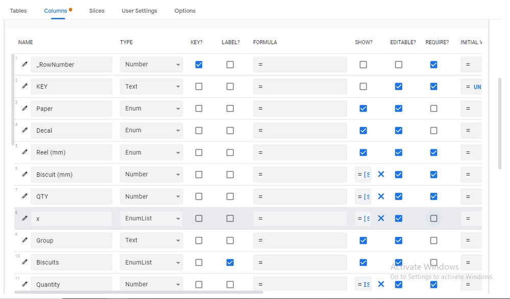
Look at the picture below, I’ve got my viewport expanded. I like to edit with my app on the side, but fine I’ll accept that space is limited. What I find harder to accept though is the painful waste of space that a lot of columns take up, without any option to shorten or tighten the space so that I can fit more columns and rows onto my screen. If this was an excel table it would be as easy as dragging the columns and rows, but of course we arent quite there yet so I accept that.
My suggestions though (if there isn’t an option already), Allow us to hide column fields like in Excel (with a small mark to show they are hidden). Or maybe instead have a compact view option where columns like KEY, LABEL, SHOW, EDITABLE and REQUIRE don’t take up so much precious space (basically anything that just uses a tick mark).
As for the rows, they can be shortened by 50% I imagine, giving you an extra DOUBLE space for all your columns, which if you design nice multi page forms with formulas know how long these rows can get.
Just my two cents guys… from someone who is returning to Appsheet after some time away.


 Twitter