- AppSheet
- Release Notes & Announcements
- Announcements
- Long view names
- Subscribe to RSS Feed
- Mark Topic as New
- Mark Topic as Read
- Float this Topic for Current User
- Bookmark
- Subscribe
- Mute
- Printer Friendly Page
- Mark as New
- Bookmark
- Subscribe
- Mute
- Subscribe to RSS Feed
- Permalink
- Report Inappropriate Content
- Mark as New
- Bookmark
- Subscribe
- Mute
- Subscribe to RSS Feed
- Permalink
- Report Inappropriate Content
Hi Everyone!
One of our goals is to ensure your apps work well, regardless of the specific content. This creates some interesting design challenges for us!
Here's a basic example.
We want to ensure you can choose meaningful names for your views in the bottom navigation bar. But right now that text can be anything, and if the view names get too long then it becomes wonky and hard to read.Like this:
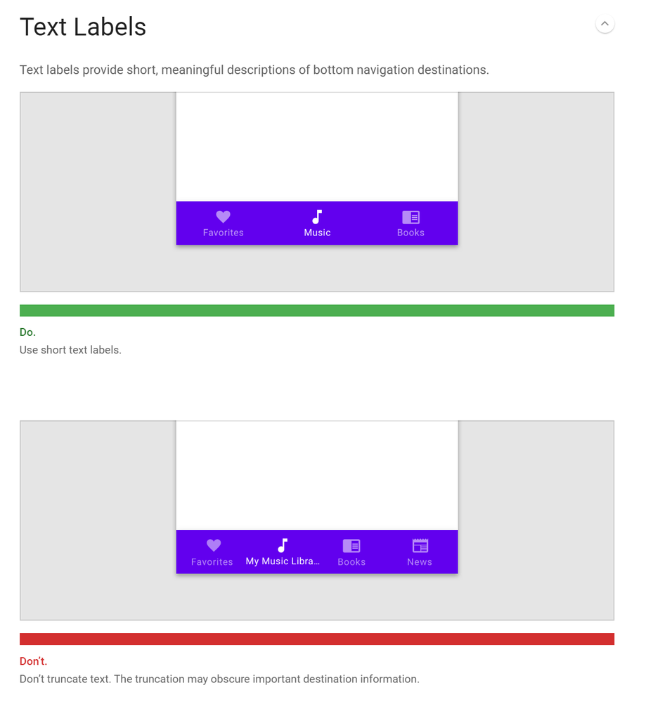
Not to mention, long menu text (even when styled well) typically hinders usability, and so most design guidelines encourage short simple names. For example, you can see in Google's Material Design Guidelines how they discourage the use of long names:
So we are faced with some different possible design choices.
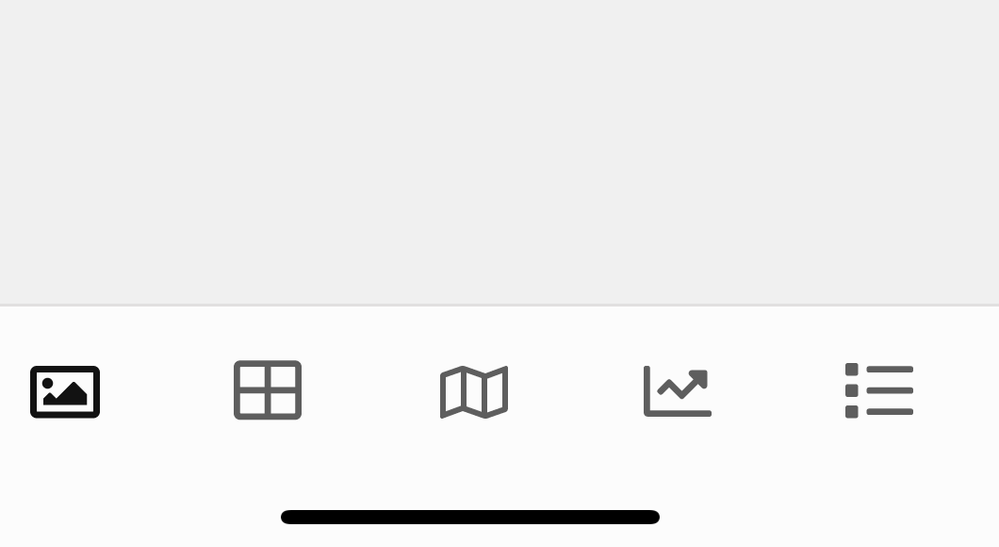
1) Only show icons.
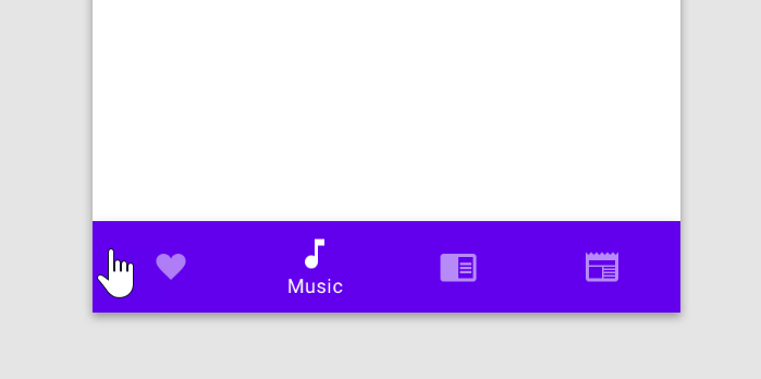
2) Only show the active view name.
3) Truncate long view names.
Violating Material Design Guidelines but at least readable.

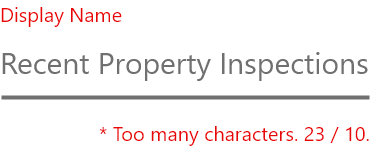
4) Restrict long view names in the editor.
Our philosophy
Ultimately all of these options are potentially valid, and we think it'd be great to give app creators the flexibility to choose from any option. In addition, we believe we should intelligently provide a default option based on the app and the app creator's intentions. Expect to see option 3) show up soon by default -- it's the simplest and least dramatic option to build in the short term. But in the long term, we're thinking of easy ways to let you choose, but only if you really want to.We want your feedback
Do you have relatively long view names? Can you comment on how you chose these view names? Is there information you're trying to communicate to your clients that our bottom navigation buttons cannot handle? Let us know!- Mark as New
- Bookmark
- Subscribe
- Mute
- Subscribe to RSS Feed
- Permalink
- Report Inappropriate Content
- Mark as New
- Bookmark
- Subscribe
- Mute
- Subscribe to RSS Feed
- Permalink
- Report Inappropriate Content
I would suggest a modified version or option 4 to prevent very strange results and create a consistent user experience. The editor View Name could be longer, but use another field for the “tray menu view name”, which could default to the editor view name as a starting point. This allows clear view names on the editor as well as top of form, but allows an alternate short name in tray. Just an option…
- Mark as New
- Bookmark
- Subscribe
- Mute
- Subscribe to RSS Feed
- Permalink
- Report Inappropriate Content
- Mark as New
- Bookmark
- Subscribe
- Mute
- Subscribe to RSS Feed
- Permalink
- Report Inappropriate Content
To have options is increase the flexibility for sure to align the appearance of the app by app creator.
I m wondering if you are going to shut down the “display name” section? Long View Name sometime I need especially we have bunch of views, and some of the view are similar, but with the slightly different config. To identify such difference, Creators should be placing the long name. Restricting the length of the name of view sounds not a good a idea to me.
Without restriction, creator picks up any string as name of view whatever they want, and then add the display name as we do now, to align the name visible on the app.
- Mark as New
- Bookmark
- Subscribe
- Mute
- Subscribe to RSS Feed
- Permalink
- Report Inappropriate Content
- Mark as New
- Bookmark
- Subscribe
- Mute
- Subscribe to RSS Feed
- Permalink
- Report Inappropriate Content
Thank you for the comments!
Mike, you raise a good point - allowing app creator to choose names depending on where it will appear in the app (e.g. a short name for the bottom nav, a longer name for the menu). I will add this to the post above and mention you.
Koichi, we are not shutting down the display name section. Currently we are only exploring a change in the app itself. Also, I’m very curious about the views you have that are similar. Are these views with the same data but different filters? Can you describe your overall goals with these views? I’m wondering if what’s going on is that we are not supporting a single view to handle different filters, sorting, grouping.
Thanks!
Morgan
- Mark as New
- Bookmark
- Subscribe
- Mute
- Subscribe to RSS Feed
- Permalink
- Report Inappropriate Content
- Mark as New
- Bookmark
- Subscribe
- Mute
- Subscribe to RSS Feed
- Permalink
- Report Inappropriate Content
Hi Morgan,
I dont want to alter the direction of discussion here, just focusing on the display names for views, but answering to your question ;
The case we have similar view with the same line-items (columns) is quite several. One of the case is, let s say we have two views, each called.
Member List - can edit
Member List - view only
we can place any name we want, but to differentiate and can get the insight what it is, we should place the meaningful name. In this case, the view type is the same, but can edit view refer to table which can be editable. The second table refer to the slice where it refer to the same table but set as read only.
Another frequent cases are we have views, one is Deck, another Table, but refer to the exactly same table. In that case, i name those something like ;
Member List - deck
Member List - table
When we create dashboard view, it makes easier to pick up target views to place on the dashboard from the long list.
Hope make sense.
All in all, the long view names are sometime quite useful, so I just wanted not to drop this option.
- Mark as New
- Bookmark
- Subscribe
- Mute
- Subscribe to RSS Feed
- Permalink
- Report Inappropriate Content
- Mark as New
- Bookmark
- Subscribe
- Mute
- Subscribe to RSS Feed
- Permalink
- Report Inappropriate Content
Great, thank you for the response Koichi. In your case the display name is helpful for you in the editor, because it helps you quickly find the view you want in a long list. Ideally we should make it easy for you to locate views you want in the editor without affecting the app’s presentation.
Thanks!
Morgan
- Mark as New
- Bookmark
- Subscribe
- Mute
- Subscribe to RSS Feed
- Permalink
- Report Inappropriate Content
- Mark as New
- Bookmark
- Subscribe
- Mute
- Subscribe to RSS Feed
- Permalink
- Report Inappropriate Content
Hi @morgan!
As this thread has to do with the bottom navigation bar, I wonder if you could comment on whether this issue is related to the choice of appropriate labels:
- Mark as New
- Bookmark
- Subscribe
- Mute
- Subscribe to RSS Feed
- Permalink
- Report Inappropriate Content
- Mark as New
- Bookmark
- Subscribe
- Mute
- Subscribe to RSS Feed
- Permalink
- Report Inappropriate Content
Hi Kirk, that certainly looks like a related issue! People have noticed that it’s technically possible on our platform to add more views in the bottom navigation bar. This isn’t a supported feature, so I can’t guarantee it’ll stick around.
We only support up to five views in the bottom navigation bar because on mobile devices, more than five buttons is likely going to cause more usability issues for customers. (Actually, on that same Material Design Guidelines page I mentioned above, they argue that the bottom navigation bar should only show 3 to 5 items). With more views, three things happen.
-
We add more competing content that your customer is going to have to understand and distinguish between.
-
We start deviating from consistency and standards. Almost every mobile app in existence that has a bottom navigation bar maintains between 3 to 5 views. This makes it easy to learn new apps (they’re all alike!)
-
We become limited in space, so the text becomes cramped and hard to read, and possibly the touch area for each button needs to be restricted as well.
I’ll make some bigger posts on usability later, and explain how we can use some pretty basic heuristics to improve the usability of our apps.
I’ll also make a post about possibilities with desktop apps vs mobile apps. On the desktop, the extra screen real estate gives us different design opportunities for our apps, and so we can make some improvements there for you and your customers.
Thanks!
Morgan
- Mark as New
- Bookmark
- Subscribe
- Mute
- Subscribe to RSS Feed
- Permalink
- Report Inappropriate Content
- Mark as New
- Bookmark
- Subscribe
- Mute
- Subscribe to RSS Feed
- Permalink
- Report Inappropriate Content
Thanks! This answers a key question of mine. I was considering adding a 6th item to my bottom menu but now I know to avoid that. ![]()
- Mark as New
- Bookmark
- Subscribe
- Mute
- Subscribe to RSS Feed
- Permalink
- Report Inappropriate Content
- Mark as New
- Bookmark
- Subscribe
- Mute
- Subscribe to RSS Feed
- Permalink
- Report Inappropriate Content
Hi Morgan! Thanks for all your work on this. I often have more than 5 views assigned to the nav-bar, but I show/hide views based on the user or some other condition, and generally limit the visible views to 5 at a time-- for the same UI considerations you have noted.
I find this technique extremely useful and efficient at providing different versions of the app for different user types. It avoids the HUGE hassle of maintaining separate copies of the app that share a data source, and trying to keep all the views and formatting rules consistent.
I understand the importance of limiting the number of visible views to five, but PLEASE DO NOT REMOVE the ability to assign more than 5 views. I consider the ability to add more than 5 views to be a feature, not a bug, so please don’t fix this one or it will break my apps! ![]()
Perhaps a better solution (if one is needed) is to only display the first view assigned to each position, and the nav-bar will always show a max of five views. So if the center position had 3 views but the first two had a *Show_If * condition that was not met, then view 3 would show.
Thank you for considering the community’s input. I understand this isn’t a supported feature, but it’s also not entirely clear if this setting is referring to allow 5 to be Visible, or Assigned. And since assigning more than 5 is possible, I assumed this was referring to limiting the number of visible views.
- Mark as New
- Bookmark
- Subscribe
- Mute
- Subscribe to RSS Feed
- Permalink
- Report Inappropriate Content
- Mark as New
- Bookmark
- Subscribe
- Mute
- Subscribe to RSS Feed
- Permalink
- Report Inappropriate Content
Hey @GreenFlux, thanks for the reply! To clarify, my post was regarding visible views. We definitely want to support conditionally showing and hiding which specific views will be visible, like you are describing.
Thanks!
Morgan
- Mark as New
- Bookmark
- Subscribe
- Mute
- Subscribe to RSS Feed
- Permalink
- Report Inappropriate Content
- Mark as New
- Bookmark
- Subscribe
- Mute
- Subscribe to RSS Feed
- Permalink
- Report Inappropriate Content
I am coming to this party a little late and would like to add some insight.
First, AppSheet is touted as a No Code/Low Code platform and as a growing developer platform, it needs to service as many app creators as it can.
So, the platform needs to resolve issues and add features that expand flexibility for all of the various types of developers while making those features as easy to use as possible! We should not be limiting capabilities.
This issue boils down to the fact view names can become too long to be visibly appealing in the “icon tray”. Yet some need/want the longer view names in other places. It’s obvious to me we need BOTH a long name and a short name to be used - to keep it simple and be as flexible as possible.
In my mind and in keeping with the spirit of the platform, I agree with others that we need to add another view name property to achieve this and of course some default rules on when they are used if both are not populated.
By truncating values or reducing number of possible characters, that is only a way of avoiding the issue by prevention. At the same time this creates a limitation that affects some developers. We should avoid that.
Now some may argue that if we don’t limit the icon tray view names that the developer will end up with too long of a name and it won’t look good. This is a developer design decision and shouldn’t be imposed by the platform.
About the Other options
I would also argue, that some of the options listed such as showing only icons or only showing the name for the Active view, these might be options some developers actually want. If so and to maintain that spirit of flexibility, maybe they should be included as well???
A Side Note on the Number of Icon in the Icon Tray
It was mentioned that having more than 5 icons appearing in the icon tray is not supported and may be removed. I would ask why? It doesn’t seem to be causing any issue and some developers are already taking advantage of this inadvertent feature. Why limit the capability now? Again, in the end the design decision to have more or less icons here should be the app creators decision and not one imposed by the platform. This is of course that it fits within the plat form capabilities.
- Mark as New
- Bookmark
- Subscribe
- Mute
- Subscribe to RSS Feed
- Permalink
- Report Inappropriate Content
- Mark as New
- Bookmark
- Subscribe
- Mute
- Subscribe to RSS Feed
- Permalink
- Report Inappropriate Content
Hi @morgan! I would suggest using an altered #2. Maybe instead of showing the name of the view you are on, you could show the name of all of the views that you are not on. Or, if you want more user control, you could have an option for each menu view asking if you want the text to show up or not on your menu bar. Like maybe if you have a home screen, and a left option, and a right option, you could just have the home as the icon with no text, but the left and right options with text. Good ideas!
- Mark as New
- Bookmark
- Subscribe
- Mute
- Subscribe to RSS Feed
- Permalink
- Report Inappropriate Content
- Mark as New
- Bookmark
- Subscribe
- Mute
- Subscribe to RSS Feed
- Permalink
- Report Inappropriate Content
Agree with @Mike_Adler and @tsuji_koichi. We should have separate controls for:
- Actual View Name
- Top Display Value (long-name)
- Nav-Bar Display Value (short-name)
- Mark as New
- Bookmark
- Subscribe
- Mute
- Subscribe to RSS Feed
- Permalink
- Report Inappropriate Content
- Mark as New
- Bookmark
- Subscribe
- Mute
- Subscribe to RSS Feed
- Permalink
- Report Inappropriate Content
I so agree!
- Mark as New
- Bookmark
- Subscribe
- Mute
- Subscribe to RSS Feed
- Permalink
- Report Inappropriate Content
- Mark as New
- Bookmark
- Subscribe
- Mute
- Subscribe to RSS Feed
- Permalink
- Report Inappropriate Content
What about Tap-To-Show-ViewName ? This may allow more icons on the navigation bar.
-
Account
3 -
Announcements
30 -
App Management
8 -
Automation
30 -
Data
31 -
Errors
17 -
Expressions
21 -
Integrations
24 -
Intelligence
5 -
Other
15 -
Resources
15 -
Security
5 -
Templates
13 -
Users
7 -
UX
34

 Twitter
