- AppSheet
- Release Notes & Announcements
- Announcements
- Looking for use cases: Desktop usage for apps
- Subscribe to RSS Feed
- Mark Topic as New
- Mark Topic as Read
- Float this Topic for Current User
- Bookmark
- Subscribe
- Mute
- Printer Friendly Page
- Mark as New
- Bookmark
- Subscribe
- Mute
- Subscribe to RSS Feed
- Permalink
- Report Inappropriate Content
- Mark as New
- Bookmark
- Subscribe
- Mute
- Subscribe to RSS Feed
- Permalink
- Report Inappropriate Content
Hey everyone,
One of our goals this year is to improve the desktop experience (Navigation and layouts).
We’d like to hear from you about some of your desktop use cases, specifically as it relates to dashboard and detail views.
If you can include some screenshots, especially of some robust views with lots of data along with some context. Here’s some of what would be helpful:
1. What’s the app’s overall purpose?
2. What types of tasks / flows are desktop views being used for?
- Analytical: overview dashboards - high level ‘at a glance’
- Operational: current metrics and trends
- Document processing
- Review of single records
- Comparison: large data sets, documents (2 datasets, 2 records, 1 record - two formats)
3. Are desktop users different from mobile users, or do the same users switch devices according to context / task?
-
What are some of the current pain points your users are experiencing?
-
What types of desktop views are seemingly not available in your current apps that would better address your current use cases?
If you have a use case, but are not comfortable sharing screens (or info) publicly, feel free to message directly.
- Labels:
-
UX
- Mark as New
- Bookmark
- Subscribe
- Mute
- Subscribe to RSS Feed
- Permalink
- Report Inappropriate Content
- Mark as New
- Bookmark
- Subscribe
- Mute
- Subscribe to RSS Feed
- Permalink
- Report Inappropriate Content
All of my apps are primarily designed for desktop use. I’m a Transportation Manager for a large watermelon shipper based in the US. My Transportation office has an app, our Sales office has an app, all of our Growers have an app, all of our Field Man have an app, and all of the Truck Brokers we utilize have an app. All users use the desktop version 95% of the time. We are in the office from 8am until around 5pm every day of the week, including holidays and weekends. The 5% of app usage via mobile comes while we are getting ready for work in the mornings, and in the evenings laying on the couch checking on things. Our entire operation uses our apps to ship 4000 truck loads of melons during the summer months. During the busiest part of the season, leading up to the July 4th holiday, we ship as much as 100 loads per day, so the apps really get put to the test and so far so good.
Our primary data tables serve as databases for: Shippers, Receivers, Growers, Carriers, Dispatchers, Drivers, and Orders. Each one of these tables have quite a bit of information in them, and it’s hard to view it all on a mobile device.
I would like to see the ability to preview the app as a different user email, but in the web browser. Right now we’re only able to preview the mobile and tablet versions. I put in a #requests for this yesterday, actually.
Hope this helps!
- Mark as New
- Bookmark
- Subscribe
- Mute
- Subscribe to RSS Feed
- Permalink
- Report Inappropriate Content
- Mark as New
- Bookmark
- Subscribe
- Mute
- Subscribe to RSS Feed
- Permalink
- Report Inappropriate Content
Oh jeez is there a character limit on forum post? Cause I could hit it for each of about 3 apps I have.
- Mark as New
- Bookmark
- Subscribe
- Mute
- Subscribe to RSS Feed
- Permalink
- Report Inappropriate Content
- Mark as New
- Bookmark
- Subscribe
- Mute
- Subscribe to RSS Feed
- Permalink
- Report Inappropriate Content
I thought I would give a look into some of the dashboards I’ve currently got with a video
Honestly everything you listed off is something that has been asked for, or I’ve wanted/needed to do, at some point.
-
Analytical dashboards are the most common request (they want an at-a-glance view)
-
A lot of my dashboards are what I would call “Functional” - meaning they serve as a primary interface for data collection, typically custom built to facilitate an on-the-job workflow someone is trying to complete (check all the traps, collect all signatures, inspect all doors, etc.).
- Most will be used on a tablet, few (like my time tracker) are used via PC
- From working with clients over the years, most of the dashboard users are the admins; while the mobile users are just users - typically tasked with data entry.
- The general consensus from my clients is they like simplified views for the mobile device (no confusion about what’s what, what to do, less data to deal with, etc.).
- Most will only use a dashboard through the browser, largely complaining about how it looks or how hard it is to work with on mobile.
I like the use of the word “seemingly” - because I’m having a hard time coming up with something that couldn’t be made (giving current limitations and capabilities).
Like… other than having some sort of better charts that I could put inside my dashboards… what else is there? lol
- Mark as New
- Bookmark
- Subscribe
- Mute
- Subscribe to RSS Feed
- Permalink
- Report Inappropriate Content
- Mark as New
- Bookmark
- Subscribe
- Mute
- Subscribe to RSS Feed
- Permalink
- Report Inappropriate Content
???
- Mark as New
- Bookmark
- Subscribe
- Mute
- Subscribe to RSS Feed
- Permalink
- Report Inappropriate Content
- Mark as New
- Bookmark
- Subscribe
- Mute
- Subscribe to RSS Feed
- Permalink
- Report Inappropriate Content
All of my desktop apps use dashboards as their primary view display. Generally I am displaying walls of text in tables views along side a detail view for interacting with singular records. Currently I must use a whole bunch of work around methods when navigating from dashboard to dashboard because I need to have everything filtered down to a parent record that was previously selected. As time has gone on I have started to get into much more complex and user friendly looking dashboards within the limitations Appsheet provides. I “like” and “hate” the ability for users to customize how a dashboard is laid out. It provides power users(such my other developers or a couple of other people around the company) amazing flexibility like how my boss has a giant 42in monitor and 2 vertical flanking monitors while the rest of us plebs have moderate sized dual/triple monitor set ups. When it comes to end users that I have to say “click the google button” instead of go to your browser or open up chrome, it backfires because they will accidentally move stuff and I can’t lock it. I know there is the reset button but for some users remembering that button is too much. Greater flexibility when laying out the default and the ability to lock the whole dashboard or even parts of it(maybe asking too much here) would be amazing. Inline views are a really nice things to have in a detail view on a dashboard because it allows me to conditionally show much more information than I otherwise would but the very rigid width of the detail view and columns in table views makes them clunky and unusable in many cases. They just don’t fit correctly it feels. Another thing about sizing and rigidness on desktops is BROWSER ZOOM LEVELS. I can’t tell you how many times I format something to look right on my desktop, go to bosses office or a conference room to demo my apps and the zoom causes hidden columns. I use 80% zoom universally where as 99% of other users use 100%. The user experience on a desktop can range from completely amazing and perfect to unusable where as on a phone or tablet this is almost guaranteed not to be the case since you are already working with such a limited amount of space all the time.
Onto your actual questions now that I have aired all my complaints about using desktop Appsheet ![]()
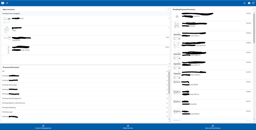
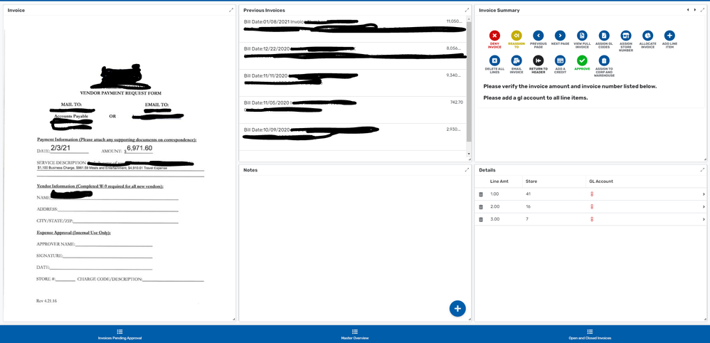
We have a whole accounts payable system that lives on Appsheet and is integrated to AWS Textract for document OCR and prefilling necessary fields. Users can see any invoice assigned to themselves or their departments, view where in the workflow any invoice they have interacted with is, and see all invoices that are waiting on accounting to put into our back office software that will pay the invoices. When filling out invoices, users can see the Invoice Image as it is laid on the background of a detail view, a deck with previous invoices with some smaller information, a deck notes section, a detail header section, and a table of the individual line items for the invoice. Actions are easiest to put onto our detail header section so that holds all the actions and minor information. We also have a separate app for historical stuff that is just a simple table and details when you click a record.
We don’t currently allow our users any reporting, metrics, and the likes in Appsheet since we are so busy making functional apps, we have neglected analytics as a whole for the users. This app ties directly into our back office software as well so they can get reporting from that if need be. Charts and SVG images in Appsheet don’t appeal to us right now so we wouldn’t do any of those things in app anyway.
For this app in particular we have no mobile or tablet users since there is such an emphasis on using it at a desktop. We have 1 tablet user that can use a tablet version although it used a completely different view designed specifically for said user.
This app would be my pride and I wouldn’t really say joy. We released it from beta hell just over a year ago and have ran over 10,000 invoices through it without too much difficulty other than Appsheet services going down/breaking out app. We have 2 other similarly large apps although one of those blurs the line between desktop/mobile as it is used on 50~ inch touch screens and tablets in our stores. The third app is our first project in Appsheet that has been due for a remodel since the day we released it but it relies on similar principals when it comes to how to handle dashboarding. Over all of our apps, the main thing that stays true is we are using it to interact with data and kick off external processes where necessary primarily from the desktop. If we ever need mobile apps we design them specifically for mobile and make much more robust and larger applications for the desktop users.
(Did I hit the limit ![]() )
)
(Feel like a CIA agent with all these black lines)
Here is the main home dashboard that we have for our navigation purposes:
This is the dashboard where our users do all of their interaction with the invoices:
- Mark as New
- Bookmark
- Subscribe
- Mute
- Subscribe to RSS Feed
- Permalink
- Report Inappropriate Content
- Mark as New
- Bookmark
- Subscribe
- Mute
- Subscribe to RSS Feed
- Permalink
- Report Inappropriate Content
Will there be keyboard shortcuts for desktop use? Is there in development planning? If the answer is yes, I can make suggestions.
- Mark as New
- Bookmark
- Subscribe
- Mute
- Subscribe to RSS Feed
- Permalink
- Report Inappropriate Content
- Mark as New
- Bookmark
- Subscribe
- Mute
- Subscribe to RSS Feed
- Permalink
- Report Inappropriate Content
What’s the app’s overall purpose?
I have fully automated R&D tax credit claims using the App
What types of tasks / flows are desktop views being used for?
The main uses of the app are to train people, allow users to capture the information that they need to gather in as close to real time as possible and then ultimately create financial and technical documentation on demand.
Are desktop users different from mobile users, or do the same users switch devices according to context / task?
95% of users will be desktop users as that is what they use in their day-to-day jobs. If Covid ever ends and people go back to work, some diligent people may use the mobile app to capture some details during commutes.
What are some of the current pain points your users are experiencing?
Directing users to the apps can be painful. People automatically navigate to the website rather than clicking the links I send them. The equivalent of a whitelabel for web apps would be amazing, where you could publish the app as a page on a google site.
In November, the grey background was not appearing in the card view and the cards looked really good floating over the background image. Something changed during December and the grey background is back but is not even always covering the full area behind the tiles. I think given the screen space on desktop apps the ability to display the background image is very important to UX.
What types of desktop views are seemingly not available in your current apps that would better address your current use cases?
For desktop apps, it would be good if the forms were wider filling more of the screen. On a wide screen monitor the form can look pretty small on the screen.
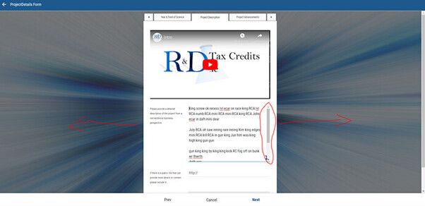
Also on web apps, the long text field in forms would be better if they kept expanding rather than created a scroll bar. People are more likely to be capturing more text data in these fields if they are on a browser.
- Mark as New
- Bookmark
- Subscribe
- Mute
- Subscribe to RSS Feed
- Permalink
- Report Inappropriate Content
- Mark as New
- Bookmark
- Subscribe
- Mute
- Subscribe to RSS Feed
- Permalink
- Report Inappropriate Content
1. What’s the app’s overall purpose?
For my original and main purpose, was to build an app that functions as a browsable menu. The ideal layout is widescreen tablet/desktop. Originally the menu was for in-store, but changes in rules, regulations, and laws, has pushed me to consider also hosting a separate version on our website. Either way, big screen real estate is what I’m looking for.
2. What types of tasks / flows are desktop views being used for?
I’ll just use pictures.
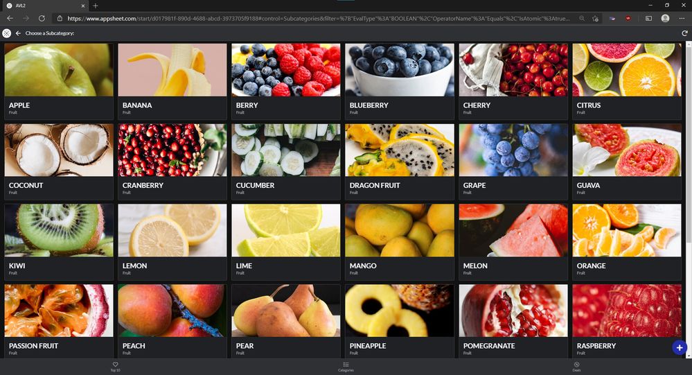
Looks good overall. Maybe a couple cosmetic tweaks could happen, but I have no major complaints here.
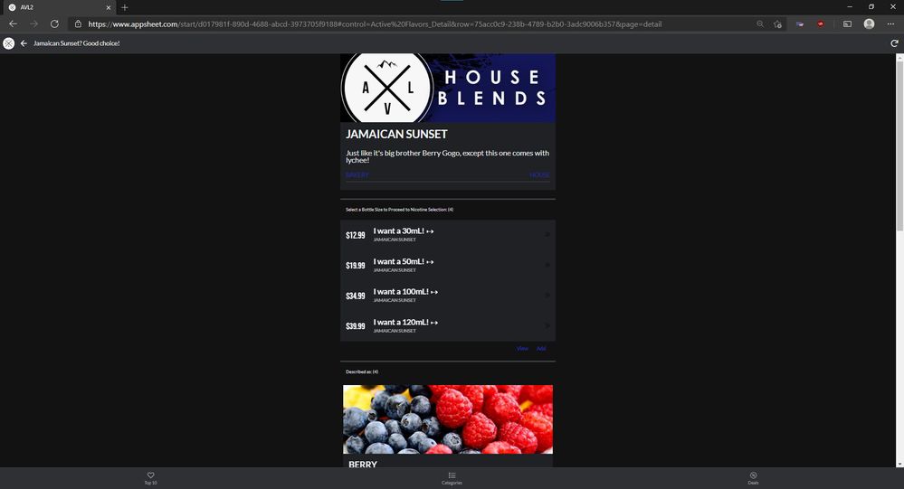
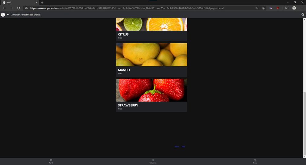
The second Inline tends to add additional unneeded space at the bottom. After fiddling with it sometimes it snaps up where it should be. But overall, there should be no reason for me to scroll down at all, because all of that information can and should fit on the screen being used for this example without scrolling. Both Inline and full versions of their views should appear identical. For example, an Inline Card List should look 100% the same (padding, outline, flex positioning). They don’t look as clickable as the full view versions - which is why I tried using only 1 out of 3 actions but can’t format it, so it’s black on gray. And stretching the Card’s width to match the Detail just looks silly. Coding the Inlines to function the exact same as their full version allows the UI team to play with width and layouts of the Detail view without need to worry about the impacts on Inlines (as much), since they can be flexible to their parent container.
3. Are desktop users different from mobile users, or do the same users switch devices according to context / task?
Small screens will almost never be used, but the thought that they can be used is always good.
4. What are some of the current pain points your users are experiencing?
A few UI bugs that are still waiting to be fixed (only using 1 out of the 3 action slots on Card Lists doesn’t respect dark/light theme or format rules). Certain Inline views looking vastly different to the full versions. And the white-space on the screen not being utilized.
5. What types of desktop views are seemingly not available in your current apps that would better address your current use cases?
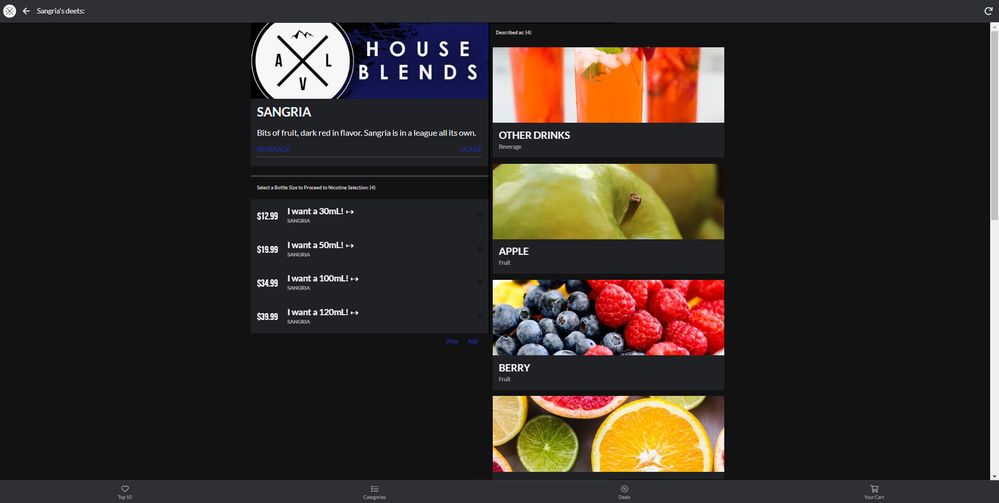
Can’t think of a specific view type, other than just every view always making the most of whatever real estate is available. I feel like Card view nails this, mostly. The widths of each card and number in each row is variable to screen width. Every view should be built in this style. Detail views should start to rearrange some things more horizontally before going down vertically. Or, perhaps, Detail views should be built more drag n drop style. More control of the size/layouts of Labels/Descriptions when shown on Details/Forms. More control how confirmation messages look (easy to edit and format the yes/no options and also customize the header instead of just “Confirm” - yes, I could change this is localization, but maybe I only want to change it for just one).
EDIT:
I made this super quick and crappy mockup of the direction I think Detail views should go. Obviously, with some better cleanup than my copy/paste screenshot collage can do. With maybe a more square-able Header image.
- Mark as New
- Bookmark
- Subscribe
- Mute
- Subscribe to RSS Feed
- Permalink
- Report Inappropriate Content
- Mark as New
- Bookmark
- Subscribe
- Mute
- Subscribe to RSS Feed
- Permalink
- Report Inappropriate Content
Hi
I made a video but can’t seem to be able to send it to you here.
Anyway, I have 3 main issues with the desktop dashboard view that we mostly want to use:
- Syncing: We have people on the field using the app on their mobile devices and a command center operator sitting IN front of the dashboard view on a desktop. Our field people upload data all the time but unless the operator in the office manually pushes the sync button, waits for the sync to complete while viewing the syncing window, well, no real live data. We are now in a dynamic world, our employees won’t manually sync every few minutes, i wouldn’t as well. I would rather have a few views that would sync in the background and then display: 'last updated 1min ago", obviously it would be great to have the ability to determine how many times an hour we want the sync to happen.
- Side menu view: At the moment i have created an image with excel and made that image a button, surely this can be made easily by appsheet and have a much much better view than what i made.
3.Filters: We need the ability to filter data the same way we use filter in an excel sheet or in a menu view, filters are essential.
Hope i made sense.
- Mark as New
- Bookmark
- Subscribe
- Mute
- Subscribe to RSS Feed
- Permalink
- Report Inappropriate Content
- Mark as New
- Bookmark
- Subscribe
- Mute
- Subscribe to RSS Feed
- Permalink
- Report Inappropriate Content
-
What are some of the current pain points your users are experiencing?
Printing Printing Printing … Before AppSheet, I was using Google Sheets: I can print anything I want from it but now with AppSheet it’s painful
- Mark as New
- Bookmark
- Subscribe
- Mute
- Subscribe to RSS Feed
- Permalink
- Report Inappropriate Content
- Mark as New
- Bookmark
- Subscribe
- Mute
- Subscribe to RSS Feed
- Permalink
- Report Inappropriate Content
Hey guys are you still looking for suggestions ?
- Mark as New
- Bookmark
- Subscribe
- Mute
- Subscribe to RSS Feed
- Permalink
- Report Inappropriate Content
- Mark as New
- Bookmark
- Subscribe
- Mute
- Subscribe to RSS Feed
- Permalink
- Report Inappropriate Content
Hey @Mike_Moss I just thought of something, and thought I would share it here.
When I view a detail view full screen, I’d like to see the details in more of a “dashboard” style view.
Dashboard-Style Detail View (Mock Up)
- All I did was rearrange the elements of the detail view from the video to take up more space of the screen.
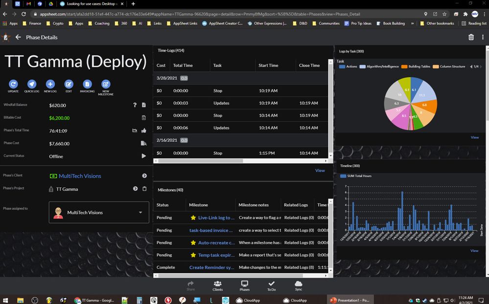
The more I think about this, the more I’m liking it.
Just like dashboards, when there’s space enough the app will show you the dashboard; but when there’s not enough space, it lists everything vertically.
- The detail view is essentially that - everything displayed in a vertical column.
Now if there was a way to create a dashboard-style detail view, we could effectively make use of the entire screen. ![]()
But How???
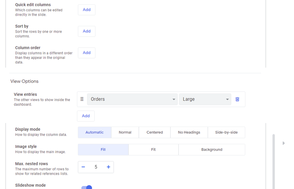
I can see a setup where on a detail view, under the columns included, is another space;
- This would function similarly to the dashboard view selection system; but instead of showing a list of views, it shows a list of reverse references and other list VCs (basically the inline views for that detail view).
- You select select the column you wish to view in this “dashboard style”
- even selecting how that inline view should be displayed (wide, small, tall, etc.)
- You select select the column you wish to view in this “dashboard style”
When you select things like this, when that detail view is displayed on a wide screen - it moves the main detail page to the left side of the screen, then populates the right side with the inline views selected.
As always, thanks for considering!
- Mark as New
- Bookmark
- Subscribe
- Mute
- Subscribe to RSS Feed
- Permalink
- Report Inappropriate Content
- Mark as New
- Bookmark
- Subscribe
- Mute
- Subscribe to RSS Feed
- Permalink
- Report Inappropriate Content
Does a dashboard not work for that use case? I mean there is extra finagling that must be done in order to get that but the fact that it can be done is what makes it hard to think it will be in there natively. If navigating to dashboards from dashboards could be filtered correctly that would basically make this possible.
- Mark as New
- Bookmark
- Subscribe
- Mute
- Subscribe to RSS Feed
- Permalink
- Report Inappropriate Content
- Mark as New
- Bookmark
- Subscribe
- Mute
- Subscribe to RSS Feed
- Permalink
- Report Inappropriate Content
Yes… but then all that overhead.
I’m just saying… there’s an awful lot of wasted space on the detail view when on a PC is all.
- A dashboard of the available inline views for a detail view seemed like a clean solution.
- Mark as New
- Bookmark
- Subscribe
- Mute
- Subscribe to RSS Feed
- Permalink
- Report Inappropriate Content
- Mark as New
- Bookmark
- Subscribe
- Mute
- Subscribe to RSS Feed
- Permalink
- Report Inappropriate Content
Extreme understatement…
awful lot of wasted space when on a PC*
- Mark as New
- Bookmark
- Subscribe
- Mute
- Subscribe to RSS Feed
- Permalink
- Report Inappropriate Content
- Mark as New
- Bookmark
- Subscribe
- Mute
- Subscribe to RSS Feed
- Permalink
- Report Inappropriate Content
This is my only issue too
- Mark as New
- Bookmark
- Subscribe
- Mute
- Subscribe to RSS Feed
- Permalink
- Report Inappropriate Content
- Mark as New
- Bookmark
- Subscribe
- Mute
- Subscribe to RSS Feed
- Permalink
- Report Inappropriate Content
it will be better if you guys develop an way for us to use our own website url for the app address
- Mark as New
- Bookmark
- Subscribe
- Mute
- Subscribe to RSS Feed
- Permalink
- Report Inappropriate Content
- Mark as New
- Bookmark
- Subscribe
- Mute
- Subscribe to RSS Feed
- Permalink
- Report Inappropriate Content
I’d love to see some form of map/XY views with lists…
- Mark as New
- Bookmark
- Subscribe
- Mute
- Subscribe to RSS Feed
- Permalink
- Report Inappropriate Content
- Mark as New
- Bookmark
- Subscribe
- Mute
- Subscribe to RSS Feed
- Permalink
- Report Inappropriate Content
@Grant_Stead can you elaborate on this context?
- What’s a real world use case for you?
- What problem is it solving?
- Mark as New
- Bookmark
- Subscribe
- Mute
- Subscribe to RSS Feed
- Permalink
- Report Inappropriate Content
- Mark as New
- Bookmark
- Subscribe
- Mute
- Subscribe to RSS Feed
- Permalink
- Report Inappropriate Content
Hi Mike, can I send you screenshots of my desktop app privately?
- Mark as New
- Bookmark
- Subscribe
- Mute
- Subscribe to RSS Feed
- Permalink
- Report Inappropriate Content
- Mark as New
- Bookmark
- Subscribe
- Mute
- Subscribe to RSS Feed
- Permalink
- Report Inappropriate Content
Absolutely. Always welcome. We have an archive of apps so we can see the wide variation of use. That goes for anyone in the community.
-
Account
3 -
Announcements
30 -
App Management
8 -
Automation
30 -
Data
31 -
Errors
17 -
Expressions
21 -
Integrations
24 -
Intelligence
5 -
Other
15 -
Resources
15 -
Security
5 -
Templates
13 -
Users
7 -
UX
34

 Twitter