- AppSheet
- AppSheet Forum
- AppSheet Q&A
- Navigation bar buttons are invisible
- Subscribe to RSS Feed
- Mark Topic as New
- Mark Topic as Read
- Float this Topic for Current User
- Bookmark
- Subscribe
- Mute
- Printer Friendly Page
- Mark as New
- Bookmark
- Subscribe
- Mute
- Subscribe to RSS Feed
- Permalink
- Report Inappropriate Content
- Mark as New
- Bookmark
- Subscribe
- Mute
- Subscribe to RSS Feed
- Permalink
- Report Inappropriate Content
In one of my apps I’m using “Allow five views in the bottom navigation bar” with dark theme. This is out of necessity because I need to hide the menu view. The app is used to log reports outdoors in the desert sun. Except for the button that is the active view, the nav bar buttons are gray and cannot be seen at all with sunglasses on.
I suggest you make the button backgrounds white instead of gray, as is the case with your 3 button nav bar. What’s more important in the app that being able to see the nav buttons?
Regards
Bob
- Labels:
-
Errors
- Mark as New
- Bookmark
- Subscribe
- Mute
- Subscribe to RSS Feed
- Permalink
- Report Inappropriate Content
- Mark as New
- Bookmark
- Subscribe
- Mute
- Subscribe to RSS Feed
- Permalink
- Report Inappropriate Content
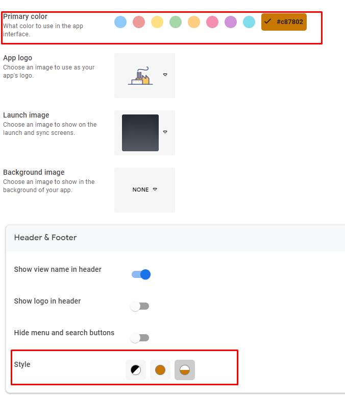
Hello @Fof_Webmaster, I’m not sure if this is a question or a feature request actually haha, but you can change the navigation bar colors in the UX-> Brand configuration, by changing the theme color and the theme settings.

- Mark as New
- Bookmark
- Subscribe
- Mute
- Subscribe to RSS Feed
- Permalink
- Report Inappropriate Content
- Mark as New
- Bookmark
- Subscribe
- Mute
- Subscribe to RSS Feed
- Permalink
- Report Inappropriate Content
Raphael
5 years ago we tested the app outdoors in the sun with sunglasses on, just like your selfie, hahah. I know about the nav bar color options. White text on black is the best. The issue is that 4 of the 5 buttons on the nav bar have font that is grayed out with almost no contrast vs the black background. This is true for all the nav bar colors.
- Mark as New
- Bookmark
- Subscribe
- Mute
- Subscribe to RSS Feed
- Permalink
- Report Inappropriate Content
- Mark as New
- Bookmark
- Subscribe
- Mute
- Subscribe to RSS Feed
- Permalink
- Report Inappropriate Content
I was in the shade tho ![]()
Dang, 5 years, if i had known i wouldn’t have mentioned the UX at all, you’re an appsheet veteran !
Have you considered moving your navigation bar buttons to a view that could be used as an in-app “menu” ? That way you could have more control over how those options are displayed, but at the cost of adding an extra step for switching between views.
PD: Asking for more control over the nav buttons would make for a very valid feature request too, since there aren’t that many legible combinations avaidable most of the time.
- Mark as New
- Bookmark
- Subscribe
- Mute
- Subscribe to RSS Feed
- Permalink
- Report Inappropriate Content
- Mark as New
- Bookmark
- Subscribe
- Mute
- Subscribe to RSS Feed
- Permalink
- Report Inappropriate Content
A very legitimate complaint. I’ve made sure the UX team is aware of your post.
- Mark as New
- Bookmark
- Subscribe
- Mute
- Subscribe to RSS Feed
- Permalink
- Report Inappropriate Content
- Mark as New
- Bookmark
- Subscribe
- Mute
- Subscribe to RSS Feed
- Permalink
- Report Inappropriate Content
Thanks Steve. This will assist the 99.99% or more of your users who use the app with sunglasses on!!!
There must be another easy way to highlight the button that’s the active view other than making the other 4 buttons, that are the only options left available the the user, unreadable. Maybe make the button that’s active unreadable? Haha. Or use the 3 button method of coloring then active button.
Cheers
Bob
-
Account
1,674 -
App Management
3,080 -
AppSheet
1 -
Automation
10,303 -
Bug
973 -
Data
9,664 -
Errors
5,721 -
Expressions
11,761 -
General Miscellaneous
1 -
Google Cloud Deploy
1 -
image and text
1 -
Integrations
1,602 -
Intelligence
578 -
Introductions
85 -
Other
2,890 -
Photos
1 -
Resources
535 -
Security
827 -
Templates
1,301 -
Users
1,554 -
UX
9,104
- « Previous
- Next »
| User | Count |
|---|---|
| 43 | |
| 29 | |
| 23 | |
| 20 | |
| 13 |

 Twitter