- AppSheet
- Tips & Resources
- Tips & Tricks
- New Chart series - Half round gauge chart ; QuickC...
- Subscribe to RSS Feed
- Mark Topic as New
- Mark Topic as Read
- Float this Topic for Current User
- Bookmark
- Subscribe
- Mute
- Printer Friendly Page
- Mark as New
- Bookmark
- Subscribe
- Mute
- Subscribe to RSS Feed
- Permalink
- Report Inappropriate Content
- Mark as New
- Bookmark
- Subscribe
- Mute
- Subscribe to RSS Feed
- Permalink
- Report Inappropriate Content
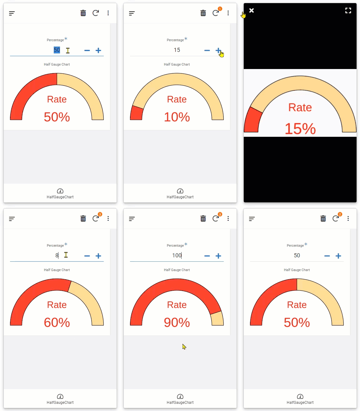
In addition to circle gauge chart as well as progress bar chart, which are generated using QuickChart Open Source chart library, I found now harf gauge chart was in place.

You see all the details and properties to control the looks of the chart, like color, size, boarders etc.
However, if you want to create the exactly same chart in this screenshot, please copy and paste the expression below to your table and Virtual Column.
“https://quickchart.io/chart?c={
type: ‘doughnut’,
data: {
datasets: [{
label: ‘foo’,
data: [”&number([Percentage])&", “&number([Remainder])&”],
backgroundColor: [
‘rgba(255, 0, 0, 0.8)’,
‘rgba(255, 165, 0, 0.4)’
],
borderWidth: 2,
borderColor: ‘rgba(0, 0, 0, 1)’,
}]
},
options: {
rotation: Math.PI,
circumference: Math.PI,
cutoutPercentage: 75,
plugins: {
datalabels: { display: false },
doughnutlabel: {
labels: [
{
text: ‘\nRate’,
color: ‘rgba(255, 0, 0, 0.9)’,
font: {
size: 50
},
},
{
text:"&MID(“x’x”,2,1)&"\n"&number([Percentage])&encodeurl("%25")&MID(“x’x”,2,1)&",
color: ‘rgba(255, 0, 0, 0.9)’,
font: {
size: 70,
},
},
]
}
}
}
}"
Make sure you have [Percentage] column (or any prefered name) and make the field to number type.
In addition to VC for chart itself, preare another chart to calculate [Remainder] In this VC, place the simple expression 100-[Remainder]
Once you place the number to percentage field, for example, you enter 10 , then reminder column will yeild 90. Those number are needed to draw the chart to construct chart URL.
Enjoy.
cc to @ianw
- Labels:
-
UX
- Mark as New
- Bookmark
- Subscribe
- Mute
- Subscribe to RSS Feed
- Permalink
- Report Inappropriate Content
- Mark as New
- Bookmark
- Subscribe
- Mute
- Subscribe to RSS Feed
- Permalink
- Report Inappropriate Content
Very Cool ![]()
- Mark as New
- Bookmark
- Subscribe
- Mute
- Subscribe to RSS Feed
- Permalink
- Report Inappropriate Content
- Mark as New
- Bookmark
- Subscribe
- Mute
- Subscribe to RSS Feed
- Permalink
- Report Inappropriate Content
Can you explain how this works? How would I use different charts on the website and have it interact with my data?
- Mark as New
- Bookmark
- Subscribe
- Mute
- Subscribe to RSS Feed
- Permalink
- Report Inappropriate Content
- Mark as New
- Bookmark
- Subscribe
- Mute
- Subscribe to RSS Feed
- Permalink
- Report Inappropriate Content
See and examine the documents provided by https://quickchart.io/gallery/
Generally, you can create any type of Chart they are providing in their gallery, and consume Appsheet table column to dynamically change the appearance like my quick demo as above.
- Mark as New
- Bookmark
- Subscribe
- Mute
- Subscribe to RSS Feed
- Permalink
- Report Inappropriate Content
- Mark as New
- Bookmark
- Subscribe
- Mute
- Subscribe to RSS Feed
- Permalink
- Report Inappropriate Content
Thank you, I don’t fully understand how this would be done. I think appsheet should do a tutorial on these because they just look and seem fantastic ![]()
- Mark as New
- Bookmark
- Subscribe
- Mute
- Subscribe to RSS Feed
- Permalink
- Report Inappropriate Content
- Mark as New
- Bookmark
- Subscribe
- Mute
- Subscribe to RSS Feed
- Permalink
- Report Inappropriate Content
Hi @Jonathan_S ! A good deal of time has passed but, if you are still interested in this topic, please take a look at the sample app I made as a demonstration:
- Mark as New
- Bookmark
- Subscribe
- Mute
- Subscribe to RSS Feed
- Permalink
- Report Inappropriate Content
- Mark as New
- Bookmark
- Subscribe
- Mute
- Subscribe to RSS Feed
- Permalink
- Report Inappropriate Content
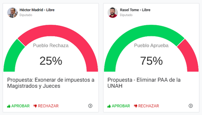
This is a great resource, Thank you very much. I achieved the following beautiful graphics by modifying some settings from your code:
The cards are politician's proposals and the chart displays the level of approval based on people's vote on each one of them.
- Mark as New
- Bookmark
- Subscribe
- Mute
- Subscribe to RSS Feed
- Permalink
- Report Inappropriate Content
- Mark as New
- Bookmark
- Subscribe
- Mute
- Subscribe to RSS Feed
- Permalink
- Report Inappropriate Content
Hay que tener cojones realmente jaja pedir que exoneren de impuestos a los jueces y magistrados🤣
- Mark as New
- Bookmark
- Subscribe
- Mute
- Subscribe to RSS Feed
- Permalink
- Report Inappropriate Content
- Mark as New
- Bookmark
- Subscribe
- Mute
- Subscribe to RSS Feed
- Permalink
- Report Inappropriate Content
Jajaja así es, realmente son estas algunas de las propuestas de los diputados aqui en Honduras, ganan exorbitantes cantidades de dinero y las propuestas que producen son de risa.
La otra propuesta que ves ahi, es eliminar una prueba estandarizada internacionalmente que actualmente se aplica en la Universidad Nacional Autonoma de Honduras. La prueba se introdujo hace años para resolver un grave problema que se dio eventualmente en la Universidad publica, al ser todos aceptados sin mas, estaban entrando personas que nunca se graduaban, llegando a viejos y solo se dedicaban a ser activistas politicos disfrazados de estudiantes para generar conflicto.
-
Account
6 -
App Management
21 -
Automation
186 -
Data
140 -
Errors
19 -
Expressions
206 -
Integrations
103 -
Intelligence
17 -
Other
57 -
Resources
24 -
Security
14 -
Templates
54 -
Users
19 -
UX
217

 Twitter