- AppSheet
- AppSheet Forum
- AppSheet Q&A
- New UI and Barcodes dont work together
- Subscribe to RSS Feed
- Mark Topic as New
- Mark Topic as Read
- Float this Topic for Current User
- Bookmark
- Subscribe
- Mute
- Printer Friendly Page
- Mark as New
- Bookmark
- Subscribe
- Mute
- Subscribe to RSS Feed
- Permalink
- Report Inappropriate Content
- Mark as New
- Bookmark
- Subscribe
- Mute
- Subscribe to RSS Feed
- Permalink
- Report Inappropriate Content
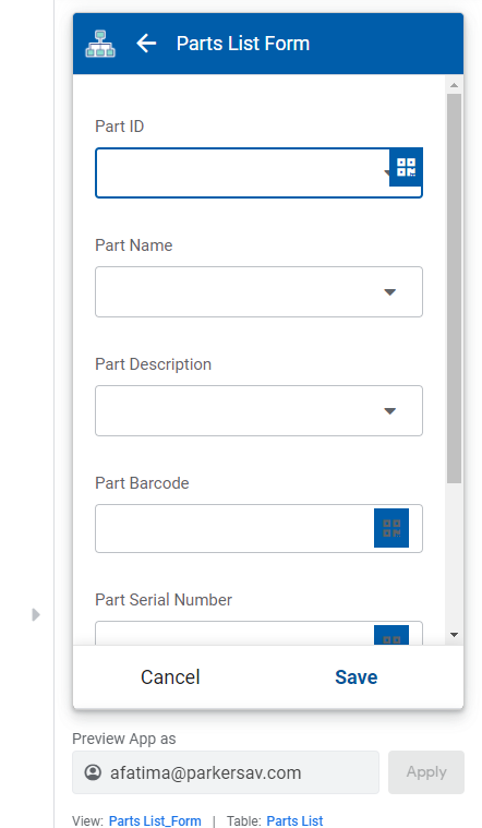
I just got the new UI on my app a few minutes ago. This is pretty disgusting to look at with the barcodes. Other than that is looks ok but that seems like a UI bug to me with how the barcode icon looks.
- Labels:
-
Errors
- Mark as New
- Bookmark
- Subscribe
- Mute
- Subscribe to RSS Feed
- Permalink
- Report Inappropriate Content
- Mark as New
- Bookmark
- Subscribe
- Mute
- Subscribe to RSS Feed
- Permalink
- Report Inappropriate Content
Just dropping copy
- Mark as New
- Bookmark
- Subscribe
- Mute
- Subscribe to RSS Feed
- Permalink
- Report Inappropriate Content
- Mark as New
- Bookmark
- Subscribe
- Mute
- Subscribe to RSS Feed
- Permalink
- Report Inappropriate Content
Did this UI update also shrink the width of a detail view in a dashboard? this is a 1/3 width view in a dashboard and I swear it used to go edge to edge.
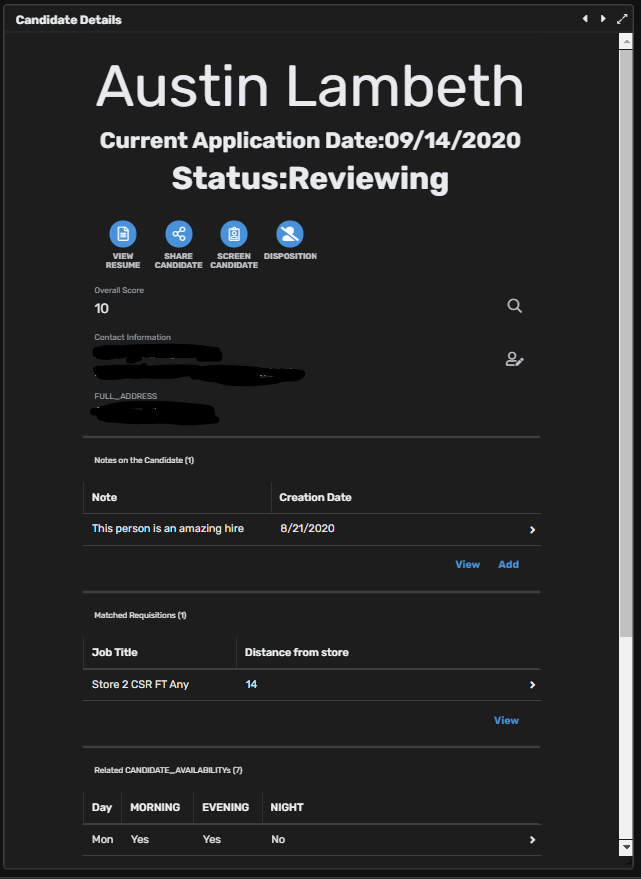
The new UI doesn’t seem to react to zooming out in chrome which is incredibly annoying.
- Mark as New
- Bookmark
- Subscribe
- Mute
- Subscribe to RSS Feed
- Permalink
- Report Inappropriate Content
- Mark as New
- Bookmark
- Subscribe
- Mute
- Subscribe to RSS Feed
- Permalink
- Report Inappropriate Content
Escalated.
- Mark as New
- Bookmark
- Subscribe
- Mute
- Subscribe to RSS Feed
- Permalink
- Report Inappropriate Content
- Mark as New
- Bookmark
- Subscribe
- Mute
- Subscribe to RSS Feed
- Permalink
- Report Inappropriate Content
Also have to click this tiny square now instead of just being closest to the tab you want on the browser…

- Mark as New
- Bookmark
- Subscribe
- Mute
- Subscribe to RSS Feed
- Permalink
- Report Inappropriate Content
- Mark as New
- Bookmark
- Subscribe
- Mute
- Subscribe to RSS Feed
- Permalink
- Report Inappropriate Content
Thanks for tagging me @tsuji_koichi !
Indeed we bumped a rollout for some UI changes yesterday (@Austin_Lambeth you’re not dreaming).
All, thanks for reporting all of that. Some of the points raised here are new to us and I’ve filed tickets so that we can work on them over time.
Regarding the width of the detail view and the clickable surface of the bottom nav bar, we’re not planning on changing them as some sort of fix. I agree with you that the width should be larger on destkop. However, as we’re currently working on some more general changes for better navigation and better Detail views on Desktop, in particular to leverage more of that available space, we’d rather tackle these issues in that project. We think it’ll be more beneficial for everyone.
- Mark as New
- Bookmark
- Subscribe
- Mute
- Subscribe to RSS Feed
- Permalink
- Report Inappropriate Content
- Mark as New
- Bookmark
- Subscribe
- Mute
- Subscribe to RSS Feed
- Permalink
- Report Inappropriate Content
I am probably the only user in our company that will experience the thinner detail view do to using 80% zoom on chrome so that is not as big of a deal and I know that previous to this update, there were other zoom levels that did the same thing it has just now been moved up to the zoom that I use.
I agree that looking at making detail views better on Desktop should be a larger project. Many other voices in the forum also agree that detail views could benefit from changes. The 2 highest votes requests being below. A thing I would also like to mention, would it be possible to force these updates to be given to all users of an organization at once? We have over 100 users and it would be confusing if 1 user has the UI update and the other doesn’t it could cause a bit of confusion. This happened when I got the update. Our other developer got the update yesterday which produces the first screenshot and I did not get the update till today. I don’t know for sure what the delay time was for me to get the update cause the other dev got it at the end of our work day.
- Mark as New
- Bookmark
- Subscribe
- Mute
- Subscribe to RSS Feed
- Permalink
- Report Inappropriate Content
- Mark as New
- Bookmark
- Subscribe
- Mute
- Subscribe to RSS Feed
- Permalink
- Report Inappropriate Content
It seems odd to me that one would get the update yesterday and someone else would get it only today. Are people working offline? If so and they sync their app at different times after our deployment, they may see the changes at different times.
When you say you have 100 users, do you mean 100 app creators or 100 app users? The rollouts impact all apps of a given app creator. So all app users of the same app should see the same changes (after they sync their app).
- Mark as New
- Bookmark
- Subscribe
- Mute
- Subscribe to RSS Feed
- Permalink
- Report Inappropriate Content
- Mark as New
- Bookmark
- Subscribe
- Mute
- Subscribe to RSS Feed
- Permalink
- Report Inappropriate Content
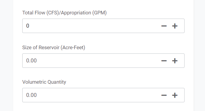
Also, although this was an issue before, the place holder in the case of decimal inputs has hardly any color distinction from an actual number that was input. See the attached image, ‘Total Flow’ is black and an actual entry whereas the other two are fields are placeholders displayed in a very dark grey color. But, I think that there is very little color difference and could be missed.
- Mark as New
- Bookmark
- Subscribe
- Mute
- Subscribe to RSS Feed
- Permalink
- Report Inappropriate Content
- Mark as New
- Bookmark
- Subscribe
- Mute
- Subscribe to RSS Feed
- Permalink
- Report Inappropriate Content
Noted, will bring that up to our UX designer.
- Mark as New
- Bookmark
- Subscribe
- Mute
- Subscribe to RSS Feed
- Permalink
- Report Inappropriate Content
- Mark as New
- Bookmark
- Subscribe
- Mute
- Subscribe to RSS Feed
- Permalink
- Report Inappropriate Content
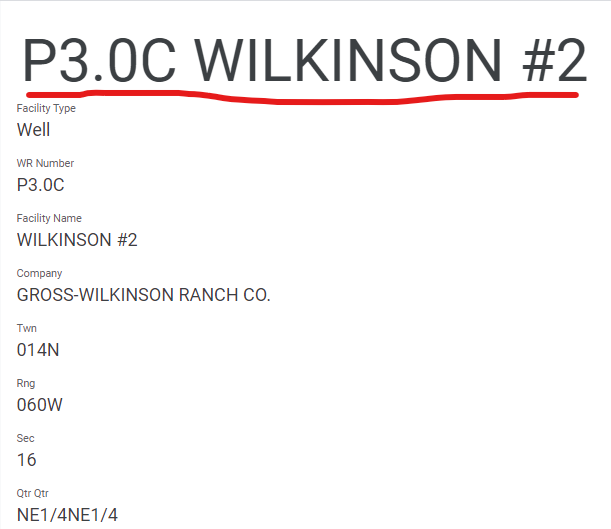
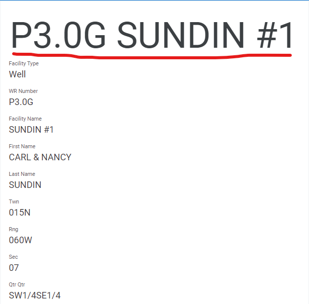
Thank you for passing this on to the UX team. While we are addressing UX could you please also address another item of mine that in my mind is a consistency issue?
Whenever there are header columns in a detail view, the font size is adjusted according to what seems like a horizontal stretch rule. So short header text is extremely large because it is stretched horizontally and thereby increased in vertical size, whereas longer text is extremely small until it spills into the next line. I would think that consistent header font size centered on the horizontal plane would solve this regardless if the header is multiple lines or not. When using the next/previous row buttons the current setup is just sort of a flow issue with the changing font sizes.
- Mark as New
- Bookmark
- Subscribe
- Mute
- Subscribe to RSS Feed
- Permalink
- Report Inappropriate Content
- Mark as New
- Bookmark
- Subscribe
- Mute
- Subscribe to RSS Feed
- Permalink
- Report Inappropriate Content
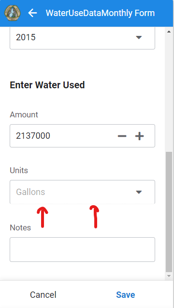
One other issue that I noticed if you don’t mind passing along? An input field that cannot be edited, the bottom line is a lighter shade, but the rest of the input box is a darker shade.
- Mark as New
- Bookmark
- Subscribe
- Mute
- Subscribe to RSS Feed
- Permalink
- Report Inappropriate Content
- Mark as New
- Bookmark
- Subscribe
- Mute
- Subscribe to RSS Feed
- Permalink
- Report Inappropriate Content
Could the new UI have caused a barcode scanning issue? We have validations in place (NUMBER()) to keep a field from being populated with any letters but it seems a driver was able to scan a barcode and the field accepted a code with letters in it.
Any help would be great.
- Mark as New
- Bookmark
- Subscribe
- Mute
- Subscribe to RSS Feed
- Permalink
- Report Inappropriate Content
- Mark as New
- Bookmark
- Subscribe
- Mute
- Subscribe to RSS Feed
- Permalink
- Report Inappropriate Content
It seems to be a separate issue.
You’ll have to share more info for further help (mobile OS, AppSheet app version, the barcode itself, …)
- Mark as New
- Bookmark
- Subscribe
- Mute
- Subscribe to RSS Feed
- Permalink
- Report Inappropriate Content
- Mark as New
- Bookmark
- Subscribe
- Mute
- Subscribe to RSS Feed
- Permalink
- Report Inappropriate Content
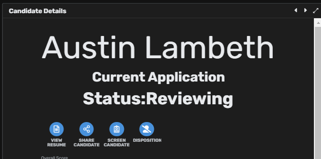
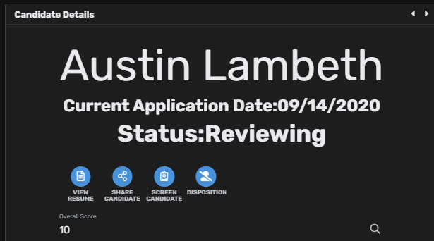
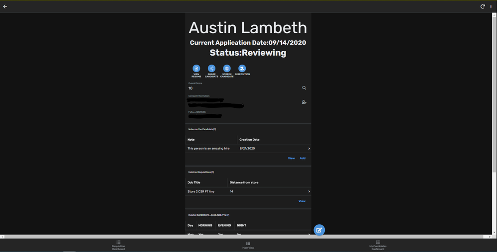
Didn’t really mean for this to turn into a bugs with the new UI post but another thing, my second header does not show all of it when I open the page but if I zoom in or out the second half of the header shows up.
- Mark as New
- Bookmark
- Subscribe
- Mute
- Subscribe to RSS Feed
- Permalink
- Report Inappropriate Content
- Mark as New
- Bookmark
- Subscribe
- Mute
- Subscribe to RSS Feed
- Permalink
- Report Inappropriate Content
@Austin_Lambeth
We can’t repro the issues you’re mentioning with the zooming in & out. Could you share a repro with us?
Can you submit a ticket to support@appsheet.com and ask whoever picks it up to send it directly to me?
Thank you.
- Mark as New
- Bookmark
- Subscribe
- Mute
- Subscribe to RSS Feed
- Permalink
- Report Inappropriate Content
- Mark as New
- Bookmark
- Subscribe
- Mute
- Subscribe to RSS Feed
- Permalink
- Report Inappropriate Content
Done. I can’t seem to reproduce the horizontal scroll bar one just the cutting of Current Application Date.
- Mark as New
- Bookmark
- Subscribe
- Mute
- Subscribe to RSS Feed
- Permalink
- Report Inappropriate Content
- Mark as New
- Bookmark
- Subscribe
- Mute
- Subscribe to RSS Feed
- Permalink
- Report Inappropriate Content
In just a detail view on the browser it’s also showing a horizontal scroll bar until I zoom in or out after opening the page. It’s also, I hate to say, incredibly ugly given how absolutely tiny the information section is. The sides of the detail page look like they were cut off rather than just ending because of how the text and lines look. The scrollbars also clash to the extreme when using dark theme.
-
Account
1,676 -
App Management
3,093 -
AppSheet
1 -
Automation
10,314 -
Bug
980 -
Data
9,672 -
Errors
5,729 -
Expressions
11,773 -
General Miscellaneous
1 -
Google Cloud Deploy
1 -
image and text
1 -
Integrations
1,606 -
Intelligence
578 -
Introductions
85 -
Other
2,899 -
Photos
1 -
Resources
536 -
Security
827 -
Templates
1,305 -
Users
1,557 -
UX
9,109
- « Previous
- Next »
| User | Count |
|---|---|
| 41 | |
| 27 | |
| 27 | |
| 20 | |
| 13 |

 Twitter