- AppSheet
- AppSheet Forum
- AppSheet Q&A
- Onboarding Image Size
- Subscribe to RSS Feed
- Mark Topic as New
- Mark Topic as Read
- Float this Topic for Current User
- Bookmark
- Subscribe
- Mute
- Printer Friendly Page
- Mark as New
- Bookmark
- Subscribe
- Mute
- Subscribe to RSS Feed
- Permalink
- Report Inappropriate Content
- Mark as New
- Bookmark
- Subscribe
- Mute
- Subscribe to RSS Feed
- Permalink
- Report Inappropriate Content
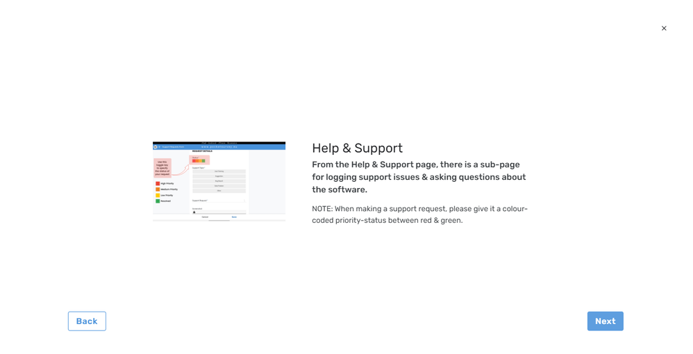
Is anyone struggling with the image size on the onboarding screens? It is ridiculously small!
The images are barely legible and with no function available to expand the image, it renders them useless.

- Labels:
-
Errors
- Mark as New
- Bookmark
- Subscribe
- Mute
- Subscribe to RSS Feed
- Permalink
- Report Inappropriate Content
- Mark as New
- Bookmark
- Subscribe
- Mute
- Subscribe to RSS Feed
- Permalink
- Report Inappropriate Content
I am having the same issue. Anyone any ideas on how to present larger images in the onboarding screen?
RoryF
- Mark as New
- Bookmark
- Subscribe
- Mute
- Subscribe to RSS Feed
- Permalink
- Report Inappropriate Content
- Mark as New
- Bookmark
- Subscribe
- Mute
- Subscribe to RSS Feed
- Permalink
- Report Inappropriate Content
Yes I've been disappointed by how small it's rendering the image even though mye images are enormous (1920x1080px).
Hopefully someone will respond with something useful.
- Mark as New
- Bookmark
- Subscribe
- Mute
- Subscribe to RSS Feed
- Permalink
- Report Inappropriate Content
- Mark as New
- Bookmark
- Subscribe
- Mute
- Subscribe to RSS Feed
- Permalink
- Report Inappropriate Content
Hi you can get the user the ctrl button and the mouse scroll wheel to adjust the view size in the web browser. Thats the only way I know to change it
- Mark as New
- Bookmark
- Subscribe
- Mute
- Subscribe to RSS Feed
- Permalink
- Report Inappropriate Content
- Mark as New
- Bookmark
- Subscribe
- Mute
- Subscribe to RSS Feed
- Permalink
- Report Inappropriate Content
Did anyone find a workaround for this?
- Mark as New
- Bookmark
- Subscribe
- Mute
- Subscribe to RSS Feed
- Permalink
- Report Inappropriate Content
- Mark as New
- Bookmark
- Subscribe
- Mute
- Subscribe to RSS Feed
- Permalink
- Report Inappropriate Content
Bump!
If anyone has a workaround, please share!
- Mark as New
- Bookmark
- Subscribe
- Mute
- Subscribe to RSS Feed
- Permalink
- Report Inappropriate Content
- Mark as New
- Bookmark
- Subscribe
- Mute
- Subscribe to RSS Feed
- Permalink
- Report Inappropriate Content
Not a solution, but just to share something in case it helps others.
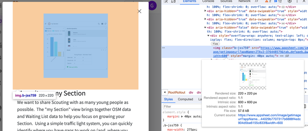
The rendered size (in browser) appears to be 220x220px. It's the 40px margin that's set within the code that seems to be the constraining factor over getting larger rendered images.
I found a source image size of 600x600 (they call it "intrinsic" in the Inspector) gives a good enough quality to the image without the file size being huge. It seems unlikely this will help get a larger "rendered" image, but it helped me understand what's happening.
- Mark as New
- Bookmark
- Subscribe
- Mute
- Subscribe to RSS Feed
- Permalink
- Report Inappropriate Content
- Mark as New
- Bookmark
- Subscribe
- Mute
- Subscribe to RSS Feed
- Permalink
- Report Inappropriate Content
Hi,
`margin: 40px auto` actually means "put a 40px margin on the top and bottom, then add the same margin to left and right until it fills the space." It's one way to center an image.
I can see that we set the max width here to 275px some five years ago, before we started working on desktop, and before we had good tracking for these kinds of decisions. I've asked the team for input and will see if we can improve this.
- Mark as New
- Bookmark
- Subscribe
- Mute
- Subscribe to RSS Feed
- Permalink
- Report Inappropriate Content
- Mark as New
- Bookmark
- Subscribe
- Mute
- Subscribe to RSS Feed
- Permalink
- Report Inappropriate Content
Hey @infinitejess do you have any news regarding changes in max width image size from your team?
Thanks in advance.
- Mark as New
- Bookmark
- Subscribe
- Mute
- Subscribe to RSS Feed
- Permalink
- Report Inappropriate Content
- Mark as New
- Bookmark
- Subscribe
- Mute
- Subscribe to RSS Feed
- Permalink
- Report Inappropriate Content
Hi, thanks for reminding me! Many balls in the air.
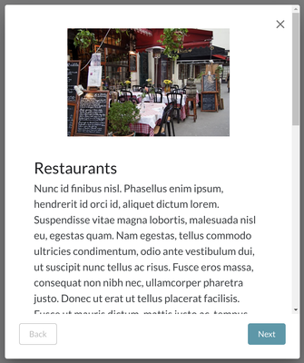
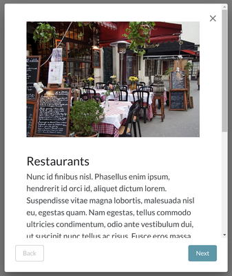
I just merged a change that should go out later this week (tomorrow earliest) that removes the excessive horizontal padding.
Before:
After:
This will apply to both legacy and desktop.
There's also a minor fix in there I turned up in testing, which is that if your onboarding rows have wildly different lengths of text, there's a bunch of padding at the bottom of the shorter views to make them all the same length. They should all be only as long as necessary now.
- Mark as New
- Bookmark
- Subscribe
- Mute
- Subscribe to RSS Feed
- Permalink
- Report Inappropriate Content
- Mark as New
- Bookmark
- Subscribe
- Mute
- Subscribe to RSS Feed
- Permalink
- Report Inappropriate Content
Thank you for the update. I'm looking forward to these improvement!
- Mark as New
- Bookmark
- Subscribe
- Mute
- Subscribe to RSS Feed
- Permalink
- Report Inappropriate Content
- Mark as New
- Bookmark
- Subscribe
- Mute
- Subscribe to RSS Feed
- Permalink
- Report Inappropriate Content
Thanks a for such quick response and for even better news🎉🥳
-
Account
1,677 -
App Management
3,099 -
AppSheet
1 -
Automation
10,322 -
Bug
983 -
Data
9,676 -
Errors
5,733 -
Expressions
11,779 -
General Miscellaneous
1 -
Google Cloud Deploy
1 -
image and text
1 -
Integrations
1,609 -
Intelligence
578 -
Introductions
85 -
Other
2,904 -
Photos
1 -
Resources
538 -
Security
827 -
Templates
1,308 -
Users
1,559 -
UX
9,110
- « Previous
- Next »
| User | Count |
|---|---|
| 41 | |
| 28 | |
| 24 | |
| 24 | |
| 13 |

 Twitter

