- AppSheet
- AppSheet Forum
- AppSheet Q&A
- Panel data - row series stack chart
- Subscribe to RSS Feed
- Mark Topic as New
- Mark Topic as Read
- Float this Topic for Current User
- Bookmark
- Subscribe
- Mute
- Printer Friendly Page
- Mark as New
- Bookmark
- Subscribe
- Mute
- Subscribe to RSS Feed
- Permalink
- Report Inappropriate Content
- Mark as New
- Bookmark
- Subscribe
- Mute
- Subscribe to RSS Feed
- Permalink
- Report Inappropriate Content
Hi everyone,
I’ve researched and read the AppSheet documentation, specially about the charts (https://help.appsheet.com/en/articles/961557-charts-the-essentials), but I didn’t succeed to achieve what I wish.
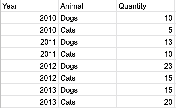
I have a panel data with 3 columns:
Table 1
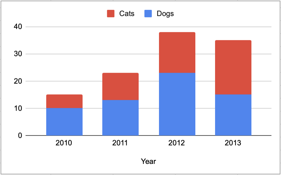
I would like to display the data in AppSheet in the following way (row series stack chart):
Graph 1

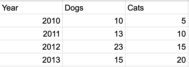
The above chart was actually a workaround using the following data framework:
Table 2
Anyway, does anyone know if there is a solution for this case of panel data (Table 1) and displaying the data in a stack chart (like Graph 1)?
Or would I have to stick with the data frame as shown in Table 2, the problem I would have to generate a new column for every new animal added in the dataset, wouldn’t this be a problem when the app is displaying the chart?
Thank you!
- Labels:
-
Automation
-
Account
1,673 -
App Management
3,071 -
AppSheet
1 -
Automation
10,291 -
Bug
966 -
Data
9,657 -
Errors
5,718 -
Expressions
11,750 -
General Miscellaneous
1 -
Google Cloud Deploy
1 -
image and text
1 -
Integrations
1,599 -
Intelligence
578 -
Introductions
85 -
Other
2,881 -
Photos
1 -
Resources
534 -
Security
827 -
Templates
1,300 -
Users
1,551 -
UX
9,094
- « Previous
- Next »
| User | Count |
|---|---|
| 44 | |
| 29 | |
| 23 | |
| 20 | |
| 15 |

 Twitter
