- AppSheet
- AppSheet Forum
- AppSheet Q&A
- Pie chart colors! Is there a way to tie spec
- Subscribe to RSS Feed
- Mark Topic as New
- Mark Topic as Read
- Float this Topic for Current User
- Bookmark
- Subscribe
- Mute
- Printer Friendly Page
- Mark as New
- Bookmark
- Subscribe
- Mute
- Subscribe to RSS Feed
- Permalink
- Report Inappropriate Content
- Mark as New
- Bookmark
- Subscribe
- Mute
- Subscribe to RSS Feed
- Permalink
- Report Inappropriate Content
Pie chart colors!
Is there a way to tie specific colors to specific values in the pie chart?
Eg, I have a chart showing 3 statuses for a delivery tracking app, Undelivered, Partially delivered and Fully delivered, which I’d like to color red, yellow and green. I have sorted the colors via drag and drop so the colors match when the chart has all 3 statuses, but all deliveries start undelivered and when there’s only one value in the chart, the color doesn’t match.
Solved! Go to Solution.
- Mark as New
- Bookmark
- Subscribe
- Mute
- Subscribe to RSS Feed
- Permalink
- Report Inappropriate Content
- Mark as New
- Bookmark
- Subscribe
- Mute
- Subscribe to RSS Feed
- Permalink
- Report Inappropriate Content
@Filipe_Damaso_Saraiv Hmm, this seems like a feature we should add. The behavior I’d expect is if the Chart Column is an enum, then the chart colors should be aligned with the enum values. But this doesn’t seem to be happening. Adding @Morgan_Dixon_AppShee
- Mark as New
- Bookmark
- Subscribe
- Mute
- Subscribe to RSS Feed
- Permalink
- Report Inappropriate Content
- Mark as New
- Bookmark
- Subscribe
- Mute
- Subscribe to RSS Feed
- Permalink
- Report Inappropriate Content
I have also tried to have pie charts colors “stick” to specific entries values (like Red = overdue) but they seem to reorder, particularly if you add a new enum value. Would great if you could assign a specific color, and if new enums added, then random assign…
- Mark as New
- Bookmark
- Subscribe
- Mute
- Subscribe to RSS Feed
- Permalink
- Report Inappropriate Content
- Mark as New
- Bookmark
- Subscribe
- Mute
- Subscribe to RSS Feed
- Permalink
- Report Inappropriate Content
Hey @Mike, from my experience this is now working as expected. So long as you remember to keep the number of colors in the graph the same as the number of options in the enum column, and place the colors in the same order as the enum options, colors match up.
- Mark as New
- Bookmark
- Subscribe
- Mute
- Subscribe to RSS Feed
- Permalink
- Report Inappropriate Content
- Mark as New
- Bookmark
- Subscribe
- Mute
- Subscribe to RSS Feed
- Permalink
- Report Inappropriate Content
@Filipe - Thanks for the heads up! Will have to go back and give it a try again.
- Mark as New
- Bookmark
- Subscribe
- Mute
- Subscribe to RSS Feed
- Permalink
- Report Inappropriate Content
- Mark as New
- Bookmark
- Subscribe
- Mute
- Subscribe to RSS Feed
- Permalink
- Report Inappropriate Content
Hi Felipe.
Does this work with enums only?
I have inspection status column which has 4 valid values (I use Valid If expression to limit the values) - “Needs Inspection”, “Rejected”, “Accepted”, “Cut Off”.
I try to present the situation in a pie chart and I have setup 4 colors in the chart view I created. Gray->Red->Green->Black
I would like Rejected to be always presented as red, and accepted as green…
Sometimes only all 4 values are available and sometimes less.
The problem is that the colors are being applied based in on the values available so sometimes red will show as red and other times it might show as gray.
Any solution to this?
- Mark as New
- Bookmark
- Subscribe
- Mute
- Subscribe to RSS Feed
- Permalink
- Report Inappropriate Content
- Mark as New
- Bookmark
- Subscribe
- Mute
- Subscribe to RSS Feed
- Permalink
- Report Inappropriate Content
Hello everyone,
Is there any solution to this problem?
Something similar to what is expressed in these publications happens to me!!
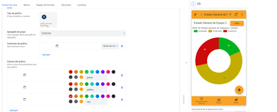
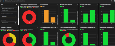
I have a column of type Ref to a table with only three stages of inspection condition, which are "Acceptable", "Moderate", "Substantial"... when presenting this data in a graph
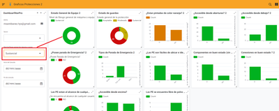
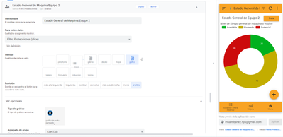
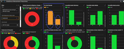
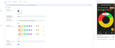
I have the configuration as specified in the publications! But when selecting a specific filter condition it does not respect the colors!! Example: I select "Substantial" in the Dashboard filter and when there is only one stage left, the graph takes the initial color ... in this case Green. When green should represent only "Acceptable"
- Mark as New
- Bookmark
- Subscribe
- Mute
- Subscribe to RSS Feed
- Permalink
- Report Inappropriate Content
- Mark as New
- Bookmark
- Subscribe
- Mute
- Subscribe to RSS Feed
- Permalink
- Report Inappropriate Content
Can you describe how your table is referenced and relevant column names and types of columns in the parent and child table?
- Mark as New
- Bookmark
- Subscribe
- Mute
- Subscribe to RSS Feed
- Permalink
- Report Inappropriate Content
- Mark as New
- Bookmark
- Subscribe
- Mute
- Subscribe to RSS Feed
- Permalink
- Report Inappropriate Content
Of course,
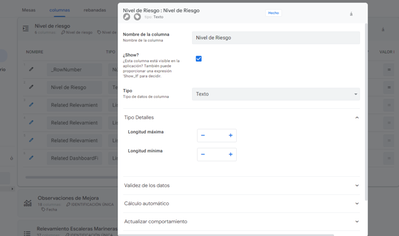
I have a "Risk Level" table that only has three values assigned in the [Risk Level[ column: "Acceptable", "Moderate", "Substantial"
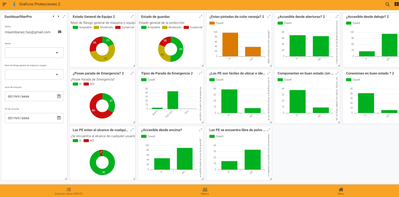
Then I have tables of different inspections that as a final assessment have the possibility of selecting the state of those machines, equipment or working conditions. Example: In this case, for the "Protection" table, this final assessment is made with a column that refers to the "Risk Level" table.
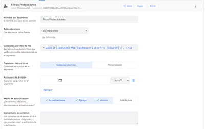
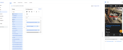
Luego tengo un slice a la tabla protecciones para poder emplear en las diferentes vistas de grafico que quiero obtener en un dashboard de esos datos de la tabla Protecciones. El Slices es el siguiente.
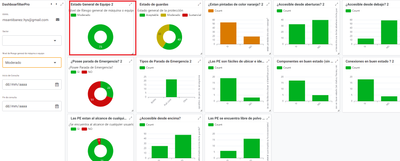
And then with this Slices I make the graphs of the columns that I represent in the panel.
- Mark as New
- Bookmark
- Subscribe
- Mute
- Subscribe to RSS Feed
- Permalink
- Report Inappropriate Content
- Mark as New
- Bookmark
- Subscribe
- Mute
- Subscribe to RSS Feed
- Permalink
- Report Inappropriate Content
Please try below. Not tested thoroughly.
Please make the column "Nivel De Riesgo..."in the "Protection" table as Enum type with base type as Ref and the column's reference table as "Nivel De Riesgo".
Please keep the enum options for this "Nivel Di Riesgo..." in the "Protection" table as Acceptable", "Moderate", "Substantial".
Please set the appropriate colors for the pie chart view and test.
- Mark as New
- Bookmark
- Subscribe
- Mute
- Subscribe to RSS Feed
- Permalink
- Report Inappropriate Content
- Mark as New
- Bookmark
- Subscribe
- Mute
- Subscribe to RSS Feed
- Permalink
- Report Inappropriate Content
I have made the changes and the graph continues to behave in the same way
- Mark as New
- Bookmark
- Subscribe
- Mute
- Subscribe to RSS Feed
- Permalink
- Report Inappropriate Content
- Mark as New
- Bookmark
- Subscribe
- Mute
- Subscribe to RSS Feed
- Permalink
- Report Inappropriate Content
If you show the column configuration for that ref column, it will help.
- Mark as New
- Bookmark
- Subscribe
- Mute
- Subscribe to RSS Feed
- Permalink
- Report Inappropriate Content
- Mark as New
- Bookmark
- Subscribe
- Mute
- Subscribe to RSS Feed
- Permalink
- Report Inappropriate Content
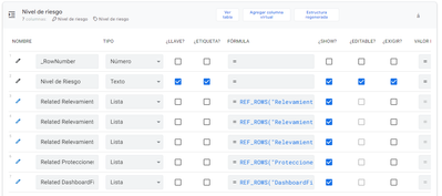
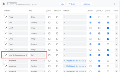
Dear, thank you for your response. Here is the column to which the table refers
"protections"
- Mark as New
- Bookmark
- Subscribe
- Mute
- Subscribe to RSS Feed
- Permalink
- Report Inappropriate Content
- Mark as New
- Bookmark
- Subscribe
- Mute
- Subscribe to RSS Feed
- Permalink
- Report Inappropriate Content
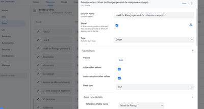
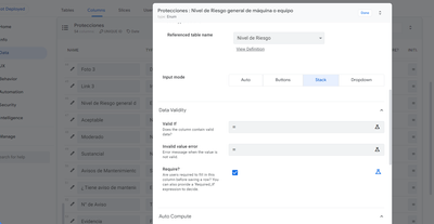
Thank you. Actually I requested to show the column setting details of that column in the "Protection" table.
- Mark as New
- Bookmark
- Subscribe
- Mute
- Subscribe to RSS Feed
- Permalink
- Report Inappropriate Content
- Mark as New
- Bookmark
- Subscribe
- Mute
- Subscribe to RSS Feed
- Permalink
- Report Inappropriate Content
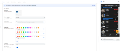
lo siento, aquí está
- Mark as New
- Bookmark
- Subscribe
- Mute
- Subscribe to RSS Feed
- Permalink
- Report Inappropriate Content
- Mark as New
- Bookmark
- Subscribe
- Mute
- Subscribe to RSS Feed
- Permalink
- Report Inappropriate Content
As requested please add the below three values in the "Valores" section of this "Nivel Di Riesgo..." column in the "Protection" table
- Mark as New
- Bookmark
- Subscribe
- Mute
- Subscribe to RSS Feed
- Permalink
- Report Inappropriate Content
- Mark as New
- Bookmark
- Subscribe
- Mute
- Subscribe to RSS Feed
- Permalink
- Report Inappropriate Content
ooooh, right..i never understood that part!! now it worked :)))))...thank you very much!!
- Mark as New
- Bookmark
- Subscribe
- Mute
- Subscribe to RSS Feed
- Permalink
- Report Inappropriate Content
- Mark as New
- Bookmark
- Subscribe
- Mute
- Subscribe to RSS Feed
- Permalink
- Report Inappropriate Content
If I wanted to change the colors of the histogram graphs: "YES" and "NO"...I can use the same mechanics...
Establish a table that has those two values, reference them and thus be able to configure the color of each chart column?
- Mark as New
- Bookmark
- Subscribe
- Mute
- Subscribe to RSS Feed
- Permalink
- Report Inappropriate Content
- Mark as New
- Bookmark
- Subscribe
- Mute
- Subscribe to RSS Feed
- Permalink
- Report Inappropriate Content
Great. Nice to know, the solution works per your requirement. All the best with your app building.
Regarding histograms, you could test. I am unsure if the approach will work because histogram has any one value at a time against some time scale etc. at a time. As per my understanding, histogram shows only one color at a time currently.
You may wish to see if multiple colors are possible with with the new chart engine that is in beta stage.
And some community members use external charting services such as Quickchart
https://www.googlecloudcommunity.com/gc/Tips-Tricks/Using-QuickChart-in-your-apps/m-p/255189
Edit: Added some more details to the post.
- Mark as New
- Bookmark
- Subscribe
- Mute
- Subscribe to RSS Feed
- Permalink
- Report Inappropriate Content
- Mark as New
- Bookmark
- Subscribe
- Mute
- Subscribe to RSS Feed
- Permalink
- Report Inappropriate Content
Thank you very much for your advice! to be able to access these graphs with views of the test phase... how can I do it?? in my editor I can't see this option
- Mark as New
- Bookmark
- Subscribe
- Mute
- Subscribe to RSS Feed
- Permalink
- Report Inappropriate Content
- Mark as New
- Bookmark
- Subscribe
- Mute
- Subscribe to RSS Feed
- Permalink
- Report Inappropriate Content
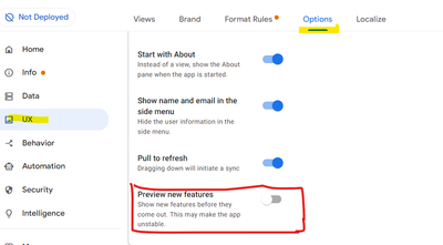
Please enable preview new features option.
- Mark as New
- Bookmark
- Subscribe
- Mute
- Subscribe to RSS Feed
- Permalink
- Report Inappropriate Content
- Mark as New
- Bookmark
- Subscribe
- Mute
- Subscribe to RSS Feed
- Permalink
- Report Inappropriate Content
Thank you very much
I've tried and it won't let me change the colors... is there something I'm doing wrong?
- Mark as New
- Bookmark
- Subscribe
- Mute
- Subscribe to RSS Feed
- Permalink
- Report Inappropriate Content
- Mark as New
- Bookmark
- Subscribe
- Mute
- Subscribe to RSS Feed
- Permalink
- Report Inappropriate Content
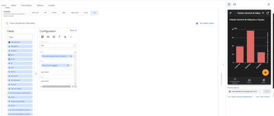
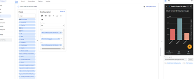
I already managed to activate the colors... I understand that I must put a column to change them... now the following is how I can choose those colors?... I would also like to know if I can change the target click view... before I it sent to the data set of that bar and now it sends me to a detail view.
Clik view now
click view before
- Mark as New
- Bookmark
- Subscribe
- Mute
- Subscribe to RSS Feed
- Permalink
- Report Inappropriate Content
- Mark as New
- Bookmark
- Subscribe
- Mute
- Subscribe to RSS Feed
- Permalink
- Report Inappropriate Content
No, that means even new charts do not have multi color histograms. I think you do not have much options.
-
Account
1,673 -
App Management
3,072 -
AppSheet
1 -
Automation
10,293 -
Bug
967 -
Data
9,657 -
Errors
5,719 -
Expressions
11,750 -
General Miscellaneous
1 -
Google Cloud Deploy
1 -
image and text
1 -
Integrations
1,599 -
Intelligence
578 -
Introductions
85 -
Other
2,882 -
Photos
1 -
Resources
535 -
Security
827 -
Templates
1,300 -
Users
1,551 -
UX
9,096
- « Previous
- Next »
| User | Count |
|---|---|
| 44 | |
| 29 | |
| 23 | |
| 20 | |
| 15 |

 Twitter