- AppSheet
- AppSheet Forum
- AppSheet Q&A
- Questions about the new charts feature
- Subscribe to RSS Feed
- Mark Topic as New
- Mark Topic as Read
- Float this Topic for Current User
- Bookmark
- Subscribe
- Mute
- Printer Friendly Page
- Mark as New
- Bookmark
- Subscribe
- Mute
- Subscribe to RSS Feed
- Permalink
- Report Inappropriate Content
- Mark as New
- Bookmark
- Subscribe
- Mute
- Subscribe to RSS Feed
- Permalink
- Report Inappropriate Content
I love the charts feature that’s in beta, it works really good for my apps because I have been using quickcharts to create energy performance charts.
I’m still working on understanding how the new tool works but I’m hoping someone will know whether what I’m hoping to do is be possible.
-
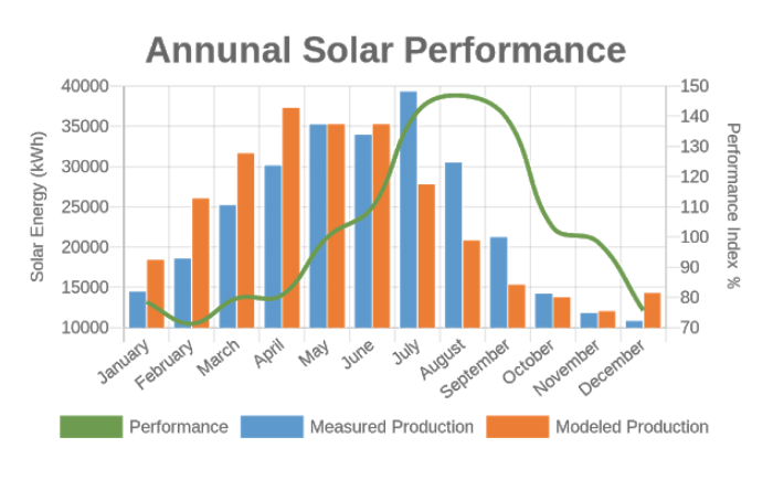
Can I create charts with multiple axes? I’d like to be able to recreate this.
-
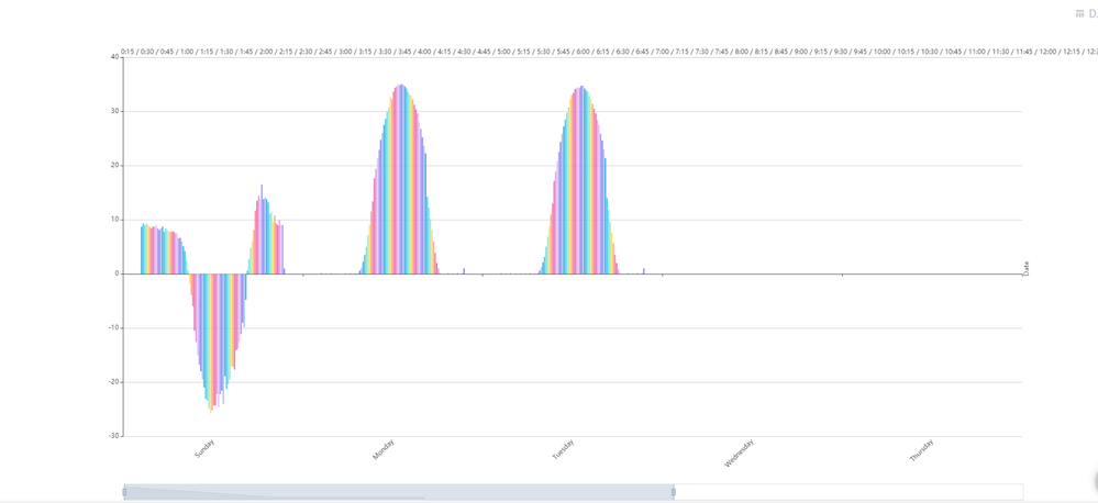
I’d also like to create charts using 15 minute interval data for solar production and energy consumption which are 2 separate sheets. I plan on having a chart with 1 week of 15 minute intervals which is 672 data points.
-
How can I adjust the colors of the fields?
-
Can I capture the chart as an image and include it on a document template? I know this isn’t possible with legacy charts.
Solved! Go to Solution.
- Mark as New
- Bookmark
- Subscribe
- Mute
- Subscribe to RSS Feed
- Permalink
- Report Inappropriate Content
- Mark as New
- Bookmark
- Subscribe
- Mute
- Subscribe to RSS Feed
- Permalink
- Report Inappropriate Content
Hi @Taylor_Felt
- Charts with multiple axes : not at the moment, to my knowledge
- charts with 15 minutes interval ==> probably. You will have to play some tricks to display datas properly, with a column “timestamp”. You will probably need to use some actions to copy datas from your 2 sheets into a 3rd one that will support all the datas you plan to display. However, because you don’t want to display the same unit informations, I’m afraid you will need to keep on 2 separate charts, maybe one above the other
- I’m afraid colors in the new chart feature are not adjustable at the moment.
- Capture Charts as images : yes you can, you will need to use the
SNAPSHOT()expression. Please see : SNAPSHOT() | AppSheet Help Center
- Mark as New
- Bookmark
- Subscribe
- Mute
- Subscribe to RSS Feed
- Permalink
- Report Inappropriate Content
- Mark as New
- Bookmark
- Subscribe
- Mute
- Subscribe to RSS Feed
- Permalink
- Report Inappropriate Content
Thank you, great idea about using timestamp. I wasn’t a fan of using snapshots before, hopefully it’s gotten better. The thing I like about quickcharts is how it lets me use the chart as an image so I can include it in a document template or as the image on a detail view…
Do you know of any way to include multiple charts within the same detail view?
- Mark as New
- Bookmark
- Subscribe
- Mute
- Subscribe to RSS Feed
- Permalink
- Report Inappropriate Content
- Mark as New
- Bookmark
- Subscribe
- Mute
- Subscribe to RSS Feed
- Permalink
- Report Inappropriate Content
yep : Dashboard views ![]()
Basically:
- you create a 1st chart view, you set its position to “Ref” (or not, this is your choice if you want to display it directly to your user as well)
- you create a 2nd chart view, position to “Ref”
- you create a 3rd view, type : Dashboard, View entry : chartView1 and ChartView2, and position…Center

- Mark as New
- Bookmark
- Subscribe
- Mute
- Subscribe to RSS Feed
- Permalink
- Report Inappropriate Content
- Mark as New
- Bookmark
- Subscribe
- Mute
- Subscribe to RSS Feed
- Permalink
- Report Inappropriate Content
Thanks! I’m also trying to get this to work in interactive mode, a chart with the customer key show when the customer is selected on the dashboard. Do you know if that’s possible?
- Mark as New
- Bookmark
- Subscribe
- Mute
- Subscribe to RSS Feed
- Permalink
- Report Inappropriate Content
- Mark as New
- Bookmark
- Subscribe
- Mute
- Subscribe to RSS Feed
- Permalink
- Report Inappropriate Content
Yes. You do the same with a view displaying your criteria (let’s say the customer table in your case), such as a gallery view (for example), and you add this one as another entry to your dashboard view.
-
Account
1,676 -
App Management
3,098 -
AppSheet
1 -
Automation
10,319 -
Bug
982 -
Data
9,676 -
Errors
5,732 -
Expressions
11,777 -
General Miscellaneous
1 -
Google Cloud Deploy
1 -
image and text
1 -
Integrations
1,608 -
Intelligence
578 -
Introductions
85 -
Other
2,902 -
Photos
1 -
Resources
537 -
Security
827 -
Templates
1,308 -
Users
1,558 -
UX
9,109
- « Previous
- Next »
| User | Count |
|---|---|
| 39 | |
| 28 | |
| 23 | |
| 23 | |
| 13 |

 Twitter
