- AppSheet
- AppSheet Forum
- AppSheet Q&A
- Quick edit field label size
- Subscribe to RSS Feed
- Mark Topic as New
- Mark Topic as Read
- Float this Topic for Current User
- Bookmark
- Subscribe
- Mute
- Printer Friendly Page
- Mark as New
- Bookmark
- Subscribe
- Mute
- Subscribe to RSS Feed
- Permalink
- Report Inappropriate Content
- Mark as New
- Bookmark
- Subscribe
- Mute
- Subscribe to RSS Feed
- Permalink
- Report Inappropriate Content

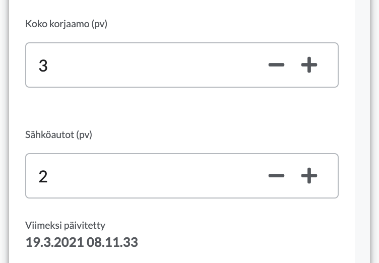
Is there a way to increase the size of the labels on quick edit fields as currently they’re embarassingly small? If not, because format rules do not work on quick edit fields, then could you possibly at the very least normalize the label size to the same size as the form labels where the text size is sensible?
Thanks!
- Mark as New
- Bookmark
- Subscribe
- Mute
- Subscribe to RSS Feed
- Permalink
- Report Inappropriate Content
- Mark as New
- Bookmark
- Subscribe
- Mute
- Subscribe to RSS Feed
- Permalink
- Report Inappropriate Content
Column label sizes cannot be adjusted, except by adjusting the app’s font size (which affects everything).
- Mark as New
- Bookmark
- Subscribe
- Mute
- Subscribe to RSS Feed
- Permalink
- Report Inappropriate Content
- Mark as New
- Bookmark
- Subscribe
- Mute
- Subscribe to RSS Feed
- Permalink
- Report Inappropriate Content
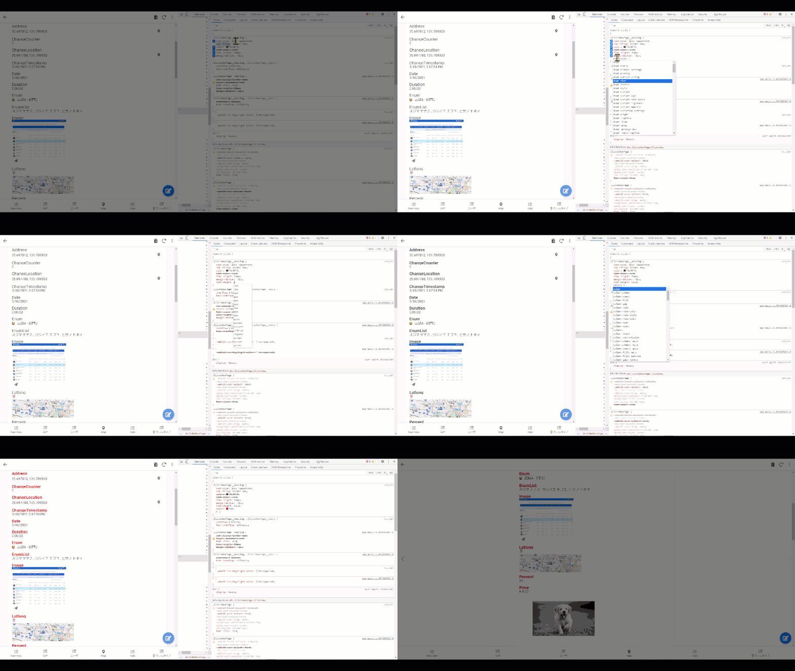
Those are one of the use cases where I wish to kick in custom css to control bits and small pieces…
- Mark as New
- Bookmark
- Subscribe
- Mute
- Subscribe to RSS Feed
- Permalink
- Report Inappropriate Content
- Mark as New
- Bookmark
- Subscribe
- Mute
- Subscribe to RSS Feed
- Permalink
- Report Inappropriate Content

Yes, it is possible that id, class name may change during the future update to the platform, but it is understandable. We app creator will be given option to set the custom css, at OWN RISK. If class name change and break up the css for existing then we made necessarily correction.
- Mark as New
- Bookmark
- Subscribe
- Mute
- Subscribe to RSS Feed
- Permalink
- Report Inappropriate Content
- Mark as New
- Bookmark
- Subscribe
- Mute
- Subscribe to RSS Feed
- Permalink
- Report Inappropriate Content
On forms the sizing of the labels and input fields is closer to each other, but for no reason on quick edit fields the text is so minuscule that even spry 20 year olds need to bring the phone closer.
That is poor design and looks like buggy software rather than a design choice and the input fields should have same sized labels across the app.
Obviously that’s the wrong solution to this problem and the trivially easy solution would be to add a textbox for inserting custom css to the head or the top of the body of a page, but that is so easy to implement that there is literally no reason why it doesn’t already exist, meaning it has to be an executive or marketing decision.
But at the very least the label sizes for input fields need to be equalized across the app.
- Mark as New
- Bookmark
- Subscribe
- Mute
- Subscribe to RSS Feed
- Permalink
- Report Inappropriate Content
- Mark as New
- Bookmark
- Subscribe
- Mute
- Subscribe to RSS Feed
- Permalink
- Report Inappropriate Content
I agree with you, but I’m not in a position to affect change on this.
- Mark as New
- Bookmark
- Subscribe
- Mute
- Subscribe to RSS Feed
- Permalink
- Report Inappropriate Content
- Mark as New
- Bookmark
- Subscribe
- Mute
- Subscribe to RSS Feed
- Permalink
- Report Inappropriate Content
Entirely understandable and sorry if I came off too cranky. That being said, should I just email the customer support or is there a better way to get the information to people who can do something about the labelling discrepancy?
- Mark as New
- Bookmark
- Subscribe
- Mute
- Subscribe to RSS Feed
- Permalink
- Report Inappropriate Content
- Mark as New
- Bookmark
- Subscribe
- Mute
- Subscribe to RSS Feed
- Permalink
- Report Inappropriate Content
I would encourage you to create a Feature Request topic here in the community. Those are reviewed by the product team.
-
Account
1,677 -
App Management
3,099 -
AppSheet
1 -
Automation
10,322 -
Bug
983 -
Data
9,676 -
Errors
5,733 -
Expressions
11,779 -
General Miscellaneous
1 -
Google Cloud Deploy
1 -
image and text
1 -
Integrations
1,610 -
Intelligence
578 -
Introductions
85 -
Other
2,904 -
Photos
1 -
Resources
538 -
Security
827 -
Templates
1,309 -
Users
1,559 -
UX
9,110
- « Previous
- Next »
| User | Count |
|---|---|
| 43 | |
| 28 | |
| 24 | |
| 24 | |
| 13 |

 Twitter